200 Landing Page Examples Analyzed
Lead Generation Landing Pages
To collect lead information from visitors you can employ a lead generation landing page. Typically a form or a click popup will collect information for further relationship development. Like every other type of landing page, a lead generation landing page directs visitors towards a single conversion; in this case, a form fill.
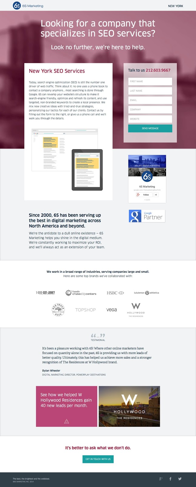
What makes this landing page work?
- White space: 6S Marketing draws the eyes into specific parts of the landing page with their use of white space. Each section stands out and attracts attention. Nothing on the page is too crowded and portions like the testimonials are highlighted for the visitor.
- Logos and social proof: Company logos and Google partnership signs enforce the professional and proven successes of 6S.
- Question: A question for the headline hits right to the pain point of the visitor. They back it up with copy that proves that they specialize in SEO and have had success with several clients across industries.
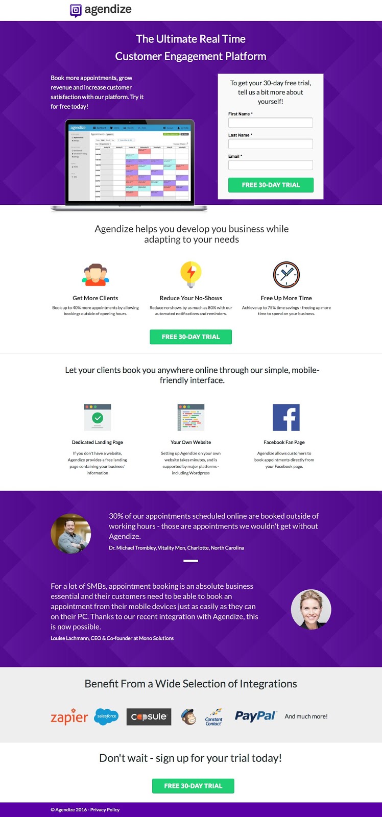
What makes this landing page work?
- Anchors: The bright green CTAs on the page direct visitors back to the top where the form is. If a landing page long it may be the case that visitors get lost. Anchor links direct visitors to the most important element on the page: the form.
- Contrast: The header and the testimonials are given emphasis on the page. With the vibrant purple backgrounds, Agendize is subtly telling the visitor that these parts are important.
- Visual: Photos and graphics are spread throughout the page to make it easily scannable. These days visitors decide if they’d like to stick around in seconds. Visuals make it faster to get your points across and make a larger impact.
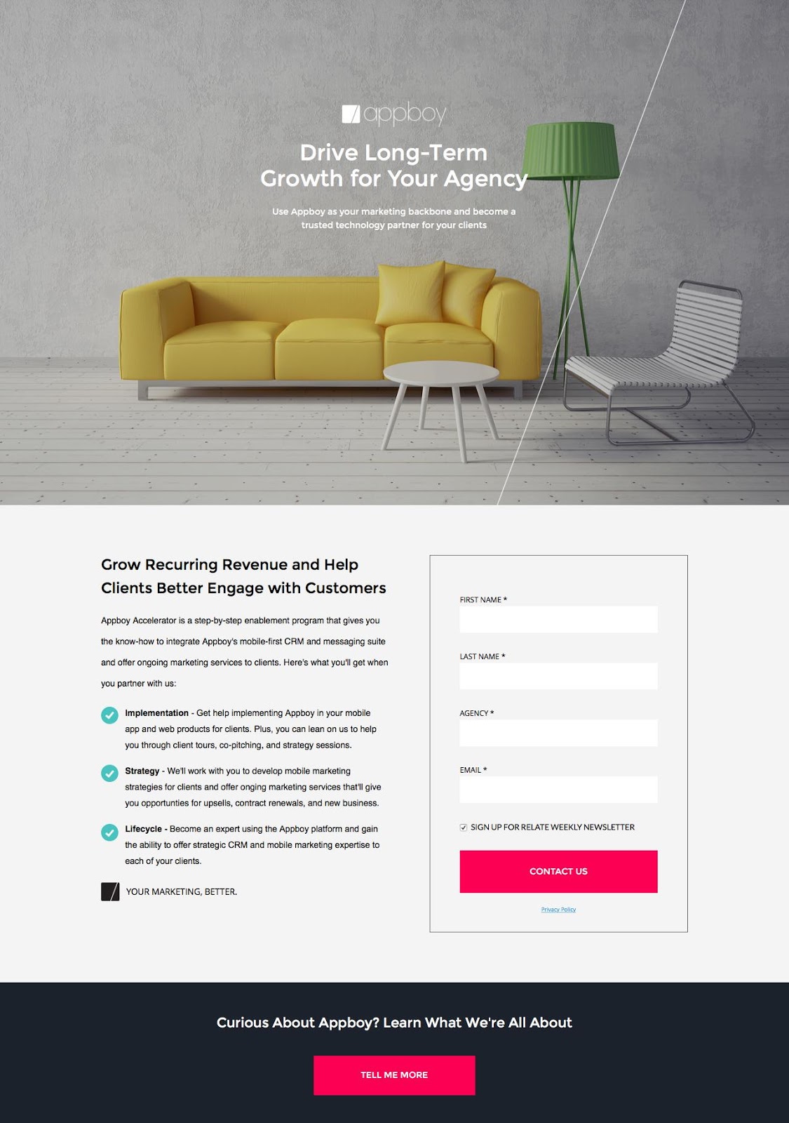
What makes this landing page work?
- Direct: The headline includes language directed at agencies. The following copy addresses issues agency owners may be facing and how Appboy can help provide a solution. Agencies receive implementation, strategy, and lifecycle planning. The subheading speaks directly to the wants and whys of agency owners, to “become a trusted technology partner to clients.”
- Encapsulation: The form uses an encapsulated design to stand out on the page. It also includes 2 variations of the call to action, “contact us” and “Tell me more”.
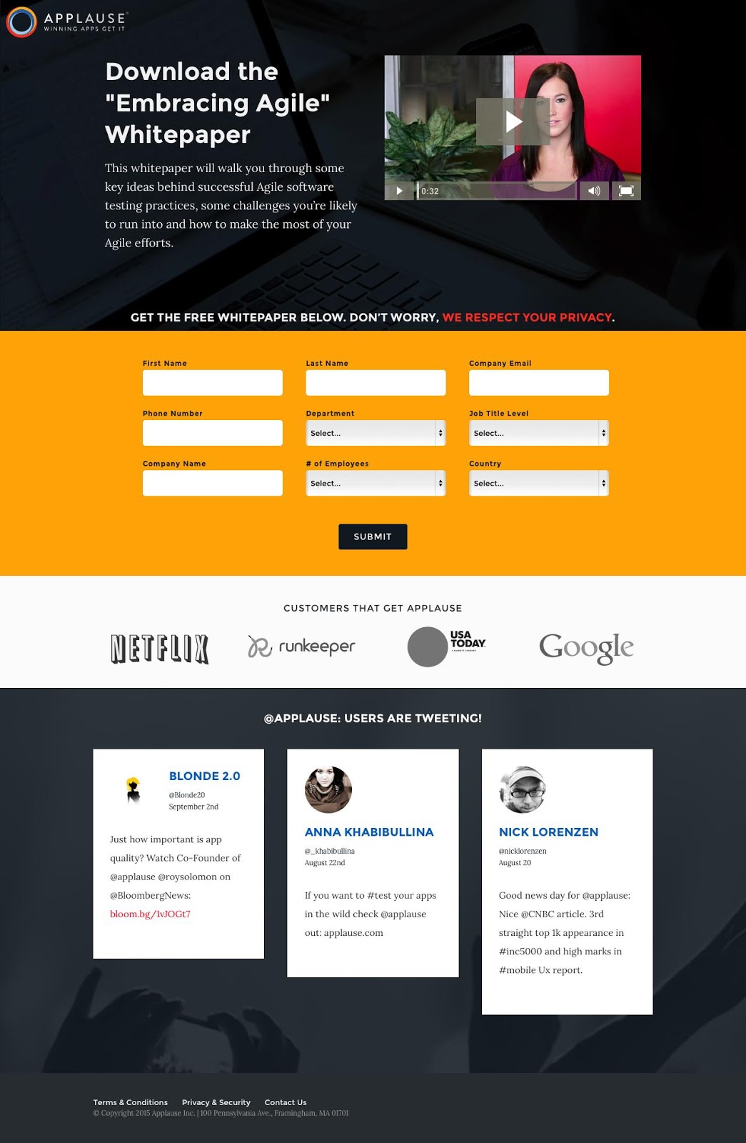
What makes this landing page work?
- Drop downs: In the form on Applause’s landing page they include drop down form fields for their visitors. Because they use quite a length form to segment opt-ins, drop down menus make life a little easier for visitors.
- Real Tweets: Showing real customers and users goes a long way to improving authenticity. Applause includes real tweets from real users to show the real people on the other side of the table.
- Video: Landing page video is a powerful tool. Because this is a whitepaper for a somewhat complex product, a landing page video can get the point across much more succinctly.
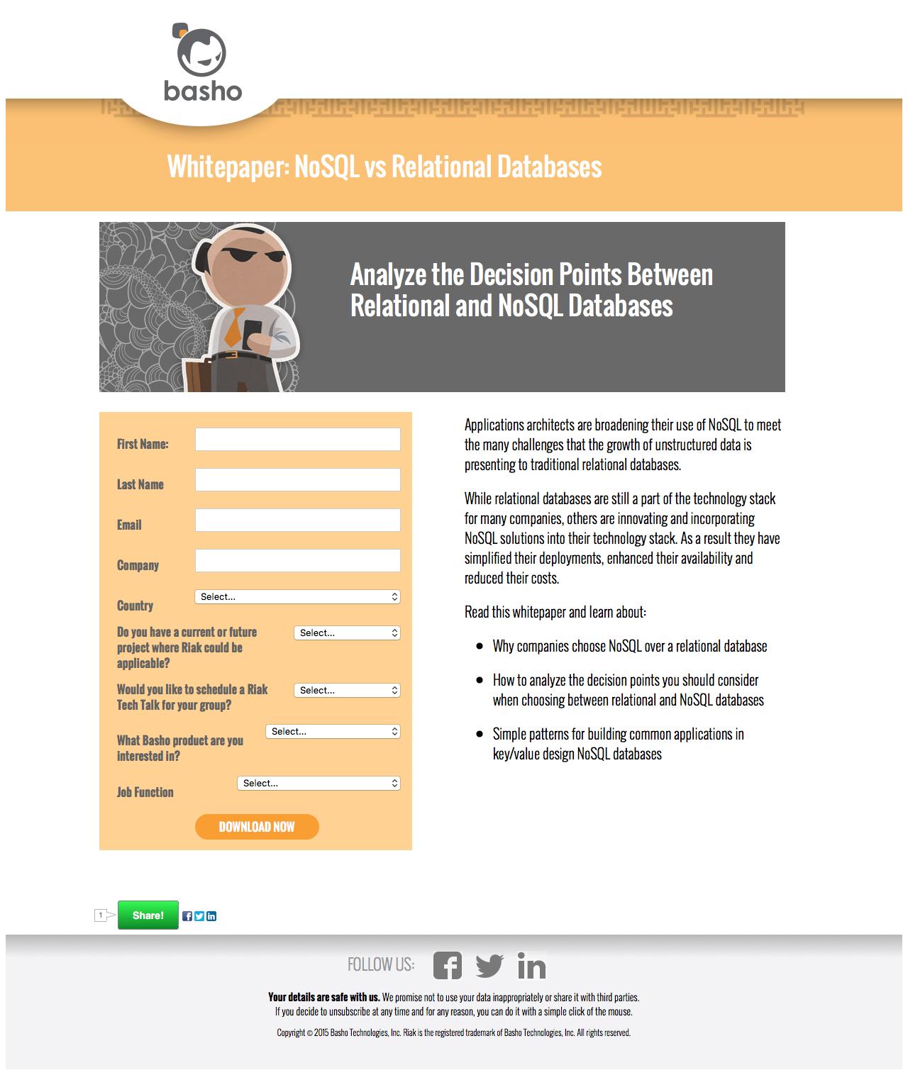
What makes this landing page work?
- Simplicity: Basho serves developers so they highlight the most important features first. The headline says exactly what is in the whitepaper. Nothing else crowds the text or the form.
- Encapsulation: The form can sometimes get lost on a landing page. Encapsulating it in a border or coloured box really helps it stand out on the page. Basho surrounds theirs with orange to make it the focal point of the page.
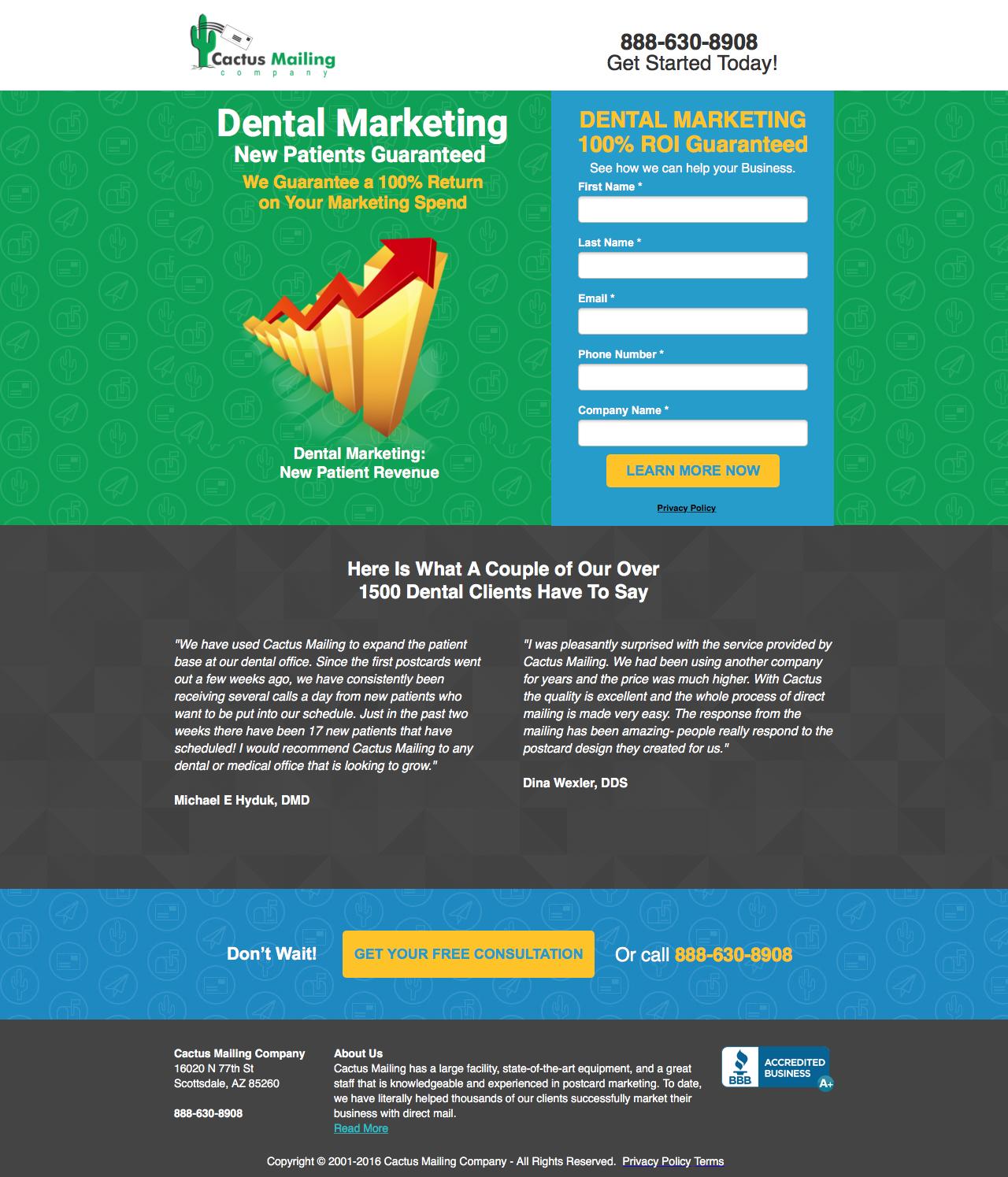
What makes this landing page work?
- Contrast: Cactus Mailing uses colours and font weights to make important elements stand out on the page. They guarantee 100% ROI which is a huge USP. The form is surrounded in blue and the CTAs are bright yellow. Because of the large amount of information, design focuses attention on the important elements.
- Social proof: Cactus Mailing provides customer testimonials to add trust and credibility. Because this is a service for dentists, seeing that other dentists use Cactus Mailing to grow their business is a persuasive tool.
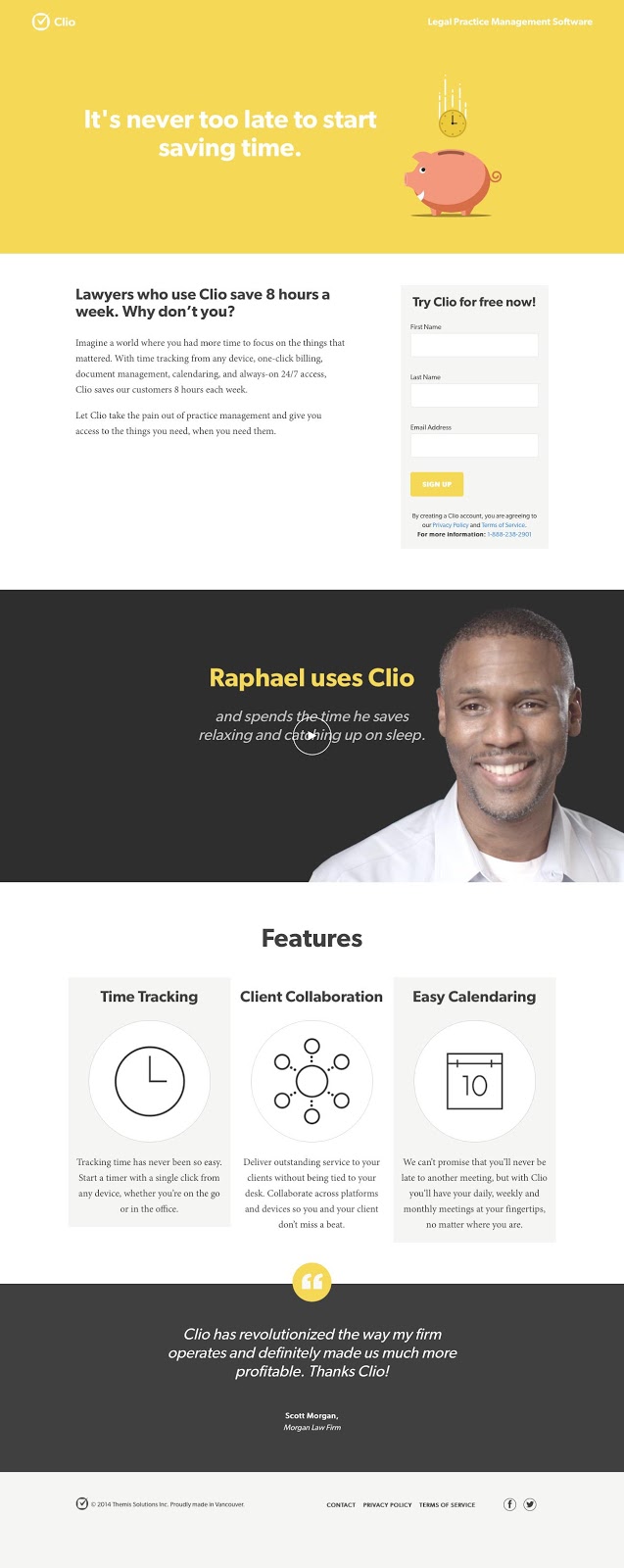
What makes this landing page work?
- Clean: This beautiful landing page by Clio keeps things simple. The headline speaks directly to lawyers, “Lawyers who use Clio save 8 hours a week. Why don’t you?” Clio relies on introspection, why can’t I save 8 hours a week? Their USP is ‘saving time’ and they’ve designed this page around that idea, highlighting it in every section.
- Video: A complex product needs a landing page video to highlight features and functions easily. Breaking down the product into a bite sized video can help ease the conversion process.
- Social proof: Serving the vertical of lawyers, it helps to have other lawyers vouch for the service. Clio uses written and video testimonials.
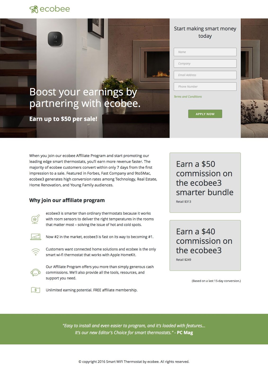
What makes this landing page work?
- Benefits: Ecobee provides a benefit in the headline of the page “Boost your earnings”. For Ecobee it’s all about money on this landing page, and attracting affiliates that want to make a lot of money. In every section of the page they mention how much money an affiliate can easily earn by representing Ecobee.
- Action: Much of the language on the page surrounds action. “Earn”, “join”, and “boost” are a few of the words Ecobee uses to incite action amongst visitors. Anyone that reads this landing page has action on their mind, Ecobee speaks to it to bring it to fruition.
- Concrete: Ecobee explicitly states the dollar figure affiliates will earn to avoid any friction or hesitation. Sometimes plainly stating what a visitor wants to know will speed up the process and convert visitors faster. It can be assumed that those interested in becoming affiliates want to know how much they can earn first and foremost.
What makes this landing page work?
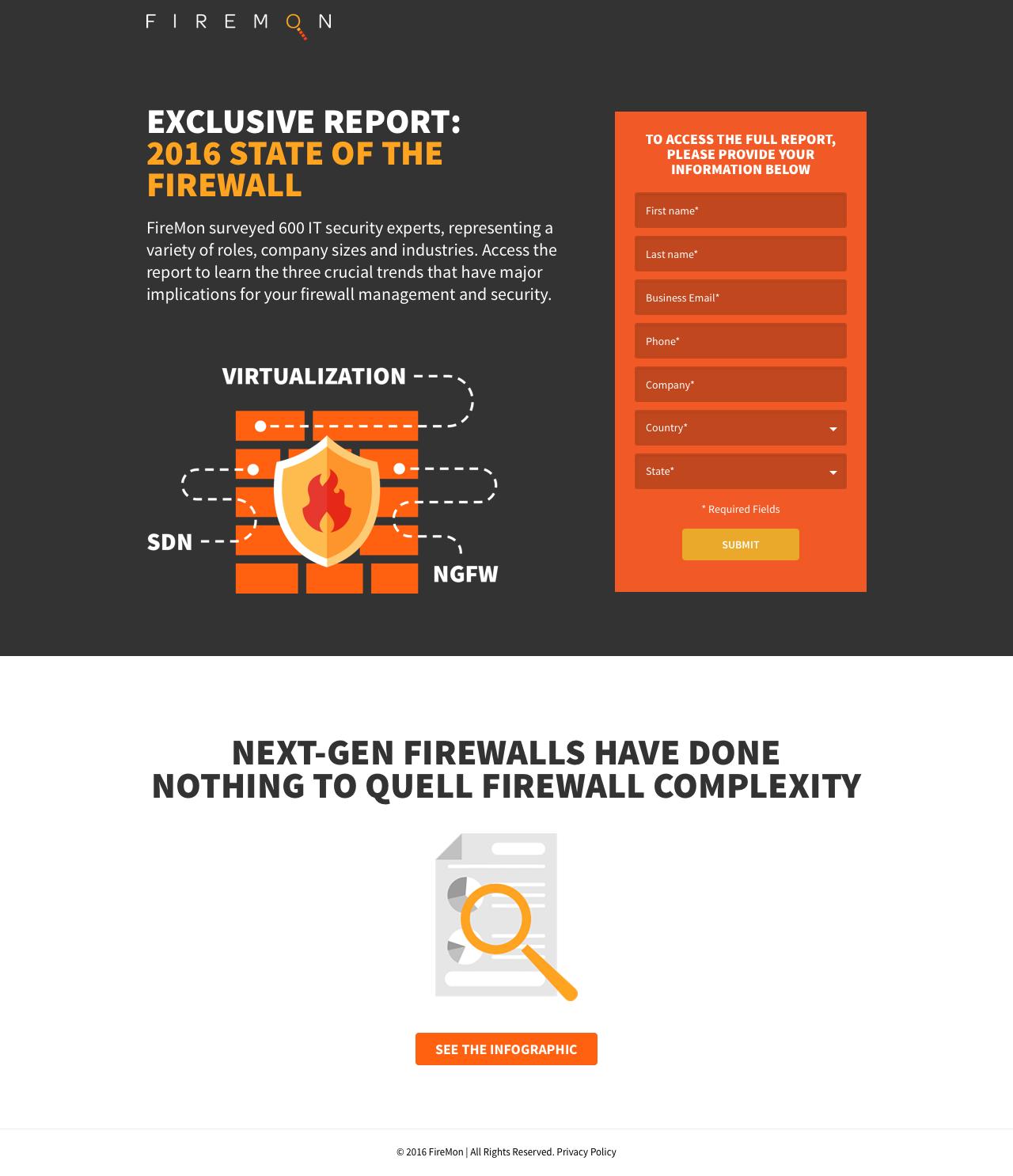
- Visual: Fun graphics and visual elements lighten up this Firemon landing page on a topic that isn’t typically considered ‘exciting’. Sometimes visualizing information instead of writing it can speed up the conversion process. Those who skim can easily understand the points and offer you’re making.
- Contrast: The form is heavily contrasted from the rest of the page. The dark background and bright form are perfectly contrasted.
- Concrete: Lending a concrete number of 600 IT professionals offers a compelling reason to convert. Specificity can be powerful tool to increase conversions.
What makes this landing page work?
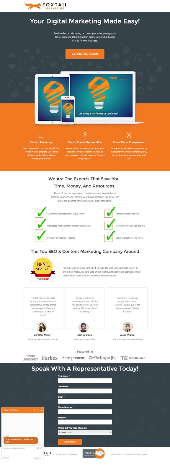
- Simplicity: Foxtail Marketing keeps things simple in this landing page. Their main focus is to show how they can make your life as a business owner easier. The design goes on to prove that they’re focused on keeping things simple. They have live chat and a minimal design to focus on the benefits and the folks they’ve worked with.
- Social proof: Testimonials and partner logos are spread around the page to provide trust and credibility. Real client testimonials go a long way to proving that Foxtail Marketing has had success providing an ROI.
What makes this landing page work?
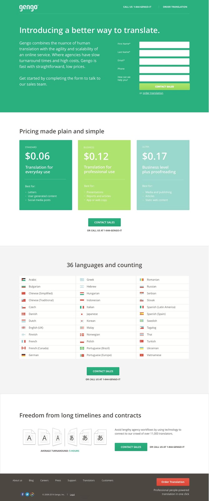
- Support: Gengo makes sure to list all of their supported languages. The company knows what visitors are looking for on arrival: Pricing and language support.
- Simple: Design is kept minimal with colours highlighting important areas. Only information that absolutely needs to be there is on the landing page. It keeps with the theme of being a “better way to translate” and “pricing made plain and simple”.

What makes this landing page work?
- Visual: Grow uses visuals everywhere they can to communicate information. Company and partner logos are everywhere to provide trust and credibility. A visual cue is pointing from the headline to the form to direct visitor attention. Concrete examples of the platform are shown and a before and after example shows what can be done with Grow.
- Social proof: Customer and client testimonials tell stories of how Grow has improved their business lives in a measurable way.
- Video: Landing page video is a powerful tool to communicate a product or services benefits. A video is a step away from a live demo of the product. Grow uses a landing page video to quickly and succinctly communicate the benefits of its product.
What makes this landing page work?
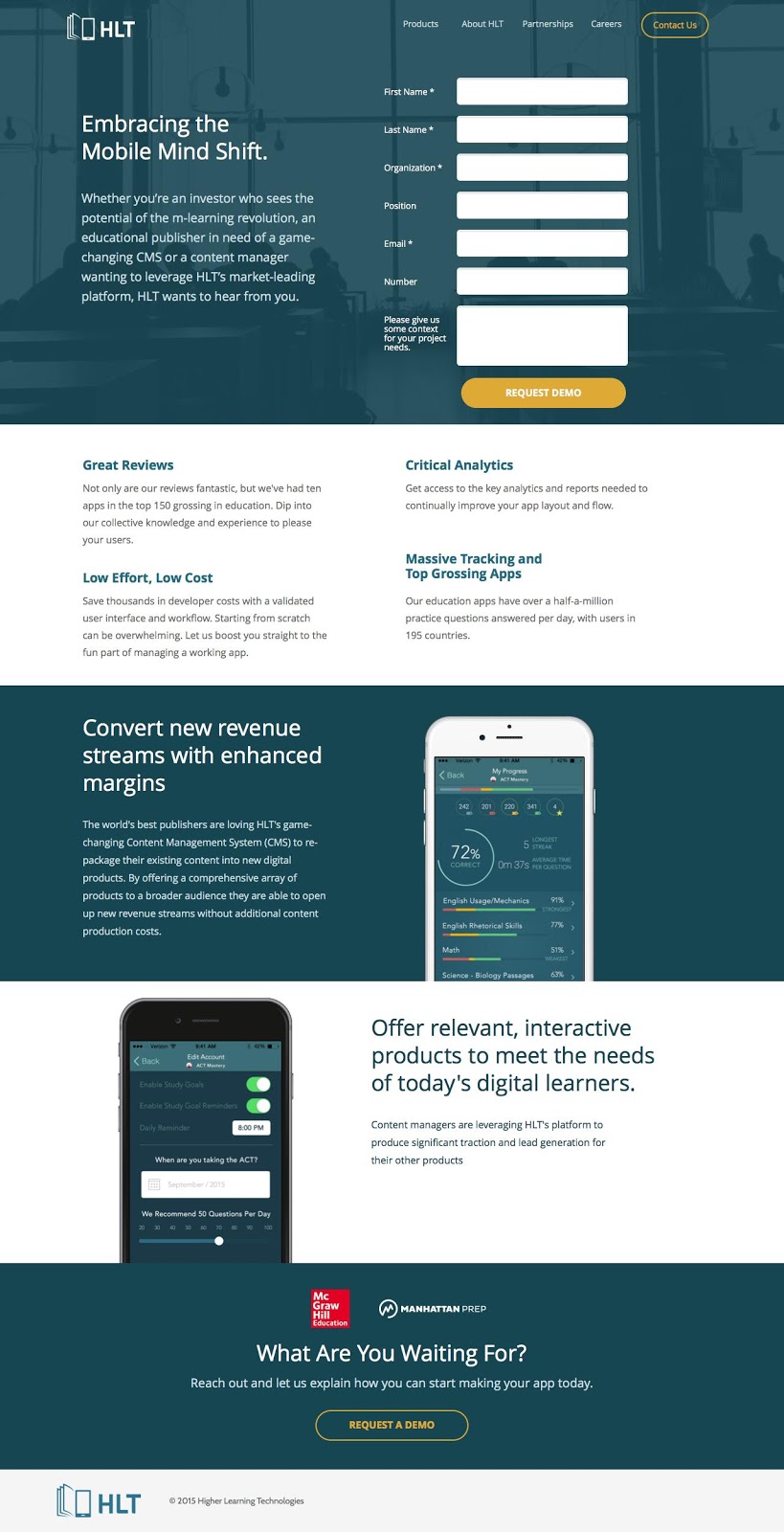
- Visual: HLT shows real images of its CMS platform. They offer relevant, interactive products to meet the needs of today’s learners and want to show how their product does so.
- Questions: HLT uses a question at the footer after a visitor has read all the information on the page. As a last ditch effort they ask “What are you waiting for?” to entice action.
- Contrast: With only 3 colours, HLT makes the most of the page by highlighting their CTAs in bright yellow. It stands
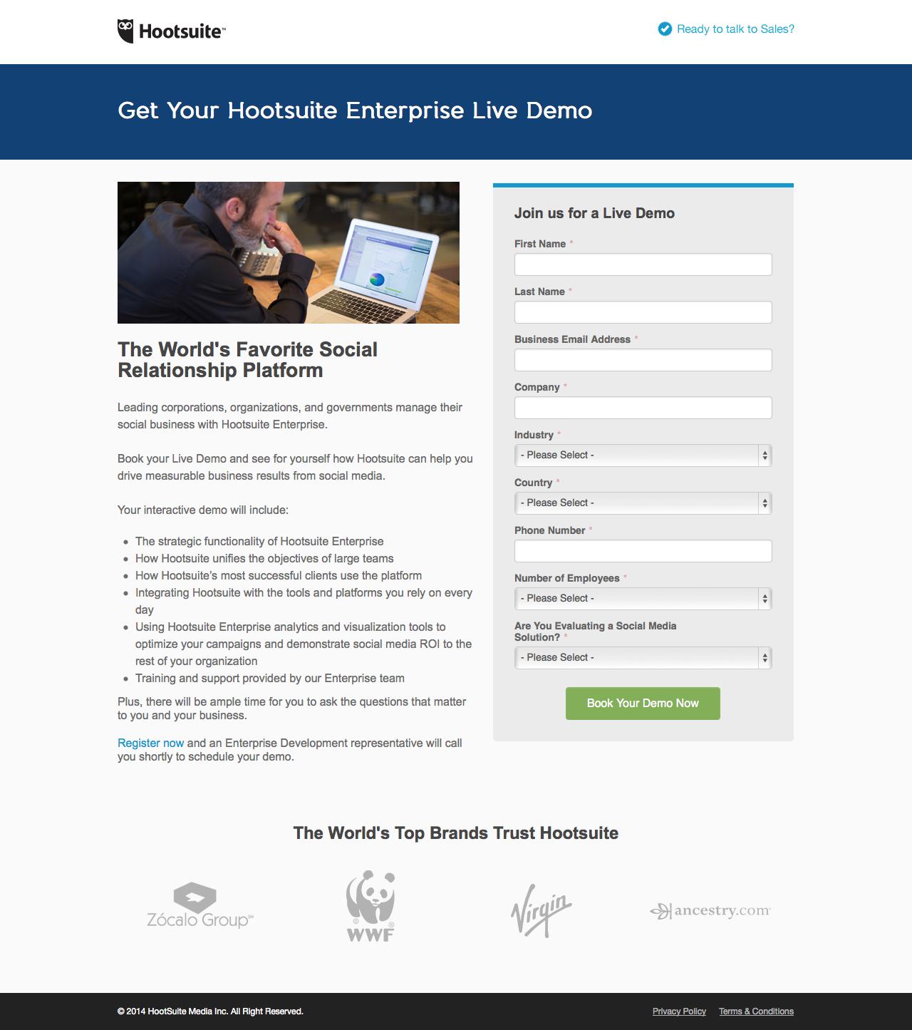
What makes this landing page work?
- Top brands: Hootsuite works with the biggest companies in the world and makes it a point to show it. They claim that the “World’s top brands trust Hootsuite” so so should you.
- Specific: Hootsuite details the content on the demo before a visitor signs up. If they have any hesitation that the demo isn’t for them, they can see what the demo includes and make sure they’re up for it.
- Design: The form is encapsulated on the page to draw attention. The language on the button “Book your demo now” signals exclusivity. The visitor is receiving the opportunity to book a private live demo.

What makes this landing page work?
- Design: Mavenlink focus on colour, simplicity, and contrast to highlight the most important aspects on the page. Whitespace draws visitors eyes towards the visual elements and onto the forms. Information is well spaced and the CTAs are clearly visible. Concrete examples of the software platform show how simple and easy to use it is.
- Benefits: Maximize profits says Mavenlink. Everything on the landing page is meant to demonstrate the benefits of saving time and an increase in profits. Training, onboarding, integrations, Mavenlink has you covered in every area.
- Encapsulation: The form in the footer is contrasted with the bright red colour to make it stand out on the page. The bright green CTAs grab attention and highlight the action oriented language.
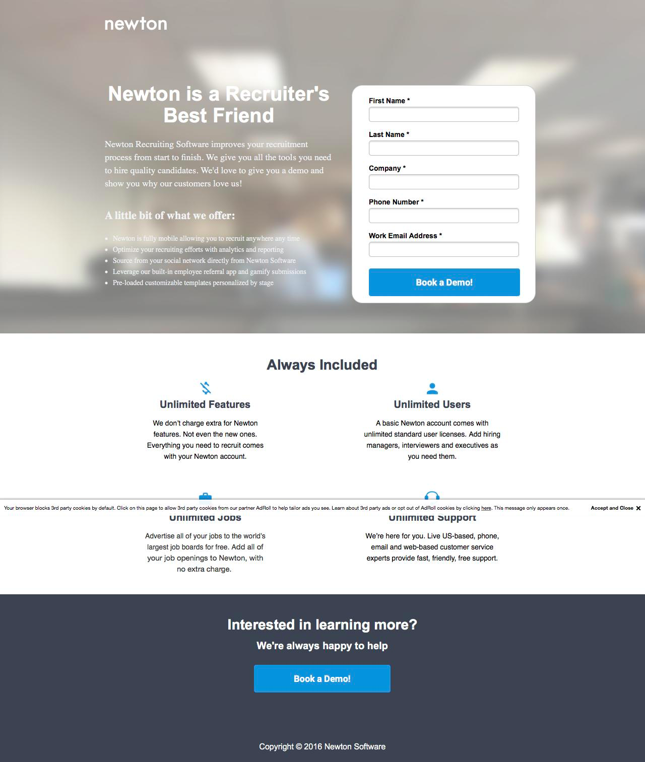
What makes this landing page work?
- Contrast: The form in the header image is encapsulated to stand out from the design. The CTA uses action-oriented language and provides clear communication about what the visitor is accomplishing.
- Always included: Newton has features that are always included in every plan. These are the features that differentiate it in the market: the USP. As best practices go always highlight the elements that make you different from your competitor.
- Unlimited: Newton makes sure to highlight the fact that their service is unlimited. It stands out as the most important aspect of their features.

What makes this landing page work?
- Visual: Restaurant management app OpenTable makes sure to show off their platform and stick to the theme of restaurant imagery. Each feature of the app is highlighted with a fun graphic to make it easy to understand.
- Simple: Each section of this landing page highlights a unique feature of OpenTable. The USP, beautiful simple hospitality, gets right to the meat of their benefit. Restaurant owners can manage the front of the house and have a powerful reservation system right at their finger tips.
- Join: Above the lead collection form they use the phrase “join our family”. It implies that the visitor can join an exclusive and well-supported network. A family is very nostalgic and it creates a feeling of relatability. It’s a smart word to use when recruiting people to your side.
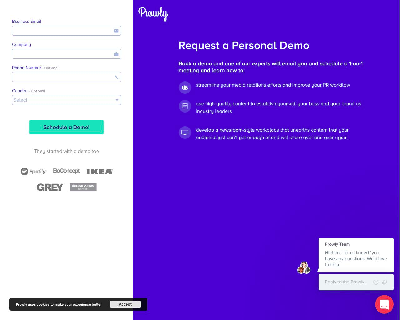
What makes this landing page work?
- Contrast: The information is clearly separated from the form field to keep things easy to navigate.
- Live chat: As an added bonus Prowly uses live chat to answer visitor questions. Live chat is a smart way to instantly connect with visitors and engage them. Engaging with a real human on the other end is a great way to build trust in a relationship.
- Visual: Company partner logos and a bright CTA go a long way attracting attention. Each element draws the eyes and moves attention along a pathway.
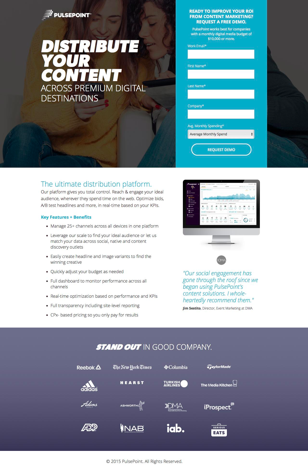
What makes this landing page work?
- Filtered: The subheading works to filter out any companies that don’t match PulsePoint’s target audience. They only work best with companies with a digital media budget exceeding $10,000. There is also a drop down form field in the form for visitors to enter in their monthly budget.
- Key features: A long list of key features are noted to show why using a content distribution platform is right for your business.
- Testimonials: A long list of business partners and key testimonials add trust. A screenshot of the product gives visitors a quick look at the platform and its simplicity.
What makes this landing page work?
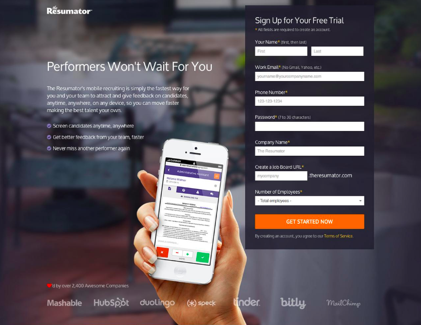
- Visual: A huge hero images takes up the entire page alongside an image of their platform. The image is an image that would relate to their target audience, most likely tech savvy millennials that operate most of their life through their mobile phone. It’s important to have your target audience in mind in everything from the copy to the imagery.
- Urgency: The headline “performers won’t wait for you” creates a sense of urgency for those that need to recruit top performing workers. Scarcity and urgency can be motivating factors for action and lead to many more conversions.
- Social proof: “Loved by over 2,000 awesome companies”, says Resumator. Company logos are shown at the bottom. Social proof and evidence of happy customers add massive amount of trust and credibility.

What makes this landing page work?
- Contrast: Headlines and subheadings are made huge in relation to the body text. RevLocal does this to draw more attention to the features and sections of its landing page.
- USP: RevLocal has a great USP: marketing shouldn’t cost an arm and a leg. It should be made affordable. They back up their affordable claim by showing exactly how much value they’re delivering as such a low cost. They speak directly to the visitor, making sure to add the ‘you’ in everything.
- Confidence: RevLocal wants to communicate that they know what they’re doing. Reading the landing page copy gives you a sense that they can handle the local marketing for any type of business no matter what. “The complete marketing package” and “The marketing partner you need” all add to the credibility of the service. At the end they finish it off with a CTA that reads “Talk to an expert”.
What makes this landing page work?
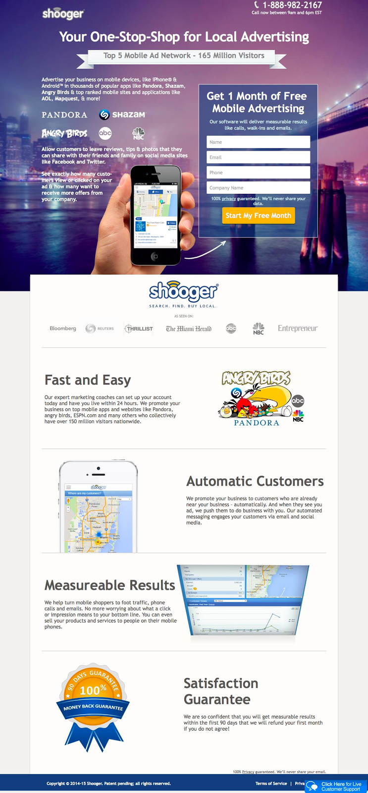
- Confidence: Satisfaction guaranteed says Shooger, they’re the top 5 mobile ad network used by some of the biggest brands in the world. They promise a 90 day money back guarantee and use an official looking stamp to support it.
- Social proof: Shooger has worked with some of the biggest brands in the world and don’t hesitate to show it. They scatter company logos everywhere to add credibility to their offer.
- Encapsulation: The form at the top stands out in its encapsulated box to draw attention. A direction cue arrow points the box to direct the visitor’s eye towards it.
What makes this landing page work?
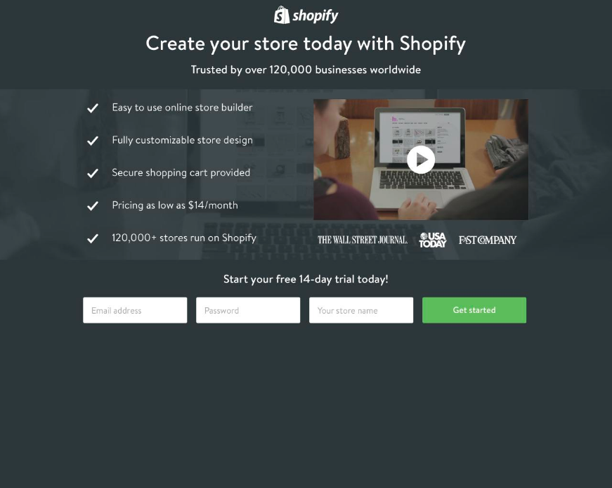
- Simplicity: Shopify knows it target audience and the established reputation it has in the marketplace. It doesn’t try too hard to convince visitors with flashy graphics and unnecessary information. It keeps the attention on its strengths, its features, and its USP.
- Trust: Trusted by over 120,000 business worldwide. Simple. Why wouldn’t you want to use it if so many others are?
- Video: A landing page video simply breaks down and walks through the Shopify product for the visitor. Sometimes video can be the easiest way to explain a product to a visitor. Shopify keeps words to a minimum and insteads shows them what they’re offering with a video.
What makes this landing page work?
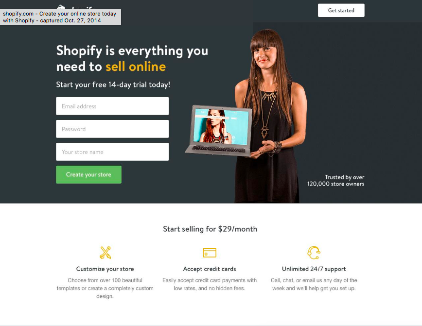
- Human: In this Shopify landing page they use a real person and their store as a representation of the 120,000 store owners that use Shopify to power their ecommerce.
- Simple: Things are still kept simple. The graphics below list the most important features of Shopify, and the best part is that you can start selling for $29 a month.
- Sell: Everything on the page relates to selling. “Sell online” in the heading, “Start selling” in the footer. The main point Shopify is getting across is that you can sell, right now.
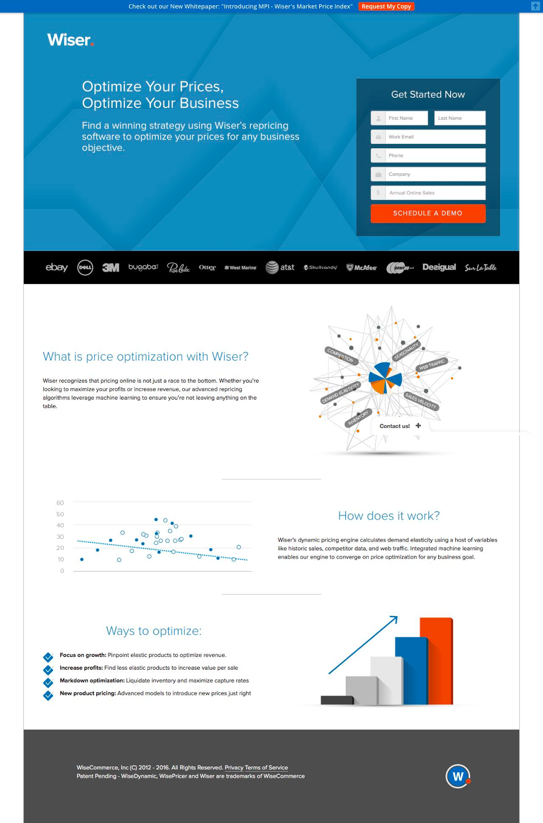
What makes this landing page work?
- Visuals: Because Wiser has such a complex business, it helps to use visuals to explain everything clearly. Each point they make is supported with a visual to support their claims.
- Social proof: Including well-known logos of companies you’ve worked with is always a good idea. Besides making you look important, it adds credibility and trust to your brand.
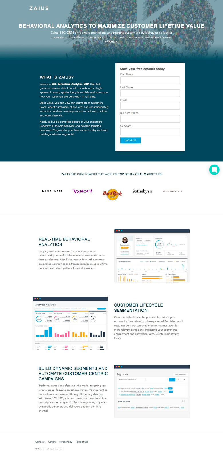
What makes this landing page work?
- Visuals: Zaius makes sure to show off as much of its platform as possible to give visitors an inside look. As a enterprise level business, its product can get a little confusing. Helpful visuals make the information easier to digest and allows the communication to slide by much easier.
- Social proof: Zaius powers the top behavioral marketers it says. Zaius works with some of the biggest brands in the world and includes their logos for trust and credibility.
- Live chat: Zaius includes live chat to engage with visitors instantly. Live chat can be a bonus feature that can really add value to businesses that have a more complex product or offer. That way visitors can ask questions and engage with a real human being before making a decision.
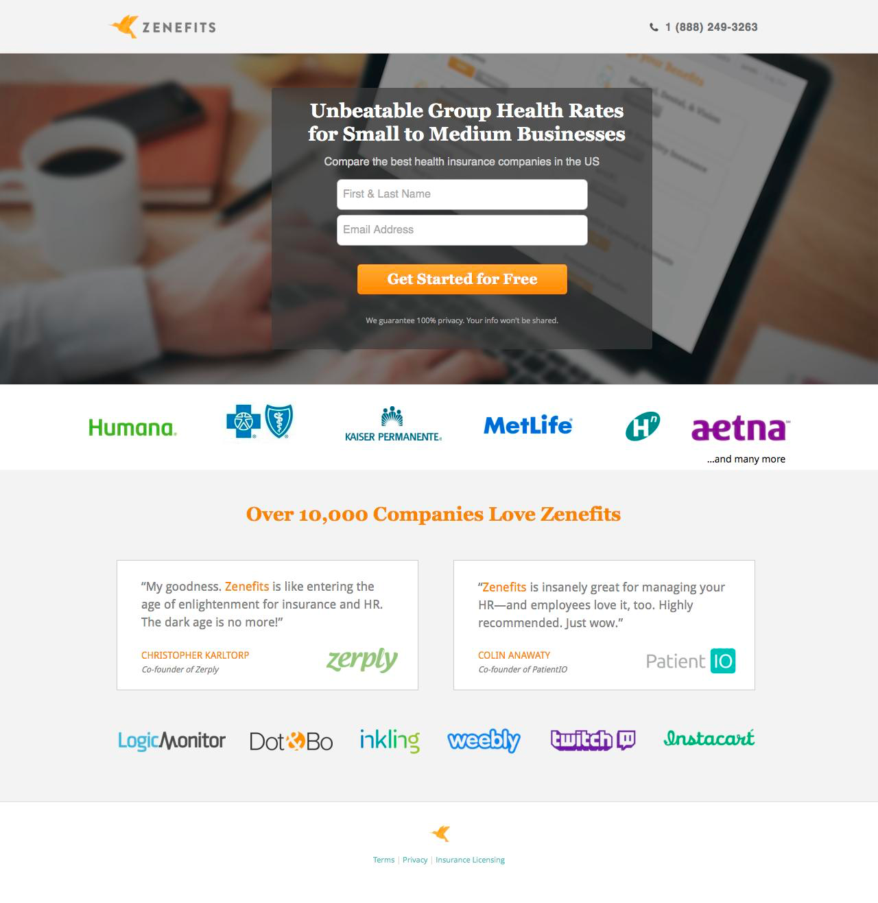
What makes this landing page work?
- Colour: Zenefits uses colour to the best of its ability to make its partner logos stand out on the page. “Over 10,000 companies love zenefits” it says.
- Social proof: There are logos from some of the biggest companies around the world on the landing page. Don’t think Zenefits is right for you? Everyone else is using it.
- Testimonials: Great testimonials can be a game changer. Having input from companies similar to your target audience can add that extra push for a conversion.
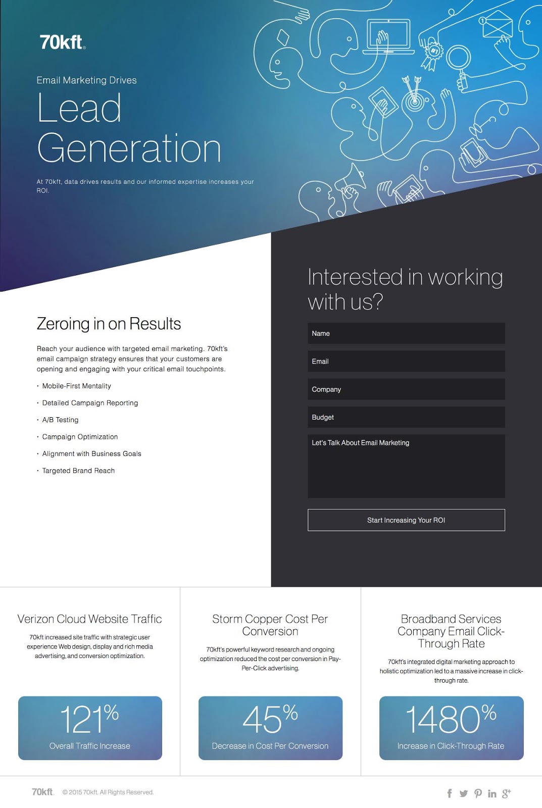
What makes this landing page work?
- Data: 70ktf includes hard data at the bottom on the page to show how their service has improved numbers for their clients.
- Action: Everything on the page communicates action from 70kft. The CTA of the form “Start increasing your ROI” is action-oriented and communicates improvement. The body copy and headline on the left hand side wants you to zero in on results and improve them with 70kft. They’ve done an excellent job at communicating change and showing visitors how they can get there.
- Contrast: The form on the page is well contrasted with the other design elements on the page. It starts with a question to grab attention, then directs the visitor below with the changes they can expect to see.

What makes this landing page work?
- Examples: Amadeus Consulting includes concrete examples of the work they’ve done and the success they’ve had with their clients. They aren’t afraid of showing off or being bold and in your face with their success. It goes a long way by adding credibility and trust. As they say in their subheading, “We build apps that people LOVE to use”.
- Social proof: This landing page includes examples and logos of the partners they’ve worked with. Amadeus Consulting uses contrast to direct visitor eyes towards the examples and towards the logos for maximum impact.
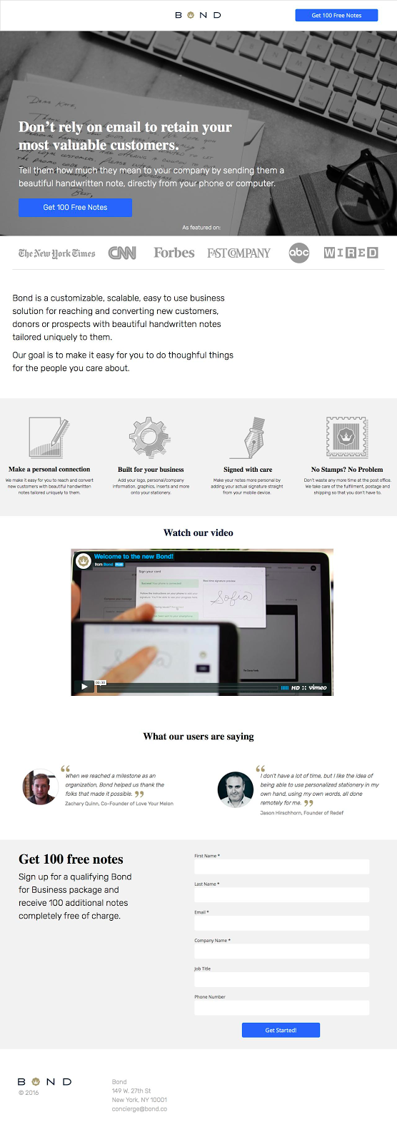
What makes this landing page work?
- Why: Bond makes it instantly clear why they do what they do in their headline. They want to make your business personable thus retain more customers. It’s direct and easy to understand, and gets to the meat of the issue instantly.
- Video: For those who don’t understand the ‘why’ or learn better visually, a landing page video explains it succinctly. Videos add exponential value to landing page because their high production costs add credibility and trust to the brand.
- Testimonials: The list of features and benefits go hand in hand with the testimonials on the page. Company logos and real user testimonials add even more credibility and trust to the Bond brand.
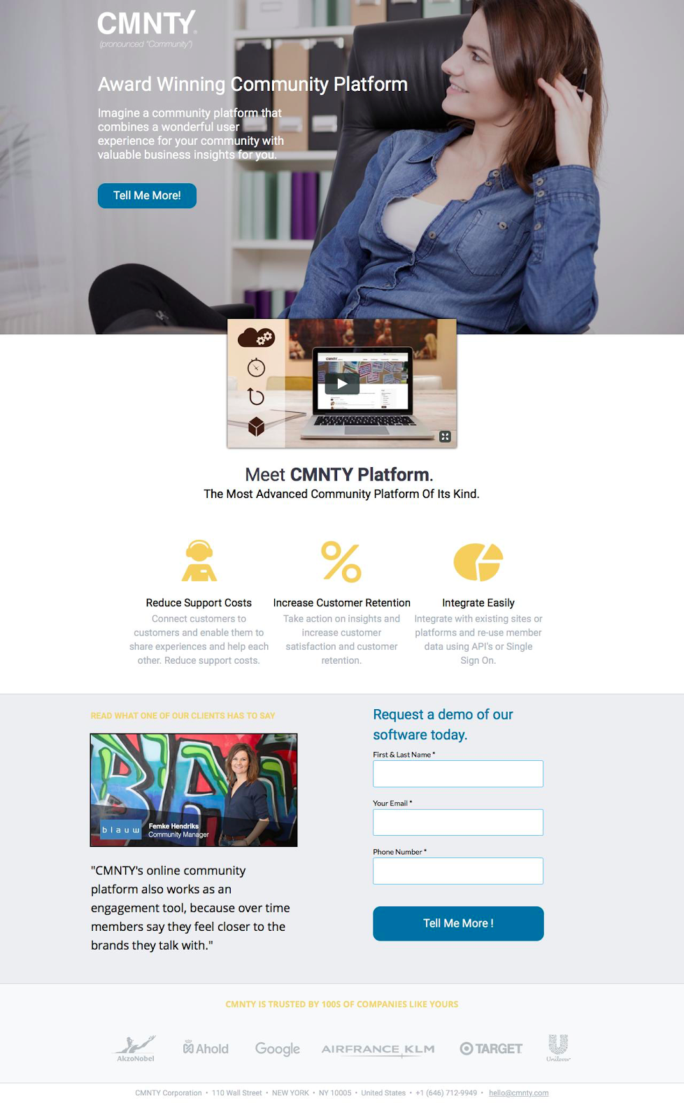
What makes this landing page work?
- Video: CMNTY uses a landing page video to feature its clients and use the power of storytelling to show why it’s an award winning company. Visitors can “meet the platform” through the video, the next best thing other than test driving it yourself.
- Contrast: The well used white space draws visitor attention to the most important parts of the page. The list of benefits, video and encapsulate form all benefit from the contrasting colours and white space.
- Social proof: Client logos and a real story from a real user shows the power of CMNTY’s platform. Doing your best to include a story can do a ton for your conversion rate because it adds relatability for the visitor.
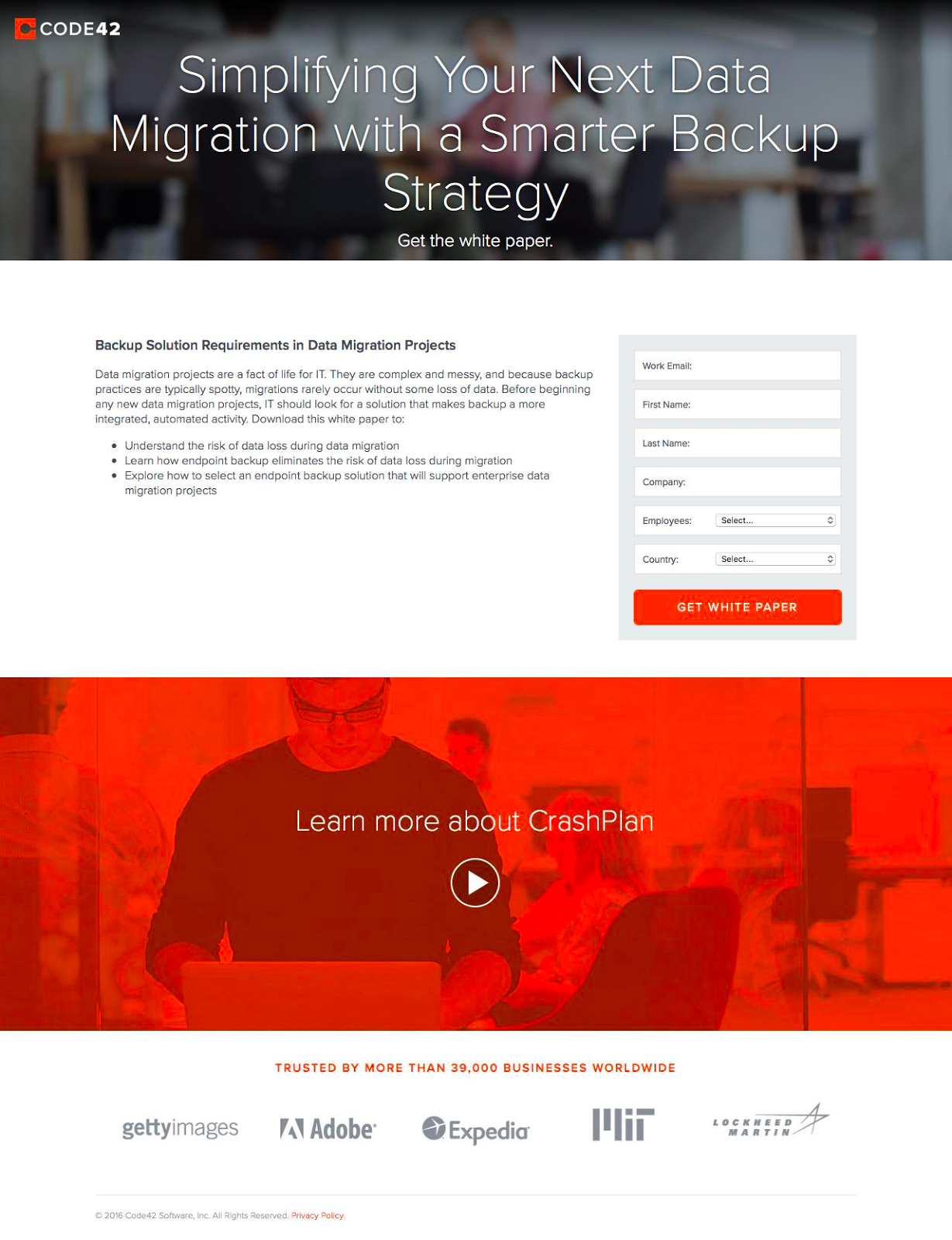
What makes this landing page work?
- Contrast: White space contrasts the important elements on the page for Code42. The benefits for the user on the left hand side are clear and easy to read. The form catches the visitor eye when scrolling.
- Video: The video in the footer provides a quick way for Code42 to breakdown the features and benefits of its product. Videos provide a powerful punch to any landing page that needs quick and succinct communication.
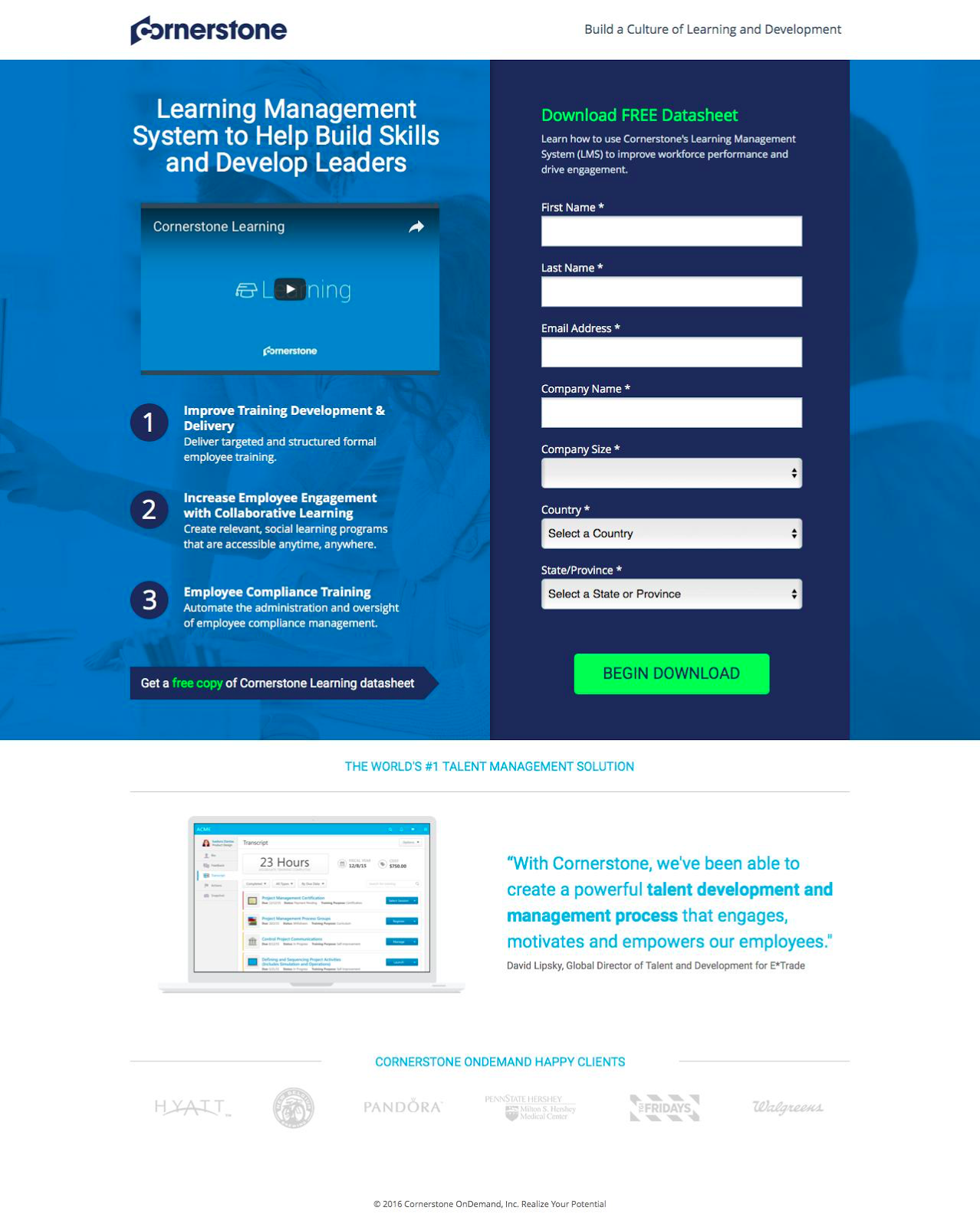
What makes this landing page work?
- Video: The video quickly explains a complex subject for Cornerstone. Something that would take several pages and paragraphs to explain can be easily communicated in video format.
- Happy clients: Cornerstone includes a real client testimonial along with corporate partnership logos.
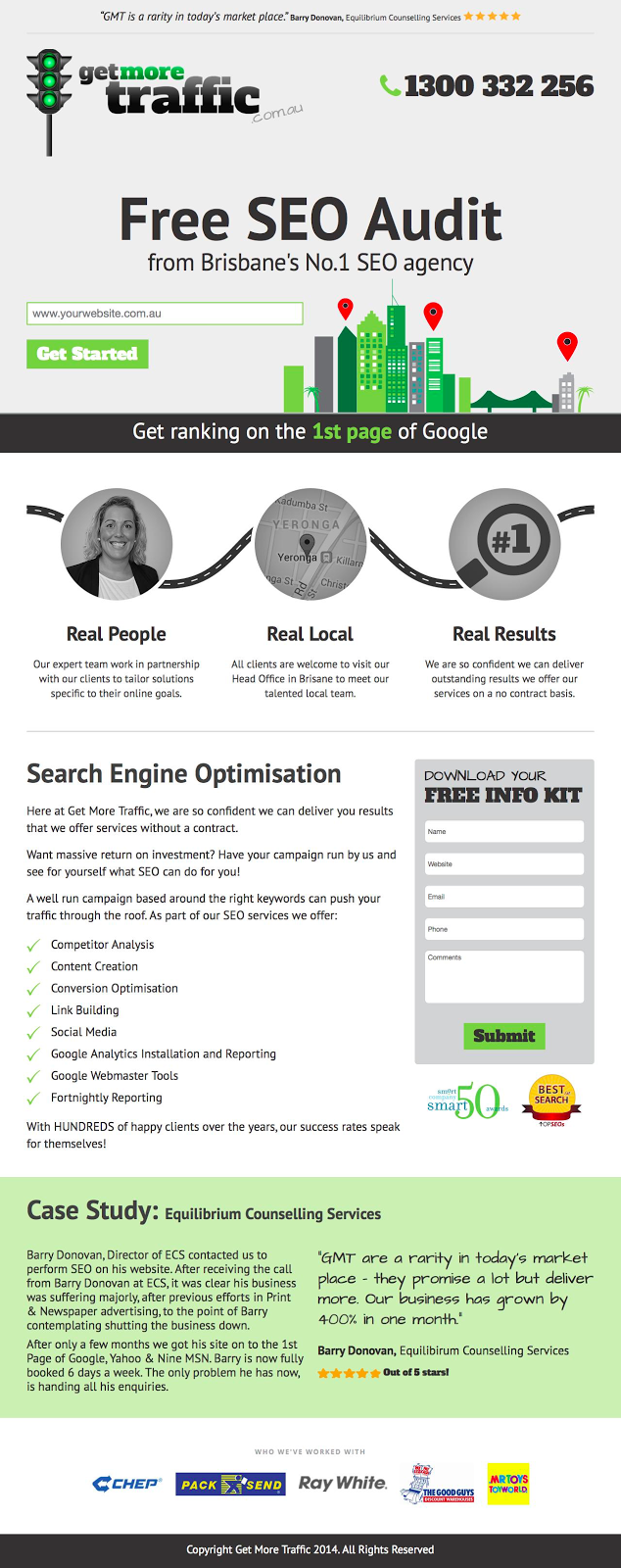
What makes this landing page work?
- Case study: The case study in the footer is a smart feature to add to this landing page by GetMoreTraffic. For internet services like SEO, it can be difficult to build trust, so it helps to have demonstrated success in the field. Their case study is from a real client with real success.
- Contrast: Background and CTA colours highlight key areas of importance on the landing page.
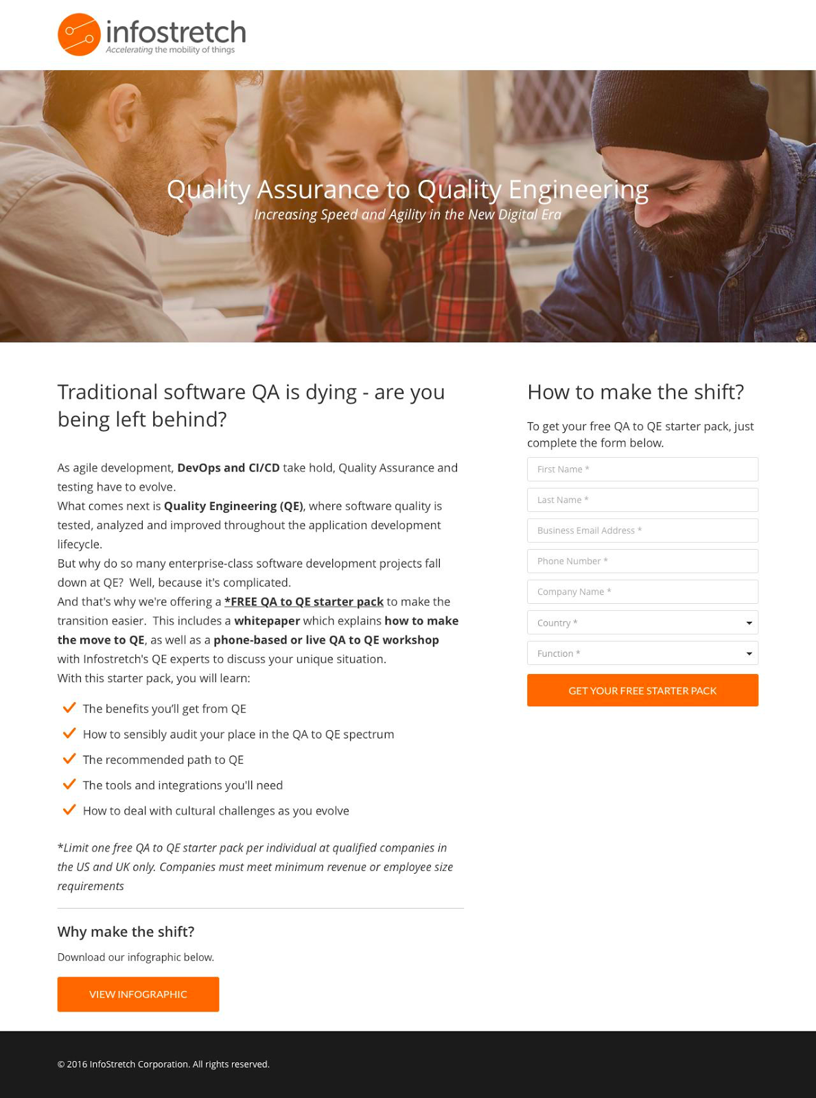
What makes this landing page work?
- Question: The headline “Traditional software QA is dying – are you being left behind” wisely calls into question one’s intuition. Are you smart enough to follow the next trend? Or are you going to be left out?
- Imagery: The people in the hero image adds personality to a rather bland page filled with text. If your product is information heavy, adding a human touch livens up the page. No one wants a relationship with a faceless entity so add life wherever possible.
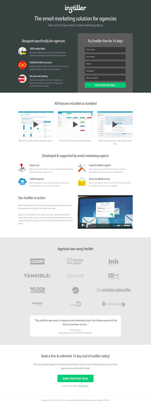
What makes this landing page work?
- Specific: Instiller knows who they’re speaking to on this landing page so they address all the issues and pain points an agency would have. They make sure to use the same jargon an agency would use when addressing problems.
- Video(s): Instiller includes video demos for each of its product’s features so that visitors can see the platform in action.
- Social proof: Testimonials and corporate logos line the bottom of the landing page to add credibility and trust.
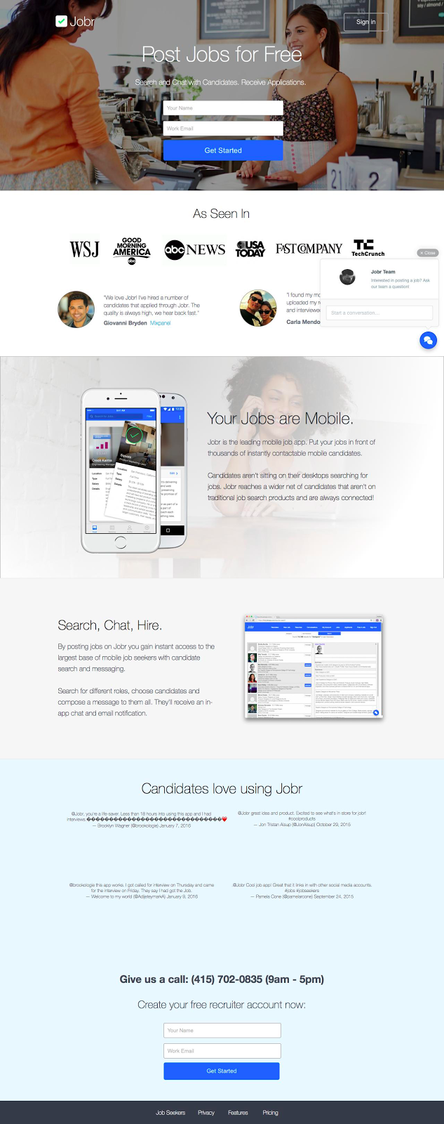
What makes this landing page work?
- Testimonials: Client testimonials line the top and bottom of the Jobr landing page. Jobr does this to add relatability and trust to each section so that visitors can see themselves using the service.
- Live chat: As a bonus feature on this landing page Jobr includes live chat to actively engage with visitors. This way they can address issues that aren’t answered on the landing page. Being proactive can be the difference between a conversion or a bounce.
- Contact: Jobr includes a phone number on their landing page for a direct support. Having a variety of ways to contact your business shows that you care.
What makes this landing page work?
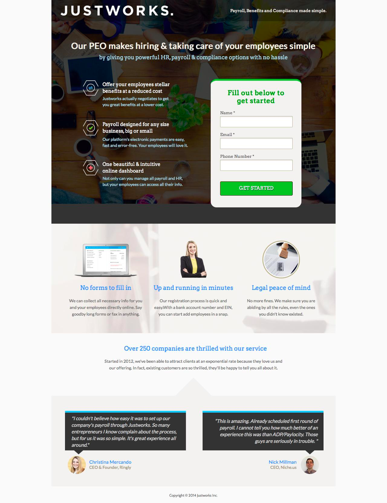
- Why: “Powerful HR, payroll and compliance options with no hassle”. JustWorks speaks directly and addresses the ‘why’ in its subheadline.
- Benefits: A full list of features and benefits fill the page and work to convince the visitors.
- Testimonials: “Over 250 companies are thrilled with our service” says JustWorks. Mentioning that other industry pros use their service speaks to the fact that others like to be in like-minded company.

What makes this landing page work?
- Social proof: Client testimonials, corporate partner logos, and awards won help LiquidPlanner signal trust and credibility.
- Video: LiquidPlanner uses a landing page video to show visitors how the platform works. The video expertly points out the difference between LiquidPlanner and its competitors.
- Variation: Varying CTA language are used on this LiquidPlanner landing page. Using different language in different sections is a great way to stay congruent with the copy.
What makes this landing page work?
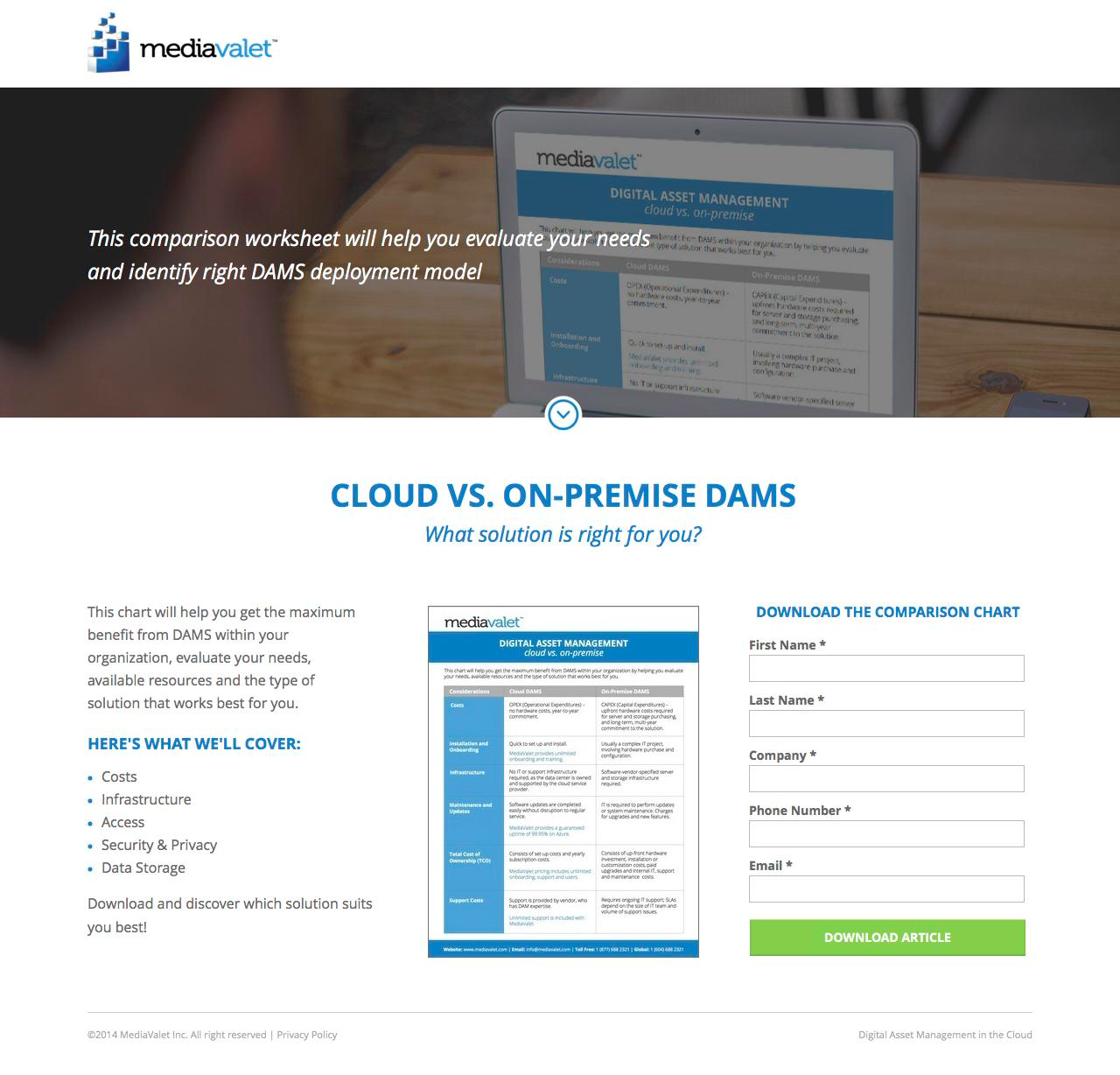
- Value: The lead magnet is MediaValet offers is perfect for a middle-bottom area of the sales funnel. A comparison chart is an excellent way to persuade a potential customer as to why your product is the solution they need.
- Preview: Since MediaValet is offering a comparison, it helps to list out the features they’ll be comparing in the chart. The “Here’s what we’ll cover” section is a small snippet for the visitor so that they know what to expect.
- Action: Action-oriented language surrounds the form, “Download the comparison chart” and “Download article”. MediaValet does a great job letting the visitor know what action is going to occur once they click that button.
What makes this landing page work?
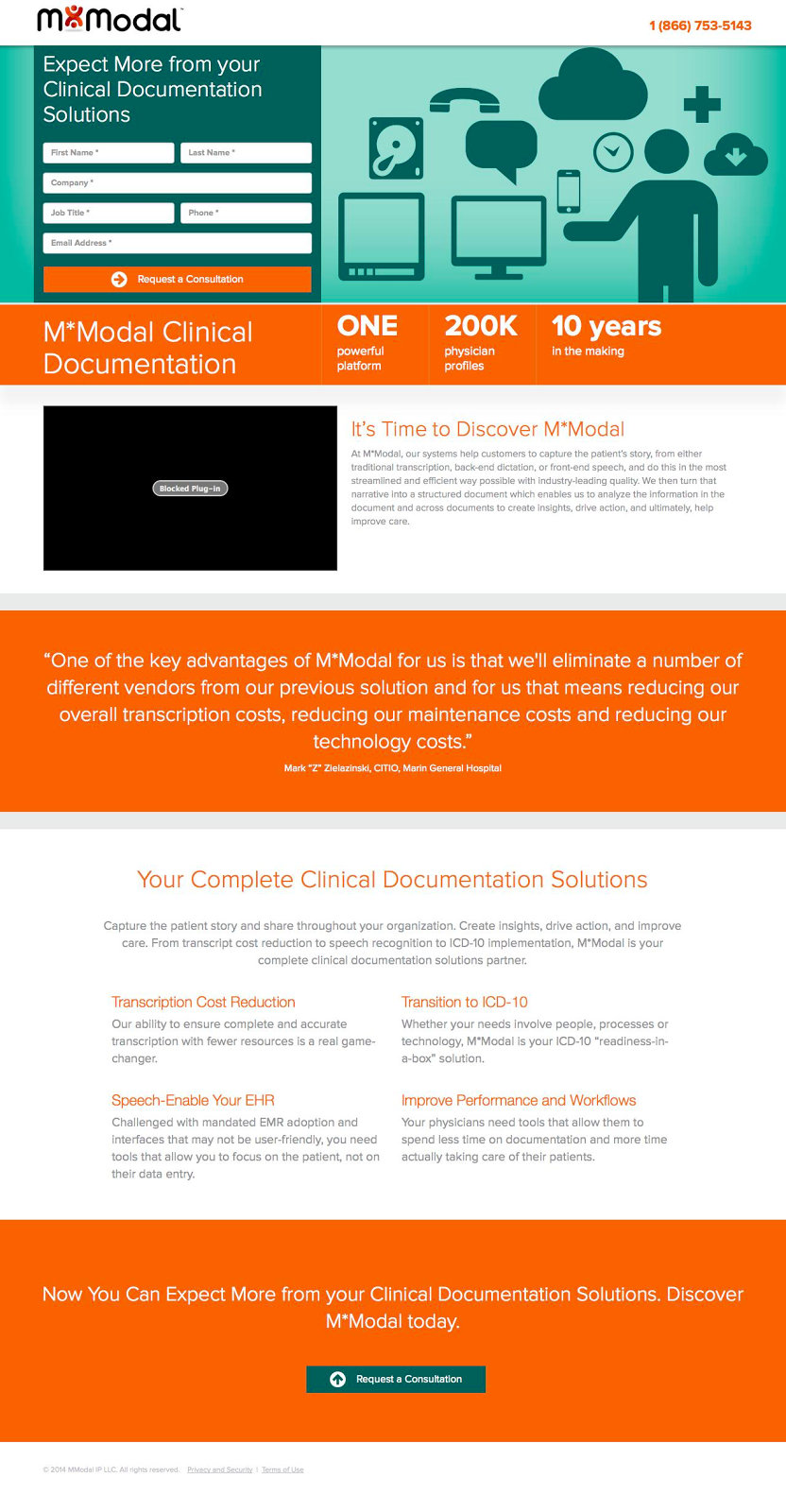
- Contrast: M*Modal makes great use of contrast using blocks of colour to separate sections of importance. Persuasive tools like testimonials, key stats and CTAs are inside the bright orange boxes while body copy is left in contrast in the white sections.
- Anchor: The CTA is the bottom is anchored to the form in the header. So when a visitor finishes reading and learning about the product, the anchor link will redirect back to the form.
- Proof: Video and testimonials all add to the trust and credibility of the M*Modal landing page. They do an excellent job at explain why they can provide more than the typical clinical documentation solution.
What makes this landing page work?
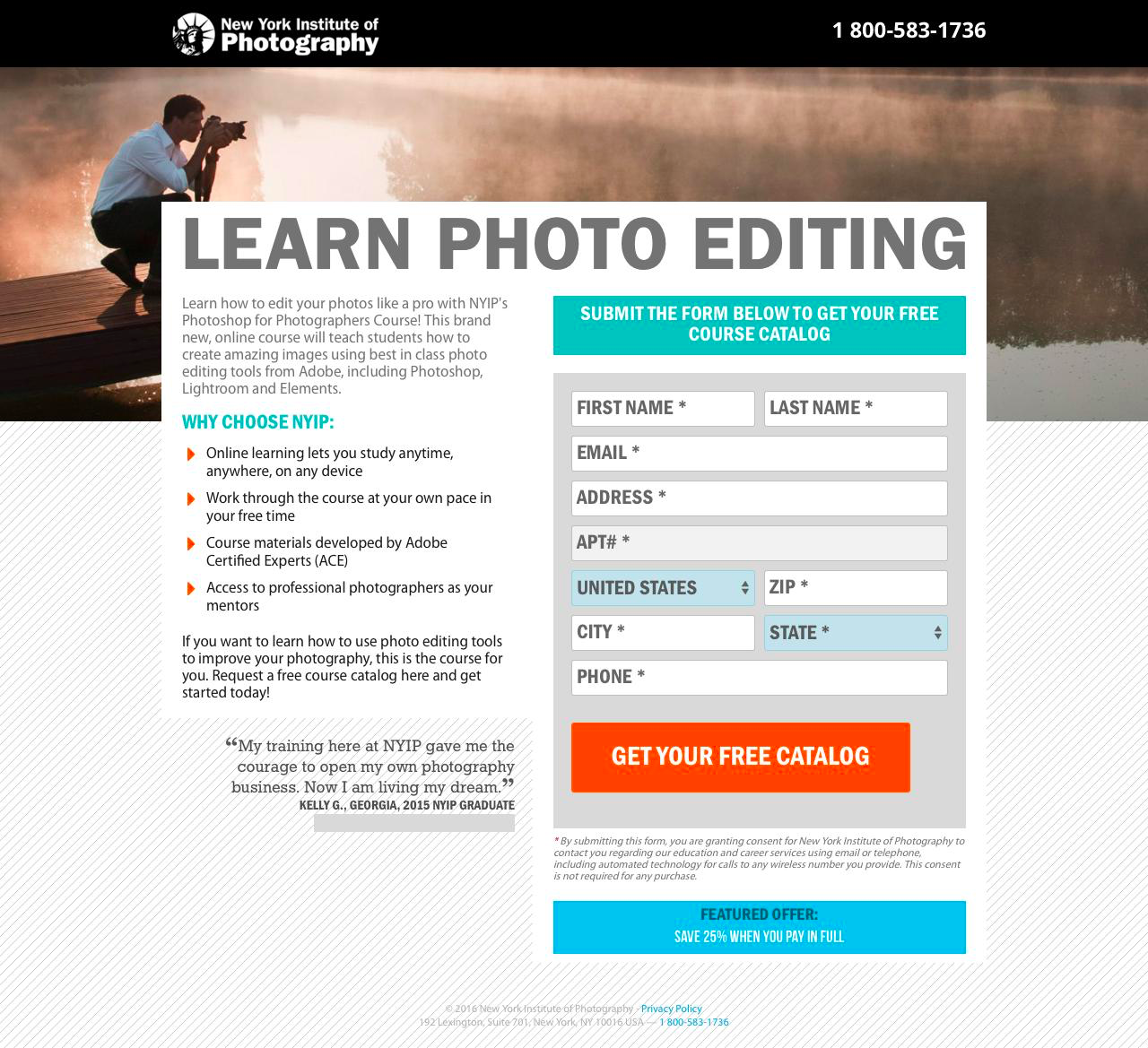
- Action: This being a landing page about photography all communication should relate to photography. The large hero image does a lot of add to the feel and communication of photography.
- Why: This NYIP landing page does a lot to convince visitors on why they should consider this course, including a long list of reasons. The testimonial and lead magnet all contribute to answering the ‘why’ for visitors.
- Get: The headline and CTA of the form use the action word ‘get’ to let visitors know they’re receiving something of value.

What makes this landing page work?
- VIsual: Park Place Technologies uses graphics, colours and visuals to liven up a rather boring industry. They mix in visuals and breakdown information into chunks to make things easier to digest.
- 3 forms: This landing page manages to include 3 forms onto the page so that visitors may choose to convert wherever they are.
- Variation: 2 versions of CTA language are used on the landing page. To request pricing you’ll have to request a quote. The pricing CTAs wisely redirect to the forms.
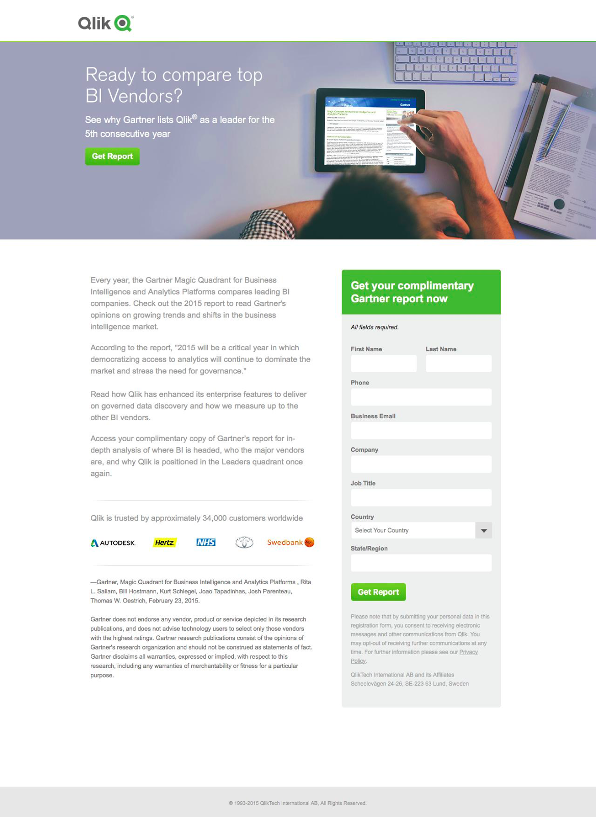
What makes this landing page work?
- Trust: Company logos that use Qlick line the bottom of the body copy to add trust and credibility.
- Action: Action is communicated in the form headline and CTA. The use of the word ‘get’ implies action and lets the visitor know what action they’re accomplishing.
- Achor: The CTA in the hero image anchors to the form. Functions like this make landing pages easier to navigate.
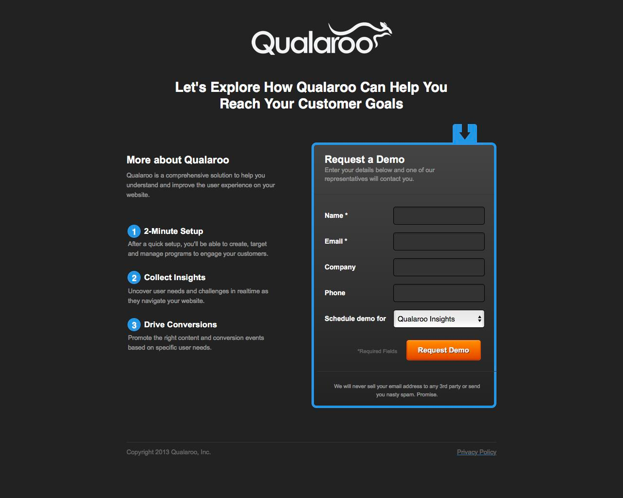
What makes this landing page work?
- Explore: The prominent headline “Let’s explore how Qualaroo can help you reach your customer goals” speaks directly to the visitor as if to take them on a journey.
- Highlights: Body copy is simply presented to explain the benefits on Qualaroo. The points supporting the USP then leads the eye to the form.
- Bright: The CTA is bright orange to attract the most attention possible. It is in perfect position to draw the eye after the visitor has read the USP and has filled out the encapsulated form.
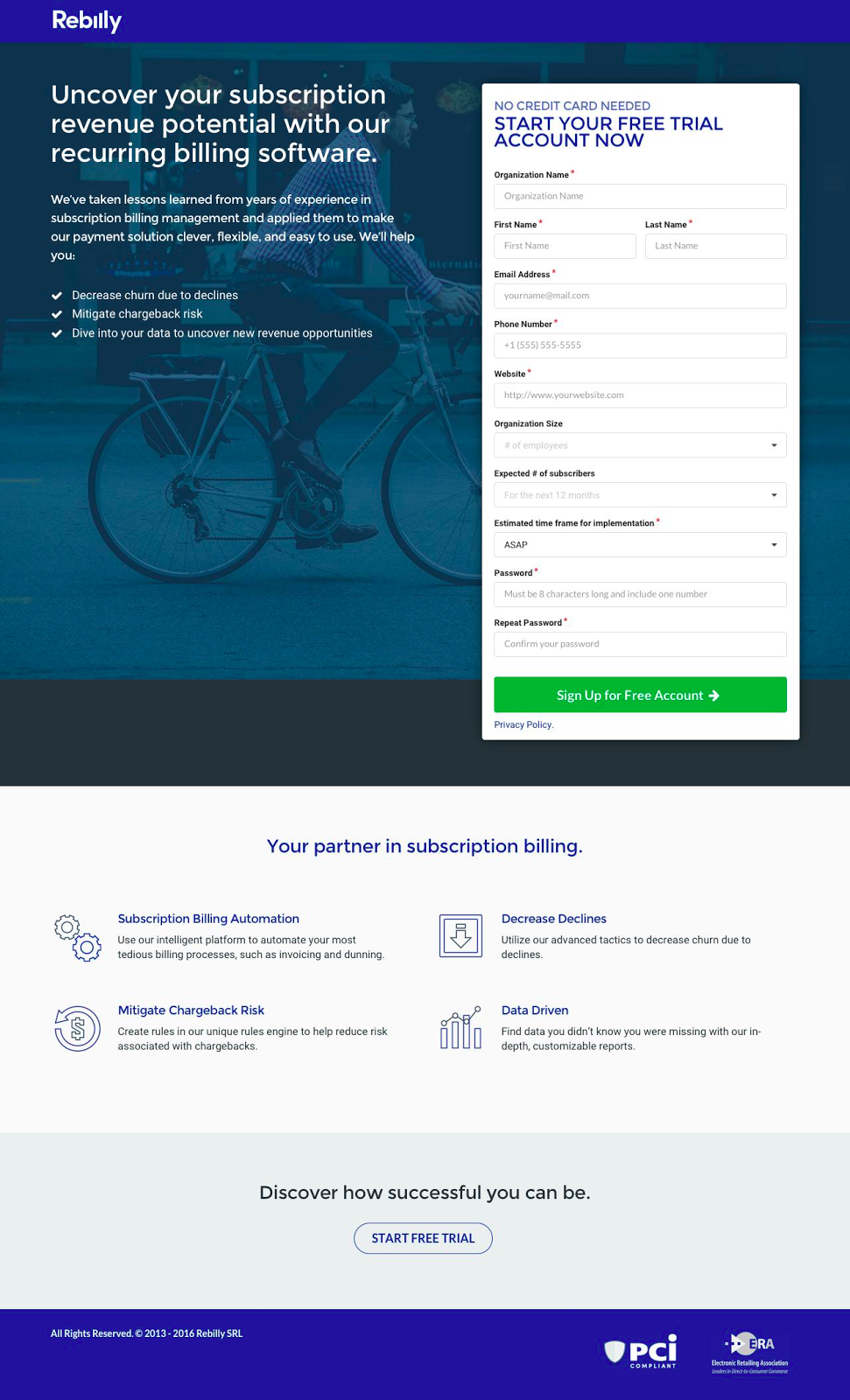
What makes this landing page work?
- Whitespace: The body copy, graphics and headlines aren’t weighed down by complexity. Plenty of white space allows the eyes to be drawn towards the information and the form.
- Prefilled: The form Rebilly uses is pre-filled with answers to help visitors complete it. This is a great way to give visitors a hint and to help them complete an otherwise lengthy form in the format of your choosing.
- Action: Several action oriented words are used to create urgency on the landing page. Words like discover, start, uncover and mitigate all urge the visitor to take action immediately.
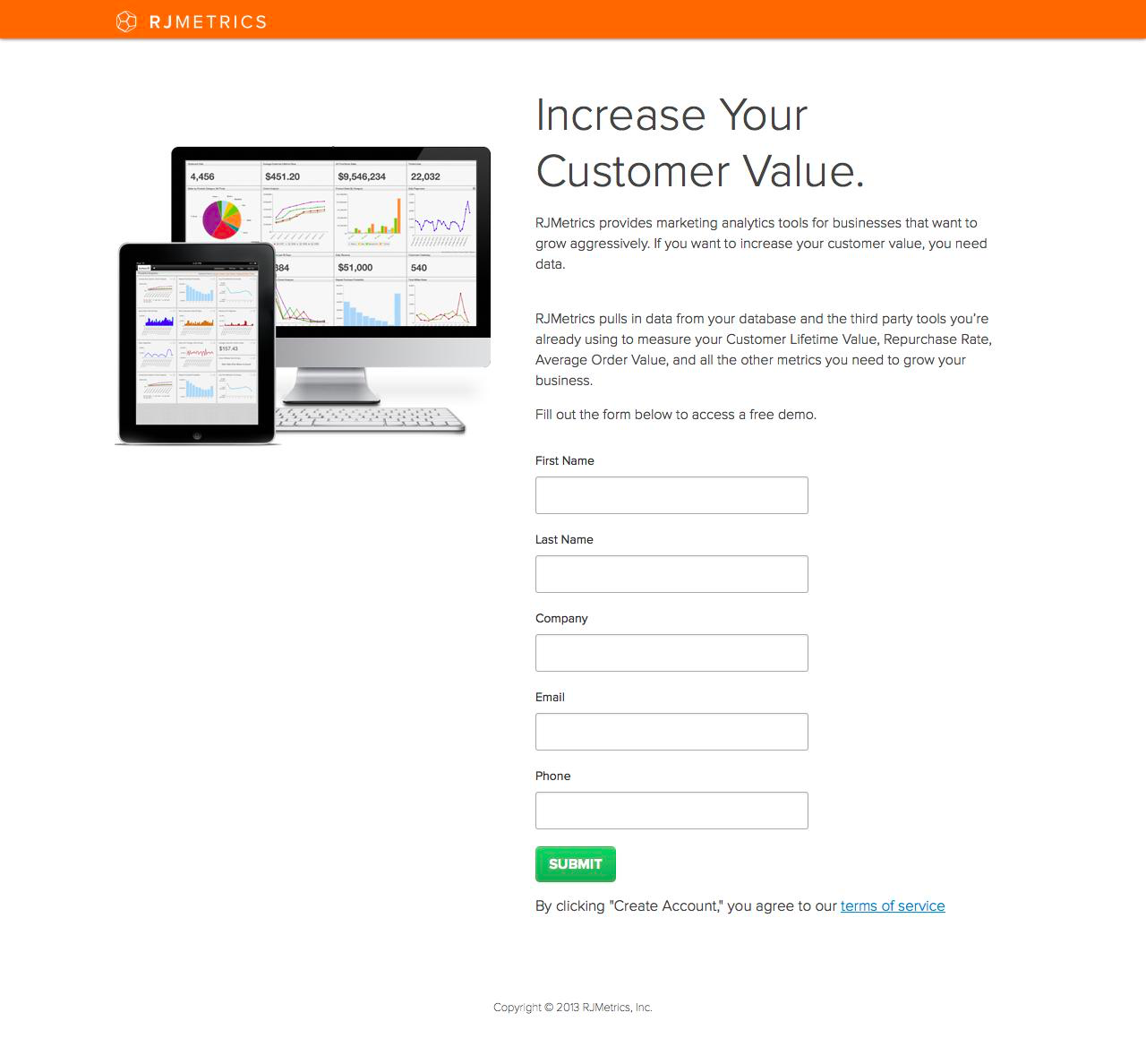
What makes this landing page work?
- Value: “Increase your customer value” says RJMetrics, a simple way to communicate their USP. Keep your USP as succinct and to the point as possible.
- Visual: RJMetrics has concrete examples of their platform as a preview for visitors.
What makes this landing page work?
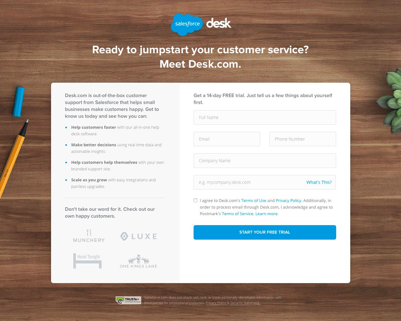
- Visual: Though small, this SalesForce landing page uses visuals in a smart way. The background image frames the content while company logos add to the trust and credibility of the landing page.
- Casual: The language and communication is kept casual as to relate more on a personal level. “Get a 14-day trial. Just tell us a few things about yourself first” says the heading above the form. Desk.com knows they’re chatting with small business owner thus keep much more like a conversation.
What makes this landing page work?
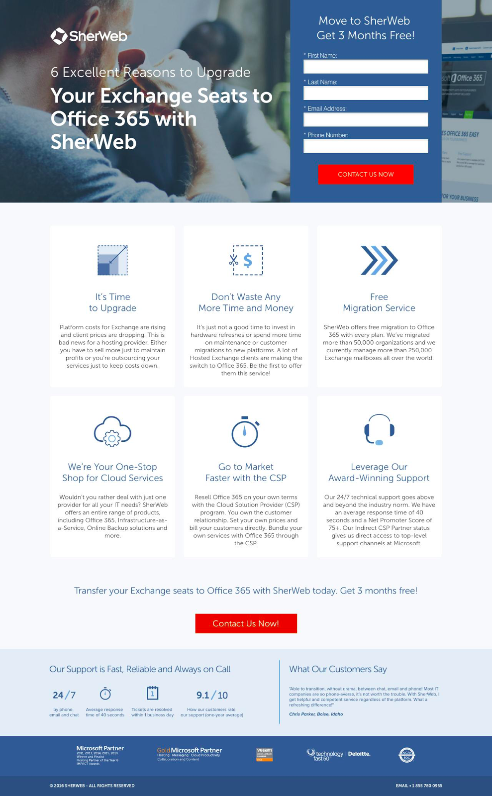
- Compelling: Sherweb gives the visitors 6 reasons to upgrade to their service using graphics and compelling communication. Visuals add to the experience by making the points easier to understand.
- Eye-catching: The CTA buttons are bright red to catch the most attention possible.
- Proof: Customer testimonials and reliable support data are presented at the bottom of the page to add to the credibility of their service.
What makes this landing page work?
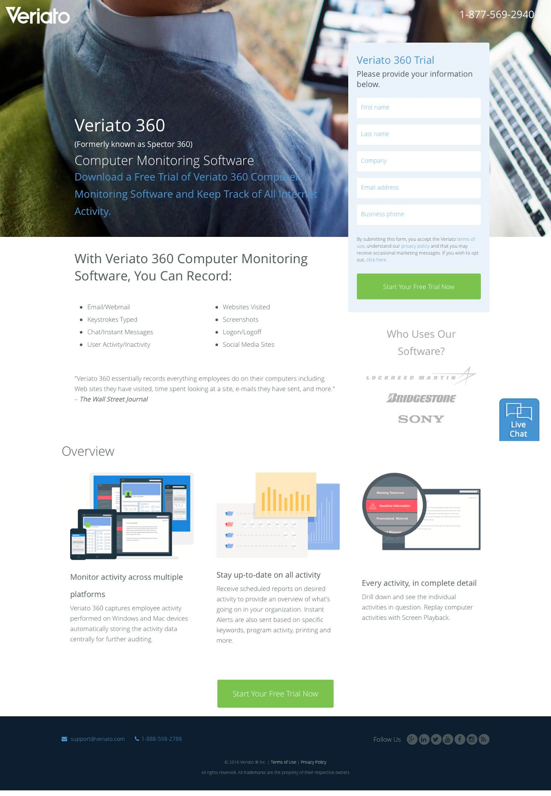
- Overview: Veriato 360 breaks down the reasons why they differ from the competition. Visuals make it easier to understand the differences and the features that Veriato 360 has.
- Live chat: Veriato 360 adds live chat to this landing page to provide 1-on-1 support for their potential customers. It works as a sales and support tool by providing information that isn’t present on the landing page.
- Attention: The bright green CTAs and encapsulated form to double work to grab attention once a visitor has read all the information.

What makes this landing page work?
- Testimonials: Vitamin T has a 110% guarantee for their clients. It shows that they’re fully confident and stand behind their service. A large testimonial is highlighted on the page for maximum effect.
- Pre-filled: The form Vitamin T uses is pre-filled so as to tell visitors what to write in each form field. It makes the process of filling the fields quicker and more reliable for Vitamin T.
- Contrast: The amount of white space on the landing page helps contrast areas of interest and the large headlines. Well used contrast helps the encapsulated form and value propositions stand out on the page.
What makes this landing page work?
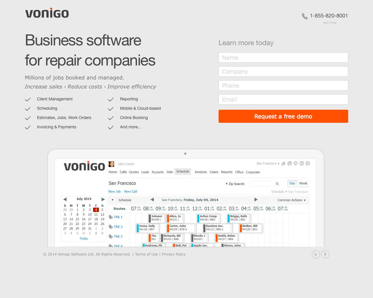
- Contrast: Plenty of white space is used to highlight the main features of the landing page. Nothing crowds the visuals or muddles the information.
- Example: A concrete example of the platform is shown to give the visitor a more solid feeling of what they’re buying.
- Sub-head: The sub heading helps backup the claims of the main heading. They use it expertly to explain the benefits and USP of their platform.
What makes this landing page work?
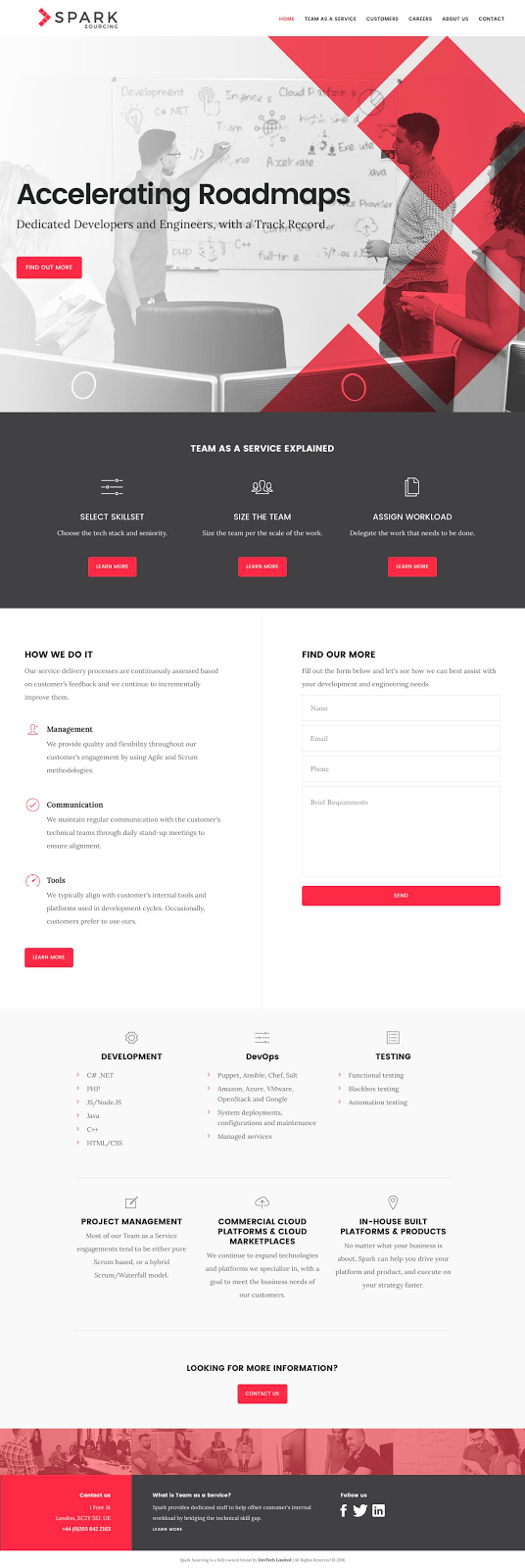
- Contrast: The use of bright pink really helps the CTAs stand out on the landing page. The ample white space helps the copy shine.
- Variation: The CTAs are varied in communication throughout the page. Having varying language helps specify the CTA to each segment of the landing page.
- Human: Spark Sourcing makes sure to include photos with people in them to add a personal touch to the landing page. Being a people sourcing company it helps to have visual elements that depict teamwork and friendly work environments.
What makes this landing page work?
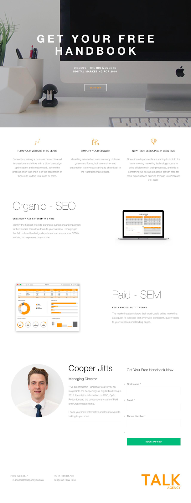
- Design: Besides being simply beautiful, Talk Agency doesn’t overcrowd the design. Information is displayed according to importance. Images are used to show off their platform and communicate selling points.
- Bio: Talk Agency includes a photo and bio of their managing director to add some personality to the page rather than represent itself as a faceless entity.
- Contrast: The bright CTA button and large hero image are only a few of the elements that help each section stand out on the landing page. Nothing crowds the design and distracts visitors.

What makes this landing page work?
- Examples: Concrete examples of the platform help the visitor get a better understanding of the product.
- Social proof: Company partner logos add to the trust and credibility of the landing page. They also include links to their social networks just incase further information or proof is needed.
- Collaboration: Being a platform for project management, Acteamo uses plenty of communication that involves a sense of collaboration. They focus on teamwork and highlight it by using words like ‘collaboration’, ‘manage’, and ‘teamwork’.

What makes this landing page work?
- Video: A landing page video quickly and succinctly explains LemonStand’s product for visitors. A high quality video is a step away from an actual product demo.
- Visual: Besides listing out their product’s features and benefits, LemonStand adds images to make each point a homerun.
- Contrast: By using ample white space, they draw the eye towards the bright coloured elements on the page, ie. the form.
What makes this landing page work?
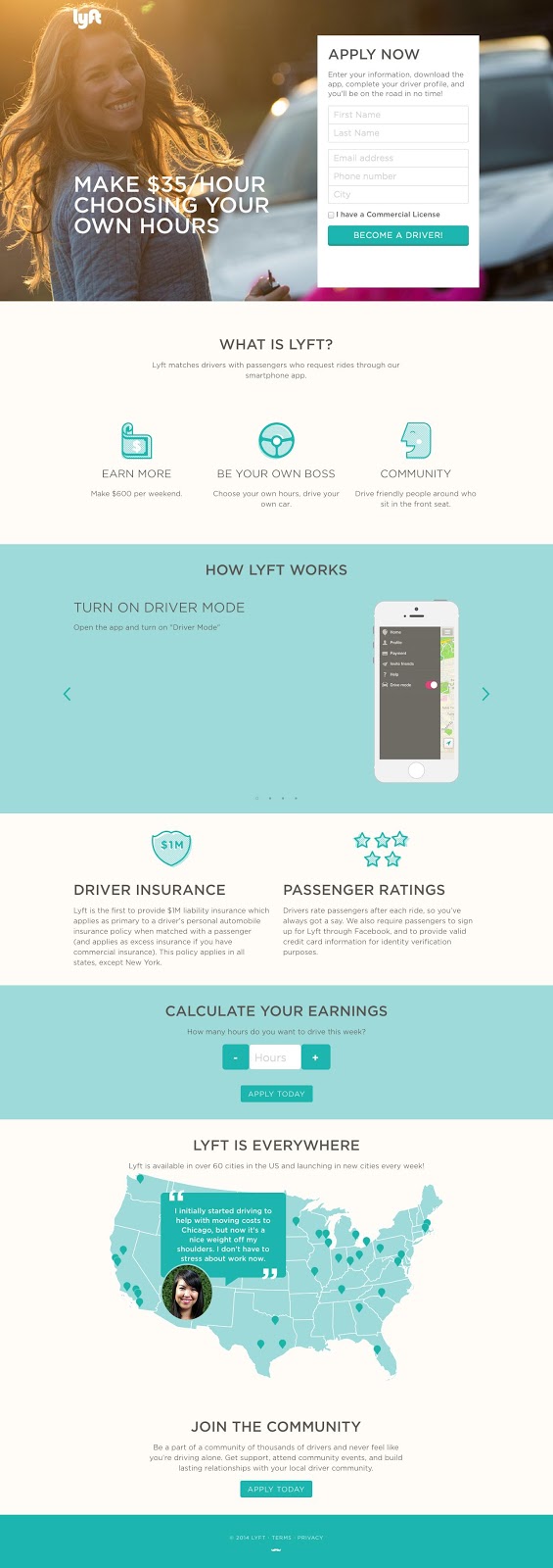
- Calculator: Lyft includes a handy little hourly rate calculator for visitors to see how much they’d make driving for Lyft.
- Proof: “Lyft is everywhere” says Lyft. Lyft uses testimonials from happy drivers and users to add credibility and trust. Everything on this landing page works toward making Lyft look as safe and trustworthy as possible for potential drivers. The secure symbols, insurance and dollar figures further promote Lyft as a safe way to earn more money.
- Benefits: Lyft does a great job at highlighting the benefits of being a Lyft driver by using persuasive language and addressing safety concerns. Becoming a rideshare driver can be a tad risky, Lyft does its best in each section to address concerns and gives the visitor confidence.
What makes this landing page work?
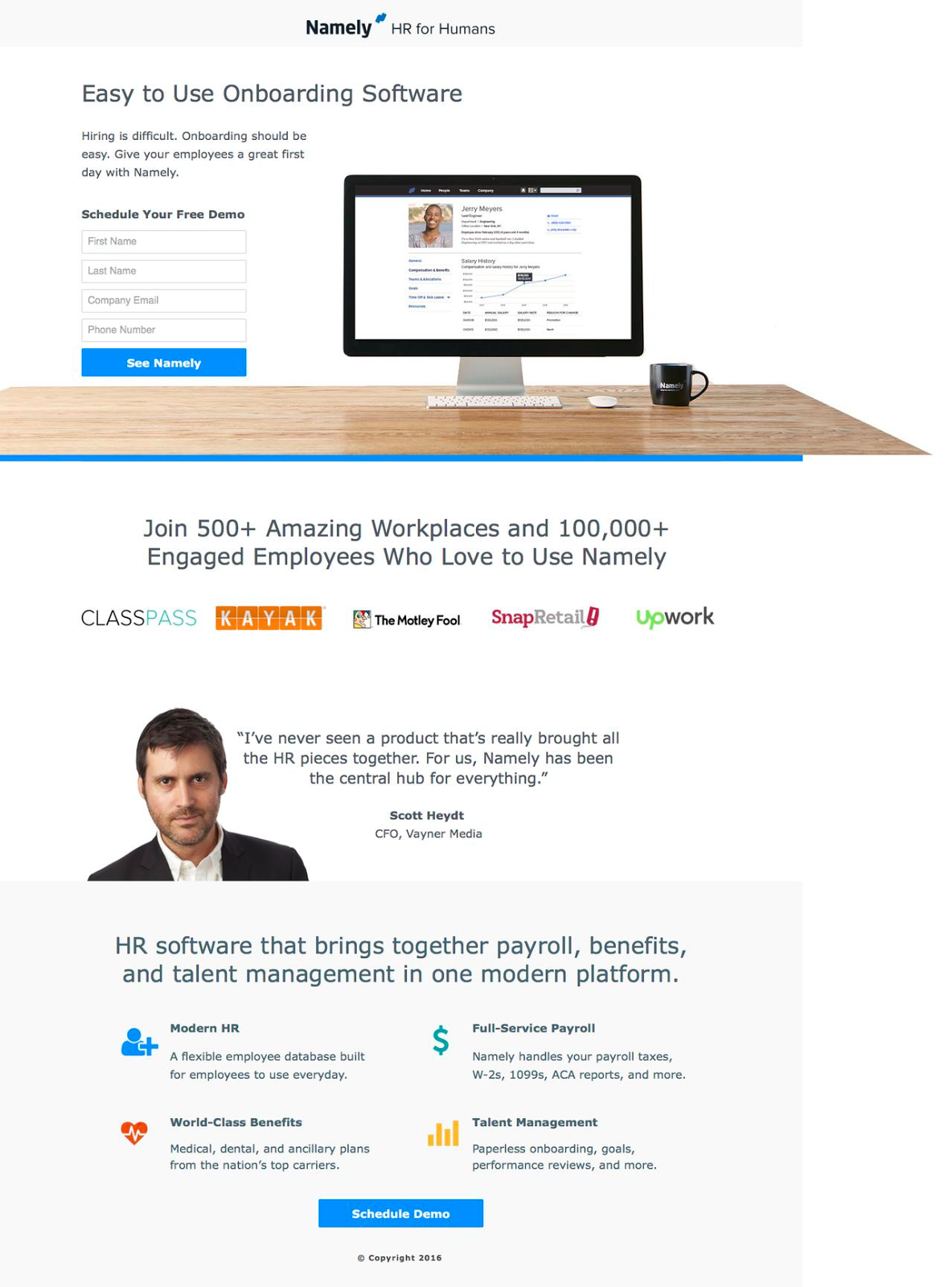
- Social proof: “Join 500+ amazing workplaces” that use Namely. Namely includes company logos and testimonials to backup its claims as an easy to use onboarding software.
- Variation: Two variations of the CTA are placed on the landing page. One to ‘schedule demo’ and one to ‘see namely’. It’s a wise move to vary your CTA language if it’s used more than once on the landing page.
- Subheading: The subheading on this Namely landing page does an awesome job of explaining the ‘why’ of the company. A strong subheading should backup your claims and convince visitors to explore the rest of the content.
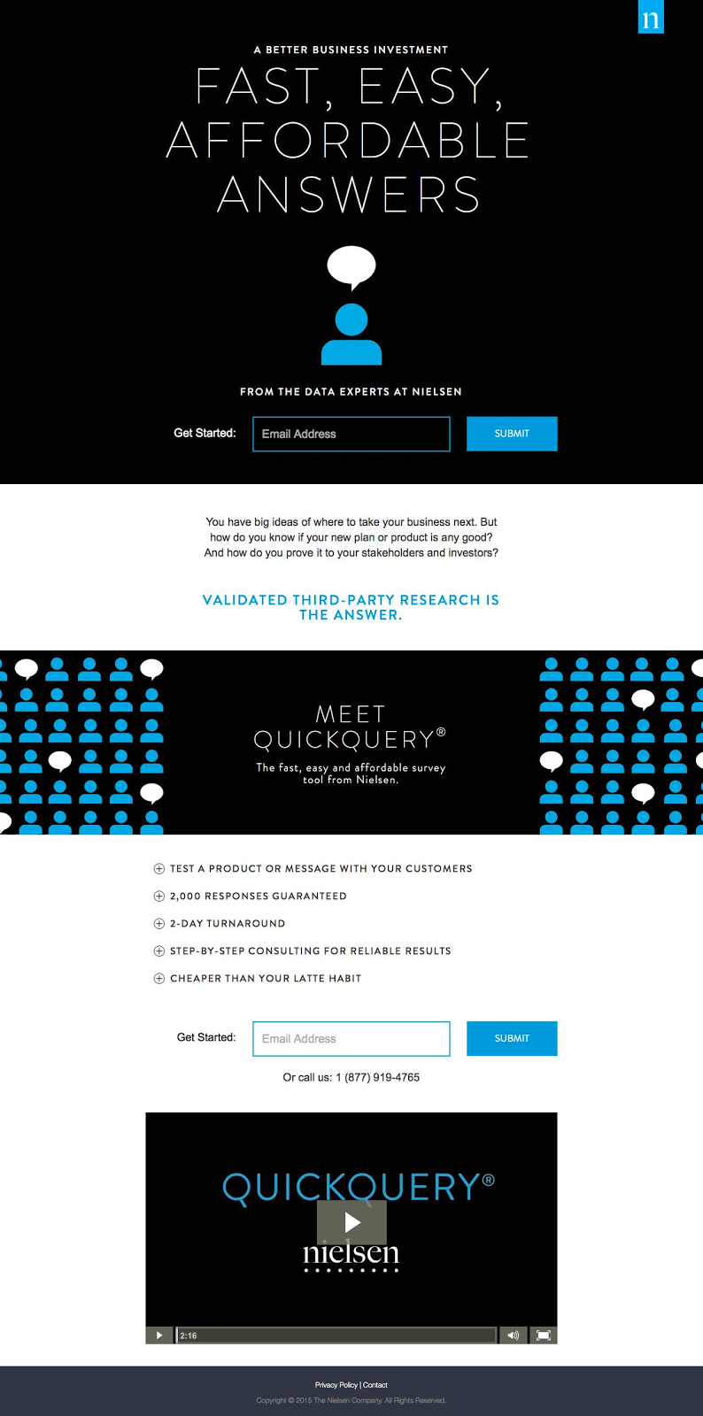
What makes this landing page work?
- Video: A well produced video gives visitors a quick overview of QuickQuery. This way those we prefer a more visual presentation can meet QuickQuery.
- Benefits: The benefits of using QuickQuery are highlighted throughout the page and supported by the branding power of Nielsen.
- Form placement: The CTA of the form stands out amongst the well-used white space. It is also present in two places on the landing page just incase a visitor gets lost.
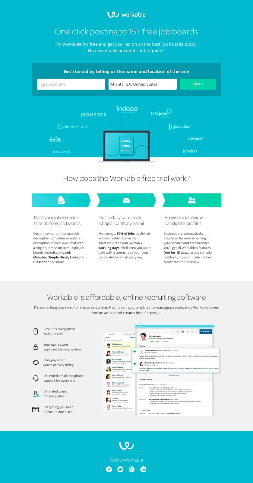
What makes this landing page work?
- Steps: Workable lays out the steps involved in the Workable free trial. Laying out a step by step process provides a bit of insight for visitors who are hesitant to opt-in.
- Social proof: Company logos from happy clients add trust and credibility to the platform.
- Visual: Workable lists the features and benefits and provides concrete examples of its platform.
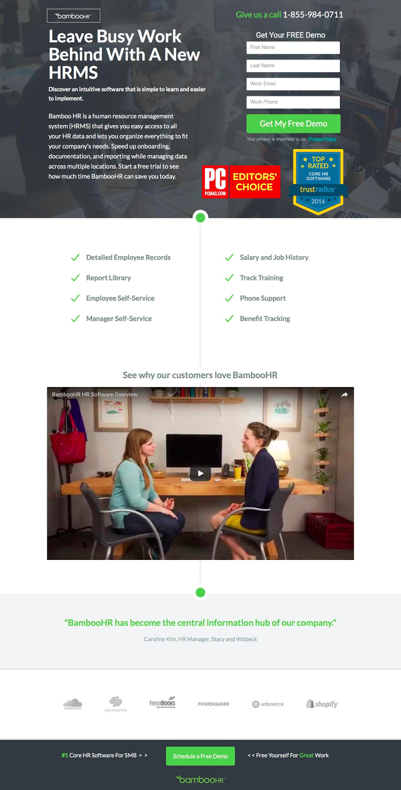
What makes this landing page work?
- Video: A landing page video shows why customers love BambooHR. Fun and well-produced videos can do wonders for your credibility in the eyes of your visitors.
- Proof: Company logos and testimonials add to the credibility and trust of the landing page. Award symbols near the form show proven success in the industry.
- Directional cues: Arrows in the footer point to the CTA button which uses an anchor link to the form at the top.
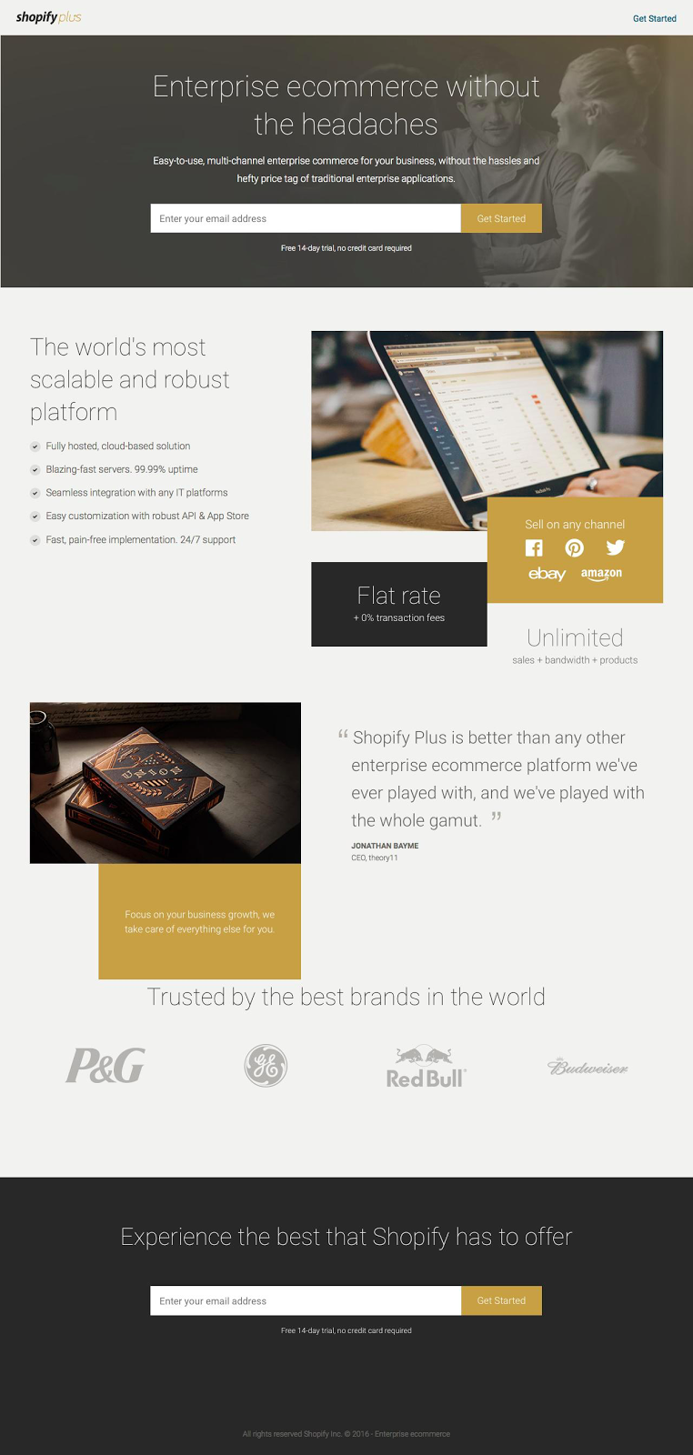
What makes this landing page work?
- Social proof: Company logos and testimonials add trust and credibility to the page. Knowing that other companies have had success using the product is a huge conversion driver.
- Visual: Images and pleasing colours attract attention and lead visitors down the page. Well used white space directs the eyes towards areas of interest for the visitor.
- Why: The headline and sub headlines expertly communicate the ‘why’ for Shopify. Explaining the difference and features you hold over the competition persuade visitors to convert.
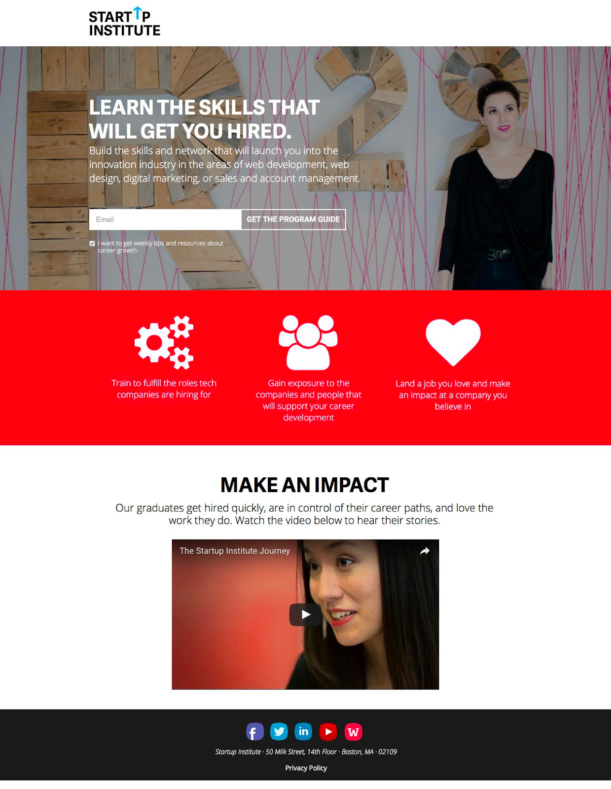
What makes this landing page work?
- Video: A landing page video provides maximum impact for the offer. Being able to hear real stories from past graduates do a lot to convince and convert visitors.
- Visuals: Bright colours and a large hero image focus attention on the form. They frame the form and direct attention towards it.
- Actionable: The communication is focused on achieving a result: giving you the skills to get hired. “Make an impact” and “learn the skills that will get you hired” all add to the actionable mix of communication.
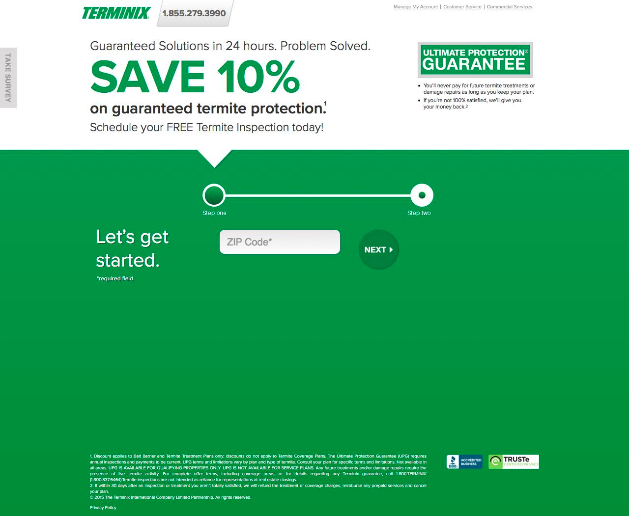
What makes this landing page work?
- Guarantee: Terminix guarantees their service. Signs, stamps and signals

Landing Pages
500 Strategies, Ideas & Examples
Click below to download the most comprehensive collection of landing page strategies and examples ever compiled. Completely free.