200 Landing Page Examples Analyzed
Squeeze Pages
Similar to a landing page, a squeeze page only has one conversion objective for the visitor: capture an email. Unlike a landing page though, a squeeze page is typically shorter and requires less information to complete, usually just an email. True to its name it’s meant to ‘squeeze’ information from a visitor.
What makes this squeeze page work?
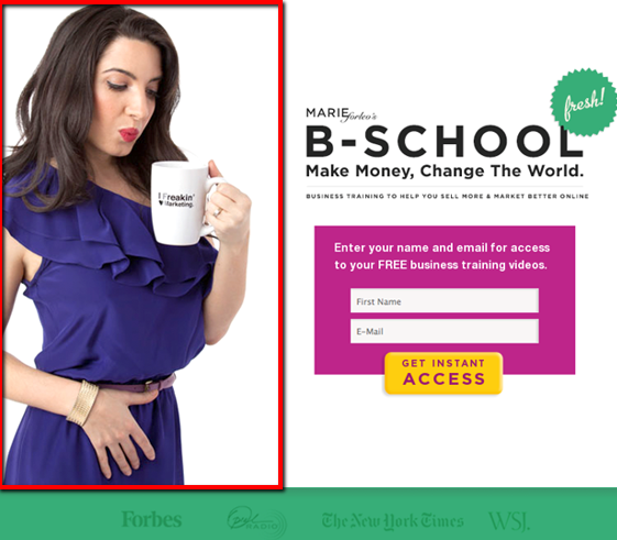
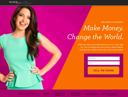
- Personable: The large image of a professional female represents Marie Forleo’s ideal target market. This use of imagery is meant to help visitors picture themselves in the role.
- Contrast: Important communication is given a priority on the page. Emphasize what you want the visitor to see and pay attention to first.
- Encapsulate: Marie Forleo encapsulates the form to draw attention to it. The bright pink box and bright yellow CTA draw the eyes towards it.
What makes this squeeze page work?
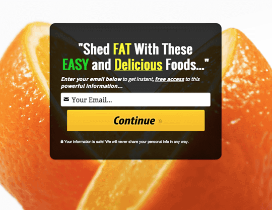
- Minimal: No other information distracts from this squeeze page form. The image frames the form so that focus can be put on the centre of the page.
- Bright: Colour is used to highlight important sections in the headline and also for the CTA button.
- Prefilled: Each form field is prefilled with instructions to make life easier for the visitor.
What makes this squeeze page work?
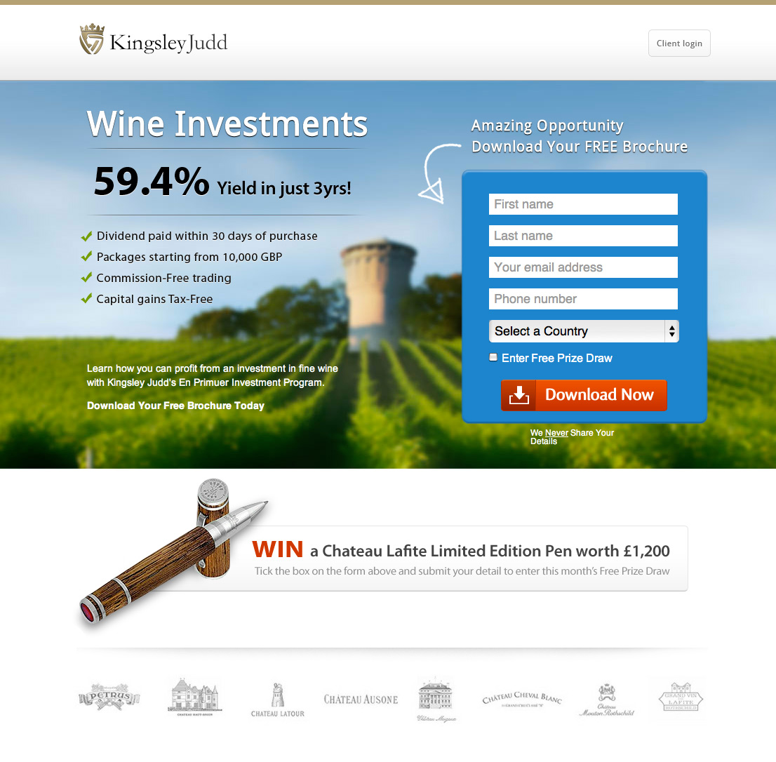
- Directional: A directional cue arrow points to the form to direct attention to it.
- Proof: Company logos at the bottom add trust and credibility to the offer.
- Encapsulated: The form is in a bright blue box and the CTA is highlighted in orange. Colour is used expertly here to draw attention to the most important section of the page.
What makes this squeeze page work?
- Directional: An arrow after ‘continue’ on the button lets the visitor know that this form leads to the second step.
- Contrast: Words highlighted in different colours stand out from the rest to draw attention.
- Visual: The large background image frames the form and focuses the attention on the centre of the page.
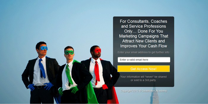
What makes this squeeze page work?
- Action: The CTA language implies action ‘Get access now!’ It implies the next step is access to the offer.
- Headline: The headline on the form directly addresses who this offer is for. The language is simple yet expertly targets its audience.
- Bright: The bright CTA button colour helps it stand out on a rather bland page.
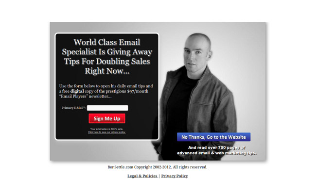
What makes this squeeze page work?
- Value: The headline promotes value right off the bat. Language like ‘world class’, ‘specialist’ and ‘doubling sales’ are used to communicate value.
- Bright: CTA colours help the buttons stand out on the page.
- Encapsulated: The form is framed in an encapsulated box to separate it from the rest of the page.
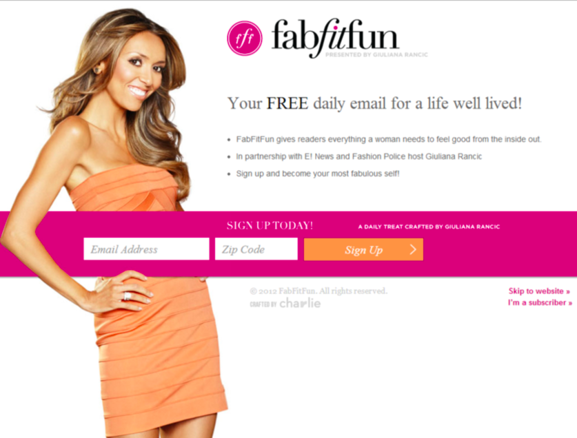
What makes this squeeze page work?
- Encapsulated: The form on the page is highlighted in a bright pink encapsulated box to draw attention.
- Imagery: The large image is meant to target FabFitFun readers. By using an image of their ideal audience, visitors can relate more soundly to what FabFitFun is offering.
- Form headline: “A daily treat crafted by Giuliana Rancic” emotes exclusivity. Visitors are receiving access to exclusive emails curated by Giuliana herself.
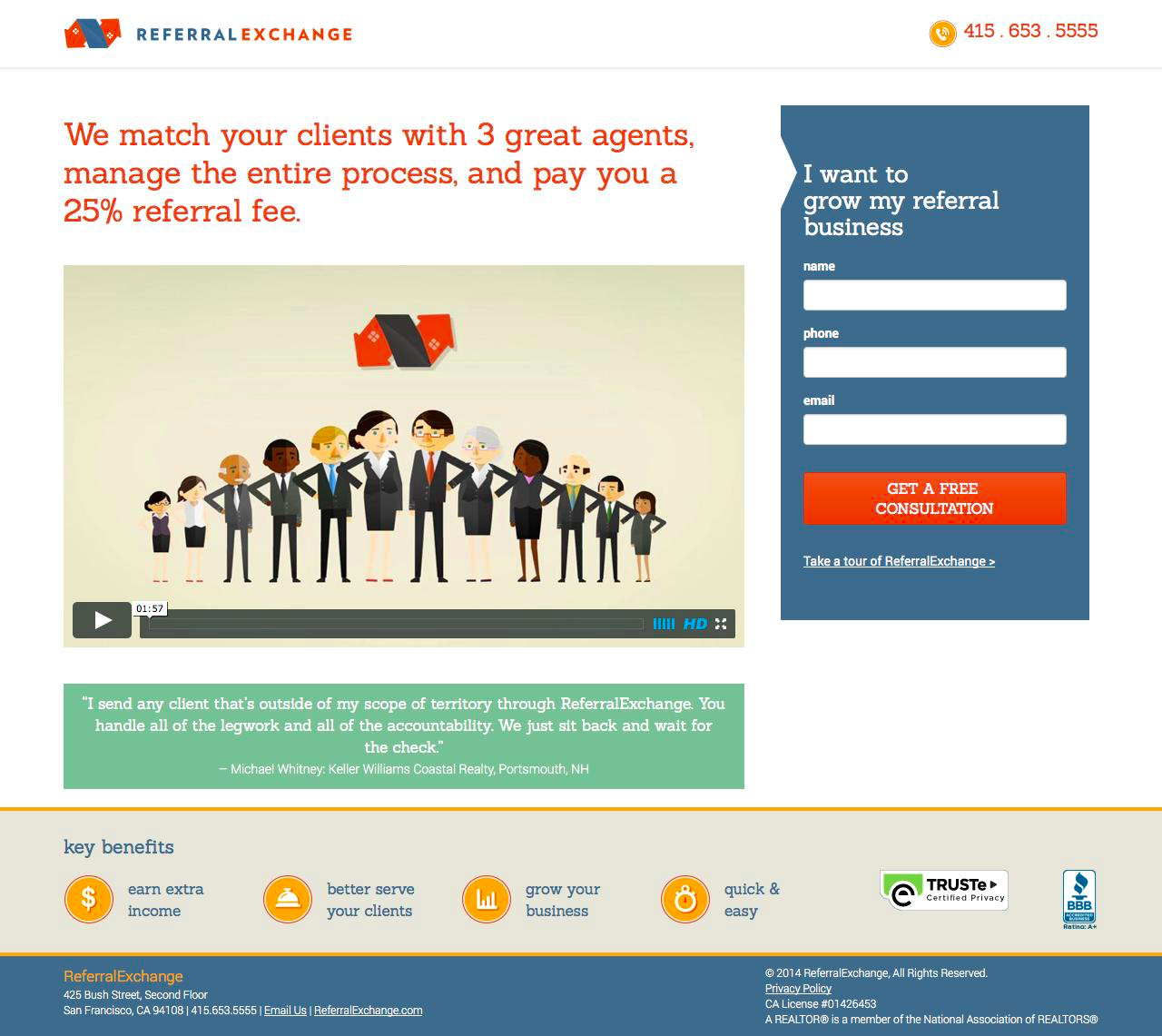
What makes this squeeze page work?
- Video: A landing page video efficiently explains the concept and the product for the visitor. High quality video is leaps and bounds more entertaining than written copy.
- Encapsulated: The form is separated from the content in an encapsulated box to draw attention.
- Proof: A testimonial from a real user further backs up the claims of the video.
What makes this squeeze page work?
- Personable: The large image of a professional female represents Marie Forleo’s ideal target market. This use of imagery is meant to help visitors picture themselves in the role.
- Contrast: White text stands out on the brightly coloured background. The CTA is large and demands attention below the form.
- Proof: Successful company logos are scattered at the bottom to provide more trust and credibility.
What makes this squeeze page work?
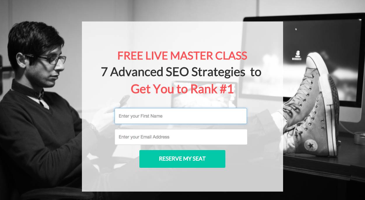
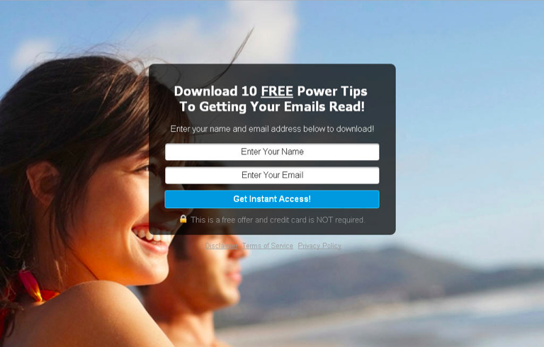
- Visual: The large background image manages to frame the form to direct attention to the centre of the page.
- Benefit: Instant benefit is communicated in the headline. “Download 10 FREE power tips” directly offers free resources to the visitor.
- Contrast: The bright blue CTA is highlighted on the form and commands access with its language “Get instant access!”
What makes this squeeze page work?
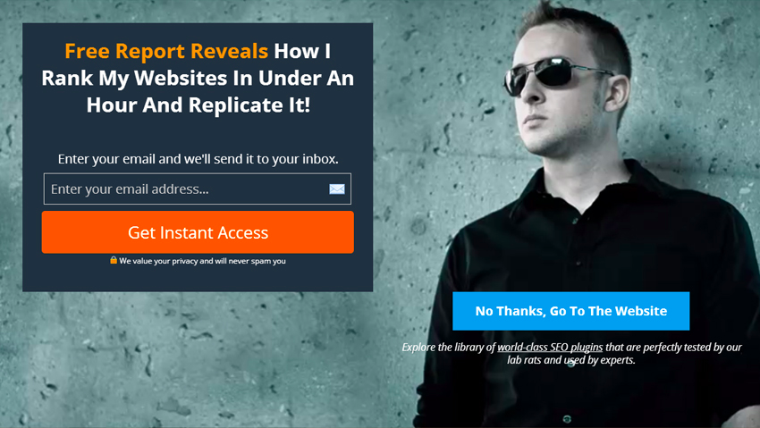
- Visual: The background image frames the form and adds the feeling of exclusivity.
- Curiosity: The headline communicates a secret to be ‘revealed’. It creates curiosity as to what the secrets and the offer holds.
- Bright: The bright orange highlights important words in the headline and makes the CTA button stand out on the page.
What makes this squeeze page work?
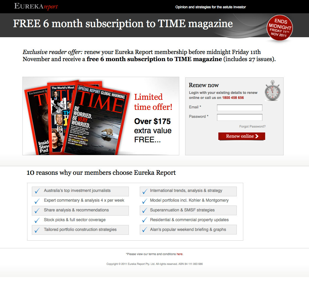
- Value: Eureka Report communicates value by including the dollar value of the free offer.
- Urgency: The ‘ends midnight’ stamp on the top right corner communicates urgency. Visitors only have until a specified time to claim this ‘exclusive’ offer.
- Reasons: Eureka Report includes 10 compelling reasons for visitors to renew in addition to the free Time magazine subscription.
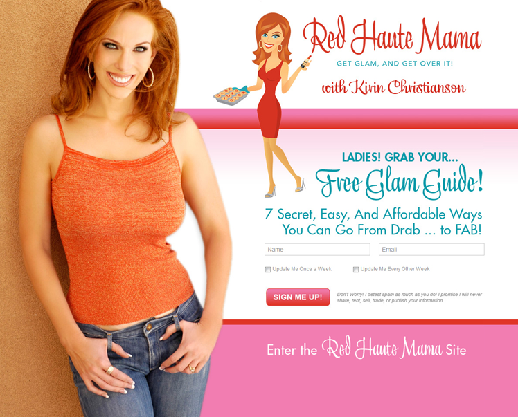
What makes this squeeze page work?
- Personal: Kirin puts herself front and centre on this squeeze page to add her personal flair to the page. Visitors will know who they’re opting into and receive a hint as to what they can expect from the experience.
- Value: The subheading communicates value “7 secret, easy, and affordable ways you can go from drab to fab”. The benefit is clearly communicated to the visitor.
- Bright: The CTA in the white space of the page is made bright pink to stand out from the form section.
What makes this squeeze page work?
- Encapsulated: The form is encapsulated in a bright white box to stand out from the copy and attract visitor attention.
- Bright: The CTA is made large and orange so as to stand out and draw attention from the visitor.
- Drop-down: Drop-down form fields make the process for the visitor easier by selecting their answer. If the answer is open ended, drop-downs can make the process easier for your visitors.
What makes this squeeze page work?
- White space: Ample white space is used to highlight the important elements on this squeeze page. Nothing distracts from the communication or the form itself.
- Action: Action-oriented language is used in the form heading and on the button itself. It communicates action so the visitor knows the next step they’re about to accomplish.
- Bright: The CTA is bright yellow to help it stand out amongst all the other page elements.
What makes this squeeze page work?
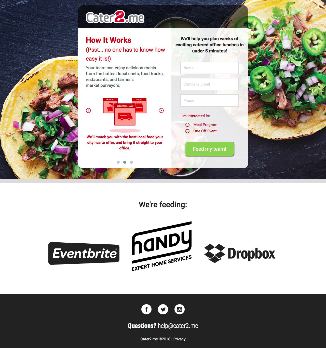
- Visual: The large background image frames the form portion of the squeeze page. It draws attention to the center (not to mention make you hungry).
- Proof: Cater2.me shows the companies they’ve supplied food to. It adds to the credibility of the service. They also include their social channels for extra proof.
- Steps: On the left hand side of the form Cater2.me includes the step by step process to use the app. It’s a smart way to give the visitor more insight into how the service works.
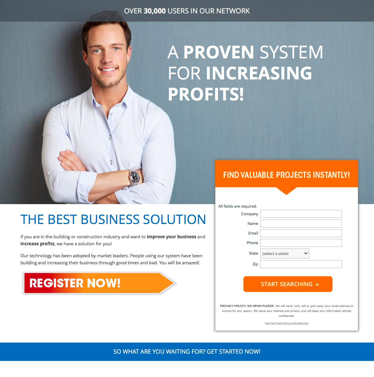
What makes this squeeze page work?
- Directional: The large direction cue arrow below the body copy direct attention to the form. After reading the body copy the directional cue guides the eye towards the right.
- Proof: There are over “30,000 users in our network” they say. Social proof adds to the credibility of the offer.
- Encapsulated: The form is encapsulated in its own box and adds a hint of bright orange in its headline and CTA. It is doing as much as it can to attract attention from the visitor.
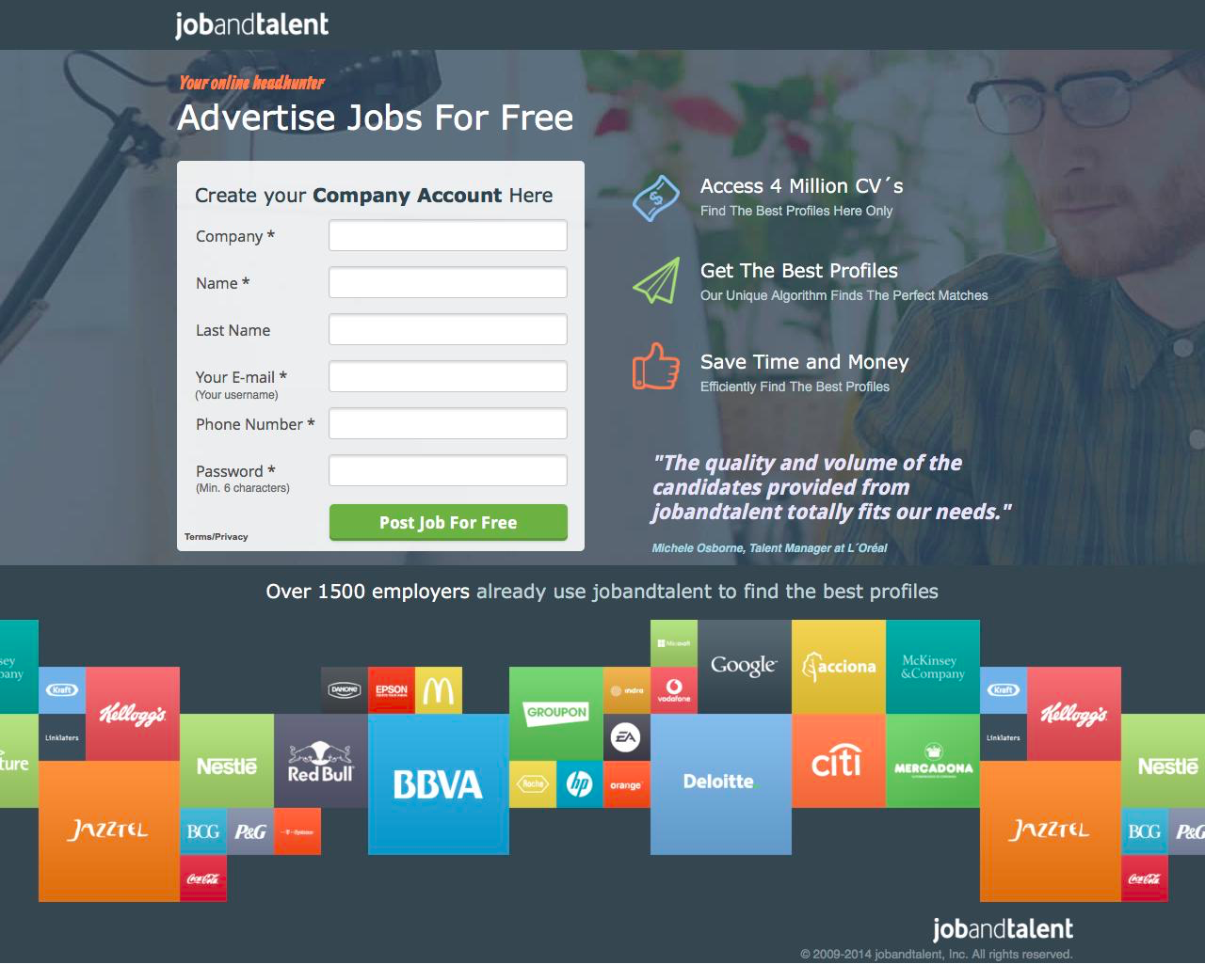
What makes this squeeze page work?
- Proof: Companies that have used JobandTalent line the squeeze page for added credibility and trust. Real testimonials, 4 million CV’s, and 1500 employers further add to the credibility.
- Encapsulated: The form on the page is encapsulated in a box to draw attention away from the rest of the page.
- Imagery: A large photo background and bright colours surround the form directing attention to the centre of the page.
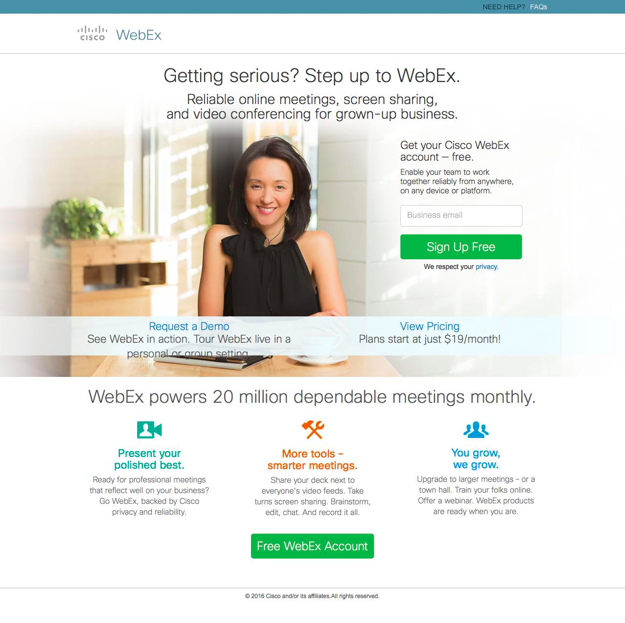
What makes this squeeze page work?
- Contrast: Visuals, graphics and CTAs are designed with bright colours to stand out from the ample white space.
- Human: The large hero image adds some personality to the page and a friendliness.
- Proof: “WebEx powers 20 million dependable meetings monthly” adds social proof and gives visitors the confidence to convert.
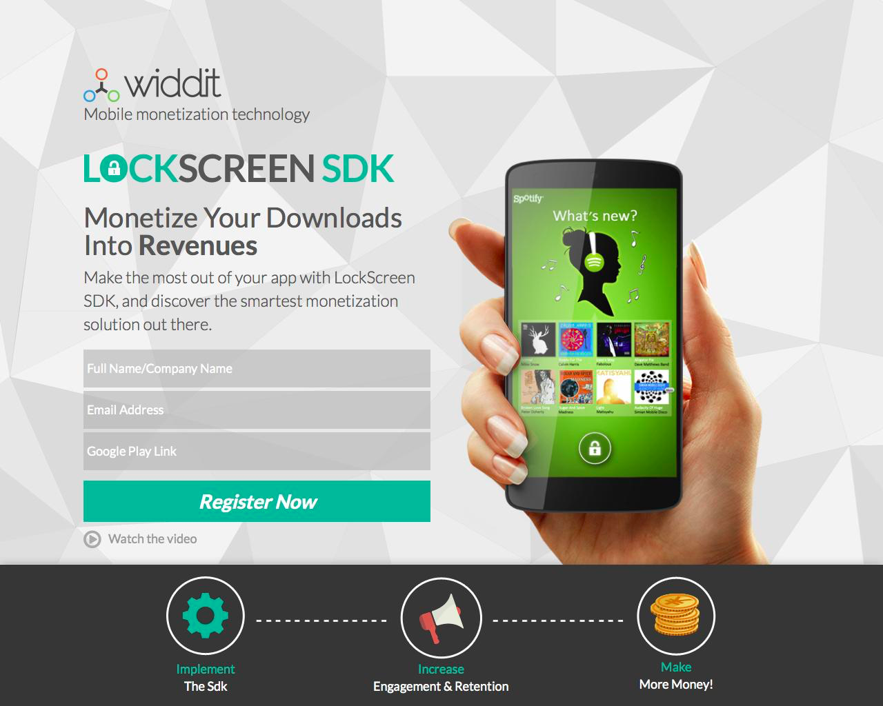
What makes this squeeze page work?
- Video: A squeeze page video can add a ton of trust and credibility to the page. Showing how LockScreenSDK works is a step away from a live demo.
- Visual: Visuals, graphics and CTAs are designed with bright colours to stand out from the ample white space.
- Step-by-step: The graphics in the bottom simplify a rather complex product into 3 steps.

Landing Pages
500 Strategies, Ideas & Examples
Click below to download the most comprehensive collection of landing page strategies and examples ever compiled. Completely free.