200 Landing Page Examples Analyzed
The buyer journey from awareness to conversion is a long one. With distractions at every corner, there’s no telling what actions your visitors will perform.
When they land, where are they going first? Are they going to browse your products? Are they going to your contact page? Or how about your shipping guidelines?
At Wishpond we believe that landing pages are the solution to the chaos. Instead of having a myriad of directions for your visitors, a landing page only has one: a conversion.
Imagine a visitor arriving on your homepage from an advertisement. Where could they go from the homepage? What could they do? What should they do first? They could peruse your ‘About Us’ page or maybe take a look at your pricing. The options are endless.
Now let’s compare this to having a visitor arrive on your landing page. With only the option of booking a product demo, the visitor has two choices: book a demo or leave. That distinction in and of itself is what makes landing pages so effective.
Take it a step further and combine landing pages with A/B testing and you’ll have an optimized page built to turn traffic into valuable leads for your business.
Landing pages can be a tough nut to crack. It helps to have a little inspiration before you get building and optimizing.
To help you find that spark, we’ve collected and analyzed 200 landing pages.
These 200 landing page examples cover the following categories:
- Sales (Click-through) Landing Pages
- Lead Generation Landing Pages
- Squeeze Pages
- Event Landing Pages
- Ebook Landing Pages
- Ecommerce Landing Pages
- Real Estate Landing Pages
- Social Contests
Sales (Click-through) Landing Pages
Click-through landing pages are built to move visitors from the landing page onto a sales or pricing page. Much like every other landing page, click-through landing pages use compelling copy, images, social proof, and examples to influence visitor behaviour for a conversion (a button click).
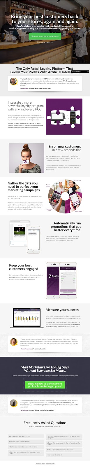
What makes this landing page work?
- Features: A list of features with compelling USP copy. They include concrete examples of the app on several devices as well.
- Testimonials: Social proof testimonials from real users that share their experience with the product. These add more trust and credibility for readers and potential customers.
- Informed: FAQ section with drop down answers to avoid any redirection to a separate page. It avoids having to send visitors to a separate page for more information.
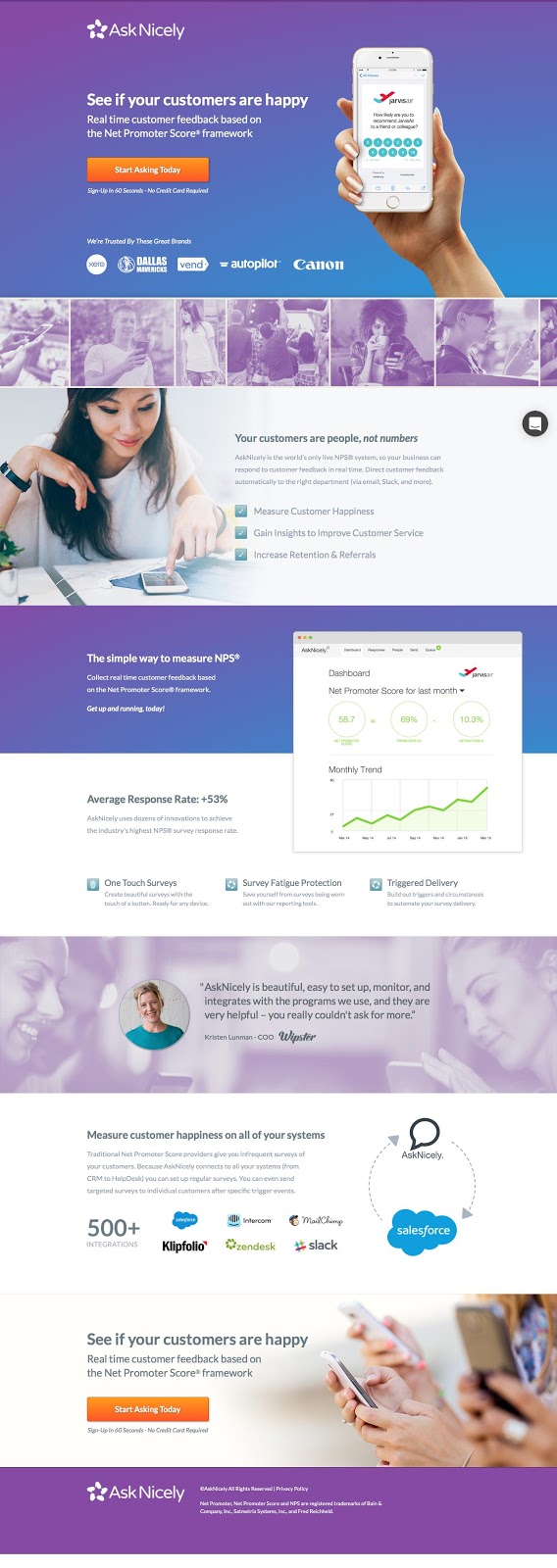
What makes this landing page work?
- Clear: A clear and compelling answer to ‘why’ in their headline to “See if your customers are happy”.
- Human: Images of people to provide a personable touch to the landing page. Studies show that photos with people are more compelling than ones without.
- Proof: User testimonials and social proof from real users. Partner and company logos add credibility to the offer for customers.
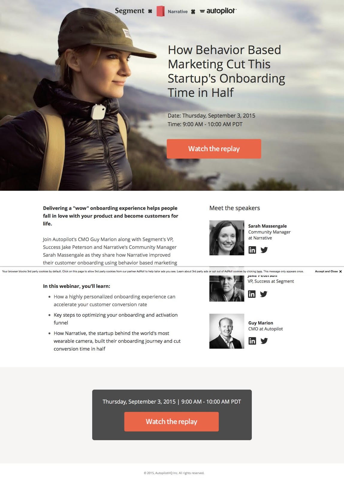
What makes this landing page work?
- Personality: Large hero image of a person in their target audience for relatability. Photos of the instructors create more of a connection with the webinars viewers.
- Benefits: The headline enticing you to learn how to cut onboarding time in half.
- Educational: “In this webinar, you’ll learn” specifically tells visitors what they’ll come out of this webinar with.
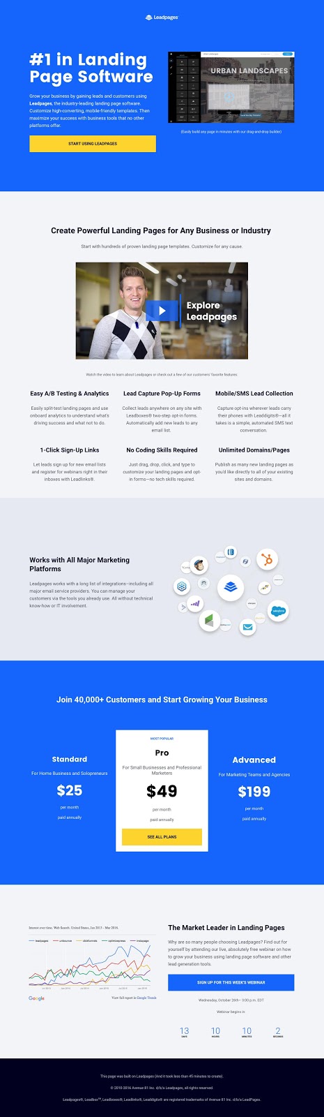
What makes this landing page work?
- Video: Time and time again it’s been shown that well-produced landing page videos increase conversions. They offer a faster more entertaining way to learn about a product.
- Social Proof: Company logos to show which platforms LeadPages integrate with so that customers know what part of their marketing stack is supported.
- Simplicity: Clean design, adequate white space for each segment highlights the CTAs.
What makes this landing page work?
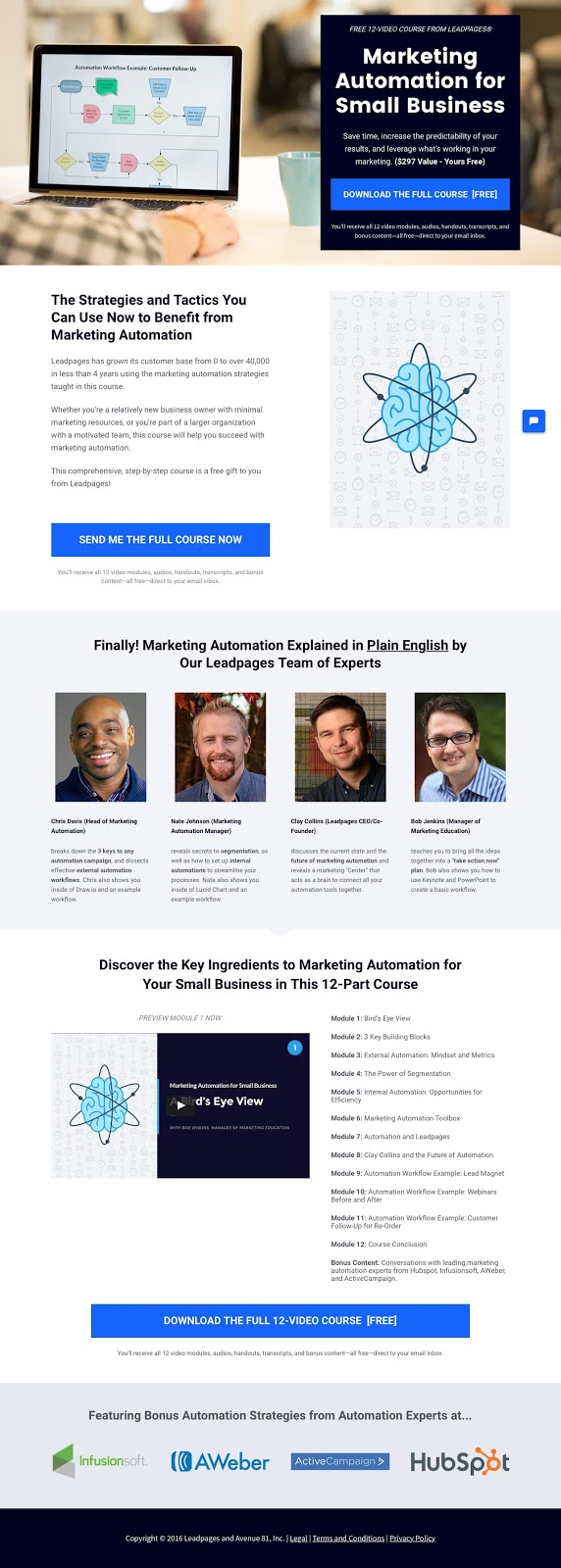
- Introduction video: An introduction video can explain the concepts quickly and succinctly for visitors opposed to reading the entire page.
- Credibility: Photos and bios of the instructors add credibility to the course.
- Proof: “Featuring bonus automation strategies from automation experts at…” high profile companies known for their marketing knowledge.
- Specificity: Show the total value of the course ($297) so that visitors know how much value they’re receiving for free.
What makes this landing page work?
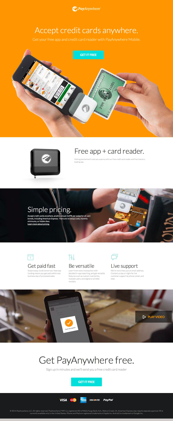
- USP: PayAnywhere highlights its product’s USP throughout the page with graphics and images of its intuitive card reader.
- Video: PayAnywhere uses a landing page video to quickly show the highlights of its product. It helps new visitors understand their concept and main selling point.
- Secure: PayAnywhere accepts all major credit payment systems listed in the footer. The fact that they’re partnered with the biggest financial institutions in the world is a huge conversion driver.
What makes this landing page work?
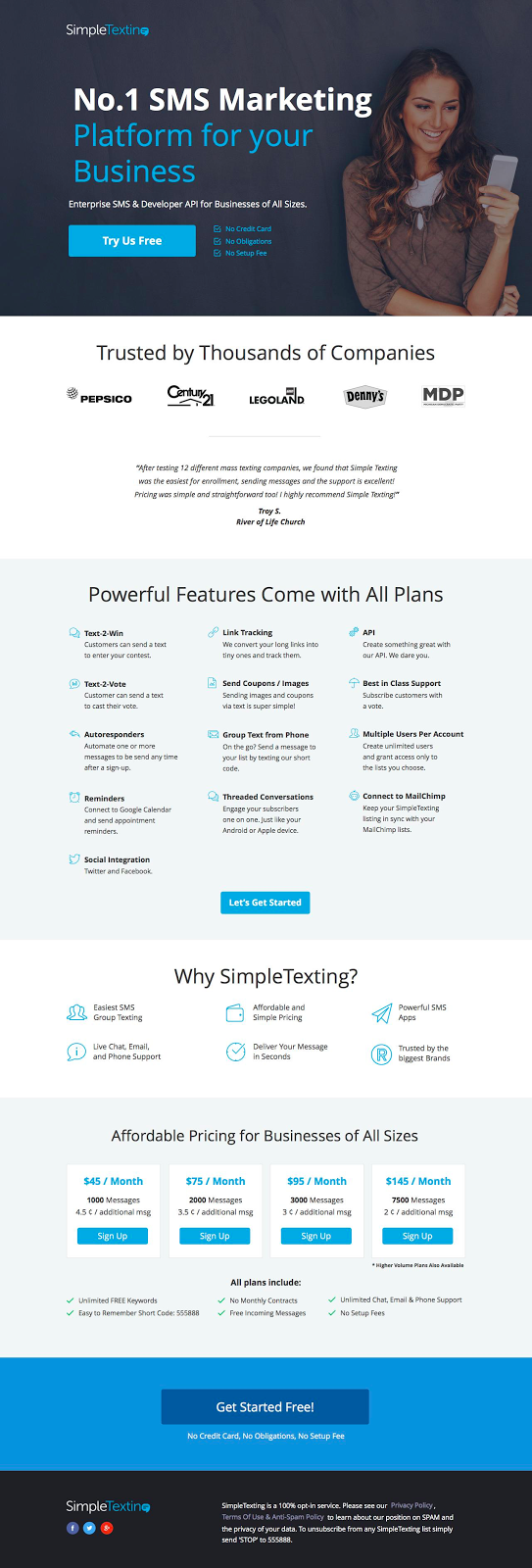
- Informed: A list of all the features and pricing plans in an effort to be more transparent. It saves the visitor from having to take an extra step to learn about pricing.
- Social proof: Partner logos for added credibility and trust. If they work for these big names they can be trusted to work with you.
- Variation: Action oriented CTAs with varying language throughout the landing page. “Try us free”, “Sign up”, “Get started free”, “Let’s get started” all communicate different things at different points on the page.
What makes this landing page work?
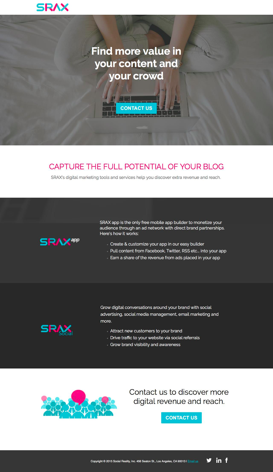
- Inspiration: “Capture the full potential of your blog” it says. SRAX wants to inspire visitors to achieve more and reach their potential.
- Informed: SRAX lists the features and benefits for both its app and social platform. You can be confident that there is already a large network to interact with.
- Power: Benefit oriented communication throughout the page inspires visitors to grow and reach more of their audience.
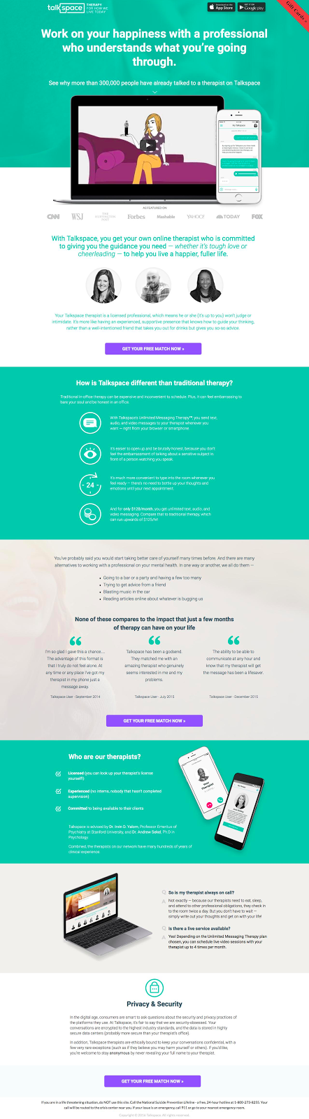
What makes this landing page work?
- Visual: TalkSpace uses plenty of photos and graphics to help communicate its message more efficiently. Concrete examples of the product are shown on desktop and mobile. Testimonials address any hesitations visitors have when seeking a therapist.
- Privacy: To build trust they include a section on privacy and security so that visitors know that their information will be protected.
- Attention: Bright purple CTAs to draw attention throughout the page using action oriented language.
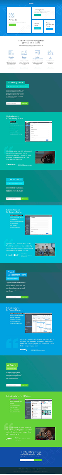
What makes this landing page work?
- Informed: Robust presentation of the features separated by team. Each section is brilliantly supported by information for each type of team.
- Benefit oriented: Depending on the type of team you have you’ll find a benefit fitting each. Testimonials add trust and credibility for each type of team.
- Social proof: In the footer it adds that you can “Join the millions of users worldwide who love Wrike” to hit on the fact that people want to join the crowd.
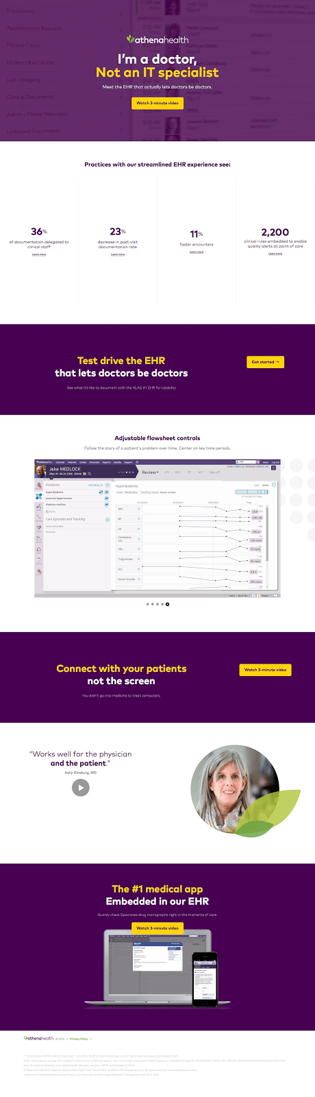
What makes this landing page work?
- Testimonials: Testimonials from real patients that use the app to address their real ailments. It’s all tied together with a compelling landing page video to address all concerns.
- Single goal: All CTAs direct people to the landing page video. It shows that Athena is acutely aware of their sales funnel and know that users must watch the video first to get a full grasp of the product. Data and statistics to backup all of their claims.
- Live: Product screenshots and explicit examples of the app and the product to show the simplicity.
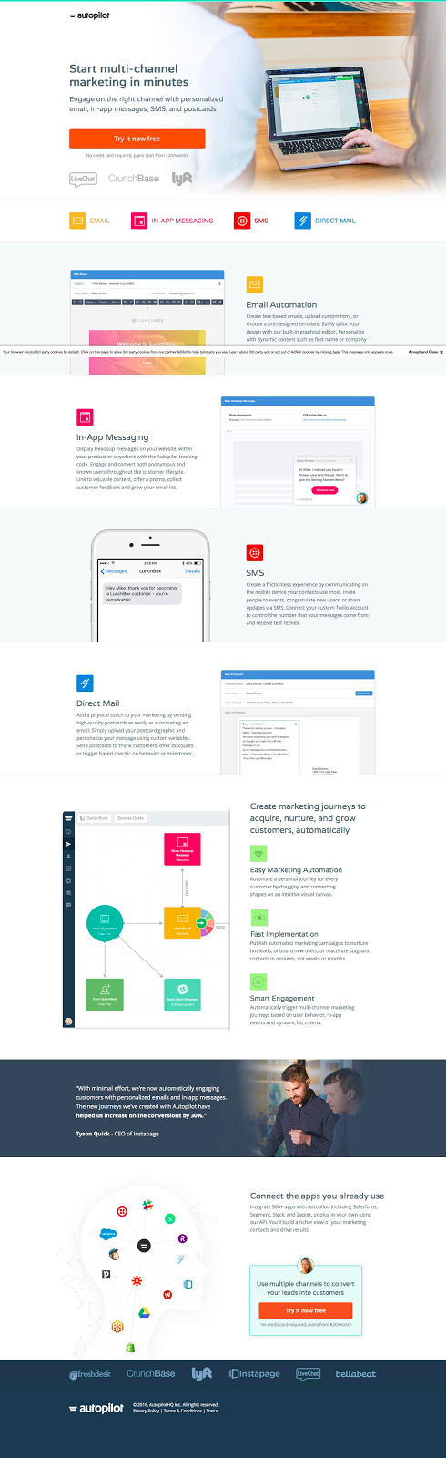
What makes this landing page work?
- Examples: Every headline and list of features is supported with a visual or graphic. Autopilot shows off its simple workflows and platform. Simplicity and ease-of-use is supported by user testimonials.
- Integrations: Partner logos and integrations are placed throughout the page. By showing that they work and partner with some of the biggest brands in the world they’re showing that they know their stuff.
- Benefit and purpose: The headline at the top is precise and directly addresses the benefit of using Autopilot. It includes its benefits and its USP — exactly explaing the ‘why’.
What makes this landing page work?
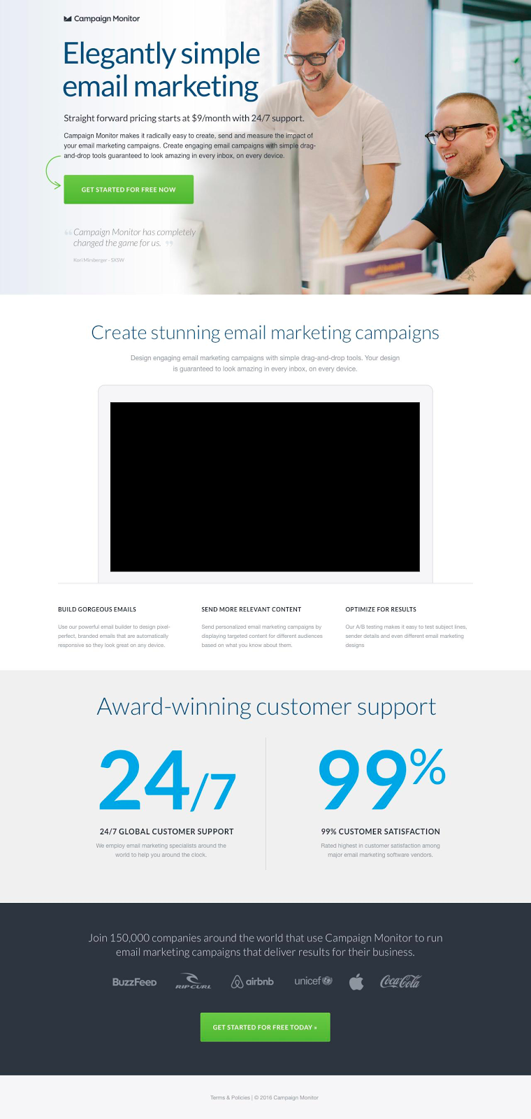
- Simplicity: “Elegantly simple email marketing” Campaign monitor keeps things simple, that’s their USP. They continue with their USP throughout their landing page with a smart video and a mention of their award winning customer support. They get straight to the point and present it with confidence.
- Concise: “Join 150,000 companies” and “Get started for free today” are clear and concise calls to action. Everything on the page has a purpose for Campaign Monitor, from the company logos to the testimonials, everything is meant to add credibility and trust.
What makes this landing page work?
- Benefits: A benefit oriented headline succinctly explains the product’s USP and appeal. It goes on to list out the key benefits then the product features to support their claims.
- Visuals: Visuals are typically quicker and easier to digest for a page visitors that is scanning the page. The infographic underneath the header and list of icons are easy to understand for those quickly scanning or reading.
What makes this landing page work?
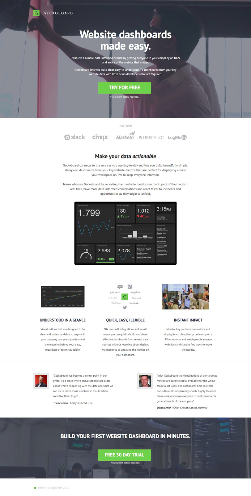
- Testimonials: Real testimonials and valid user input make the product more appealing and trustworthy.
- USP: Geckoboard is aptly familiar with their ‘why’ and explain it succinctly in their headline “Website dashboards made easy”. It’s important to understand your USP and follow through with it throughout the page.
- Visual: Geckoboard employs plenty of photos and graphics to make scanning the page easy. They also include concrete examples of the product along with a list of features and benefits.
What makes this landing page work?
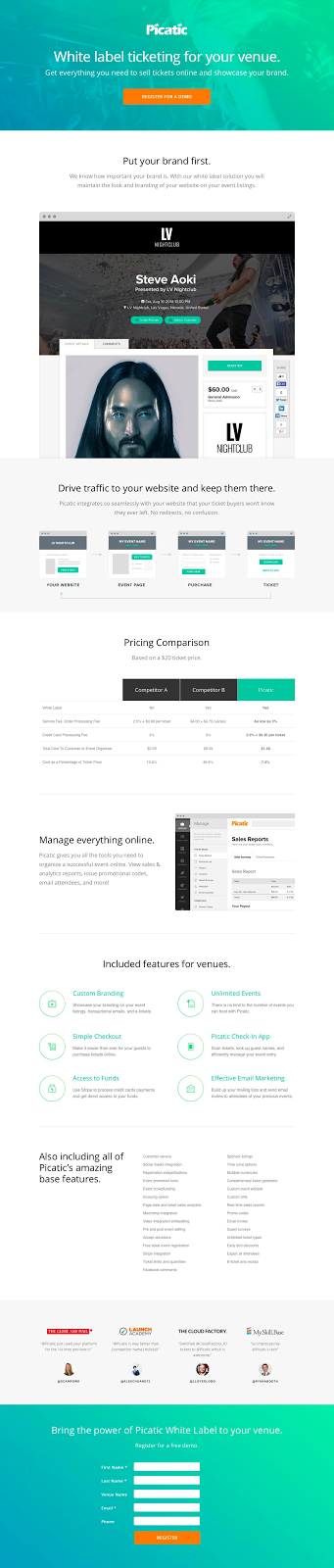
- Benefits: “White label ticketing” is exactly their USP. They back it up by showing a celebrity user Steve Aoki, who uses it for all of his concerts. Unique benefits and features are listed out and supported by testimonials from real users.
- Visual: Picatic uses plenty of real user photos and graphics to make scanning the page easy. Concrete examples of the platform are spread throughout to add trust and credibility. Bright CTAs draw attention in this rather long landing page.
What makes this landing page work?
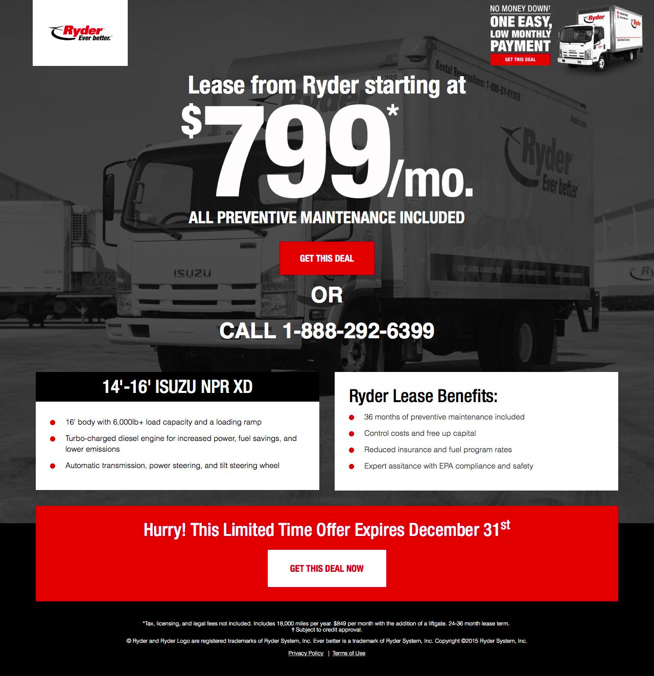
- Contrast: The most important elements on the page are large and highlighted in bright red. Everything that needs attention is focused via design hierarchy.
- Promo: The most important element, the promo price is highlighted in the headline to attract the most attention.
- Urgency: The lower CTA uses contrasted colours along with language that uses urgency. “Hurry!” tells the visitor the deal is limited and quickly expiring.
What makes this landing page work?
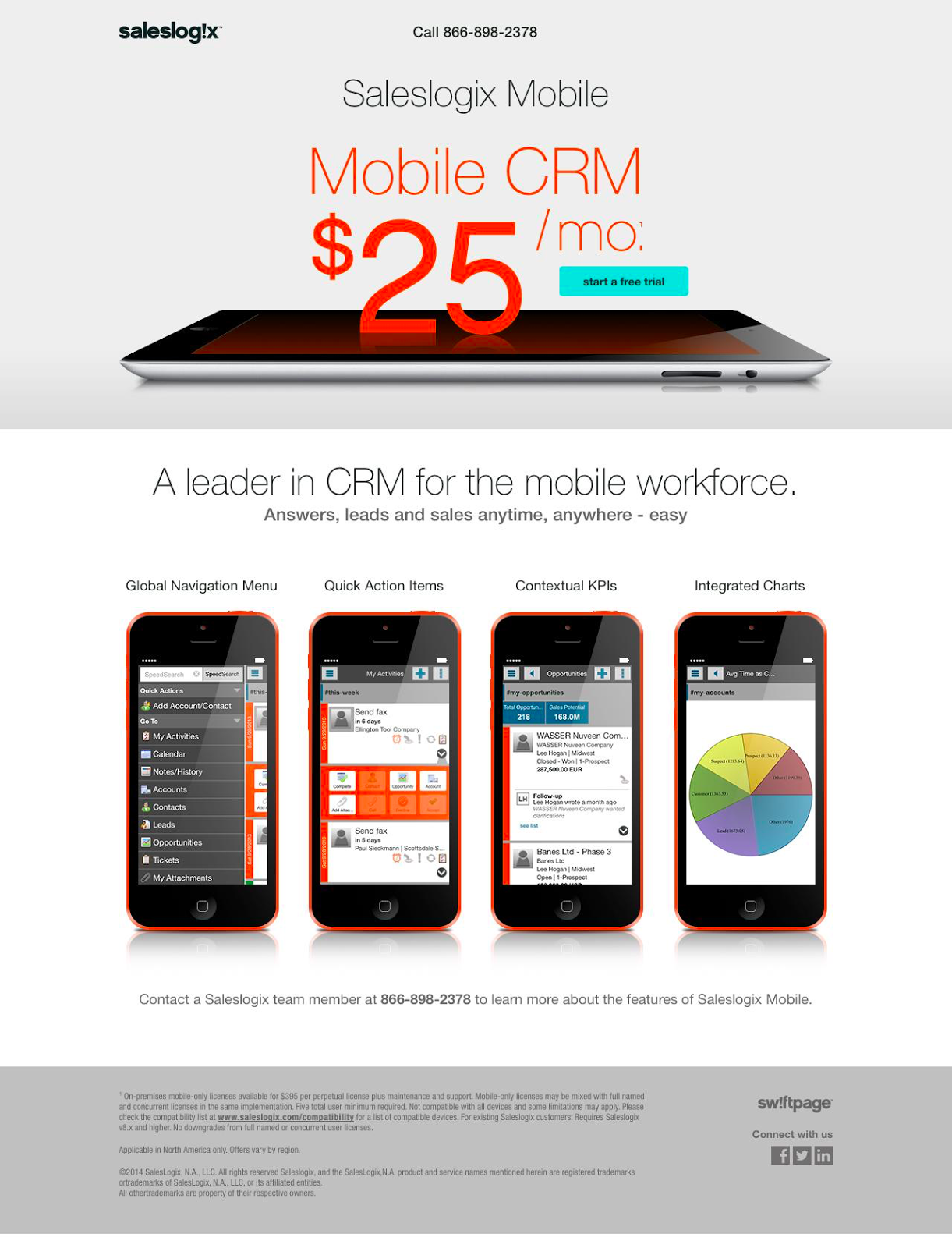
- Simplicity: Saleslogix keeps things simple with big bold imagery and a clear offer at the top of the page. They chose to include their USP in the subheading to drive home the price as well as the ‘why’.
- Real: Being a CMS, concrete examples of the platform go a long way to add trust and credibility to the landing page. Mobile responsiveness is a big concern for web users so it helps to show the scale of the platform on a mobile screen.
What makes this landing page work?
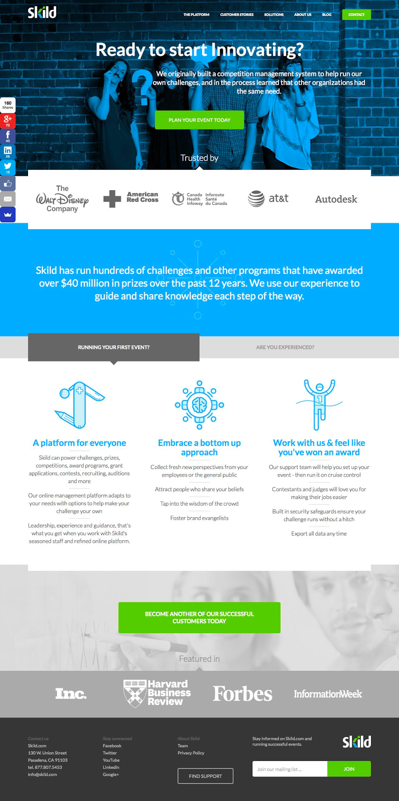
- Trust: Trusted brand logos are placed at the top for the visitor to see immediately. Other big brands use Skild so why can’t I?
- Numbers: Putting a number to their presentation, $40 million in prizes.
- Why: They properly communicate the ‘why’ in their USP. They tell visitors why this is the platform for them and why it exists in the first place. They realized when building this platform that they were the one that needed it too.
What makes this landing page work?
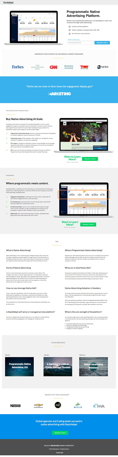
- Info-packed: StackAdapt includes an exhaustive amount of information for its visitors. But they were sure to include plenty of visuals to support their claims and make it easier to digest. Real examples and partner testimonials do a lot to provide credibility. They made sure this landing page had the info to address every single concern a buyer might have.
- White space: The use of white space draws eyes to certain areas of the page. Apart from all the information, it’s hard to get distracted by anything else. Clean and simple design makes presenting important information easier and with less friction for the visitor.
What makes this landing page work?
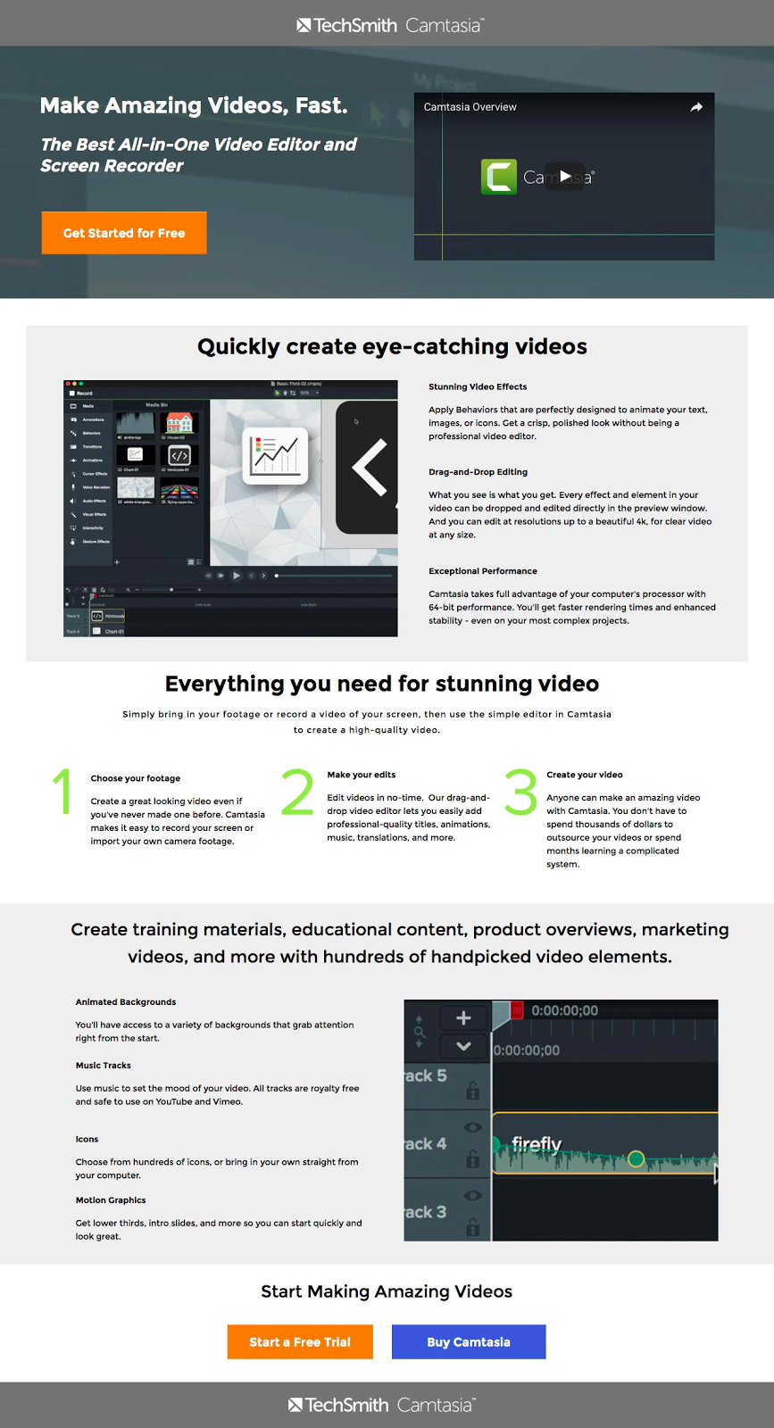
- Concrete: Real product use photos are spread throughout the landing page. Taken a step further, Camtasia has a step by step process to explain how easy the software is to use. Being able to demonstrate ease of use and step by step processes are an easy way to add transparency.
- Video: Landing videos work. For those who don’t want to read and would like a live demo of the platform, a video does wonders. Being a visual product as well a video is the next best thing besides using the product.

Landing Pages
500 Strategies, Ideas & Examples
Click below to download the most comprehensive collection of landing page strategies and examples ever compiled. Completely free.