Landing Page Design: 100 Strategies, Ideas and Examples Part 4
76. Don’t Oversell
Nobody likes a used car salesman, at least not the stereotype. I’m sure there’s some great people out there selling cars, but all most of us can picture is Matilda’s dad putting sawdust in the engine.
Overselling makes enemies of your landing page visitors and leads. It doesn’t just frustrate them, but actually makes them feel cheated. And people who feel cheated write reviews.
How to avoid overselling on your landing page:
- If promoting a product, don’t photoshop it. If it doesn’t look good on camera, use a different image.
- Words like “best” and “ultimate” are fine, but avoid “the world’s best” or “best ever” as they’re more aggressively ambitious and unbelievable.
- If you’re going to state something which might sound unbelievable, have a customer testimonial do it
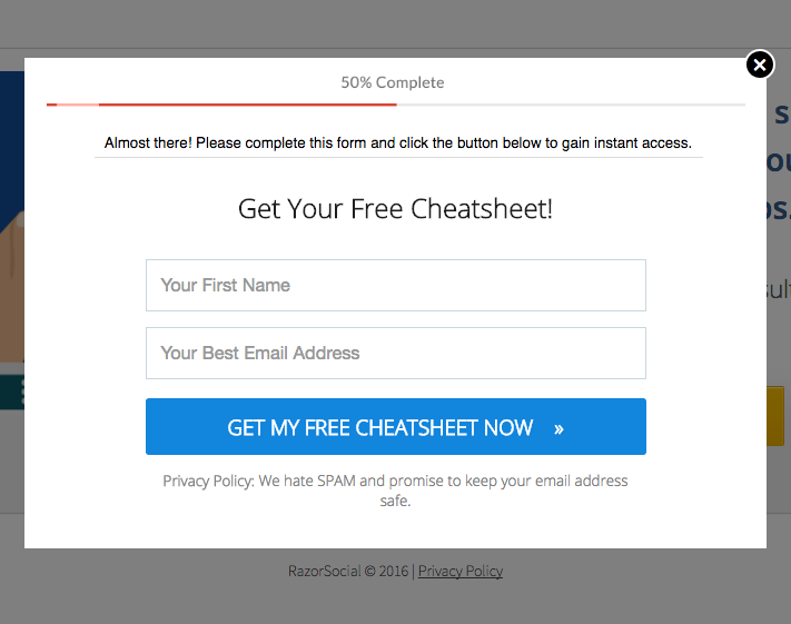
77. Match the Form Fields to the Lead Magnet
What you’re offering needs to be worth what you’re asking people for.
The “worth” of your gated content is going to depend very much on your brand authority (you can ask for more if you’re Nielsen or Moz, for instance) and what the offer is.
But ultimately, it’s up to you. Do you want fewer leads but know more about them, or more leads about whom you know less?
- If you offer an ebook and ask people for their name and email address, expect your landing page conversion rate to be between 30 and 40%. If you offer an ebook and ask people for their name, email address, phone number, business website and job title, expect 20%.
- If you offer an industry report with original statistics and research, feel free to ask for more information. Your offer is worth it.
- If you offer a case study ask for more information, as you want to know more about people who download bottom-of-funnel content related specifically to your brand.
- If you offer a webinar, unless it features a well-known industry thought-leader, ask for the same as you would for an ebook
- If you offer article-specific gated content (a content upgrade) ask for name and email address.
The hierarchy of lead information (from least impactful on conversion rate to most):
- Name
- Email Address
- Country
- Industry
- Job Title
- Size of Business
- Business Website
- Phone Number
78. Autofocus Form Fields
This is a best practice related to ease-of-use.
It’s a very simple bit of javascript worked into the backend of many 3rd party landing page builders. Essentially, when a landing page visitor arrives, the form will be pre-selected.
They can simply start typing rather than having to click on the form. If they click anywhere else, of course, the selector will be removed.
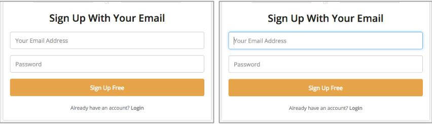
When wishpond ran this test on a signup page we saw a 45% conversion increase with a 95% confidence level.
79. Multi-step Conversion
Forms are intimidating.
When a visitor arrives on your page, the form can loom like the entry to a haunted house. You’ll have to convince me pretty effectively to get me anywhere near it.
Perhaps that’s why multi-step conversion strategy has proven so effective for so many businesses.
When merchandising platform Namify added multi-step conversion to their landing page they increased conversion rates by 311%.
Here’s a simple example from Razorsocial:
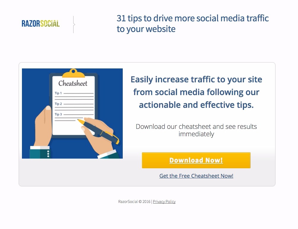
See how, with a multi-step conversion process, the landing page itself can focus on delivering value and convincing visitors without the distraction of a form looming over them?
Clicking the CTA (which feels like less of an “ask” without the form attached) triggers a click popup with the form and a progress bar (also best practice).
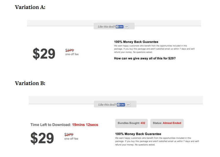
80. Countdown Timer
When something is available for a limited time, the value of it is subjectively increased (see #38 – urgency – above).
People feel the need to “act now” for fear of missing out.
If applicable (usually in webinars, conferences, coupons, discounts, etc) countdown timers can be extremely effective in increasing the impetus for your visitor to convert. They need to take advantage now, or they lose out forever.
Marcus Taylor A/B tested a countdown timer on his online music package and saw his conversion rates jump from 3.5% to 10%.
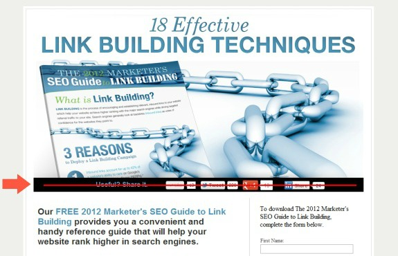
81. Remove Social Share Icons
Social share icons can increase the organic reach of your gated content. But at a cost.
Several businesses have found that, rather than increasing conversion, social share toolbars or icons are actually decreasing their conversion rate.
Removing them has increased conversions to the tune of 11.9% and 18%.
Why?
Remember #74? A single ask?
Social share icons are CTAs. And you don’t want more than one of those on your page. Your visitors need to be thinking about converting on your offer, not sharing your page with their friends.
And, secondly, social share toolbars are rarely populated with numbers you want to advertise. Unless you’re a major corporation with major traffic, your toolbar isn’t going to show that many sharers. And a toolbar which shows “0” next to each social platform is doing more damage than no toolbar at all (even before you consider it’s distracting from the page’s conversion goal.
82. Remove Stock-y Photos
Stock photos are getting better, don’t get me wrong. Companies like Pexels and Unsplash have made it far easier for businesses to find affordable (or even free) images for their landing pages.
But from time to time I still see landing pages and websites featuring stock images reminiscent of 2004.
Really though, if you saw these pictures on a landing page, which business would you prefer?

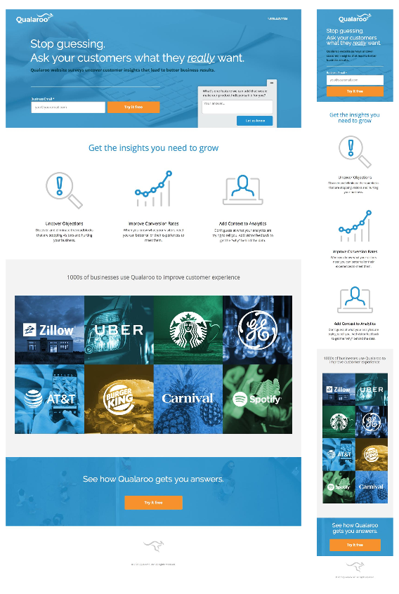
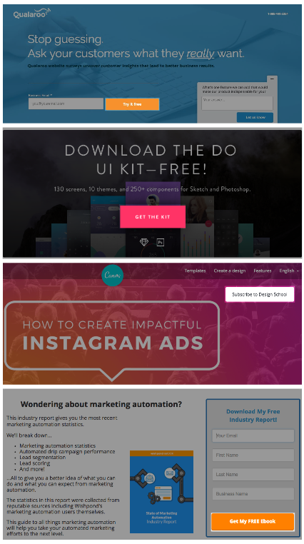
83. Mobile Optimization
Nobody can totally agree on the degree to which the web has gone mobile. Some say we’re over 50%, some say we’re almost there.
No matter who you talk to though, it’s clear that having a mobile optimized marketing campaign is essential – and nowhere is that more important than in the landing page you send people to.
It’s easy to optimize an email for mobile. Most email clients or marketing platforms do it automatically. But what’s the point if you’ve convinced people to click through on an email but the page they arrive on is screwy?
Here’s an example of a landing page optimized for both desktop and mobile from Qualaroo:
Remember, if you’re going to get a freelance coder to create your landing pages, be sure the elements they add stack.
Or, better yet, use a third-party landing page platform whose every template is already optimized for mobile. And be sure to check your previews before launching.
84. Exit Popup
You can design your landing page with every best practice, test it to its maximum and keep doing so until the cows come home.
But you’re not going to get everyone.
Some will leave because you haven’t sold them; some because they’re not ready; some because they get distracted by something or your conversion goal isn’t obvious enough.
No matter the reason, there’s only one thing you can do after you’ve done everything possible to optimize the page itself.
An exit popup.
Here’s an example of an exit popup from Brent Jones Online:
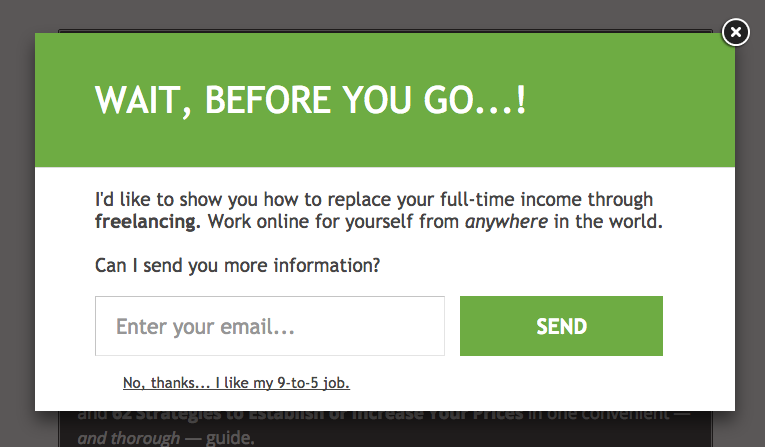
Exit popups appear when your landing page visitor brings their cursor to the top pixel of the page (to go back, open a new tab or close their browser). They’re triggered by a bit of javascript automatically added to the page.
The implementation of a popup means you’ve done everything possible to get your visitors to convert. You’ve added the right copy, used the right formulas, tapped into psychology and added the design touches and best practices necessary.
Now it’s just down to testing.
Landing Page Design Elements to Test
Never stop testing, and your advertising will never stop improving.
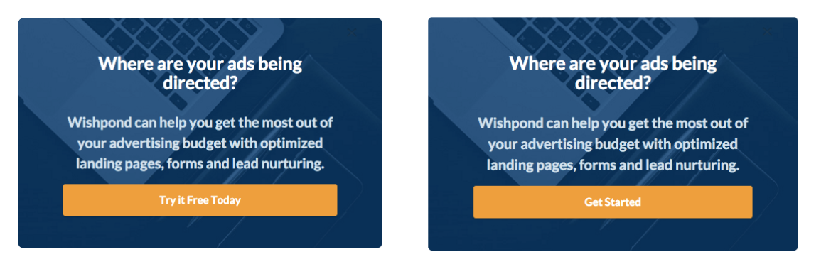
85. CTA Button Placement
Best practice is to have a CTA button above the fold (and another below the fold if you have a longer-form page) but beyond that it’s all about testing.
Should it be front and center beneath the headline or on the right side beneath the form? Should your form be horizontal and the CTA button on the right?
Here’s a few CTA button placement examples from Qualaroo, InvisionApp, Canva and Wishpond:
CTA button placement matters. It’s the focus point of your page. How everything else flows – how much value you need to communicate before people are ready to convert – impacts where that button should be.
86. CTA Copy
Your CTA copy can be easily overlooked. It’s usually less than 3 words. But, again, this is the focus point of the entire page.
Everything is driving people to that button and the word or words on it. So they need to entice people to click as much as your headline does.
Here are a few of the top words to use on your CTA buttons:
- Start
- Build
- Join
- Learn
- Discover
- You
- Me
- Want
- Need
- Free
- Save
- Now
- Today
- Get
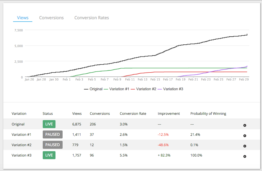
We A/B tested “Get Started” against “Try it Free Today” (both of which align with best practice):
“Get Started” increased the popup’s conversion rate by 82% with 100% statistical significance:
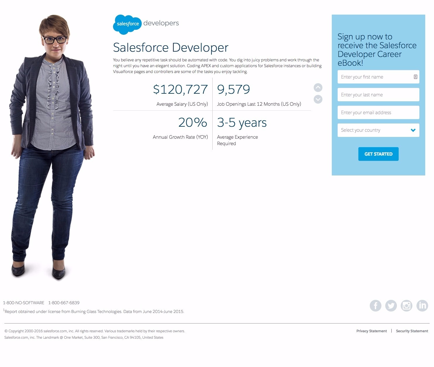
87. Image
- Try a Hero Image: A large, oversized header image behind the headline.
- Test featuring people using your product vs the product by itself.
- If your product is software, feature a platform screenshot or
Here’s an example of an effective, “everywoman” image on a ebook landing page from Salesforce:
88. An Explainer Video
Video is worth a thousand pictures, and pictures a thousand words.
- Make sure it’s professional. A poorly-done video is worse than any text or image could ever be.
- Emphasize audio. It’s the most noticeable element of a poor video.
- Spend the money. A well-done video is worth the investment. A poorly-done one not worth the space it takes on your computer.
- Make sure it’s less than 2 minutes, and visually appealing.
Here’s an example of a phone number on a free trial landing page from Spotify:
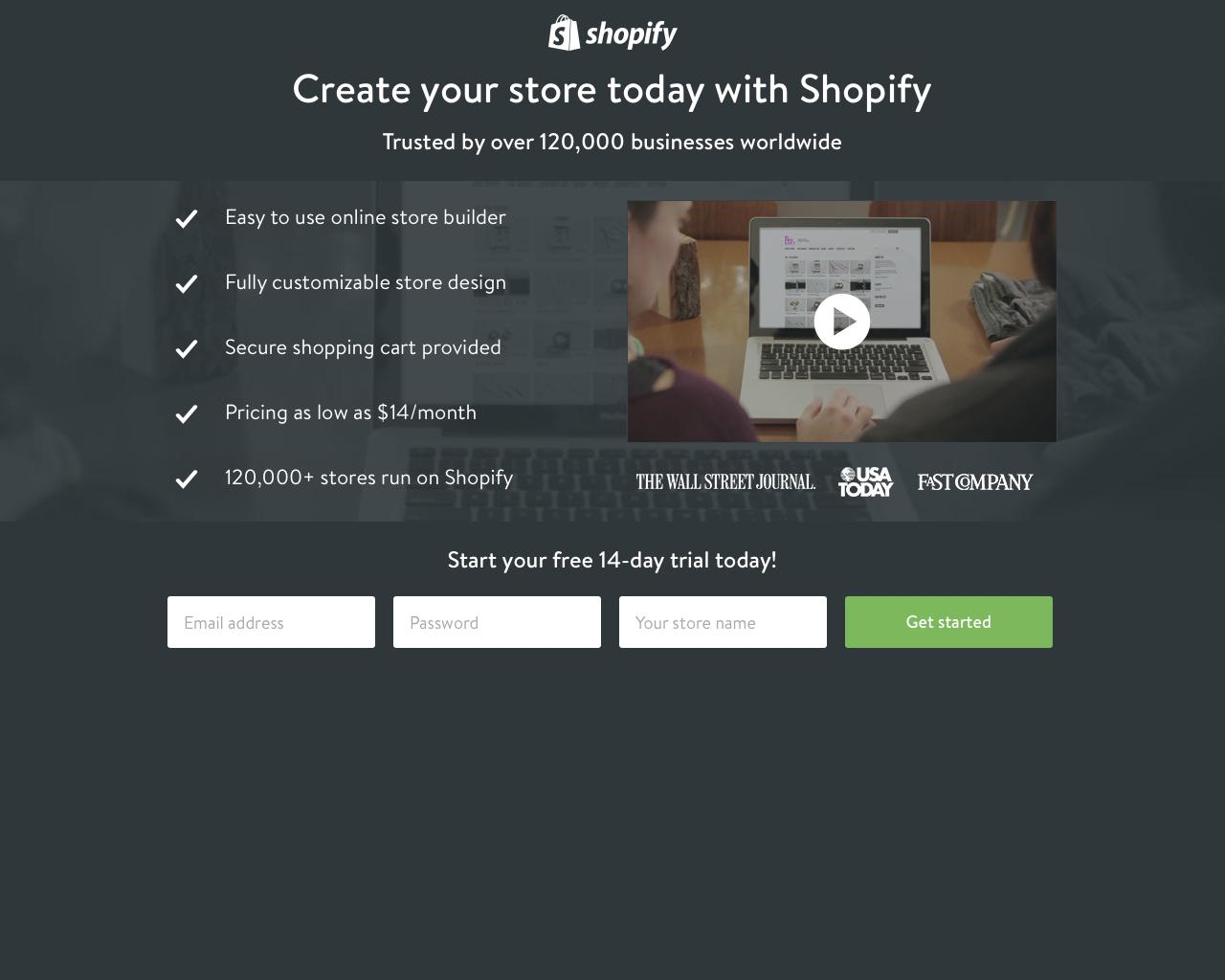
89. A Phone Number
The more accessible you are (social network, address, etc) the more open and friendly you’ll appear.
Lack of a phone number makes it look like you’re hiding something.
Here’s an example of a phone number on a VIP demo landing page from Contently:
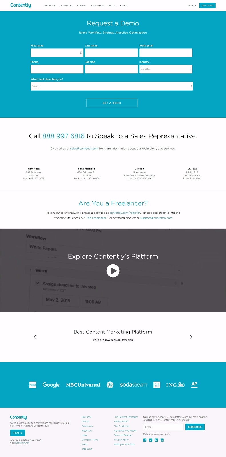
- Don’t make it a link. You don’t want to distract people from the landing page’s conversion goal.
- That said, a phone call is likely a more valuable conversion than anything you’ll get from an email-gate. Don’t hide the number, but keep the visitor on-page.
- Place it below-the fold. If you’re retaining your website footer within your landing page, place it there. If not, place it beneath the “copyright” notice.
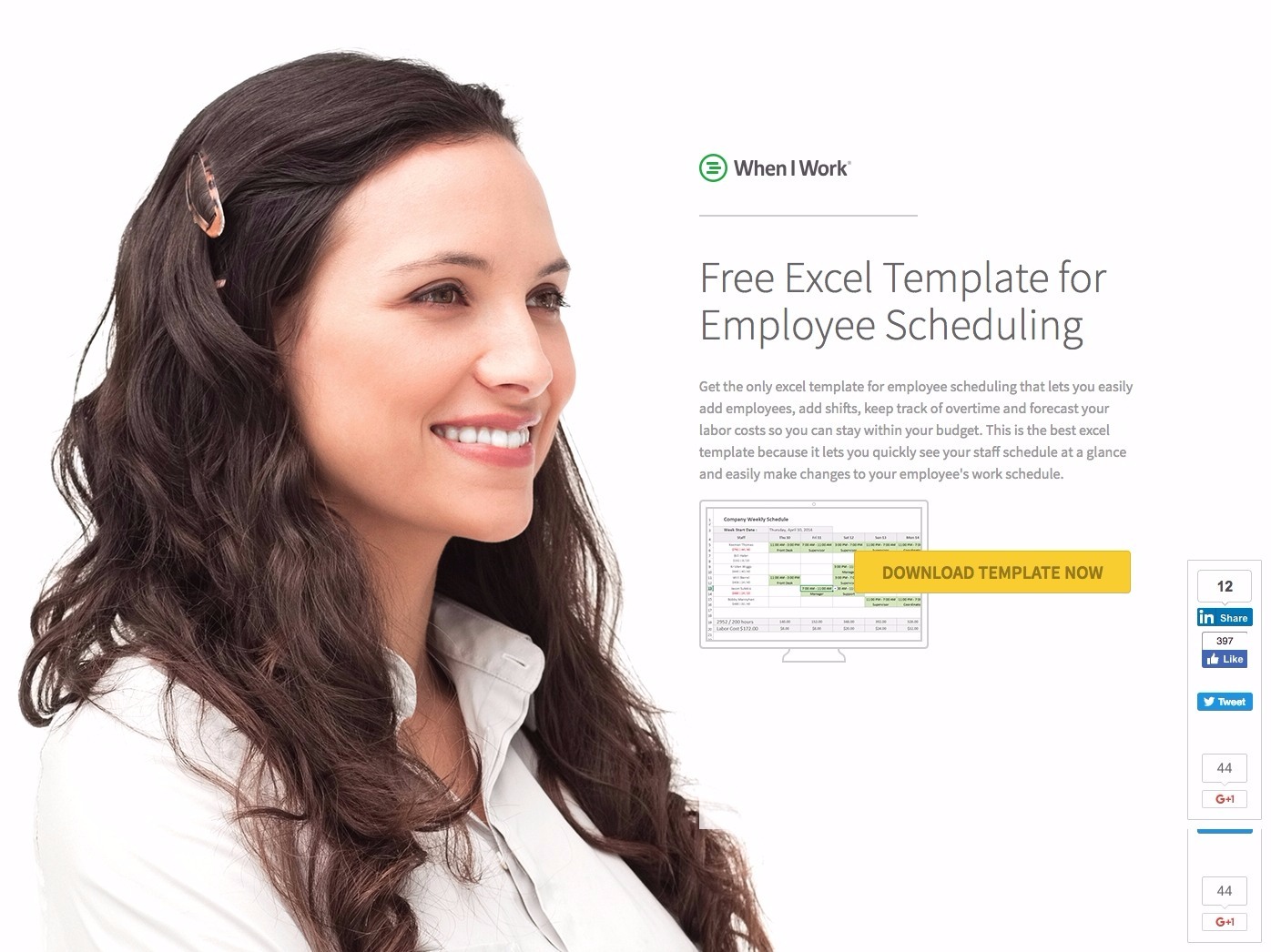
90. Two-Step Opt-in
I’ve said a two-step conversion is best practice, but that doesn’t mean it shouldn’t be tested. Two-step conversions might also make your visitor feel that they’ve been deceived (thinking there wasn’t a form until one pops up).
In general, it should increase your conversion rate, but don’t just trust best practice.
To implement a two-step opt in, use a third-party lead generation tool click popup.
For more on click popups, read “How We Doubled Blog Lead Generation With Click Popups.”
Here’s an example of a two-step opt-in on a landing page from When I Work:
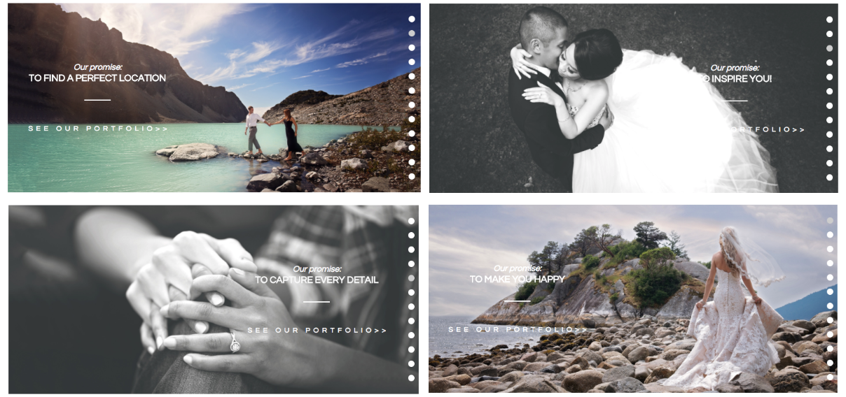
91. Image Gallery
Image galleries will work best for ecommerce, fitness and photographer landing pages.
They allow you to showcase a selection of your work without taking your visitor off-page to a portfolio slidedeck.
They can also be a powerful builder of business legitimacy: If you only have a single image on your landing page people know you’ve created one good thing. If you have three or four, they assume you have a collection.
92. Unique Selling Point
What makes you better than your competitors? You need an answer to that, and fast.
More people are shopping around than ever before, and for every solution to their needs. It doesn’t matter if you’re the oldest and largest provider of antique leather belts in the Pacific Northwest, you can be sure your prospective customers are checking to see if there’s someone who does it cheaper or faster or who they just feel more of a connection to.
Your landing page’s unique selling point can be in your benefit list. It can be in the awards you’ve won (placed in a row at the bottom of the page) or in the subheadline. It can even be the headline. But no matter what, be sure you differentiate your brand – your content – from that of your competitors.
A few words to differentiate yourself:
- Best
- Only
- Final
- Unique
- Innovative
- Never-before-seen
- New
- Award-winning
- Favorite
Another way to do this is to use a customer testimonial. Reach out to any users or customers who might have used a different solution or product before and ask them what sets you apart. Even if you don’t use their quote in your landing page, their answer will inform you nonetheless.
93. Value Proposition
This is the reason people are there. It may not be the headline (that should probably be the thing itself, rather than the reason) but it shouldn’t be far behind, either.
What value are you offering people? Why should they convert?
Here’s my recommendation:
- Brainstorm 5-10 of your best reasons visitors should convert. 5-10 things they’ll get out of it.
- Choose the primary reason out of the ones you come up with.
- Hone it into a question or pithy format. Make it simple and cutting.
- Use the other brainstormed value propositions as your landing page’s benefit list.
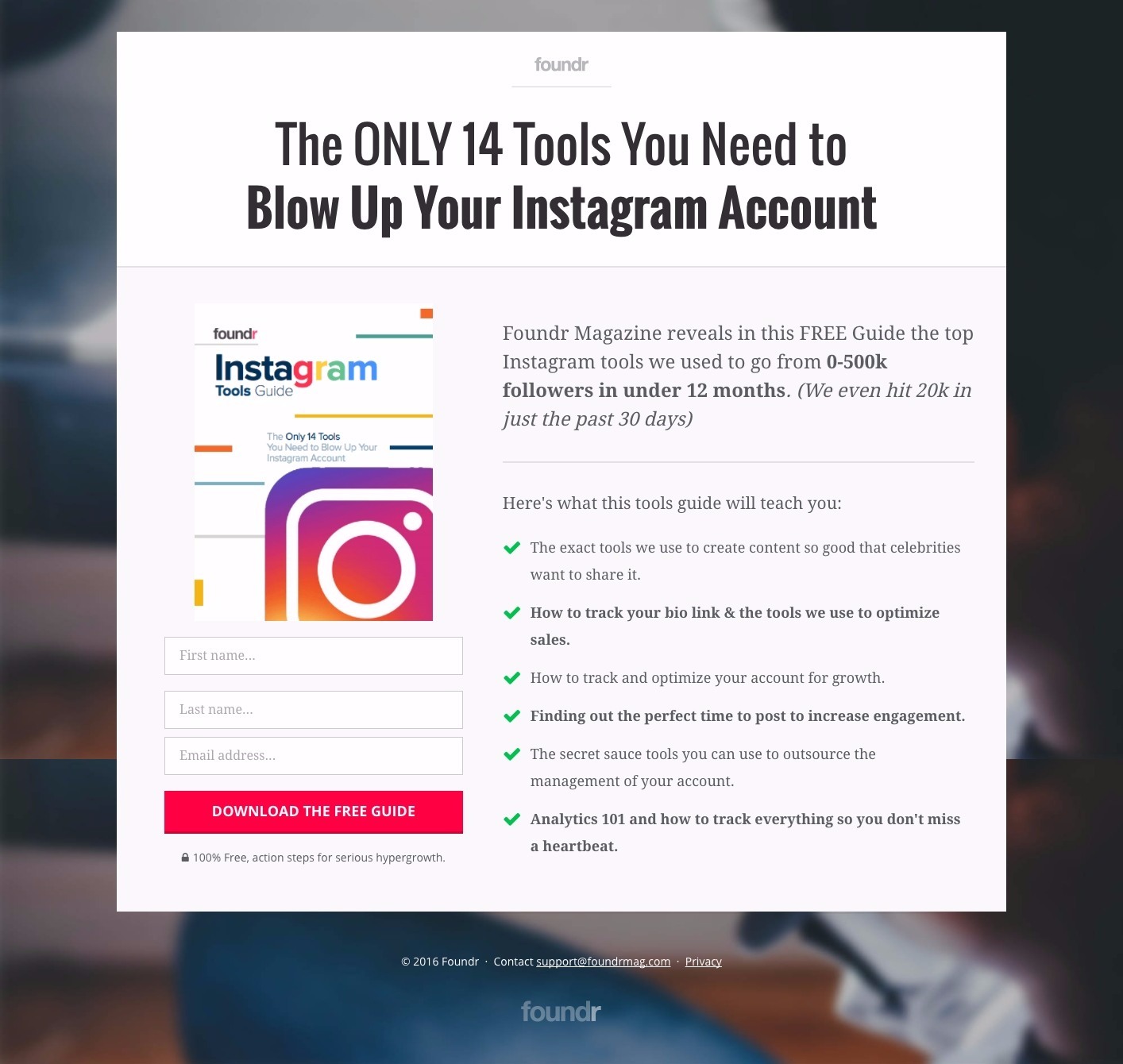
Here’s an example of an excellent value proposition and benefit list combo from FoundrMag:
94. Subheadline
Your subheadline is as important as the headline itself. The headline is there to inform the visitor that they’re in the right place and grab their eye. But like a hook, it’s only as useful as the guy at the other end of the pole. If you can’t keep them interested and express why they should convert/keep reading, they’ll bounce only a second faster than if they never read the headline at all.
95. Button design
Use design principles to accentuate the appearance of your CTA.
- Whitespace (space around the CTA)
- Size
- Text size
- Border color
- Corner radius
- Hover color
- Hover animation
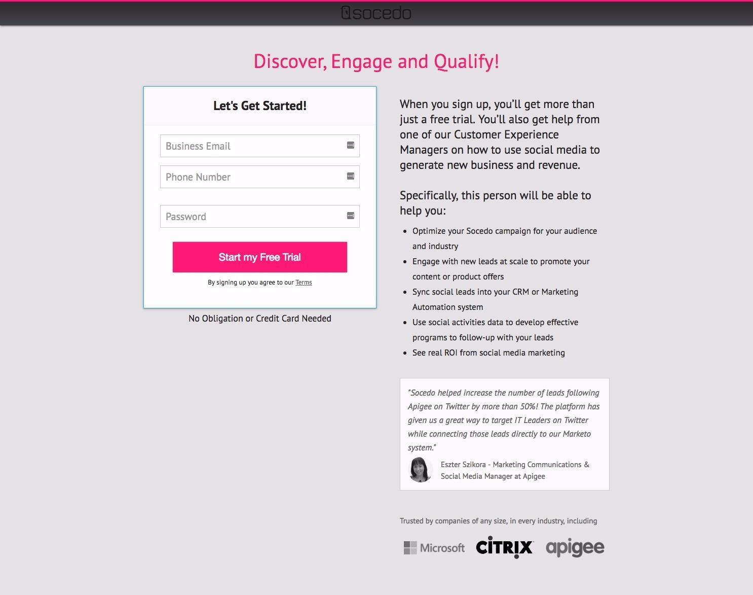
Here’s a large and eye-grabbing CTA button from Socedo:
96. Button color
More than one color contrasts with your landing page background.
- Green means go – contrasts well against a dark or white background
- Orange grabs the eye – works well against everything except red
- Blue is subtle – contrasts well against white. Light blue against black
- Red is urgency and emotion – contrasts well with everything except orange
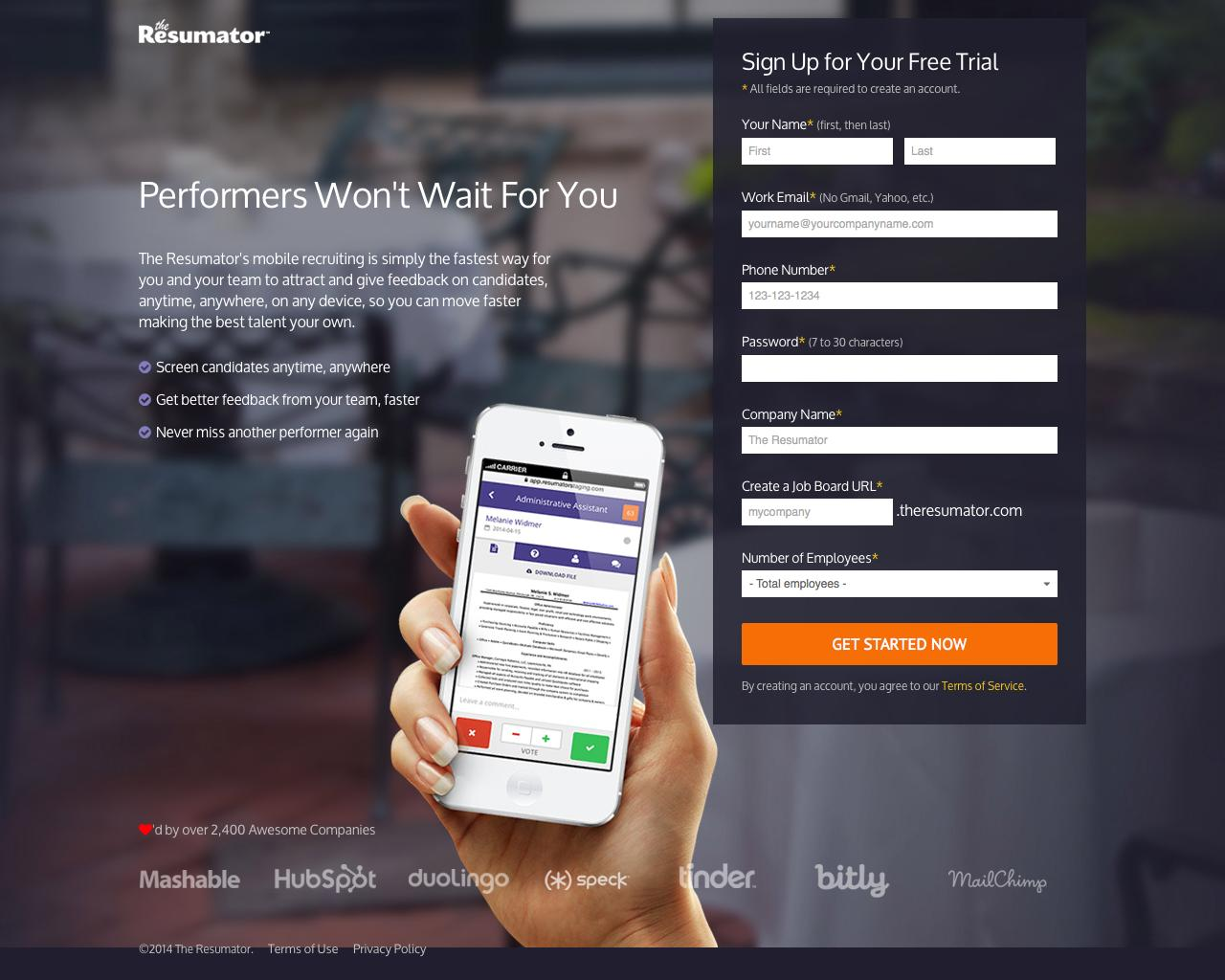
Here’s a well-contrasted CTA button from Resumator (now Jazz):
97. Form length
Form length is one of the more difficult things to test. But it’s also one of the more influential.
Ultimately, your landing page visitor is balancing your offer against the value they hold for their information.
The reason it’s so difficult to test is because, beyond landing page conversion rates, you need to factor in final sales.
If having a lead’s job title and business name enables your sales team to close them 50% more reliably, then a 25% drop in conversion rate is acceptable.
But you need to test it.
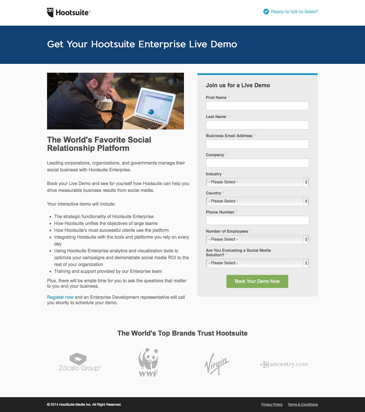
Here’s a form which asks a lot of the lead but results in the sales associate knowing everything they need to convert them, from Hootsuite:
98. Animations & Parallax
Your business’ landing pages need to stand out, or at least match up to, your competitors.
Ideally though, you’ll stand head and shoulders above them.
The best way to do that (particularly if you’re not in a computer/tech-related field) is to look like you are. Why should the tech startups have the best websites and landing pages? With third-party builders and a bit of time, there’s no reason every business can’t create brand-matched, modern pages with the most contemporary elements.
Animations and parallax are just a couple of the most contemporary elements. Test them out and see if your market appreciates the look.
If you don’t have a landing page builder, here are 30 CSS snippets to animate icons from Envato.
And here’s a walkthrough on creating a parallax scrolling background from W3Schools.
99. Chatbox
Just as you should see if a phone number will increase the number of visitors who start a relationship and close with your business, a chatbox on your VIP demo, free trial or product landing pages is also well worth testing.
Make it simple, just “Have any questions?”
Here’s an example of Wishpond’s chatbox on a product landing page:
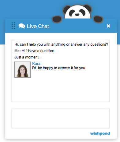
Test if a chat with your customer support team (once they’re trained to turn visitors into leads through conversation) increases conversion and final sale.
100. Long copy vs. short copy.
Crazy Egg improved their conversion rate by 30% by increasing their landing page length by 20x.
Fitness World, on the other hand, improved their conversion rate by 11% by decreasing their landing page length by almost half (via ConversionXL):
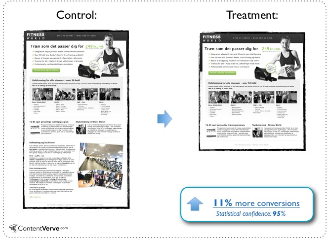
So which do we go with?
Test it.
More information means you can communicate more value. It means you can fit more testimonials, benefit points, social proof and psychological elements.
Less information means you clean up your page, avoid information overwhelm and the paradox of choice. It means you doing intimidate your visitor with too much text or lose their interest with a poor paragraph.
Test it.

Landing Pages
500 Strategies, Ideas & Examples
Click below to download the most comprehensive collection of landing page strategies and examples ever compiled. Completely free.