Landing Page Design: 100 Strategies, Ideas and Examples Part 3
51. Encapsulation
Why do the two lines below group the triangles more effectively than their coloring?
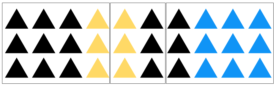
Surely that’s the more dominant defining characteristic. And yet, this is clearly four groups of objects.
Encapsulation is a powerful thing. We associate things which are held within a border, and disassociate things which aren’t.
So, when you’re designing your landing pages, consider a sectioned structure to help your visitors take in the content a bit at a time. Consider encapsulating your form to draw attention to it, and adding a border around your bullet-point lists to make them more legible.
52. Eye Direction
For a long time (like, longer than civilization has existed) we were hanging out on the plains of Africa.
So most of our evolution was spent there, rather than in front of a computer.
And some things, like our ability and natural inclination to follow the eye gaze of the people around us, has stuck around.
If you’re in a tree, gathering fruit, you always have one guy looking out for lions. When that guy hollers, you run. But, first, you check where he’s looking (because the last thing you want to do is run in the direction of a hungry lion).
So, we’re really, really good at identifying what someone’s looking at. And we can’t help ourselves from doing it.
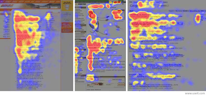
In 2013, Neil Patel published findings from an eye-tracking study (where they put little goggles on people) and came up with the following heat map:
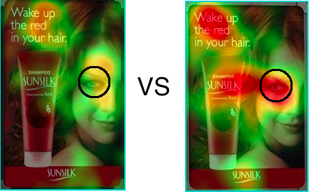
Essentially, this shows where the study’s participants looked when shown two different images. On the left, people looked at the headline and the woman’s face. On the right, when her eye was looking to the right and at the product, people looked at the headline, the woman’s face, and then slid to the left to view the product.
Pretty, cool, huh?
In short, use eye direction as you would contrast – to emphasize focus points within your landing page that you want visitors to pay attention to.
53. Continuation & Directional Cues
Continuation is the visual phenomenon resulting from a viewer’s eye following every line to its origin or endpoint, automatically.
Arrows, it turns out, don’t work because of the arrow on the end, they work because of the line. The arrow only tells you which way to continue your eyeline.
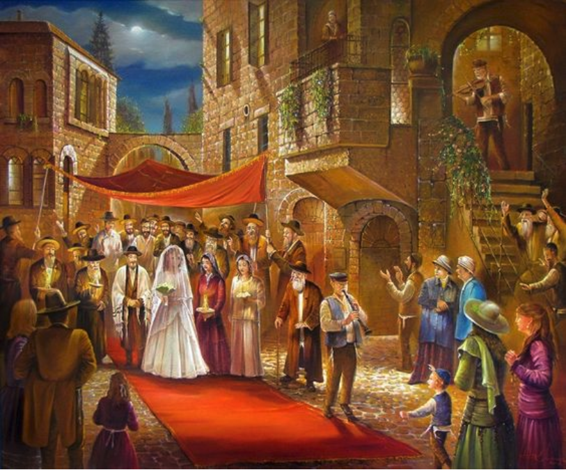
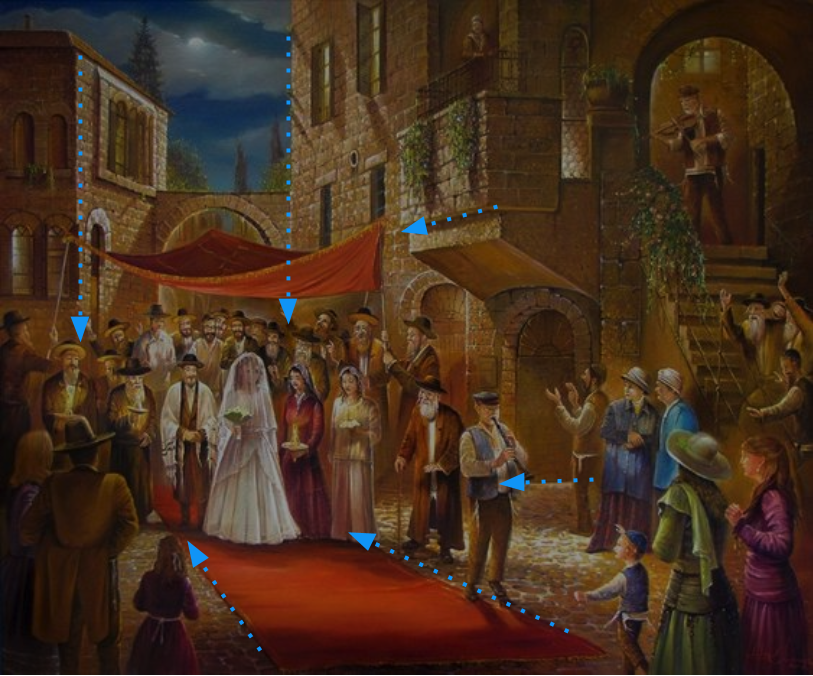
Continuation is a common element of art. The artist wants to create a focus-point in their painting, so creates lines to direct attention.
Here’s an example:
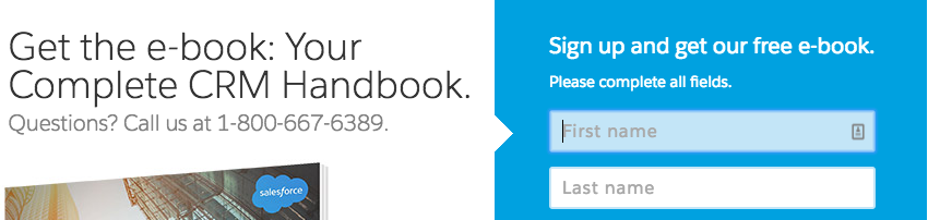
In landing page design, continuation is most frequently seen in the form of directional cues: arrows, lines, chevrons (see below) etc.
It’s simply the use of visual elements to direct the eye.
Here’s an example of a directional cue in Salesforce’s ebook landing page:
54. The “F” Shape
This is one of the most well-known design factors out there, but that doesn’t mean it can be forgotten.
As I’ve said before, you have only a few seconds to grab the attention of your landing page visitors and communicate the relevancy and value of your offer.
“F” shape formatting is a big part of that.
Several years ago now, Nielsen found that ”Eyetracking visualizations show that users often read Web pages in an F-shaped pattern: two horizontal stripes followed by a vertical stripe.”
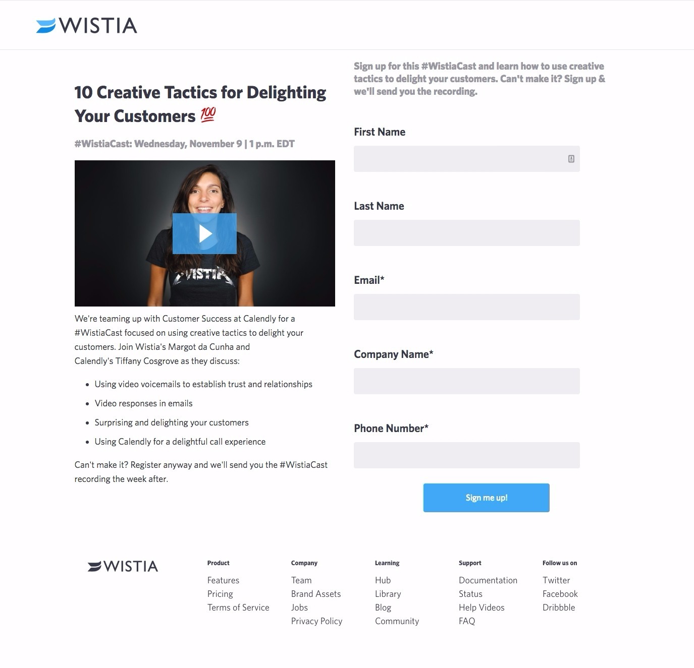
For your landing page, this means keeping your headline and value proposition at the top (either centered or left aligned) and your subheadline or benefit list right below it.
Something like this from Wistia:
55. Using Color in Landing Page Design
Color is ubiquitous and is a source of information. People make up their minds within 90 seconds of their initial interactions with either people or products [and] about 62‐90 percent of the assessment is based on colors alone.
55. Complementary Colors
The first thing your visitors see, even before they read a headline or view an image, is the layout of your page – its professionalism and, above all else, its color scheme.
It’s the first impression: “Does this landing page appeal to the eye?”
Monet wrote in 1888, “color makes its impact from contrasts rather than from its inherent qualities […] the primary colors seem more brilliant when they are in contrast with their complementary colors.”
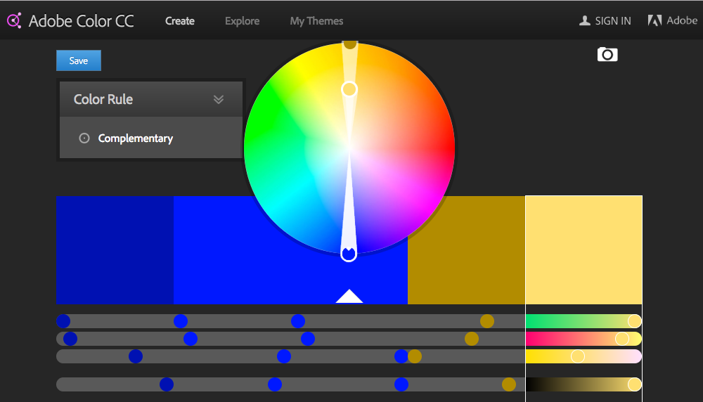
Contrasting colors are simply those colors which are opposite each other on the color wheel (below).
To get a better idea of what colors work best together, use a free tool like Adobe Color CC:
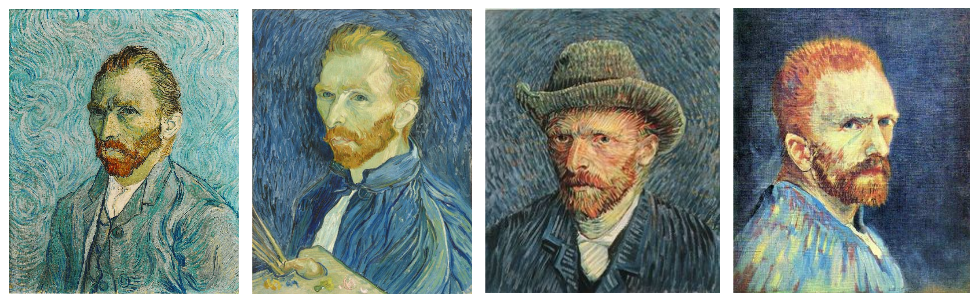
To see complementary colors in action, look no further than Van Gogh’s self portraits, which he always painted on a blue background to complement the orange in his beard:
56. Contrast
Contrast is the application of complementary colors to draw attention to something within your landing page or website.
Most frequently, color contrast is used to attract the eye to a CTA button.
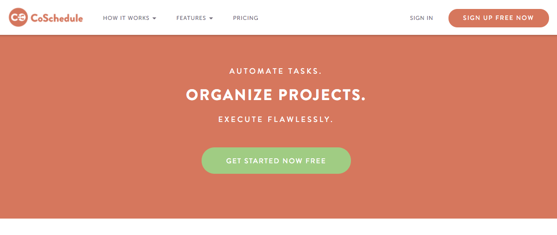
Here’s an example of contrasting colors in CoSchedule’s homepage:
57. Red
Typically seen with sales, promotions and references to food
- Associated with energy, urgency and passion
- Negatively assocaited with mistakes
- Increases the heart rate – gives the perception of time moving faster than it is (seriously, it’s science)
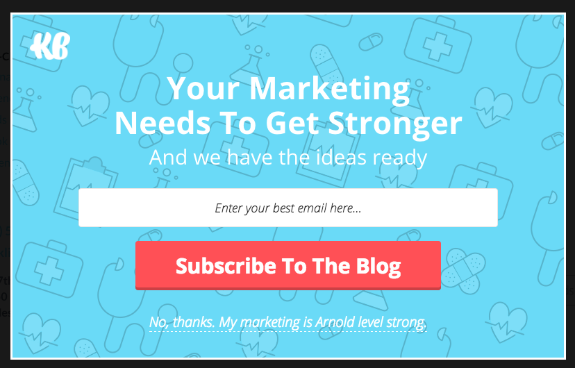
Here’s an example of the color red used on the KlientBoost website:
58. Yellow
Typically used to grab a viewer’s attention, either for promotion or in CTAs.
- Associated with optimism, youthfulness, happiness, light
- Negatively associated with illness and quarantine
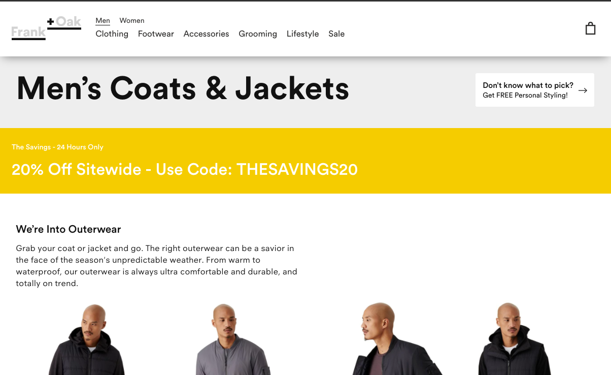
Here’s an example of the color yellow used in a promotion on the Frank&Oak website:
59. Green
Green is the easiest color for the eye to process and is used primarily in the environmental and finance industries.
- Associated with wealth and the environment
- Negatively associated with illness
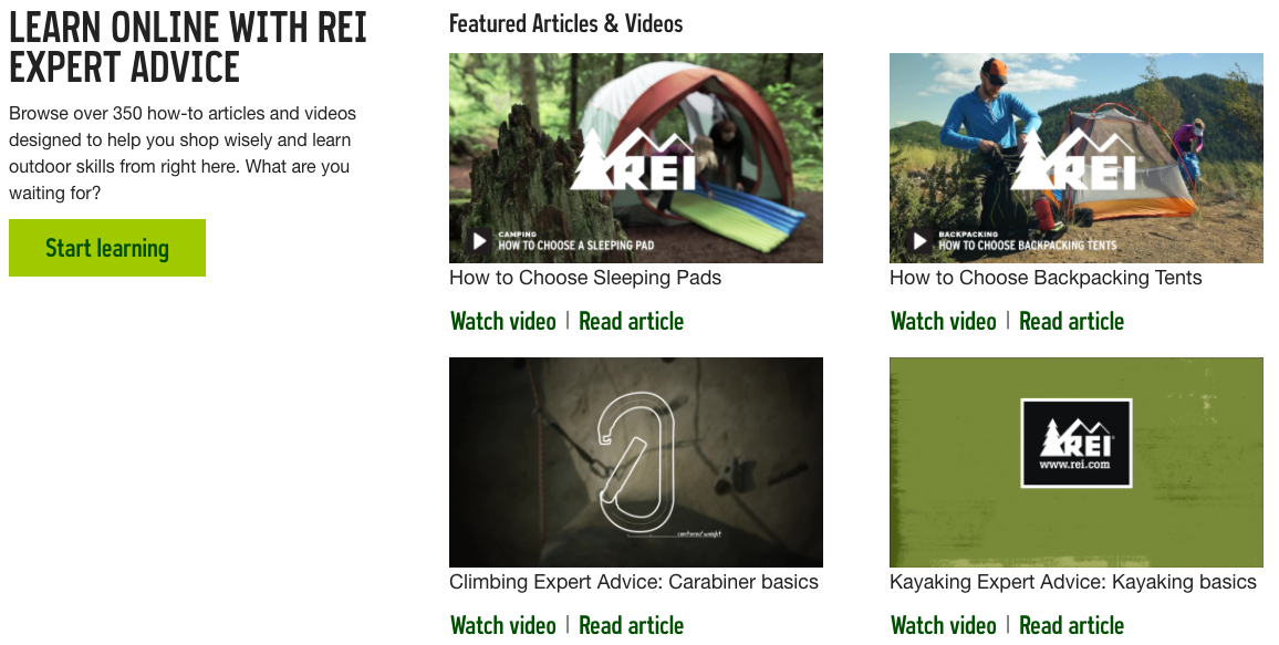
Here’s an example of the color green used on the REI website:
60. Blue
Blue is often used by banks and startups. It is the most popular color and used most frequently online.
- Dark blue is associated with trust and sincerity; light blue with youth and ideals.
Here’s an example of the color blue used on the CoSchedule website:
61. Pink
Pink is used to market products and services designed for women and girls.
- Associated with the romantic and feminine
- Can be negatively associated with “girly.”
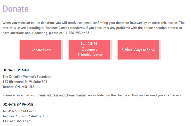
Here’s an example of the color pink used on the Canadian Women’s Foundation website:
62. Purple
Purple relates to beauty and anti-aging. The pink for middle-aged and older women.
- Associated with mature femininity, soothing and calm.
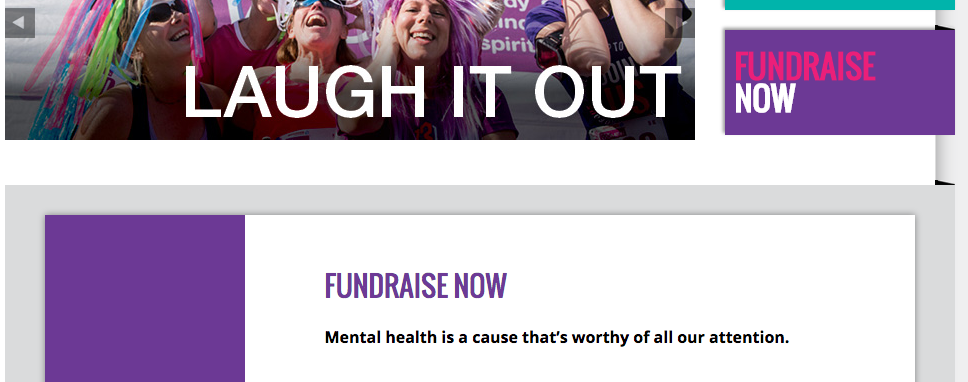
Here’s an example of the color purple used on the RunForWomen website:
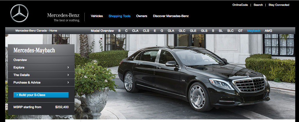
63. Black
Often used on corporate and long-existing, luxury-brand websites and brands: IBM, Mercedes, etc.
- Associated with professionalism, power and luxury.
- Negatively associated with death
Here’s an example of the color black used on the Mercedes Benz website:
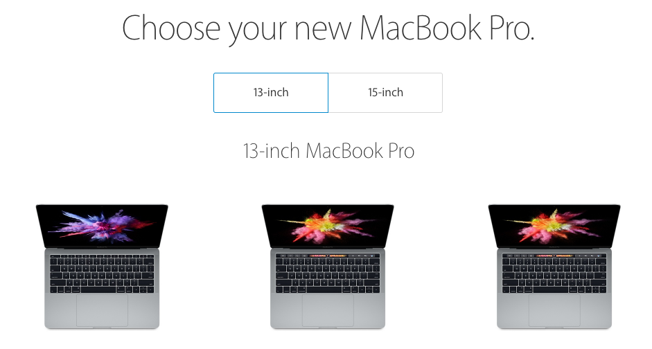
64. White
Often used on corporate sites to communicate modernity, white is used by designers seeking a minimalist aesthetic: Apple.
- Associated with innocence, purity, cleanliness and peace.
- Negatively associated with sterility and coldness (also death in China).
Here’s an example of the color white used on the Apple website:
65. Orange
The most frequently-used color for call-to-action buttons, orange contrasts well with a lot of colors and draws the eye effectively.
- Associated with aggressiveness but also positivity (similar to yellow, but without the youthfulness association).
Here’s an example of the color orange used on the Zendesk website:
66. Brown
Brown is a rarely-used color in landing page or website design. It’s people’s least-favorite color, but can be used with outdoor-focused websites or services.
- Associated with ruggedness and the outdoors
- Negatively associated with “ugly”
Here’s an example of the color brown used on the Wildlife Conservation Network website:
Creating Trust Through Design
The primary reason people will choose not to buy from you is lack of trust.
67. Pictures of People
The idea of a faceless corporation is almost entirely gone in modern digital marketing, and for good reason.
People don’t like working with them. It’s why personalization and merge tagging is so popular, why segmentation is such an important element of brand communication and lead nurturing.
And nothing personalizes a faceless corporation more than a face.
Here’s an example from Amy Porterfield’s webinar landing page
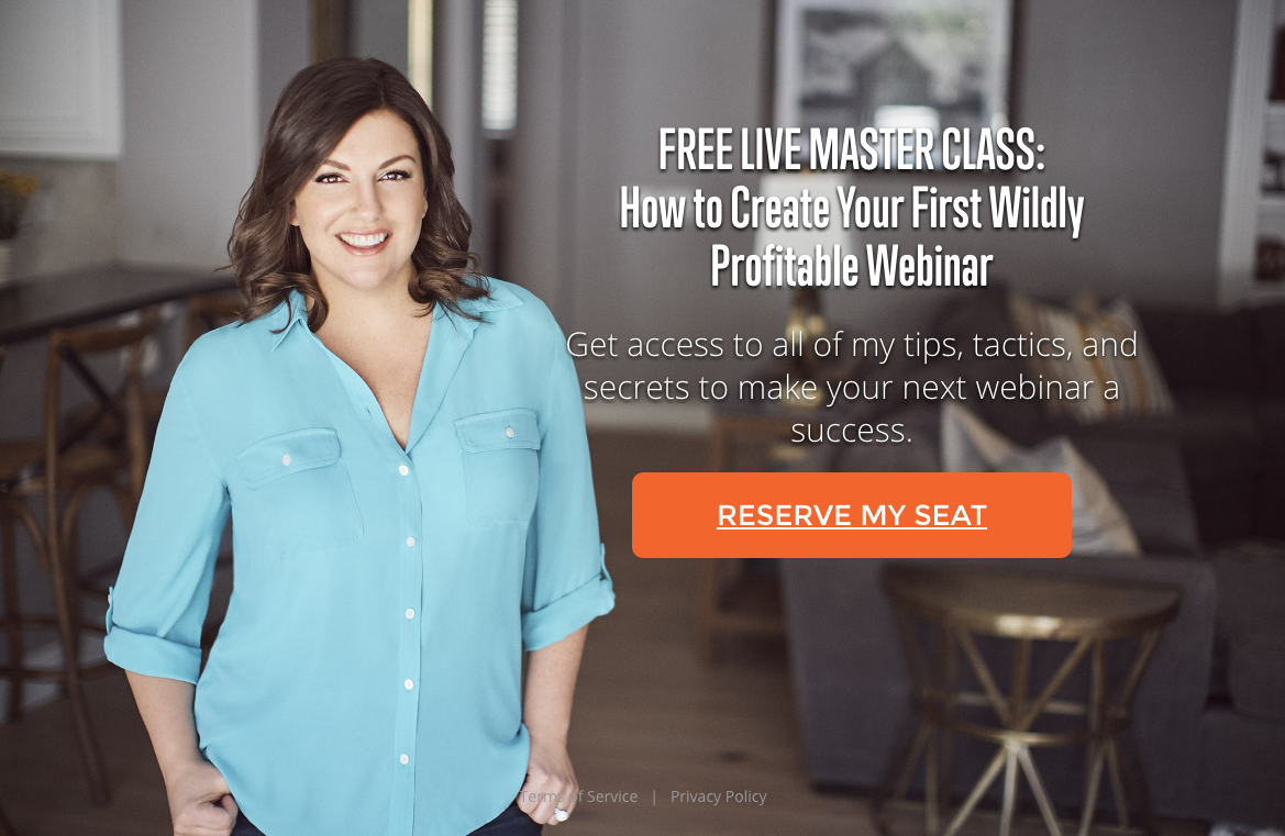
Notice she’s looking at the visitor:
“Eye-contact is the chief factor in non-verbal communication – something that makes up more than half of the meaning we take from a conversation. It’s equally essential in conversion optimization because eye-contact – no matter the medium – denotes trust, friendliness and openness. Studies show that eye-contact is also the first step in persuasion.” (Source)
68. Customer Testimonials
“I like the honesty of them. I like how you can feature a customer review as your landing page’s main image and that image will speak to everything you’re trying to communicate.
The value of engaging with your business is never clearer than when a previous customer is willing to stand ahead of you and say ‘Seriously, this business behind me had a huge influence on my own success.'” – Landing Page Customer Testimonials: The How the What and the Wherefore
Customer testimonials are an important part of your landing page’s design. There’s a few reasons why they’re so powerful:
- They showcase people like your landing page visitors, which makes what they say resonate more strongly.They feature real and relatable people, increasing the
- They showcase real people who have had experience with your brand, rather than theoretical success you quote people
- They showcase value points which you might not have a place for otherwise
- They showcase specific, case-study-like metrics in a real, concrete way
Here’s an example from KlientBoost legitimizing value with a customer testimonial:
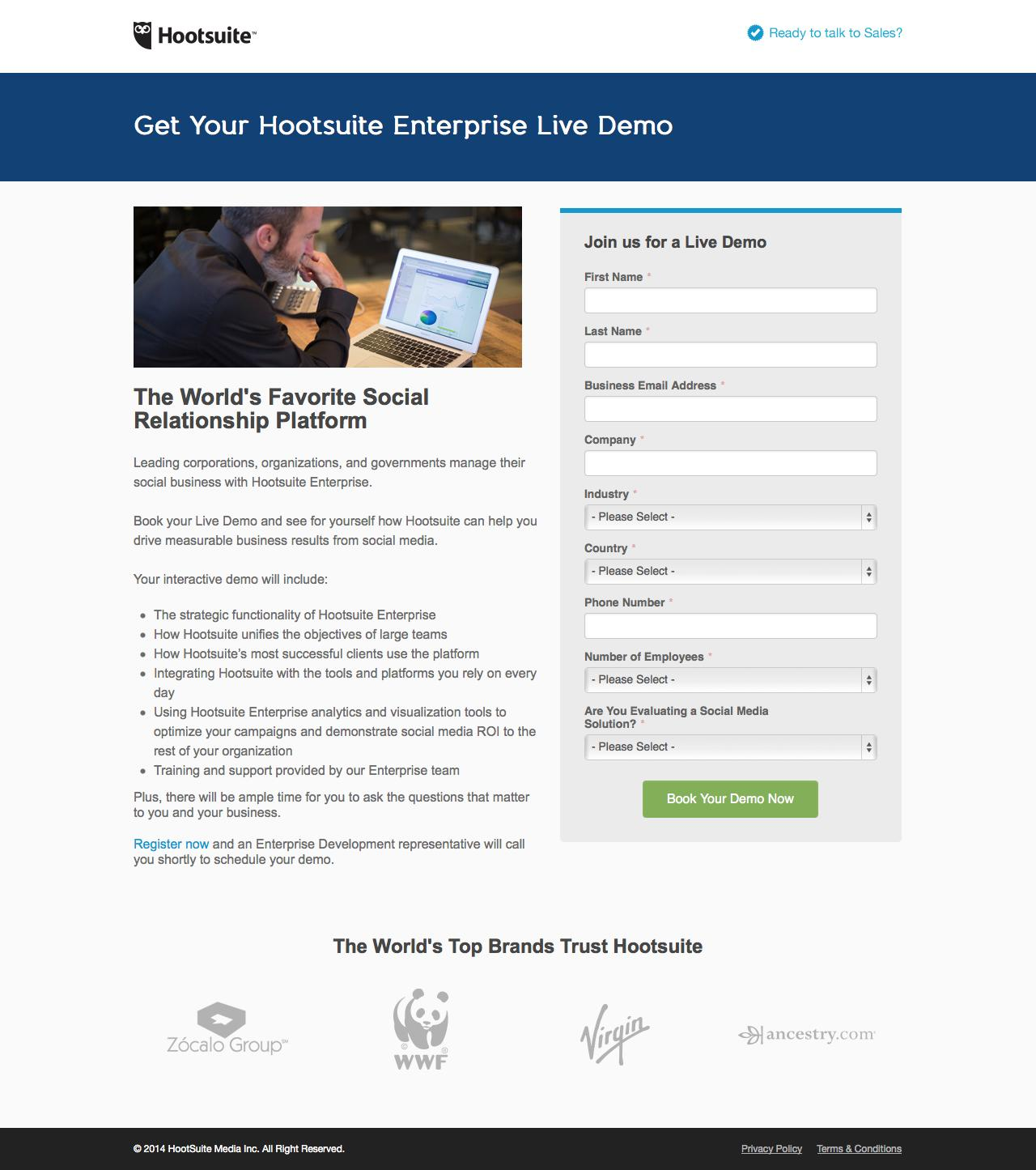
69. Building Legitimacy
There’s no possibility of a converting your landing page visitor if you can’t convince them you’re a legitimate company with legitimate value to provide.
A well-designed landing page can take you far with that, but a pretty face only gets you so far.
Here’s a few ways you can build legitimacy in your landing pages:
- Brand logos from companies you’ve worked with
- Customer testimonials
- Peer validation/proof with “Join [X] other Marketers…”
- Featured awards
- Official partner of…
Here’s an example from Hootsuite building legitimacy with brand logos:
70. Creating Likeability
We’re tribal.
At the heart of it, I trust my immediate family and friends far more than I do a random person walking down the street.
It’s gotten us into trouble a bit in these past few centuries, but for a long time that tribal nature saved us more often than not. People we didn’t know usually were trying to take our caves or best sticks or whatever.
We trust more the people we like. Think about a tupperware party (even if you’ve never been to one). Most of the people there don’t actually need tupperware, but they’ve been invited by their friends and feel an obligation.
Here’s how to use likeability in your landing page to increase conversion rates:
- Research your target market closely. What do they like? What do they sound like? What type of persona will they feel relates to them? Mirror it with your design, colors, images, content, social media voice, and every other way you can.
- Feature your brand’s employees or “face” prominently. Don’t be anonymous. Feature people and let them speak genuinely.
- Associate with relatable businesses, brand names or ideas your target market already likes. I know that I like my girlfriend’s friends more than I like strangers, even if I’ve never met either.
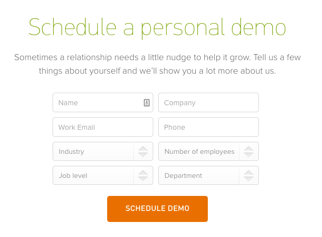
Here’s an example from Wistia creating likeability with a video:
71. Social Proof
Peer pressure works. It motivates far more of our behavior than you might think.
In 1969, psychologists created a study (published in the Journal of Personality and Social Psychology) in which a single man stopped in the middle of a New York sidewalk and stood, looking up like there was something there. The study sought to determine if peer pressure (even strangers) plays a role in people’s behavior:
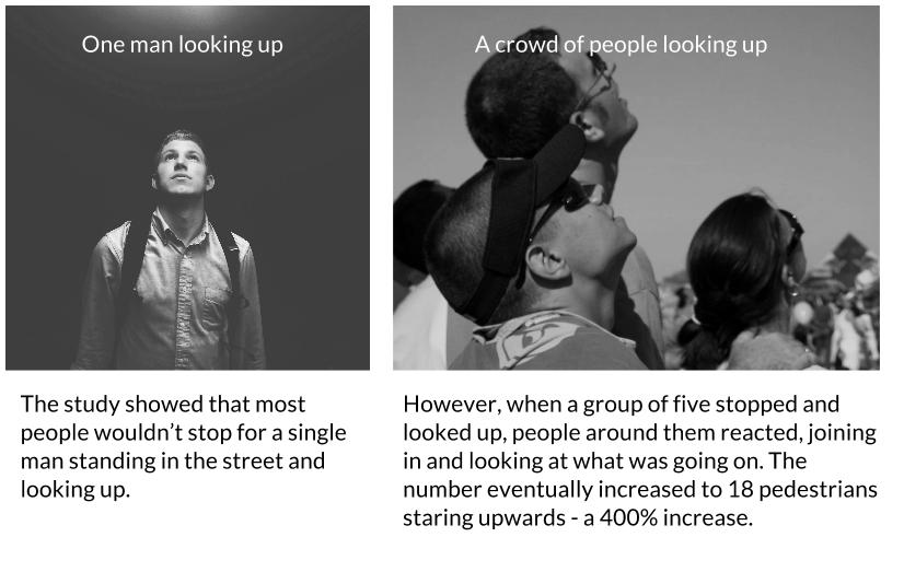
The study showed that most people wouldn’t stop for a single man standing in the street and looking up. But, when a group of five stopped and looked up, people around them reacted, joining in and looking at what was going on. The number eventually increased to 18 pedestrians staring upwards – a 400% increase.
If your landing page visitors know that someone like them has engaged or converted, they’re more likely to do so themselves.
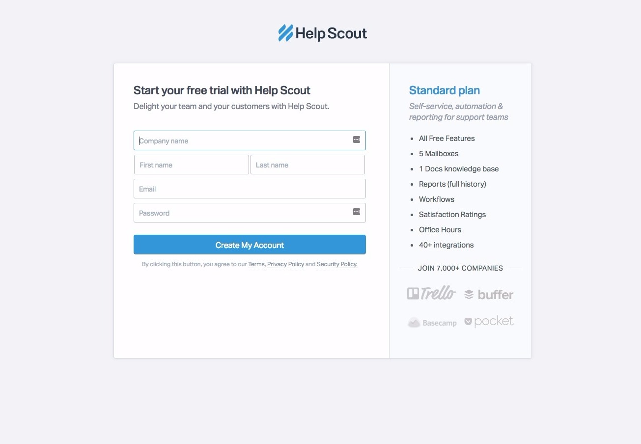
Here’s an example from HelpScout creating social proof with subtle peer validation (“Join 7,000+ companies”):
Landing Page Design Best Practices
Savvy companies know that custom landing pages are essential to maximise conversion of leads when using inbound marketing techniques like SEO, AdWords and social media to drive visitors to a site.
72. Hierarchy of Elements
You have a couple seconds to grab your visitor’s attention, communicate value, address objections and explain how they can convert.
That means you don’t get to place your social proof at the top of the page. You need to prioritize information.
Here’s a proven framework for prioritizing the elements of your landing page:
- Draw attention to a pain-point – Grabs the visitor’s attention
- Explain how your offer addresses that pain point – Do this either in the same headline or a subheader)
- Communicate unique selling point – Why are you, in particular, specifically capable of addressing the pain point best?
- Show how people can get the offer – Call-to-Action
- Address objections – Price, authority, legitimacy, etc (using peer pressure, social proof, testimonials, brand logos, etc)
When creating your landing page’s hierarchy, remember the F-Shape.
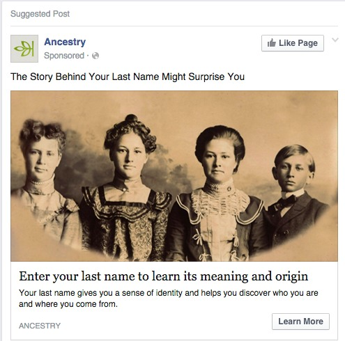
73. Campaign Consistency
Your Facebook or Google Ads are only as effective as the landing page they send people to. After all, what’s the point in getting 1,000 clicks on an ad if nobody ends up converting on what it’s advertising?
A primary best practice for landing pages is to retain the design and copywriting elements from your ad within your landing page. This assures the people who click that they’re in the right place and reiterates whatever value you communicated in the ad.
Here’s a Facebook Ad example from Ancestry.com:
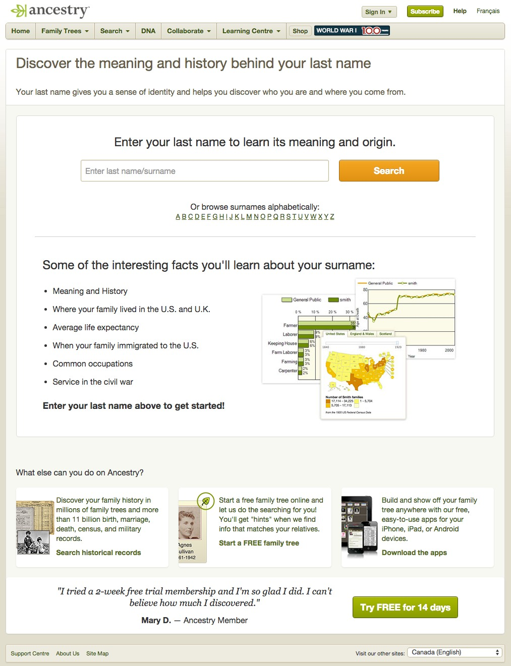
And here’s the corresponding landing page featuring an ad-consistent headline:
74. Single “Ask”
Above all else, a landing page is defined by having a single conversion goal – a single ask.
Some landing pages have navigation bars or a footer with external linking (though that’s against best practice) but, even if they do, it’s more important that the page have a single focus than that there are no external links.
Your page’s “ask” or conversion goal needs to be obvious, visible, eye-catching, and easy to convert upon. It should contrast with the page design and be extremely different from any other links on the page (or, better yet, just remove the links altogether).
Here’s an example of a “single-ask” landing page from Twelveskip:
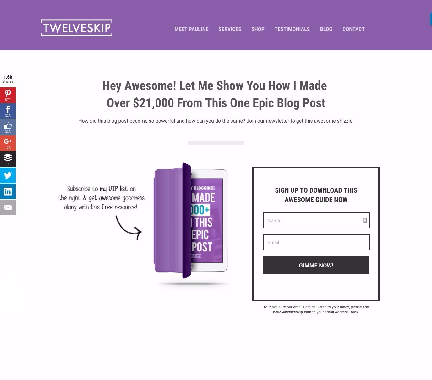
Even if there’s other links on the page (in the nav bar) there’s still only one focus point – one “ask.”
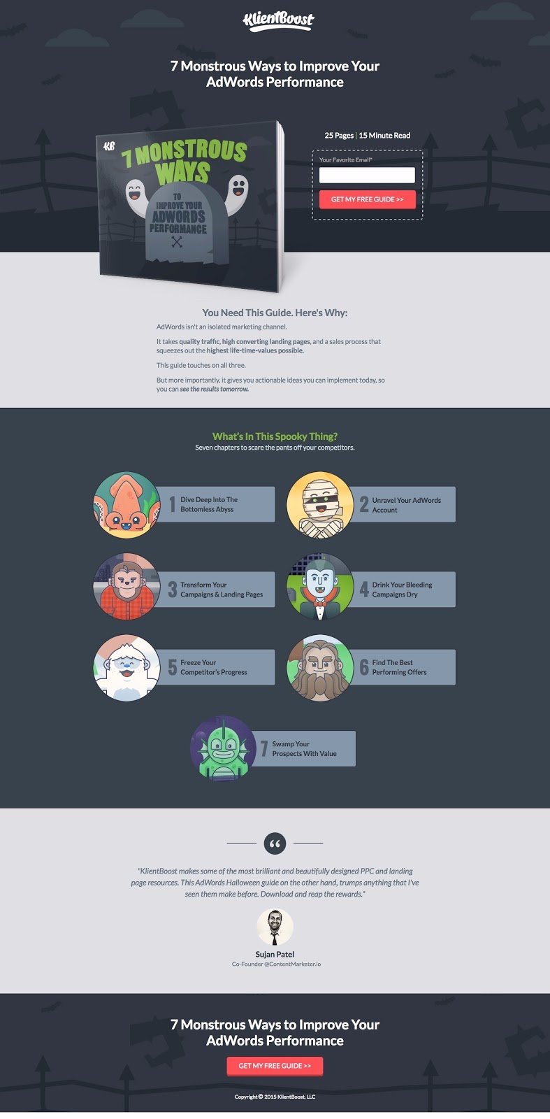
75. Benefit List
We touched on information overwhelm above, but I’ll reiterate the importance here, and recommend you use a benefit, bullet-pointed list whenever possible.
Avoid paragraphs to make your landing page easier to read and the value within it more obvious.
A benefit list is simply that, a list (bullet-pointed or with icon bullets) outlining the benefit of your offer to the visitor.
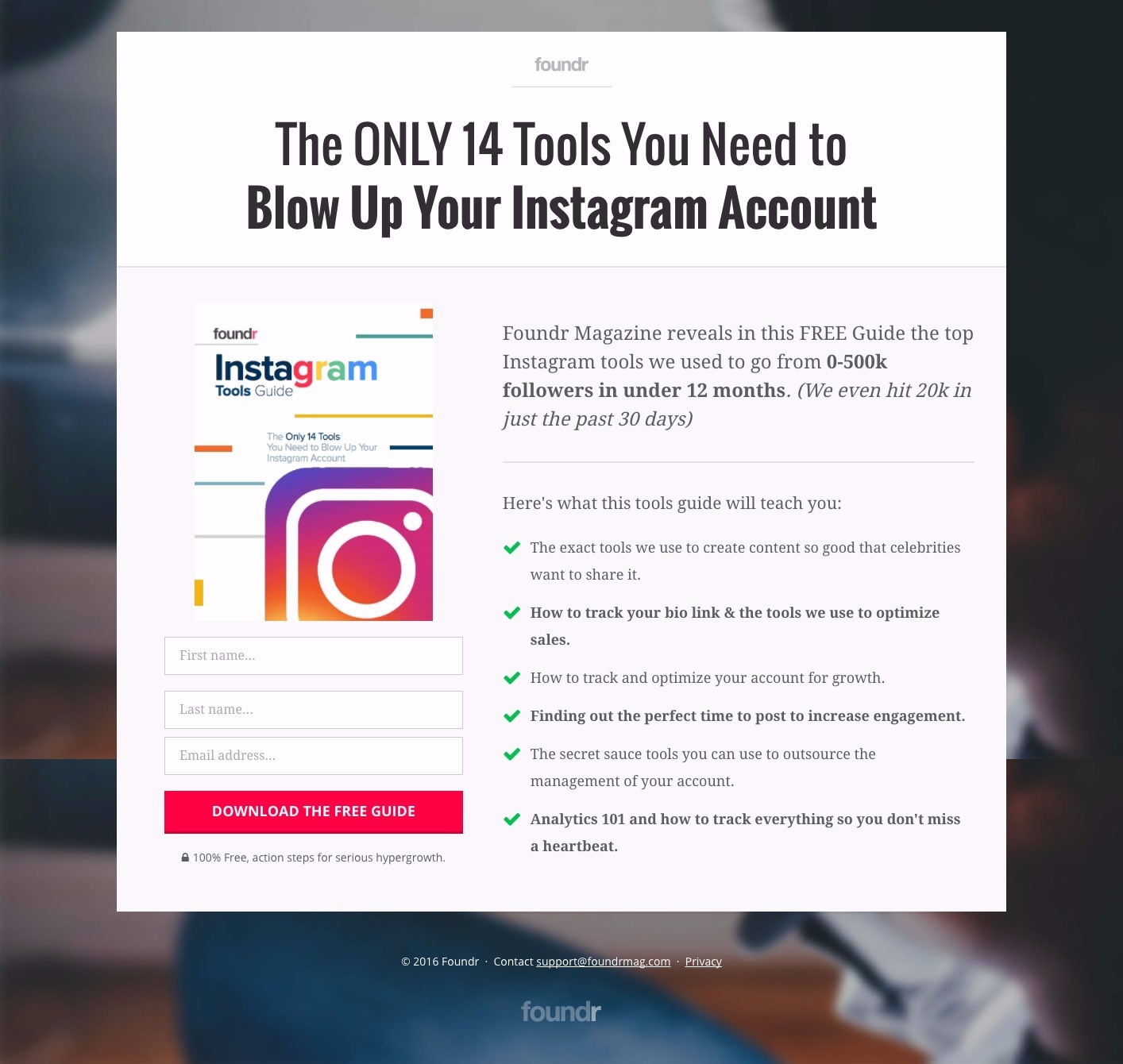
My recommendation is always to brainstorm 5-10 benefits of your offer/lead magnet and then use the best, most appealing one as a headline. The others should be outlined in bullet-point format below.
Here’s an example of information made more palatable with a benefit list from FoundrMag:

Landing Pages
500 Strategies, Ideas & Examples
Click below to download the most comprehensive collection of landing page strategies and examples ever compiled. Completely free.