101 of the Best Landing Pages Analyzed – Part 2
The Best Free Trial and Signup Landing Pages
46. Shopify Free Trial Landing Page
Shopify is a leading ecommerce website platform.
Here’s one of their best landing pages:
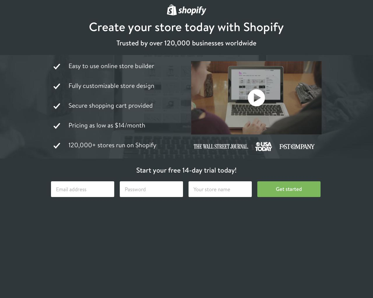
Why This is One of the Best Landing Pages Out There::
- No paragraph text – the messaging is short and to the point.
- The reliance on a good, five-point benefit list and a few brand logos to create trust.
- An excellent and professional video communicates, with personality, everything the landing page would do with cold, boring text.
- The horizontal signup form shortens the page, allowing everything to be above the fold.
47. AdEspresso Free Trial Landing Page
AdEspresso is an industry-leading PPC management agency and service focused on Facebook Advertising. They’re known for (among other things) their beautifully-designed content.
Here’s one of their best landing pages:
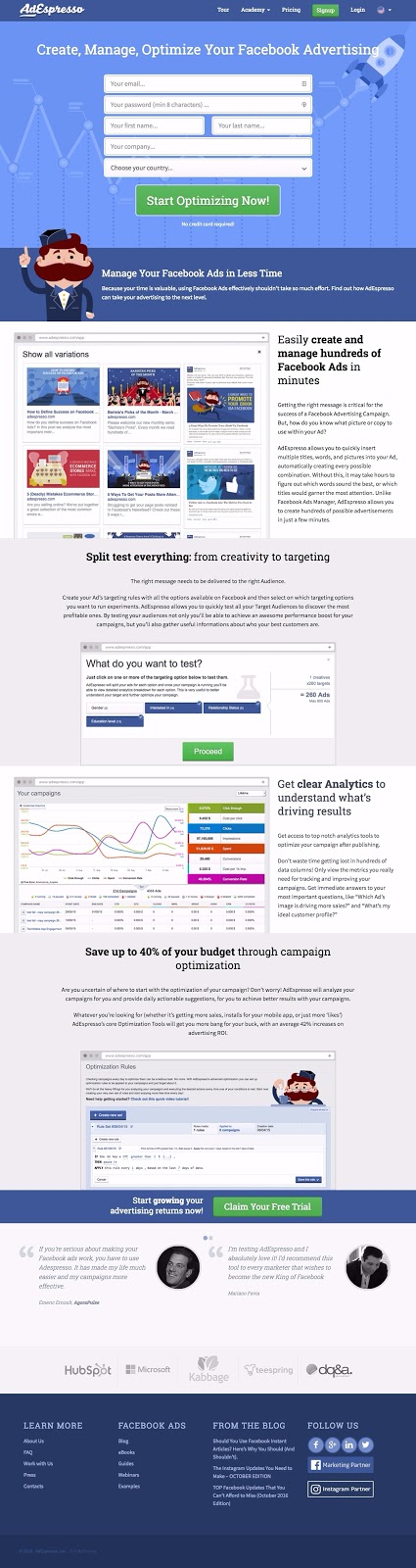
Why This is One of the Best Landing Pages Out There:
Four distinct value propositions and selling points, separated into distinct sections and backed up with relevant screenshots to show off the platform:
- Easily create Facebook ads in minutes
- Split test everything
- Get clear analytics
- Save up to 40% of your budget (price point USP)
- Three CTA buttons with different copy, to appeal to everyone
- Start Optimizing Now
- Proceed
- Claim Your Free Trial (My favorite, as “claiming” insinuates that it’s already the property of the prospective lead)
- Two customer testimonials with headshots and full names
- Three recognized business brand names and two lesser-known ones; this proves both that Adespresso is legitimate enough to work with Microsoft, but not too big to alienate DQ&A.
48. Wordstream Free Trial Landing Page
Adespresso is another industry-leading PPC management agency offering social ad packages or full service.
Here’s one of their best landing pages:
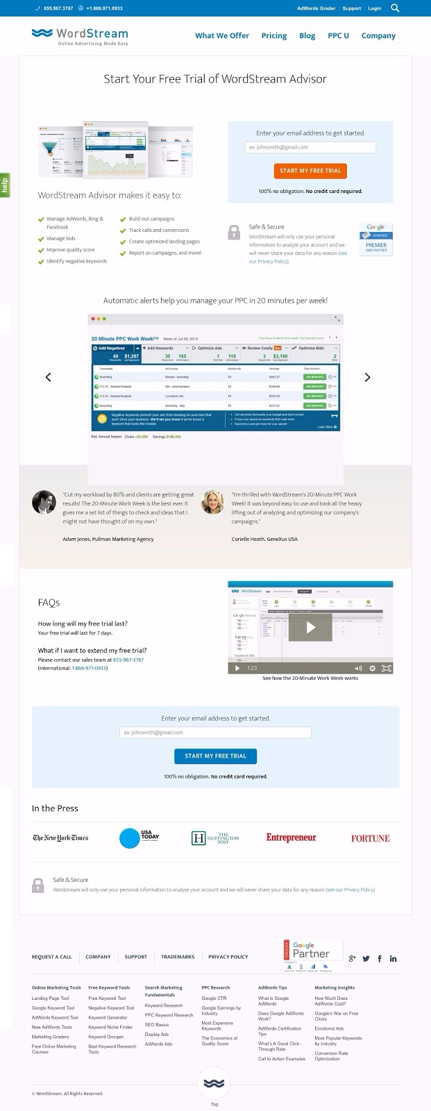
Why This is One of the Best Landing Pages Out There:
- Above-the-fold focus on a benefit list, contrasting CTA button, simple form field and assurance to the visitor that the service is “safe and secure” as well as an official Google partner. This shows the hierarchy of information they want to communicate, and these elements have been chosen correctly.
- Screenshot-centric middle section to show their dashboard off.
- Customer testimonials with full names, headshots and specific benefits. This is the strength of testimonials (particularly Adam Jones’ “Cut my workload by 80%”) – specificity.
- A video showing how their “20 minute work week” strategy works in action, as well introducing visitors to the brand tone.
- Second, below-the-fold field and CTA so visitors don’t have to scroll up.
49. Helpscout Free Trial Landing Page
Helpscout create customer support tools with help desk, knowledge base and “docs” software.
Here’s one of their best landing pages:
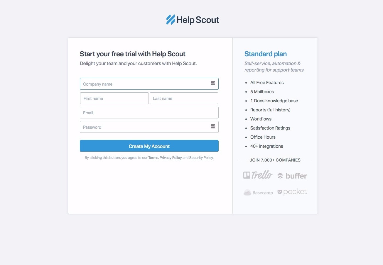
Why This is One of the Best Landing Pages Out There:
- Anyone who’s visiting this landing page is likely to have already been sold through content and product pages. Nonetheless, Helpscout brings it home with a simple and clean design, centered on your screen and with great spacing and implementing design best practice.
- The right-side “standard plan” section is encapsulated and reiterates 8 of the main points they would have communicated on their product page.
- They also feature some brand legitimacy points with “Join 7,000+ companies” as well as 4 recognizable brand names and logos that their target market would be extremely familiar with – and few who weren’t their target market.
- The brand names you mention tell your visitor who you are, and help to ensure you generate leads who are actually interested and to whom your service is applicable.
50. Tableau Free Trial Landing Page
Tableau is a data-focused software provider, enabling users to see all their platform’s data in one place and take action on it intelligently.
Here’s one of their best landing pages:
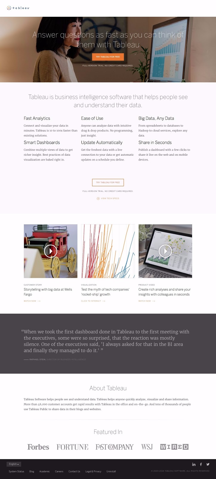
Why This is One of the Best Landing Pages Out There:
- Non-stock image of a respectable woman (resembles Tableau’s ICP) using their platform. This also showcases the look of their dashboard.
- Two CTAs – one above the fold and one below – both featuring “Full version trial. No credit card required” which is important to place front and center.
- Six benefits of use presented in three clean columns and with large, simple headers and short, three-line breakdowns.
- Two videos which open right in the signup page.
- No navigation bar, making this a true landing page.
- Expand chevron for “View tech specs” for those who want it.
- Customer testimonial is large and discusses specific reactions and needs addressed.
51. Harry’s Free Trial Landing Page
Harry’s is an industry-leading creator of men’s shavers and accessories
Here’s one of their best landing pages:
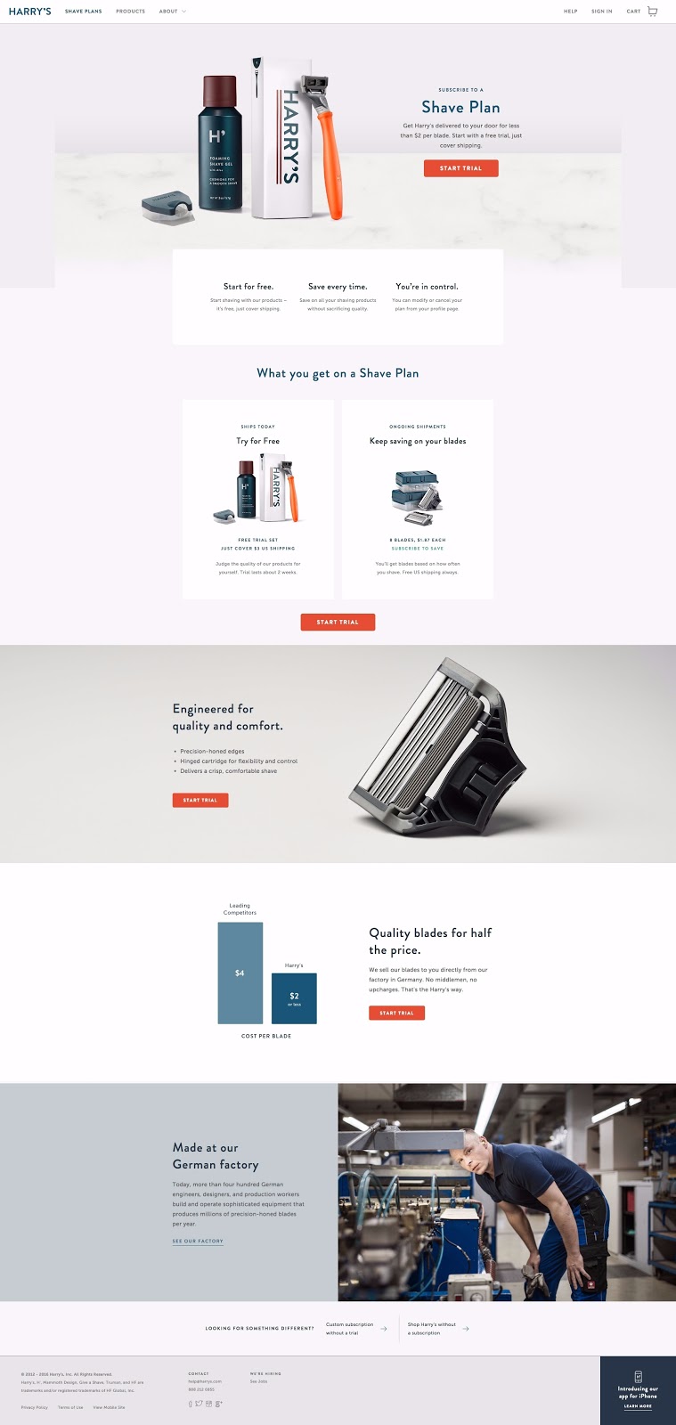
Why This is One of the Best Landing Pages Out There:
- 4 CTAs (with the same conversion goal) ensure that whenever a visitor decides they’re “sold,” they can convert. No scrolling necessary.
- 3 unique selling propositions to maximize the chance of a visitor being “sold” on at least one of them:
- “Engineered for quality and comfort” (with high-res image of the shaver)
- “Quality blades for half the price” (price point USP)
- “Made at our German factory” (connotatively communicates quality)
- This page is all about addressing visitor’s potential objections:
- Price objection: “it’s free. Just cover shipping.”
- Quality: “Save […] without sacrificing quality” (plus the german thing below)
- Commitment: “You’re in control. You can modify or cancel your plan from your profile page.”
52. Socedo Free Trial Landing Page
Socedo is B2B demand generation software focused on helping businesses “discover, engage and qualify” prospects through social media.
Here’s one of their best landing pages:
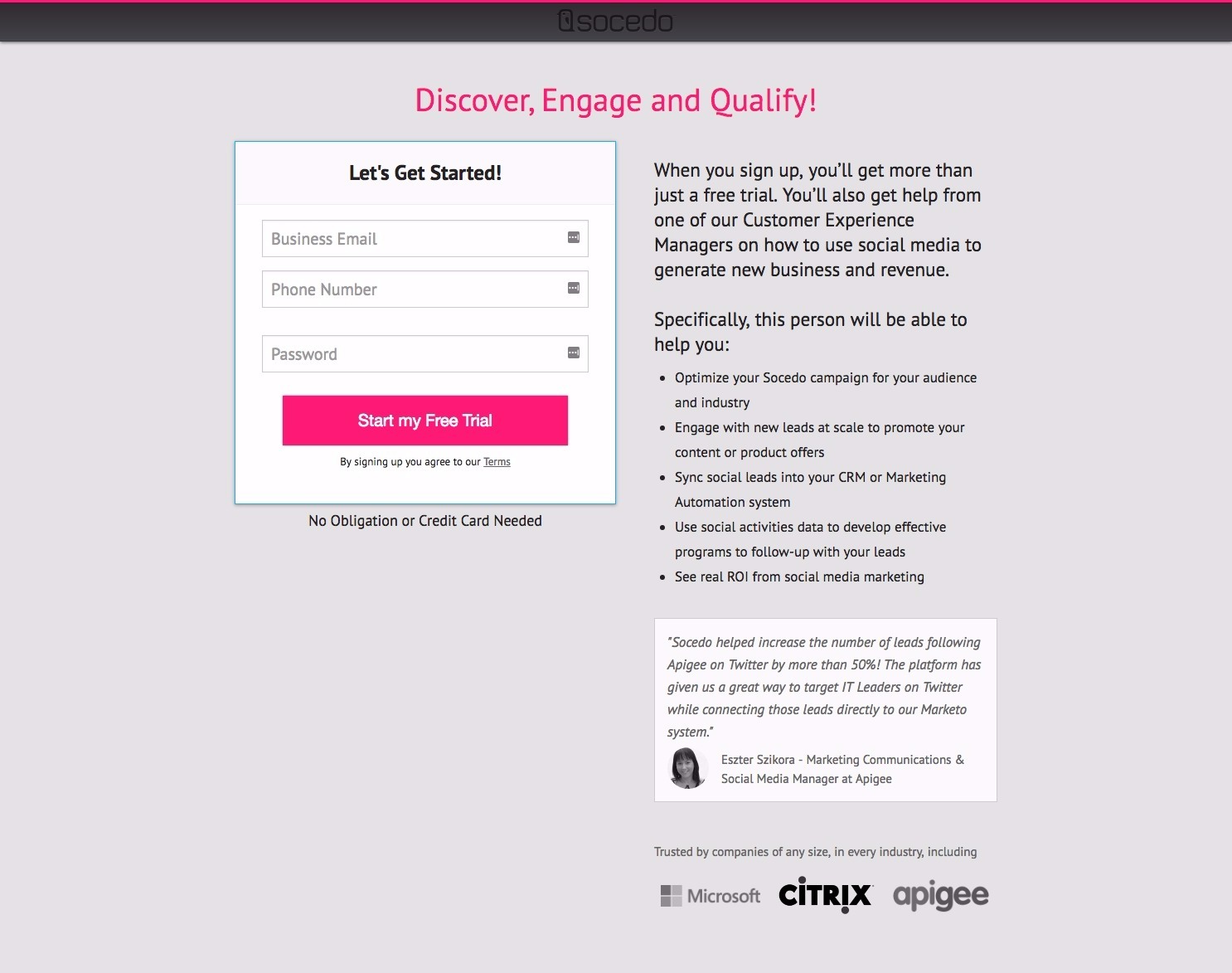
Why This is One of the Best Landing Pages Out There:
- The repetition of their motto “discover, engage and qualify” adds consistency to their sales funnel, which is best practice and also yields better conversion rates throughout.
- The testimonial (encapsulated and separated from the rest of the copy) is a good one with a headshot, job title and business name.
- Brand names cover everything from Enterprise (Microsoft) to medium (Citrix) and Apigee (Small) to showcase that Socedo can address the needs of every business.
- If your business doesn’t ask for credit card information for a free trial, or even a limitation on time, make that information extremely clear, as Socedo has done beneath their form.
53. CoSchedule Signup Landing Page
CoSchedule creates an industry-leading marketing calendars for social media, content marketing, blog management and other marketing-related projects.
Here’s one of their best landing pages:
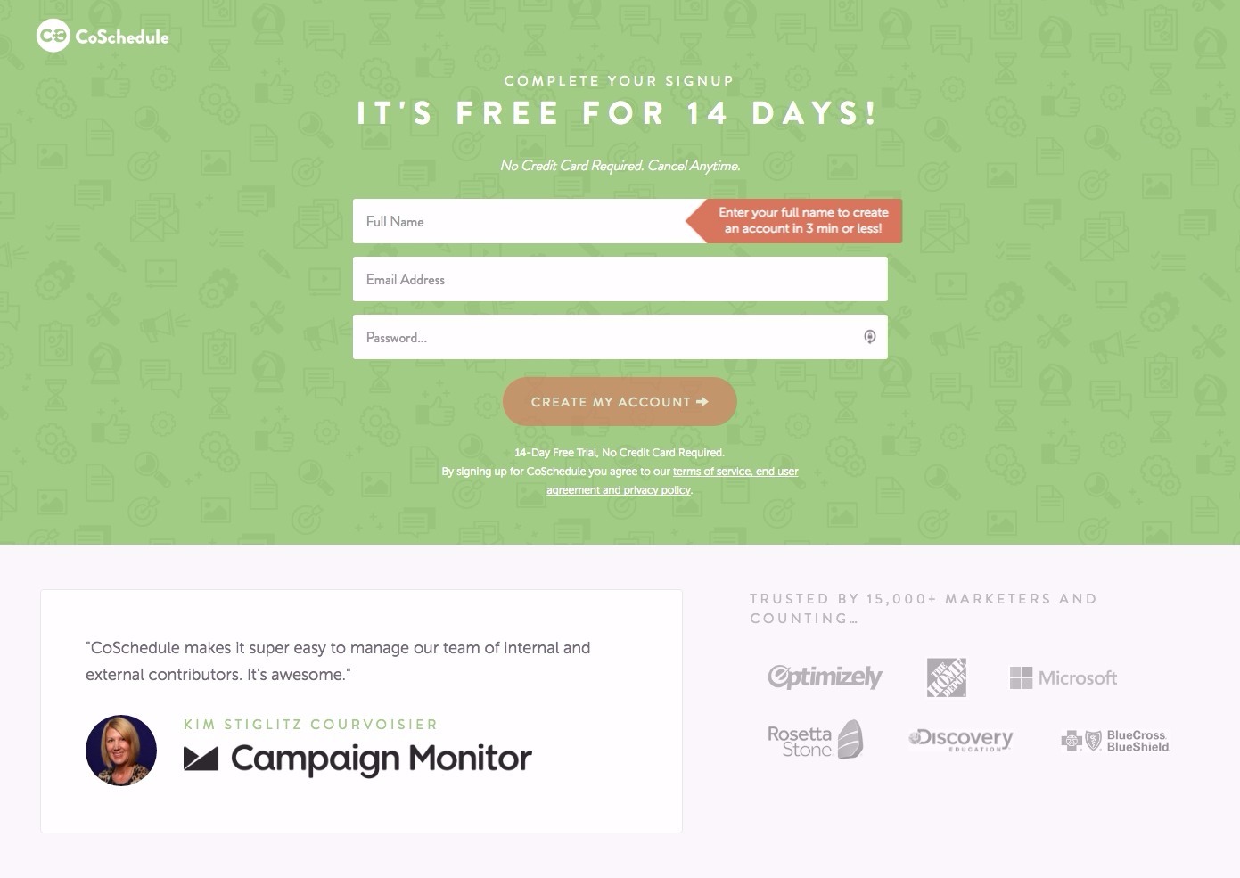
Why This is One of the Best Landing Pages Out There:
- Directional cue draws the eye towards the first field as soon as you scroll over it, mentions the time required to convert (3 min or less) which is best practice if you can find a place for it.
- Again, this page mentions the fact that no credit card is required. This is one of the main pain points for free trial page visitors so should be addressed immediately.
- Like Mailchimp above, the CTA button only brightens when the form is filled out entirely. This makes the lead feel like they’ve accomplished something.
- Customer testimonial and brand logos from businesses the target market is familiar with. This adds legitimacy.
- No external navigation whatsoever focuses attention where CoSchedule wants it – the CTA button.
54. Resumator Free Trial Landing Page
Resumator (now rebranded as Jazz), helps businesses recruit and hire employees.
Here’s one of their best landing pages:
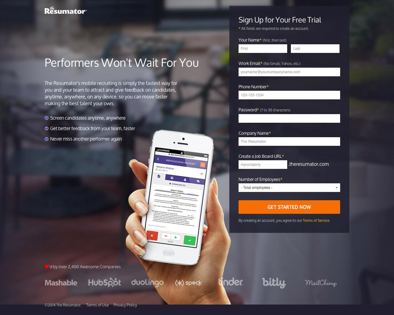
Why This is One of the Best Landing Pages Out There:
- This landing page centers on the image of the software/app itself, showcasing the look and feel of the app in your hand.
- Benefit list communicates quickly and easily the strengths of the app and why it’s appealing.
- Trust-symbols, in the form of successful and recognizable brand logos with whom Resumator has worked, build trust with the visitor: “If these companies have worked with Resumator, I can trust them too.”
- The signup process/form is complete, meaning everything is on this page. Once you’ve completed this form, you don’t have to do anything else to get rolling. Test this strategy for yourself – progressive signup or all-in-one?
55. Intouch Insight Free Trial Landing Page
Intouch Insight is an enterprise-level software company which captures mobile data to bring mobile auditing, mobile shopping, customer surveys and event data capture together in one place.
Here’s one of their best landing pages:
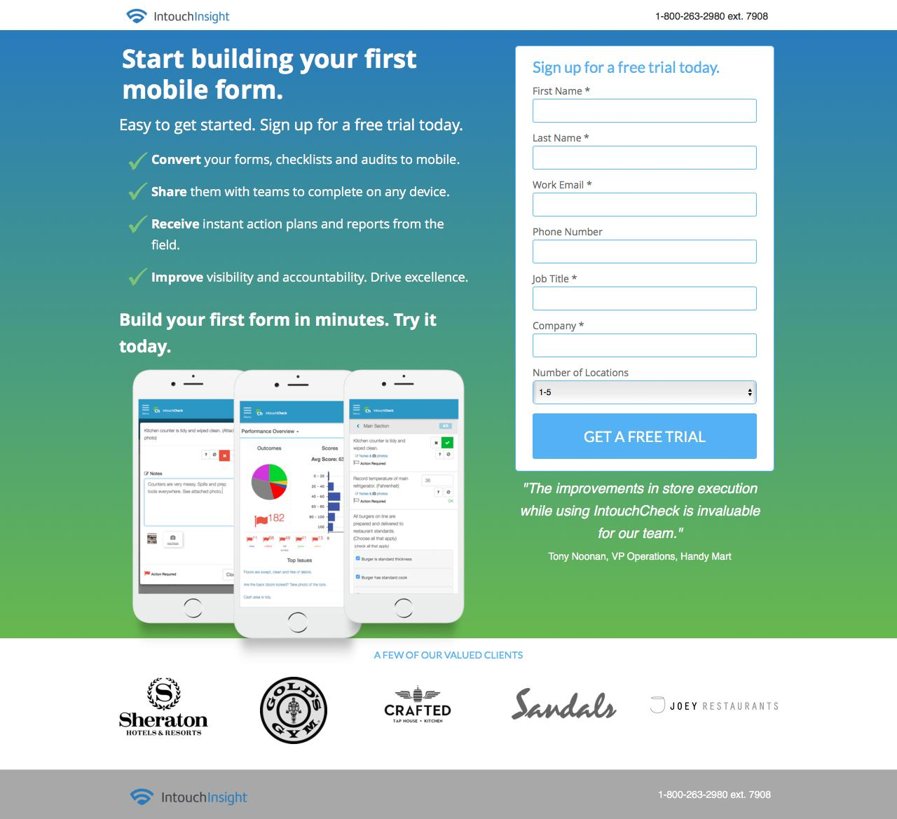
Why This is One of the Best Landing Pages Out There:
- Intouch Insight has built free trial landing pages for each of their products, personalizing the messaging to match best with what website visitors are interested in.
- Placing product screenshots front and center ensures visitors know you’re not hiding anything, and the visuals communicate value as much as text.
- Customer testimonial and brand logos drive trust with visitors
- Removing the navigation bar at the top and the normal footer ensures there are no distractions for landing page visitors.
56. Uscreen Free Trial Landing Page
Uscreen is a cloud-based software company offering e-learning and video hosting software alongside numerous features based around video on demand and visual content management.
Here’s one of their best landing pages:
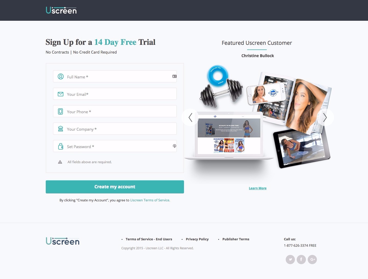
Why This is One of the Best Landing Pages Out There:
- The UScreen free trial landing page is, interestingly, based on case studies which are held off-page. This is a very interesting strategy, but clearly a winning one (their free trial page has been tested extensively). Crucial to this strategy is the fact that the case study page opens in a new tab, ensuring that visitors can return easily to the free trial page once they’re convinced.
- A case study is an excellent way to, objectively, communicate the value of your platform or service. Visitors see previous customers are more unbiased than your marketing team (and legitimately so). They trust them far more than they do you.
- The free trial landing page is also super professional with good balance, a contrasting and large CTA button and no navigation bar.
57. DocuSign Free Trial Landing Page
DocuSign allows you to send, sign and approve e-documents from wherever you are, on any device.
Here’s one of their best landing pages:
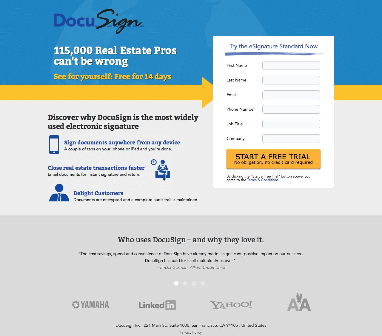
Why This is One of the Best Landing Pages Out There:
- Campaign-specific landing pages convert significantly better than general ones. If you can drive real estate specific visitors (like Docusign has here) from a PPC campaign or industry-specific content, be sure the landing page reflects their focus.
- Uses peer validation with “115,000 real estate pros can’t be wrong.”
- Uses a directional cue to drive the eye towards the form.
- Three-point, concise (one=line) benefit list with icons.
- Features customer testimonial with full name and where they work.
- Subtle but good brand validation at the bottom.
58. Mailchimp Signup Landing Page
Mailchimp is the leading email marketing platform for SMBs.
Here’s one of their best landing pages:
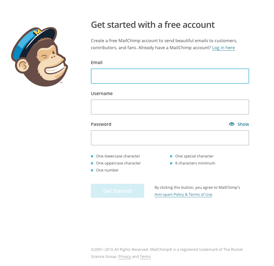
Why This is One of the Best Landing Pages Out There:
- The monkey (Freddie, if you care to know) is a huge part of Mailchimp’s branding and personality. He’s central here, as well. Without him this free trial page would be extremely white, with little to say for it. With him it’s a clean page with personality.
- A great touch here is the CTA button, which stays greyed out until all the form has been filled. You might be surprised to know that many people fill out forms completely but don’t take the final step of actually clicking the button. Making it blue only when the form’s been filled gives the prospective free trialer a sense of accomplishment (even if it’s only small) and might be the little subconscious thing they need to complete the ask.
- The headline is simple but good. It’s action oriented and features the “Free” thing prominently. The subheadline/copy afterward mentions the value of conversion.
59. Signpost Signup Landing Page
Signpost creates CRM software and marketing technology systems for small business.
Here’s one of their best landing pages:
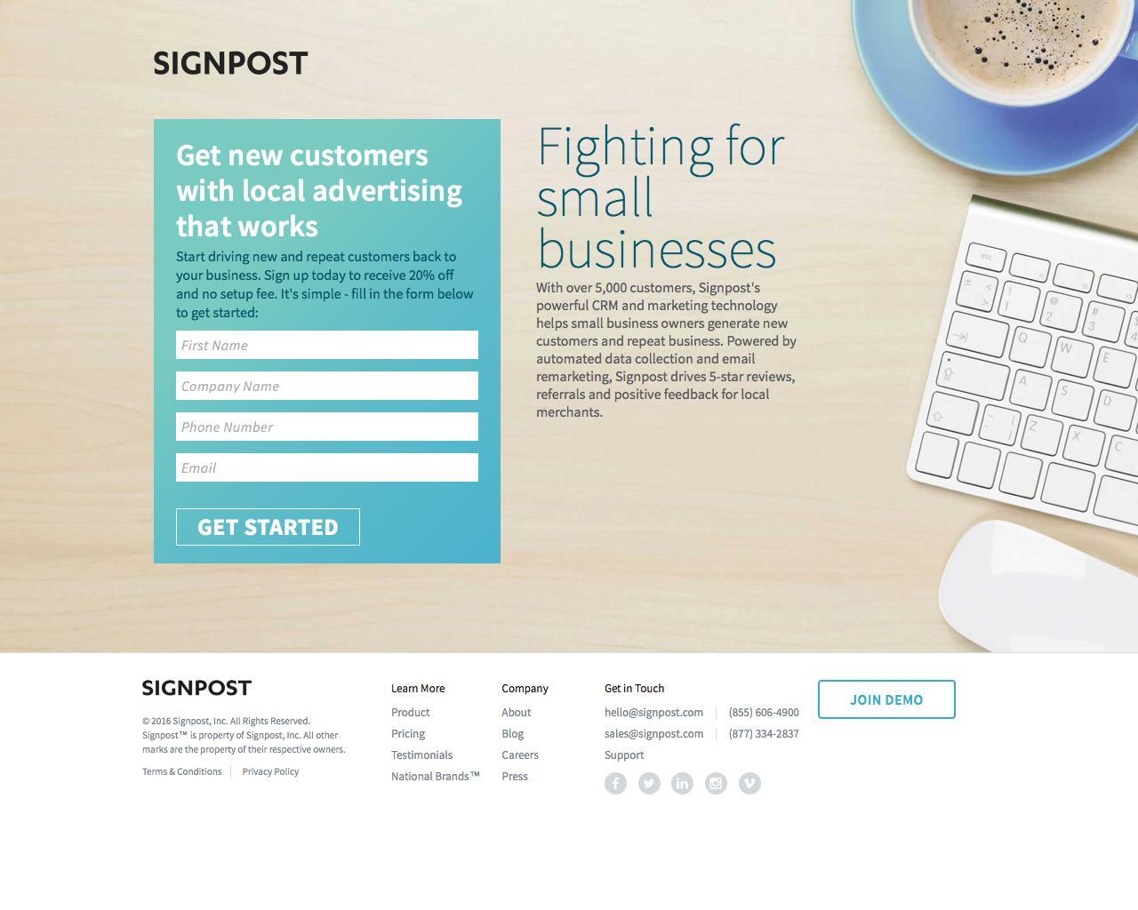
Why This is One of the Best Landing Pages Out There:
- Signpost knows that they have a few target markets – small, locally-based businesses being one of them. Creating campaigns and landing pages specific to each target market is essential to running an optimized marketing strategy.
- Incentivized signup (20% off, now) is a good idea for an individual campaign. In this case, Signpost is using a promotion alongside an ad campaign targeting small business advertisers.
- Featuring a “Join Demo” CTA is the only external (emphasised) link you should have on your signup page. Someone may not want to sign up immediately and may need a bit of a conversation before they do. Rather than having them bounce, not wanting to signup, maximize the chance of a conversion down the line by offering a demo.
60. Degoo Signup Landing Page
Degoo provides encrypted cloud backup storage for both individuals and businesses.
Here’s one of their best landing pages:
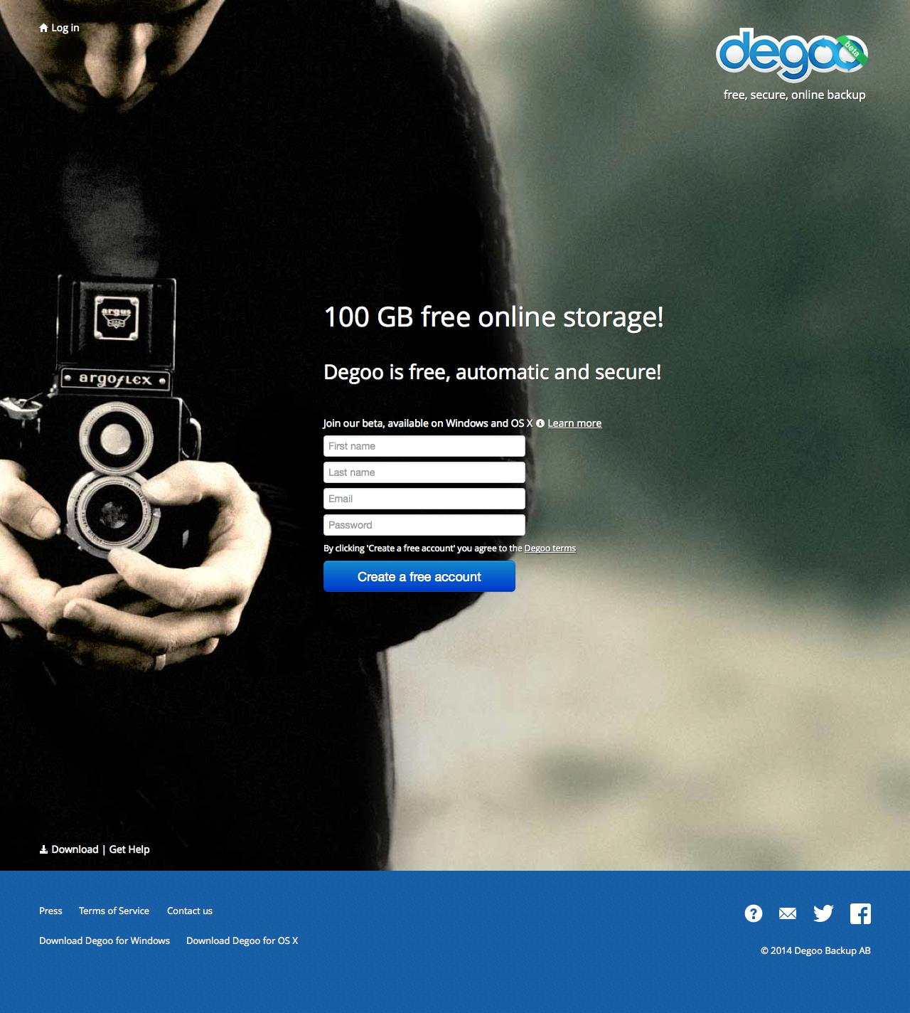
Why This is One of the Best Landing Pages Out There:
- There’s no more information than you need. Their USP (100 GB free online storage) and subheadline encompass everything you need to know to sign up.
- The form asks for everything needed to sign up, right there. The process is completed on this single page.
- The emphasis is clearly on the central headline, subheadline and form. There’s a huge amount of whitespace around it, limited (and de-emphasized) external links, and a high-contrast CTA button.
- Emphasis on the word “Free” is always good.
61. Zenefits Signup Landing Page
Zenefits is an online HR software provider, integrating everything from payroll and HR management to benefits, compliance and billed hour tracking.
Here’s one of their best landing pages:
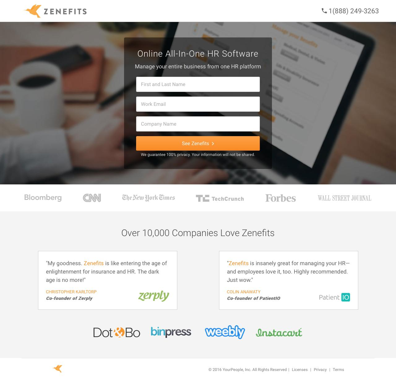
Why This is One of the Best Landing Pages Out There:
- Placing the form front and center drives attention to it and precludes the need for directional cues or excessive contrast (though Zenefits features high contrast on their CTA nonetheless.
- Zenefits likely has larger, more well-known businesses using its software, but they’ve chosen to promote companies like DotBo, Binpress, Weebly and Instacart instead (lesser-known companies). This is because their target market is SMBs, not huge corporations. Promoting their relationship with Coca Cola, for instance, might alienate the SMB target market.

Landing Pages
500 Strategies, Ideas & Examples
Click below to download the most comprehensive collection of landing page strategies and examples ever compiled. Completely free.