101 of the Best Landing Pages Analyzed – Part 3
The Best Webinar Landing Pages
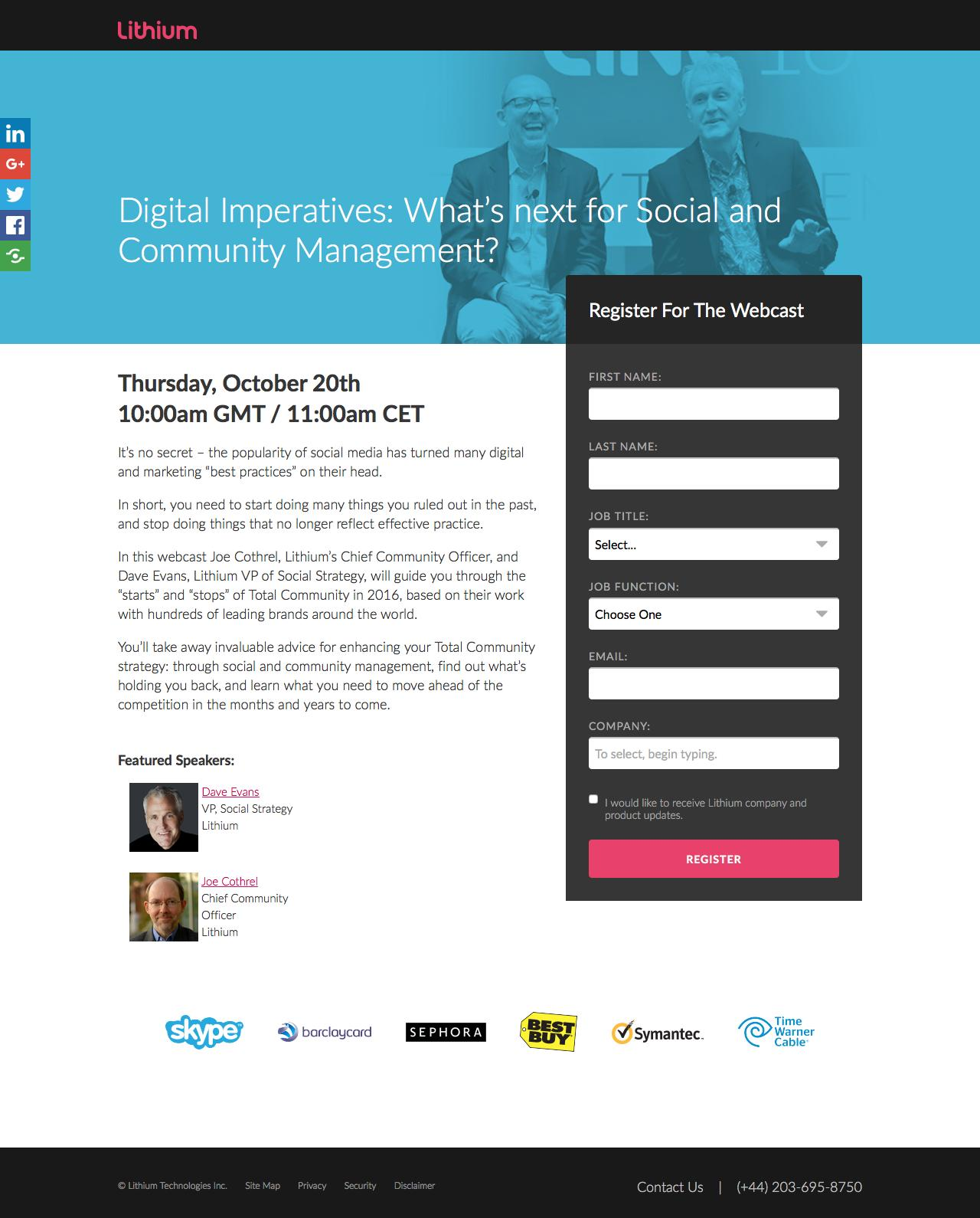
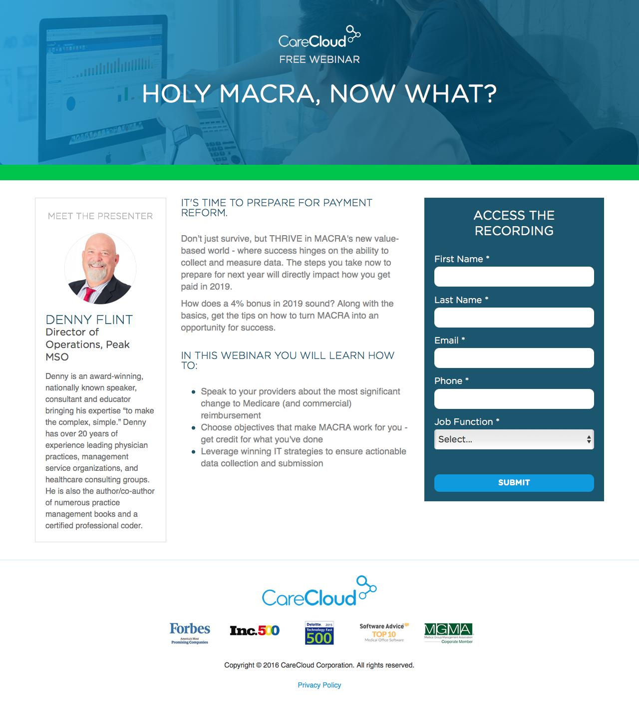
62. Lithium Webinar Landing Page
Lithium is a social media management and customer community software platform.
Here’s one of their best landing pages:
Why This is One of the Best Landing Pages Out There:
- The first thing that jumps out at you when you see this landing page is the smiling and laughing faces of the hosts in the top header image. This, immediately, makes you more likely to convert. People like knowing and liking the hosts of any webinar, event or conference. If you can find a candid image of your hosts (especially if they’ve ever been together) do so.
- I’m impressed and inspired by the form on this landing page. Placing email address (the only field you need from leads) fifth is a really interesting idea. Once people have started something, they’re likely to feel committed and want to finish. If you place the email address field below other, easy-to-offer, fields you might increase conversion rates.
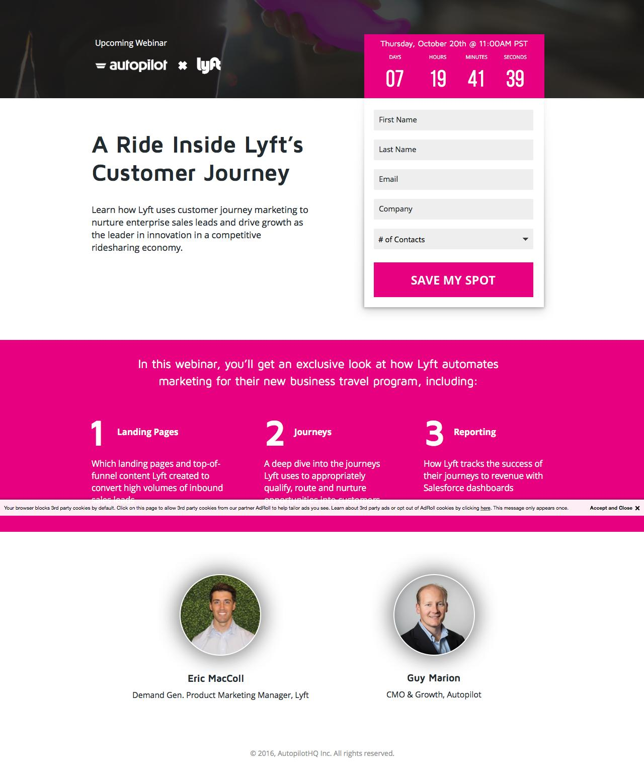
63. AutoPilot Webinar Landing Page
AutoPilot makes email marketing software to personalize the customer and prospective customer journey.
Here’s one of their best landing pages:
Why This is One of the Best Landing Pages Out There:
- Co-webinars are a great way to reach a new audience, as both businesses promote to their own contacts, thereby trading leads and customers.
- Countdown timers have shown to improve landing page conversion rates by 147%.
- The three-step “what you’ll learn” section makes it clear the value of the webinar and what registrants can look forward to.
- Featuring both the host and the guest (with headshots) increases the personal connection with visitors.
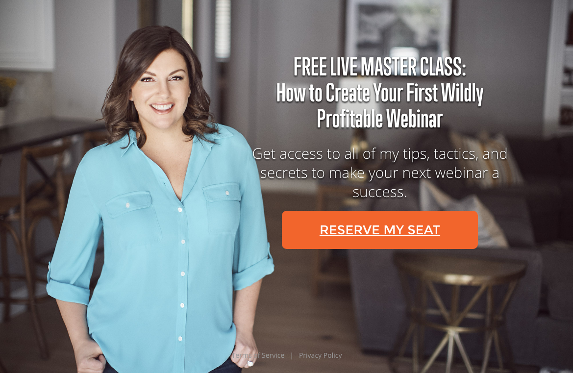
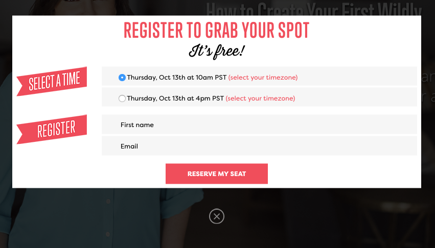
64. Amy Porterfield Webinar Landing Page
Amy Porterfield is a social media and digital marketing thought-leader, known for her webinars.
Here’s one of her best landing pages:
Why This is One of the Best Landing Pages Out There:
- Amy Porterfield is one of the leading webinar hosts for digital marketers. She’s recognizable and trustworthy. Though the image on her webinar landing page has changed from time to time, her design has remained the same – indicating to me that this is optimized as well as her and her team can make it. Whenever a landing page stays the same for an extended period of time (and the company behind it is one with a sizable budget and team) you know it’s been tested and found optimized.
- This is a two-step landing page, where the form appears as a click popup only after the CTA button is clicked.
- She offers multiple timeslots, maximizing the chance of visitors being able to register.
- She features herself front and center. This improves the chance of registrants attending (as they feel like they know her).
65. Kissmetrics Webinar Landing Page
Kissmetrics is a software platform which tracks and analyzes a business’ customer behavior with the focusing on turning website traffic into customers.
Here’s one of their best landing pages:
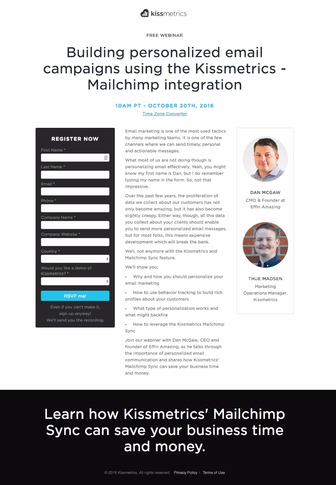
Why This is One of the Best Landing Pages Out There:
- This is another webinar landing page which hasn’t changed in a long time. Kissmetrics tests everything, but their webinar page template has remained the same for as long as I’ve known them (a couple years now). This indicates it’s optimized for them and their audience.
- This page features both hosts with their headshots, names and job titles.
- The timezone converter is a good call, as it enables prospective registrants to easily determine if they can watch.
- This landing page has a couple headlines – one at the top and one at the bottom, ensuring that anybody who scrolls down is hit with another emphasized value proposition.
66. Wistia Webinar Landing Page
Wistia is a leading video hosting platform that provides users with hosting, marketing tools (lead generation, primarily) and analytics.
Here’s one of their best landing pages:
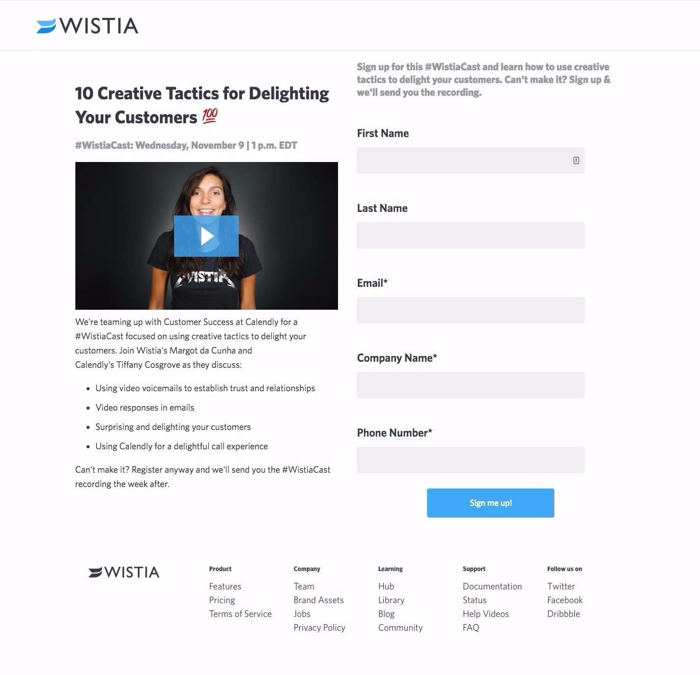
Why This is One of the Best Landing Pages Out There:
- As a video platform, Wistia features videos constantly, and with good reason. The webinar host, Margot da Cunha, is front and center here, adding personality and communicating the value of the webinar in a friendly way which encourages registration and attendance both.
- The CTA is action-oriented and inspires engagement with an exclamation point and personal pronoun.
- The “Can’t make it? Sign up and we’ll send you the recording” option is a good one because it addresses any visitor’s concern that they won’t be able to attend. Webinar attendance usually floats anywhere between 30 and 50%, so letting registrants know they’ll get a recording no matter what is worth doing.
67. Jeff Goins Webinar Landing Page
Jeff Goins is an author and content creator whose blog “Goins, Writer” is a leading platform for anyone looking to create better content or hone their writing skils.
Here’s one of his best landing pages:
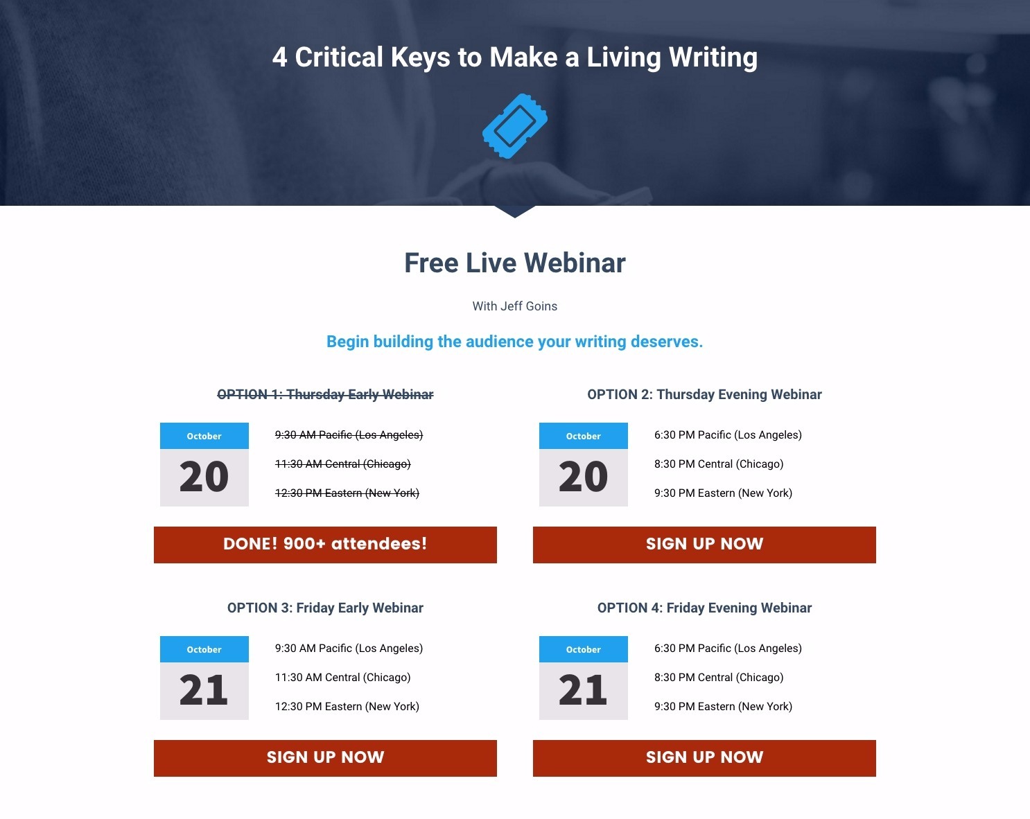
Why This is One of the Best Landing Pages Out There:
- Simplicity first and foremost. Anyone arriving on this page has already gotten or seen value from Jeff. They’re not coming here without knowing him or how good he is. So why spend paragraphs reiterating it? Amy Porterfield has the same strategy. Only “sell” your landing page visitors if they need to be sold on you or if your landing page is collecting new traffic.
- Four webinar times maximizes the chance of this webinar being attended, and I like that he updates the landing page once a webinar has been completed.
- The note “900+ attendees” is a great way to add third-party legitimacy to the page. If more than 900 people attended the webinar on the 20th, it must be a valuable experience.
68. Engagio Co-Webinar Landing Page
Engagio is an “account-based” software platform which adds to your CRM and marketing automation platforms with analytics and outbound interactions.
Here’s one of their best landing pages:
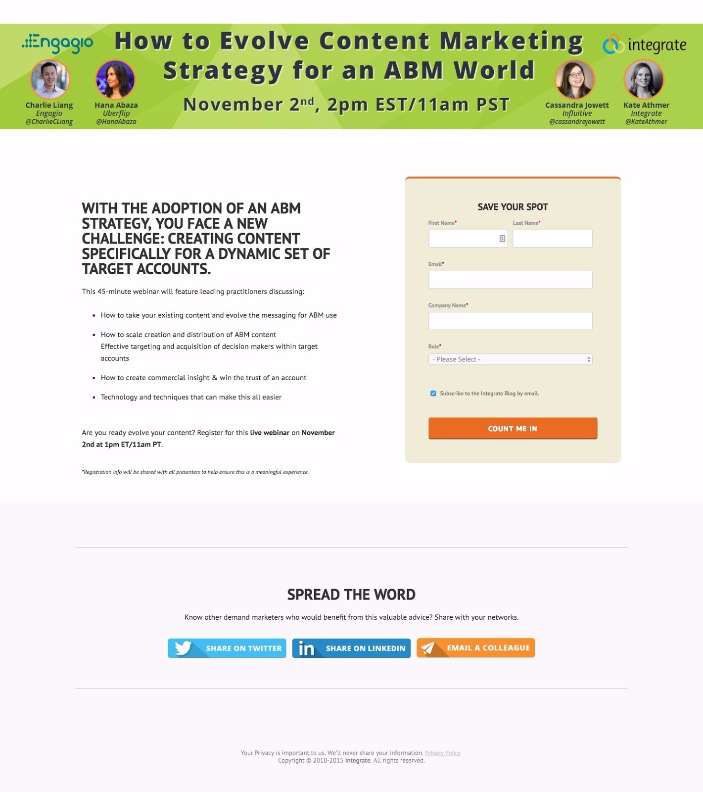
Why This is One of the Best Landing Pages Out There:
- Teaming up with three other companies triples the reach of Engagio’s webinar and exposes each brand to an entirely new audience.
- The sub-headline draws attention to the visitor’s pain point, and the copy below (as is best practice) addresses how the lead magnet can help assuage that pain point immediately.
- I also really like the “Count me In” CTA copy.
69. Geoffrey Owen Webinar Landing Page
Geoffrey Owen is a public-speaking consultant and guru based out of the UK.
Here’s one of his best landing pages:
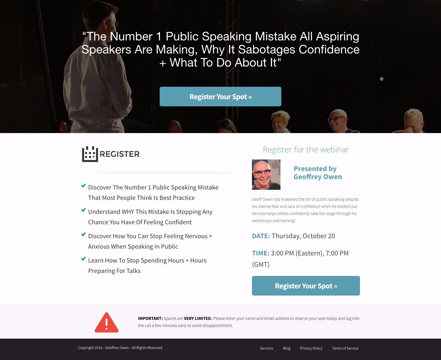
Why This is One of the Best Landing Pages Out There:
- Like Amy Porterfield’s example above, the CTA buttons on this landing page trigger a click popup with the form. This is well worth testing.
- The “Important” note at the bottom creates urgency, which is a best practice for webinar landing pages.
- The header image is a good one, showcasing exactly the subject of the webinar
- The benefit list is short and means there’s no long paragraphs which visitors have to read to understand the value of conversion.
70. Nuvi Webinar Landing Page
Nuvi creates social media management software which differentiates itself from competitors by offering highly visual, real-time data visualizations of their user’s social strategy.
Here’s one of their best landing pages:
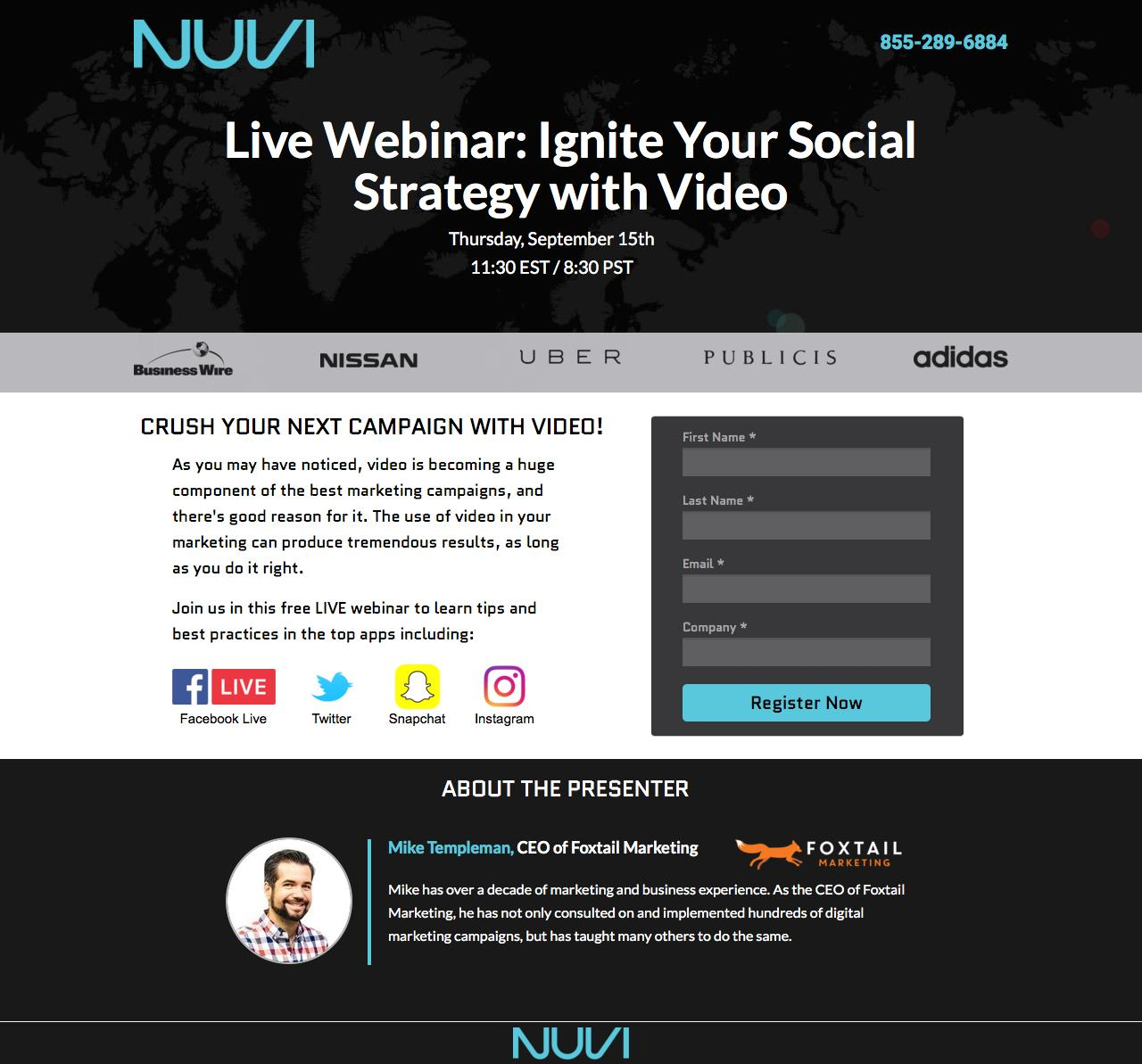
Why This is One of the Best Landing Pages Out There:
- This landing page is just one of the many landing pages optimized and built by Nuvi to email-gate everything from their webinars to their ebooks and industry reports. They’ve tested and found a landing page template which works well and converts highly, and they use it time and again.
- That’s not to say that you shouldn’t continually test your landing pages, but do so with your high-traffic ones, so you can come to statistical significance quickly. But keep your other landing pages optimized in the meantime.
- This landing page promotes the webinar as “Live” and free – two big selling points for any webinar’s value proposition. The date is clear and the copy (“Crush your next campaign”) exciting.
- The presenter is also featured with a headshot and bio, as is best practice.
71. MEMSQL Webcast Landing Page
Honestly I’m not 100% sure what MEMSQL does, so I’ll have to quote their site:
“MemSQL is a high-performance, in-memory database that combines
the horizontal scalability of distributed systems with the familiarity of SQL.”
I’m sure that makes perfect sense to their target market.
Here’s one of their best landing pages:
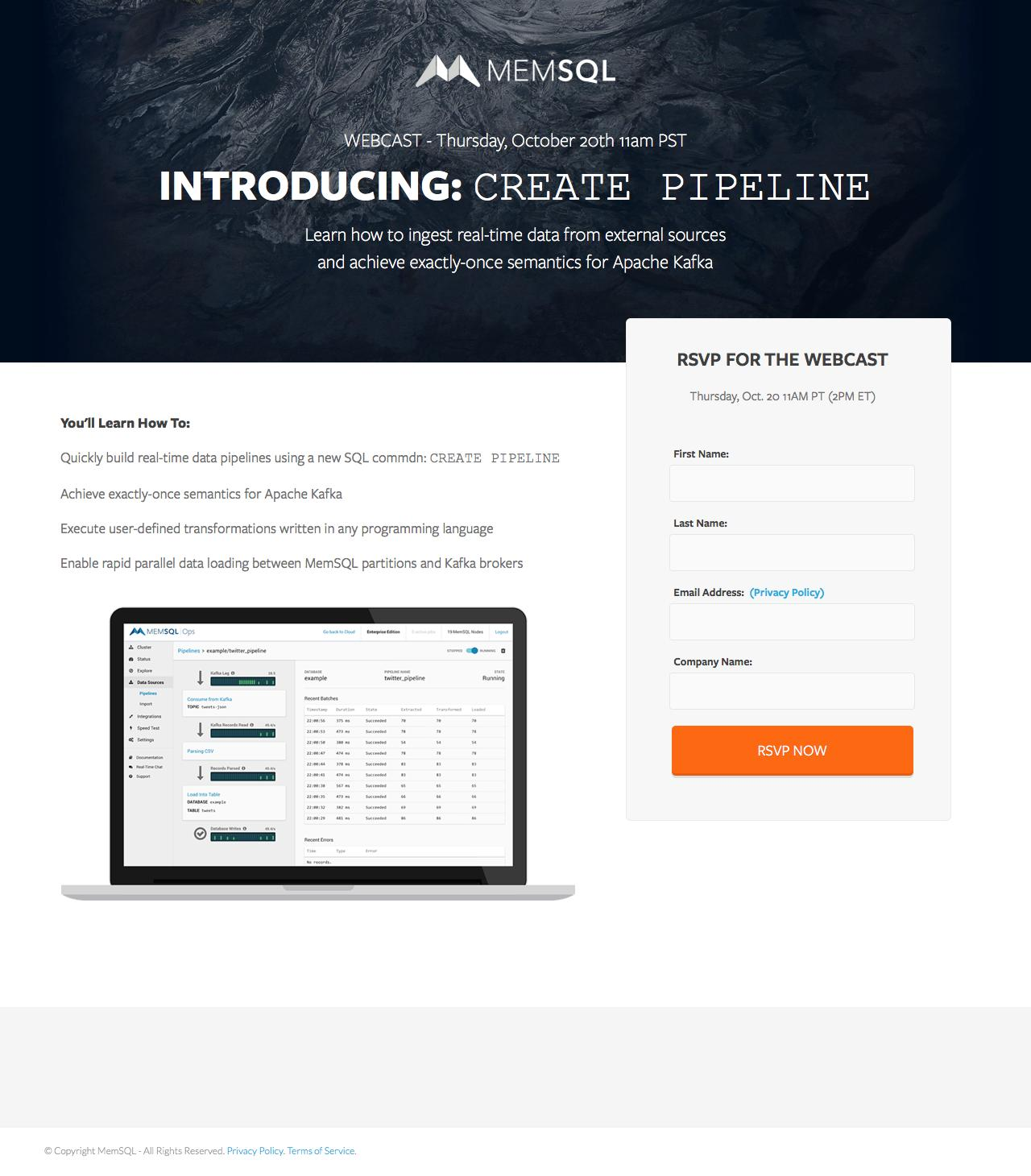
Why This is One of the Best Landing Pages Out There:
This is a beautiful and optimized page. It’s (almost) everything you want in a landing page
- Visually appealing and professional image at the top which matches the color scheme perfectly
- Features the date and time of the webinar
- Concise and clear copy about what you’ll learn, both in the headline and in a “you’ll learn how to” section
- A professional screenshot of the platform, featuring an image related to the subject matter
- A simple, four-field form which asks no more than is needed at this stage in the sales funnel, but does ask for information (company name) valuable in lead nurturing down the line
- A high-contrast CTA button which grabs the eye
72. HourlyNerd Webinar Landing Page
HourlyNerd facilitates communication between freelance consultants and the businesses who need them.
Here’s one of their best landing pages:
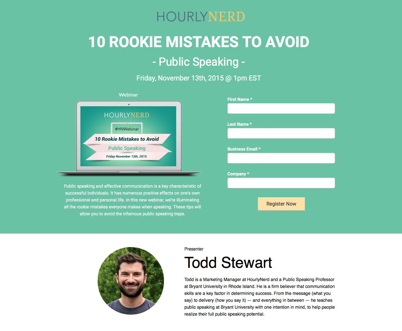
Why This is One of the Best Landing Pages Out There:
A webinar landing page should feature a few things first and foremost (all of which HourlyNerd has featured).
- The date and time of the webinar clearly and obviously
- What will be learned and why it’s important
- The presenter’s name, bio and headshot
- The headshot both personalizes the webinar and introduces the registrants to the host. This increases the likelihood of registrants actually attending, as they feel like they know the host, and not showing would let them down on a (somewhat) personal level.
73. CoreIntelligent Webinar Landing Page
CoreIntelligent is an IT consulting company which helps businesses grow through the creation of five distinct product lines from support solutions to product procurement and security.
Here’s one of their best landing pages:
Why This is One of the Best Landing Pages Out There:
- The host’s headshot is the first thing we see, as our eyes are drawn to faces. A smiling, laughing image is as good as it gets when it comes to creating trust.
- Niche-based jokes are always a winner. It grabs the eye of, exclusively, your target market, and prompts them to keep reading.
- If you have a high-profile or reputable webinar guest host (as CoreIntelligent does above), make their bio as prominent as the copy. The fact that they’re hosting this webinar is worth as much to the registrants as what they’ll learn.
74. Social Tools Summit Co-Webinar Landing Page
Social Tools Summit is is a social media marketing conference held in San Jose each year.
Here’s one of their best landing pages:
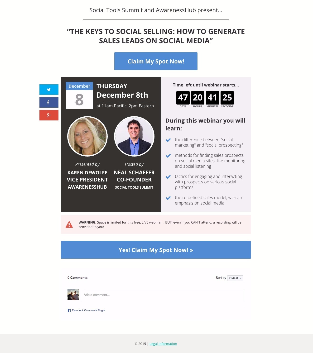
Why This is One of the Best Landing Pages Out There:
This webinar features a lot of the best practices which define an optimized webinar landing page:
- A countdown timer to drive urgency (though this one should, perhaps, be removed and started again with a couple weeks to go)
- Click popup-triggering CTA button
- Large host headshots and names
- Co-promotion to double the reach of the webinar
- Social share toolbar to make it easy for page visitors to share with friends and colleagues
- Bullet-pointed value messaging
- CTA copy which is action oriented, features a personal pronoun and the word “now”

Landing Pages
500 Strategies, Ideas & Examples
Click below to download the most comprehensive collection of landing page strategies and examples ever compiled. Completely free.