101 of the Best Landing Pages Analyzed
Welcome to the web’s most comprehensive resource for the best landing page examples. We’ve scoured the top brands for the landing pages they’ve tested, tweaked and optimized to find the best 101.
This resource compiles the best landing pages in the following categories:
- Ebook Download Landing Pages
- Demo and Contact Landing Pages
- Free Trial and Signup Landing Pages
- Webinar Landing Pages
- Whitepaper Landing Pages
- Miscellaneous Landing Pages (Courses, Communities, Infographics, Case studies, Reports, Etc)
Let’s get right into it!
The Best Ebook Download Landing Pages
1. Kapost Ebook Download Landing Page
Kapost is a content marketing software platform which helps businesses create, coordinate, approve, distribute and analyze content.
Here’s one of their best landing pages:
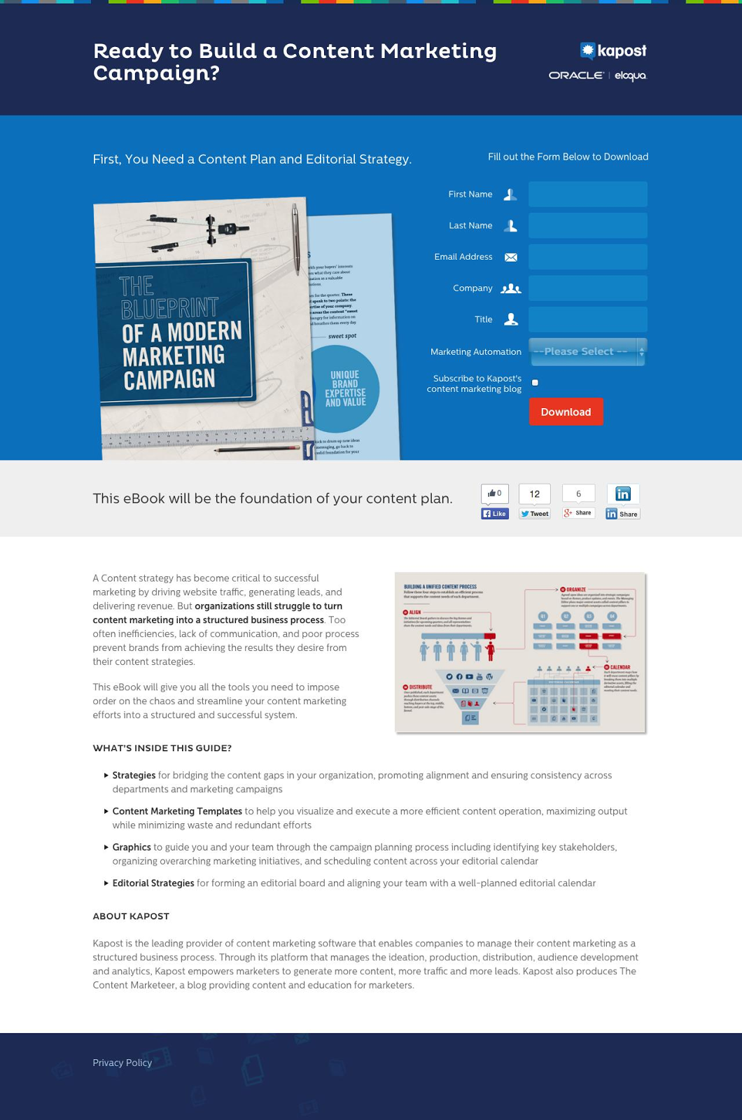
Why This is One of the Best Landing Pages Out There:
- The semi-independent above-the-fold formatting makes it easy for people who want to just convert to do so. Those who need more information can scroll.
- The social share toolbar in the middle of the page makes it easy for visitors to promote on Kapost’s behalf.
- The screenshot of the ebook provides a peek into the look and value. This is a great idea, particularly if you’ve invested heavily in creating a professional ebook.
- Bolded text emphasizes certain sections and ideas, including the four-point benefit list.
- The landing page matches perfectly with Kapost’s website design and color scheme. Consistency is key to an optimized lead generation strategy.
2. Twelveskip Ebook Download Landing Page
Twelveskip is a creative marketing consulting business from Pauline Cabrera. Known for her beautifully-designed web pages and content, Pauline is, personally, one of my favorite content creators out there.
Here’s one of her best landing pages:
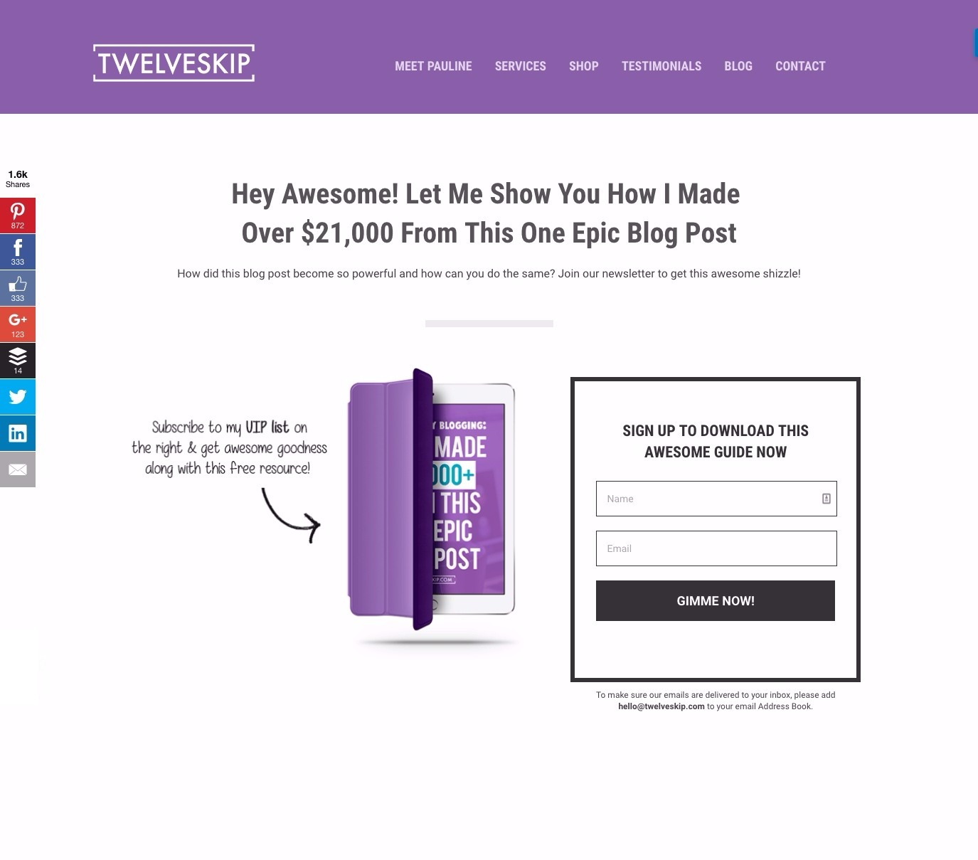
Why This is One of the Best Landing Pages Out There:
- People love being called Awesome. Right off the bat I’m happy I’m here.
- The social share toolbar on the left side makes it easy for me to share this page and gated content with friends and colleagues. This decreases the energy and resources Pauline has to expend herself.
- The ebook tease image and directional cue (the arrow) draw attention to the concrete value of the ebook.
- When your headline and subheadline say everything you need to say about what this is and why it’s valuable don’t worry about saying anything more. More text or paragraphs, here, would just overwhelm visitors and be unnecessary.
3. Razorsocial Checklist Ebook Download Page
RazorSocial is a digital marketing (primarily social media) consultancy founded by Ian Cleary which focuses on training for small businesses and marketing consultants alike.
Here’s one of their best landing pages:
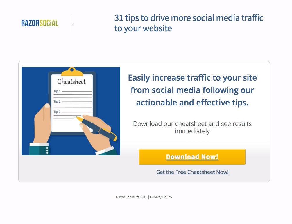
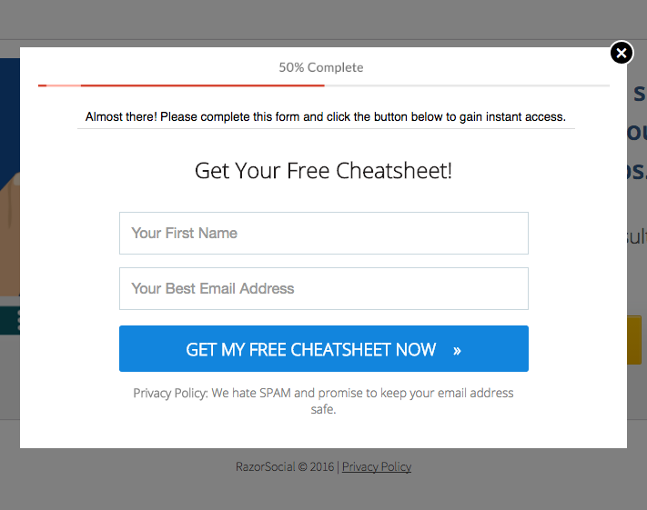
Why This is One of the Best Landing Pages Out There:
- This landing page uses the most recent development in optimization – the click popup. This serves to both give you more space on the page (making it appear simpler) and also keeps you from intimidating your page visitors with a bunch of information and the form. Multi-step conversion processes have shown to improve conversion rates by 311% when tested.
- This gated content is promoted only on RazorSocial articles and content where it’s relevant. This is best practice for educational, top-of-funnel gated content.
- Informing the visitor that the guide contains 31 distinct steps clarifies for them what to expect in terms of time they need to devote as well as how comprehensive and valuable this content might be.
4. Zendesk Ebook Download Landing Page
Zendesk is a leading customer service software provider.
Here’s one of their best landing pages:
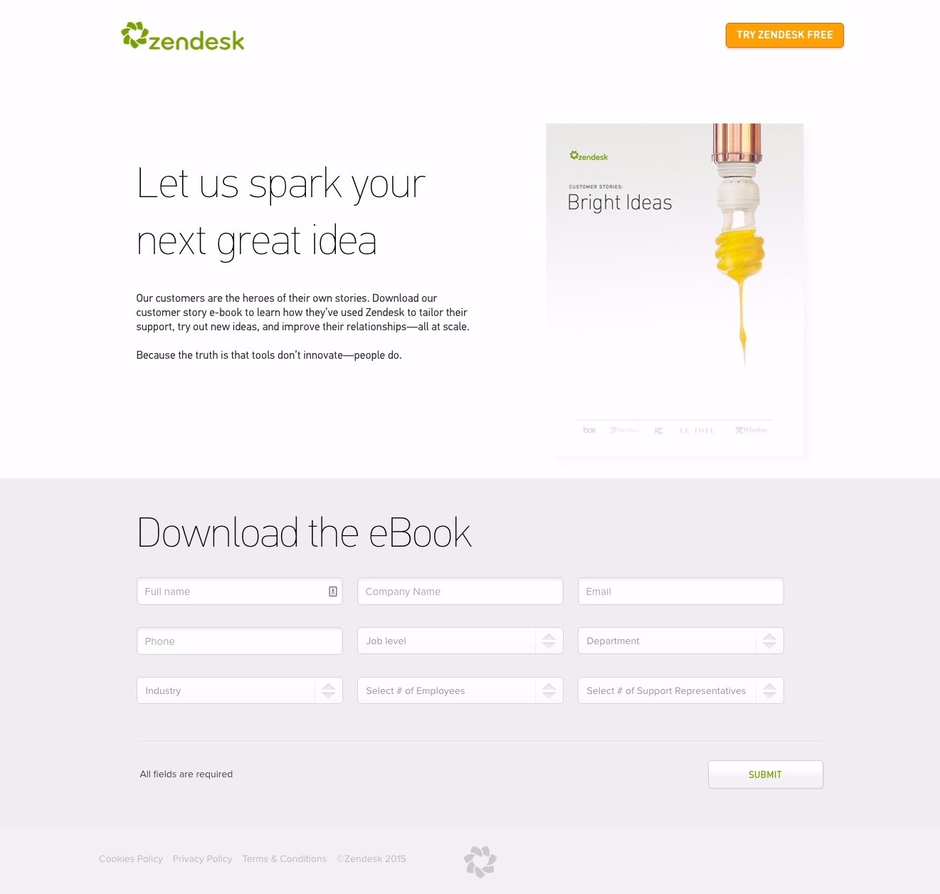
Why This is One of the Best Landing Pages Out There:
- Simple and to the point, this landing page focuses on a few shots of light – the light bulb on the right side, the demo CTA at the top (a legitimate distraction, as the “ask” is worth so much more than the page’s) and the flash of green in the “Submit” button at the bottom right.
- The form makes up 50% of this page, which is an interesting tack I’ve rarely seen. Here’s why it works:
- The lead magnet here is a book of case studies – a bottom-of-funnel lead magnet. The only people who are going to download this ebook are people making a final decision about what customer service platform to use. Zendesk wants these customers, and they need to know who they are.
- They don’t care if the conversion rate on this landing page is low, because the leads they generate are valuable. They have other, top-of-funnel ebooks for generating early-stage leads. This page focuses on generating high quality, late-stage leads. So what’s the point in asking for less than you need?
5. Salesforce Ebook Download Landing Page
Salesforce is the premiere CRM platform in the world.
Here’s one of their best landing pages:
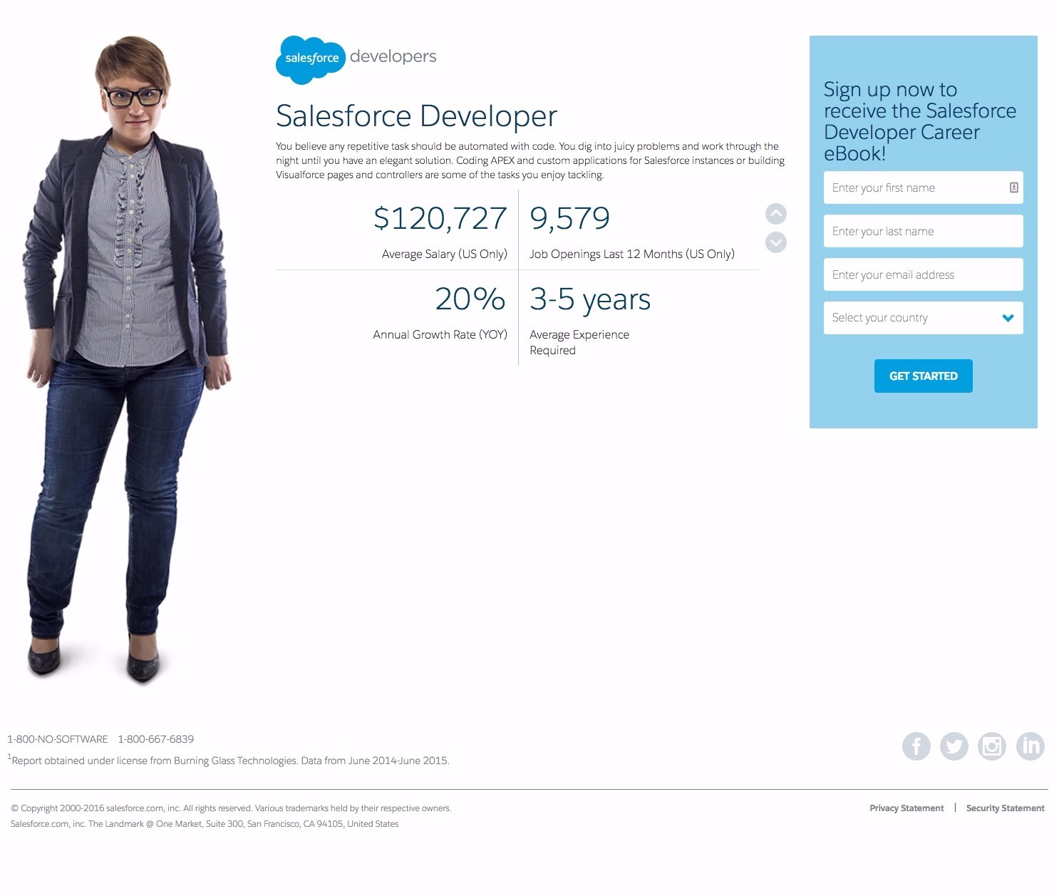
Why This is One of the Best Landing Pages Out There:
Salesforce has a couple primary optimization elements here, both of which are best practice and worth testing:
- The hero image is of an “everywoman” similar to the target market. If you’re going to use an image of a person, be sure they’re not intimidatingly beautiful (unless you’re in ecommerce, in which case, go for it) or too different-looking from your target customer.
- They’ve teased the visitor with valuable information which, the visitor is sure, would be further expanded upon in the ebook. The arrows on the right side of this section navigate the visitor to three more pages which contain information taken from the ebook.
6. KlientBoost Ebook Download Landing Page
KlientBoost is a PPC campaign management agency known for their beautiful design and happy customers.
Here’s one of their best landing pages:
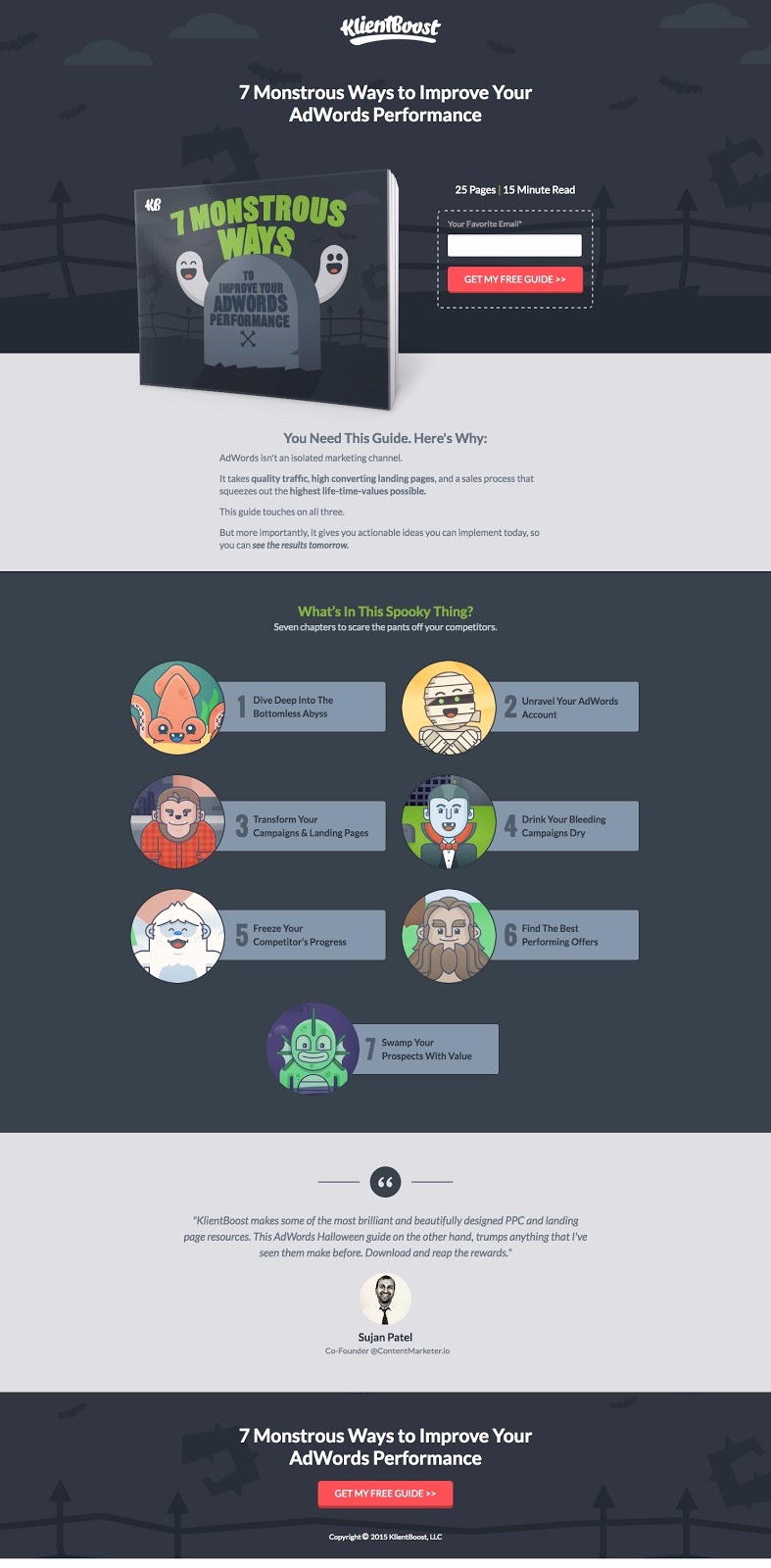
Why This is One of the Best Landing Pages Out There:
An awesome testimonial (campaign-specific and with headshot), multiple CTAs and the complete absence of external linking or distractions ticks all the standard landing page optimization boxes here.
It’s the thematic elements and design, however, which put this landing page into a “best of” list:
- The target market is marketers who have seen a dozen landing pages every day since they started their careers. Being different is key, and KlientBoost knocks that out of the park.
- The professional but fun color and images and Halloween-y language are very well done and keep the visitor on-page.
- Launching standard educational content in the framework of the holiday season is a great idea and best practice. Tap into what your visitors are thinking about already.
7. SalesLion Ebook Download Landing Page
The Sales Lion was founded by Marcus Sheridan, and is his sales and marketing consultancy and training business.
Here’s one of their best landing pages:
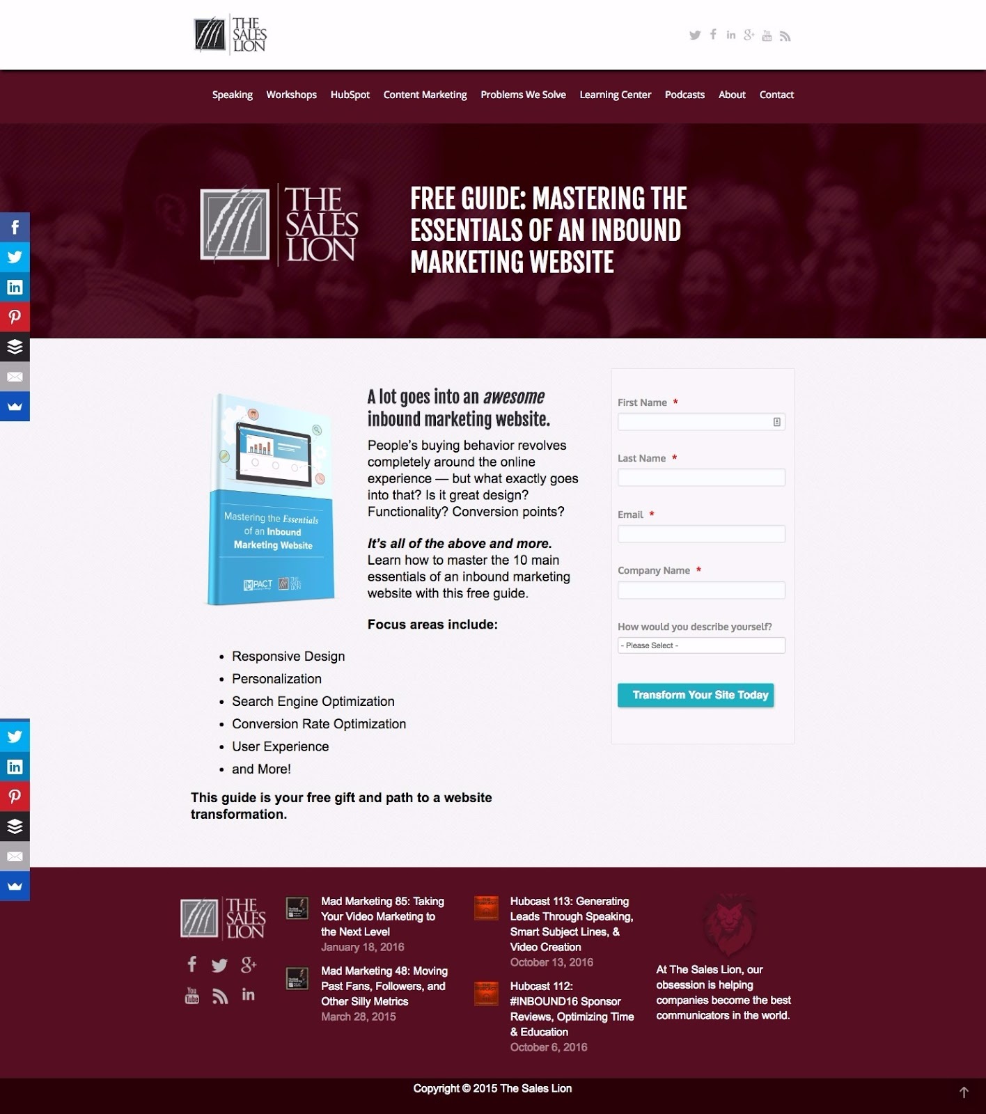
Why This is One of the Best Landing Pages Out There:
- Taps into the visitor’s pain points right off the bat with “A lot goes into an awesome inbound marketing website” and then asking pointed questions. This causes the visitor to ask themselves the same questions. And then you answer them with the gated content.
- The image of a digital guide made concrete increases the subjective value and removes the imaginary or ephemeral/low value – totally subconsciously of course.
- The CTA copy “Transform Your Site Today” is a good one. It inspires action and speaks to the value of the incentive, as well as putting the action in terms of the visitor with “your.”
8. FoundrMag Ebook Download Landing Page
Foundr is a digital magazine focused on entrepreneurship and with a popular podcast on growing your business.
Here’s one of their best landing pages:
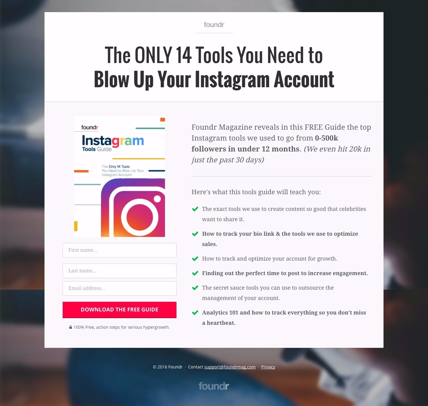
Why This is One of the Best Landing Pages Out There:
- The large background image encapsulates the central section in a way that keeps your attention focused
- The large headline grabs your attention as well and assures you that you’ve navigated to the right page. It also utilizes blog article title best practices.
- The CTA button really stands out and has great copy, as does the benefit list.
9. MakerBot Ebook Download Landing Page
MakerBot is a leading 3d printer manufacturer.
Here’s one of their best landing pages:
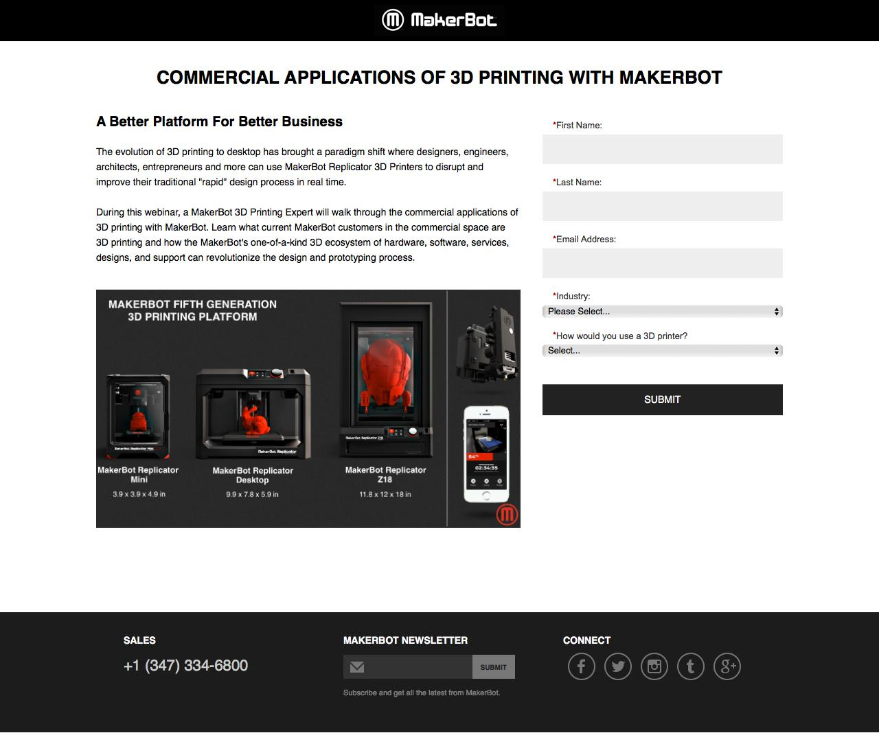
Why This is One of the Best Landing Pages Out There:
- This landing page is designed for the commercial printing market, and looks the part. No colorful cartoons here, just to-the-point messaging and high quality images.
- The headline is very to-the-point, and the messaging across the board sings of enterprise-level communication.
- The phone number at the bottom right is also an important piece here. People visiting this page may have questions not answered by the ebook, so giving them an opportunity to speak to sales is a good call.
- The fields on the right side (industry and “how would you use a 3d printer”) are excellent for lead segmentation. They inform MakerBot’s sales team exactly who their leads are and what sales points they should focus any conversation upon.
10. Yesler Ebook Download Landing Page
Yesler is a B2B marketing agency.
Here’s one of their best landing pages:
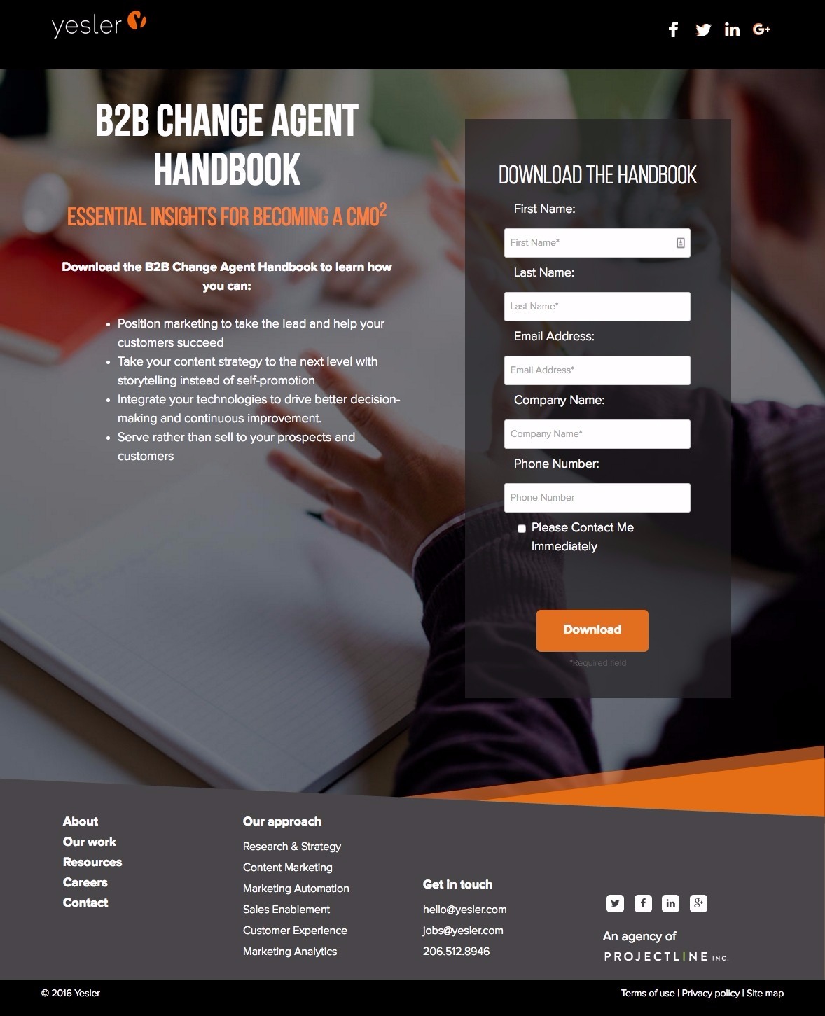
Why This is One of the Best Landing Pages Out There:
- I like the look of this page very much – from the color scheme (which matches Yesler’s brand perfectly) to the background image (darkened) and the clean, angled lines.
- While we do see Yesler’s footer on this page, most web users have been trained to ignore it. To all intents and purposes this page has a single focus – the large, high-contrast “Download” CTA button on the right side.
- The simplicity here is good as well: no paragraphs, just four benefit points which describe a very comprehensive piece of content.
- The box for “Please contact me immediately” is a nice touch and definitely worth testing on all middle and bottom-of-funnel gated content.
11. WiderFunnel Ebook Download Landing Page
WiderFunnel is a marketing agency focused on website conversion optimization, including planning, design, development and A/B testing.
Here’s one of their best landing pages:
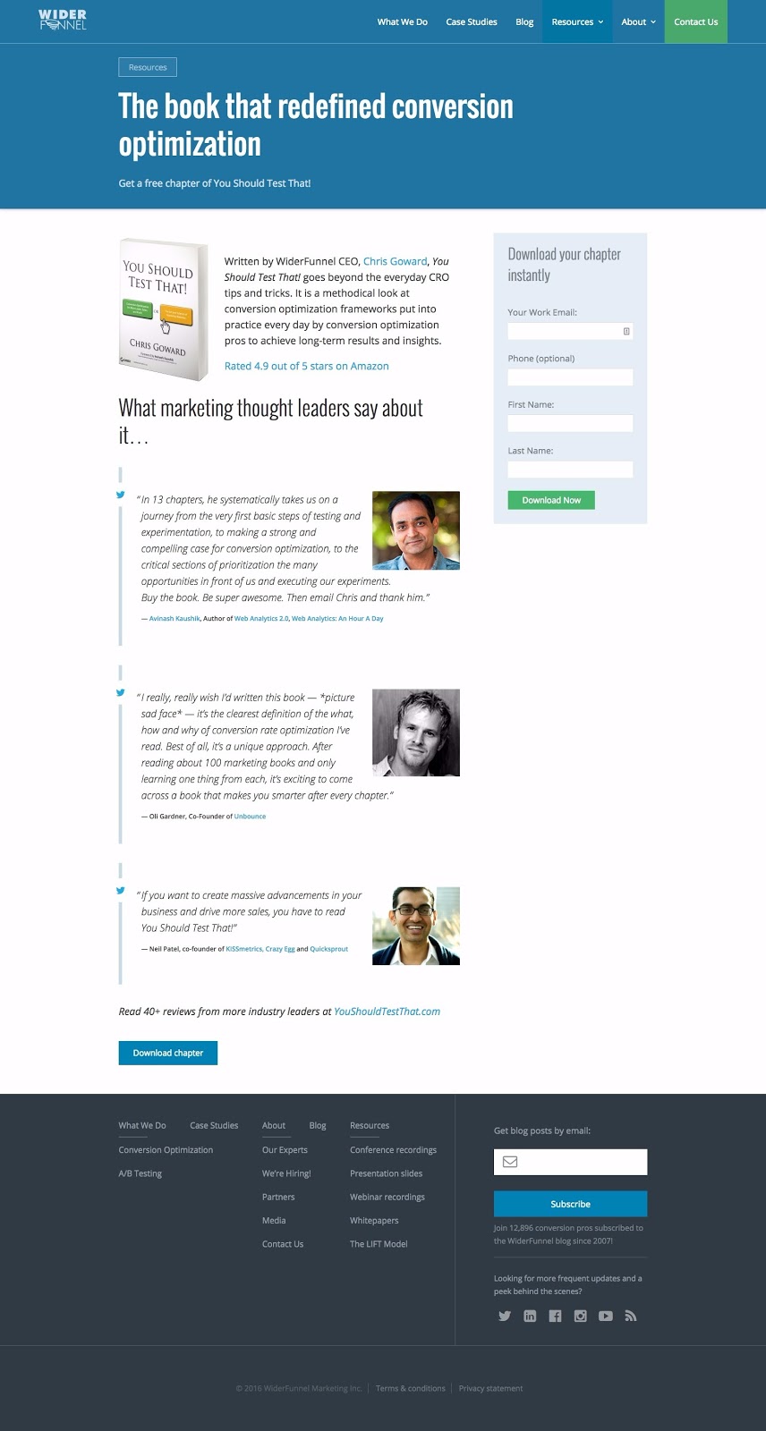
Why This is One of the Best Landing Pages Out There:
- This page focuses on the testimonials – everything else is tangential. Yes, we have high-contrast CTA buttons (two of them, as it’s a longer-form page) and a headline ambitious enough we want to see the story behind it. But, ultimately, it’s about the testimonials.
- Having testimonials from three well-known optimization experts is absolutely perfect for WiderFunnel because, though they may not be as well-known, they’re being vouched for by people who the visitor will recognize and already respects.
- The headshots of these guys grab the eye of anyone interested in conversion optimization. These are well-known faces and, if someone’s been reading up on conversion optimization and considering outsourcing it to an agency, they would have seen these guys.
12. SugarCRM Ebook Download Landing Page
SugarCRM creates CRM software.
Here’s one of their best landing pages:
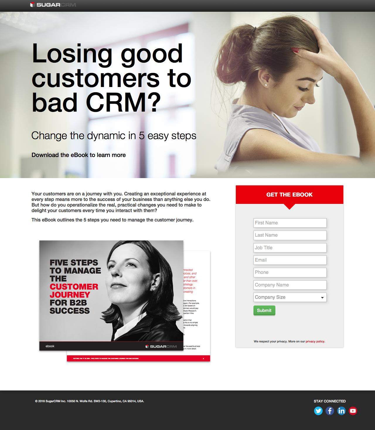
Why This is One of the Best Landing Pages Out There:
- This landing page has a great, pain point-oriented headline which addresses their prospective customer’s concerns and then immediately says that this ebook can help fix those concerns.
- We get a bit of a preview of the ebook’s contents.
- We have two contrasting images – the first is a frustrated/depressed-looking woman who relates to the headline and pain point-oriented question it asks. The second is a confident woman who has read this ebook and been helped.
13. WebDAM Ebook Download Landing Page
WebDAM is a digital asset management software provider, making it easier for their users to connect their marketing assets, permission-based distribution and brand guidelines in one place and on the cloud.
Here’s one of their best landing pages:
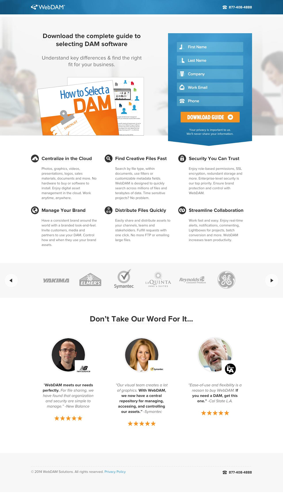
Why This is One of the Best Landing Pages Out There:
- An ebook directly related to choosing a platform like yours is a very different piece of content than an educational ebook. WebDAM knows this, so they’ve designed their landing page differently than most ebook landing pages.
- WIth this landing page, they know they’re speaking directly to bottom-of-funnel leads or prospects – people interested in making a final decision related to DAM software. As such, they’ve presented it similarly to a product page with a six-piece benefit list and a large, three-person testimonial as well as brand legitimacy section.
- They’re nurturing leads towards a different kind of conversion with this ebook landing page. Sure the conversion here is only the downloading of an ebook, but they know they need to communicate as much value to visitors to this page as possible. Sometimes the conversion goal on-page is different than the conversion goal for the campaign that page is a part of.
14. Procore Download Ebook Landing Page
ProCore is an all-in-one, mobile (and desktop) construction management tool featuring everything from collaborative communication with all teams and subcontractors to drawing markup.
Here’s one of their best landing pages:
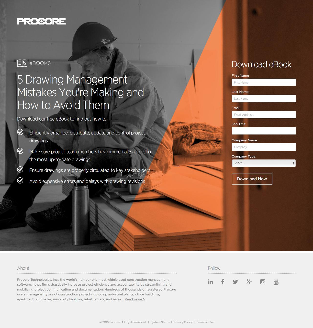
Why This is One of the Best Landing Pages Out There:
- Great background image adds personality and color to the landing page.
- No emphasized navigation. “About” and social toolbar are de-emphasized, below-the-fold and greyed out.
- The ebook, which is closely-related to Procore’s product, requires leads to submit job title, company name and company type information. This makes it easier for a lead nurturing strategy to convert the leads generated from this page into sales.
15. InsideView Download Ebook Landing Page
InsideView is a market intelligence platform, giving businesses insight into their industry news, company data and how they’re related to their prospects.
Here’s one of their best landing pages:
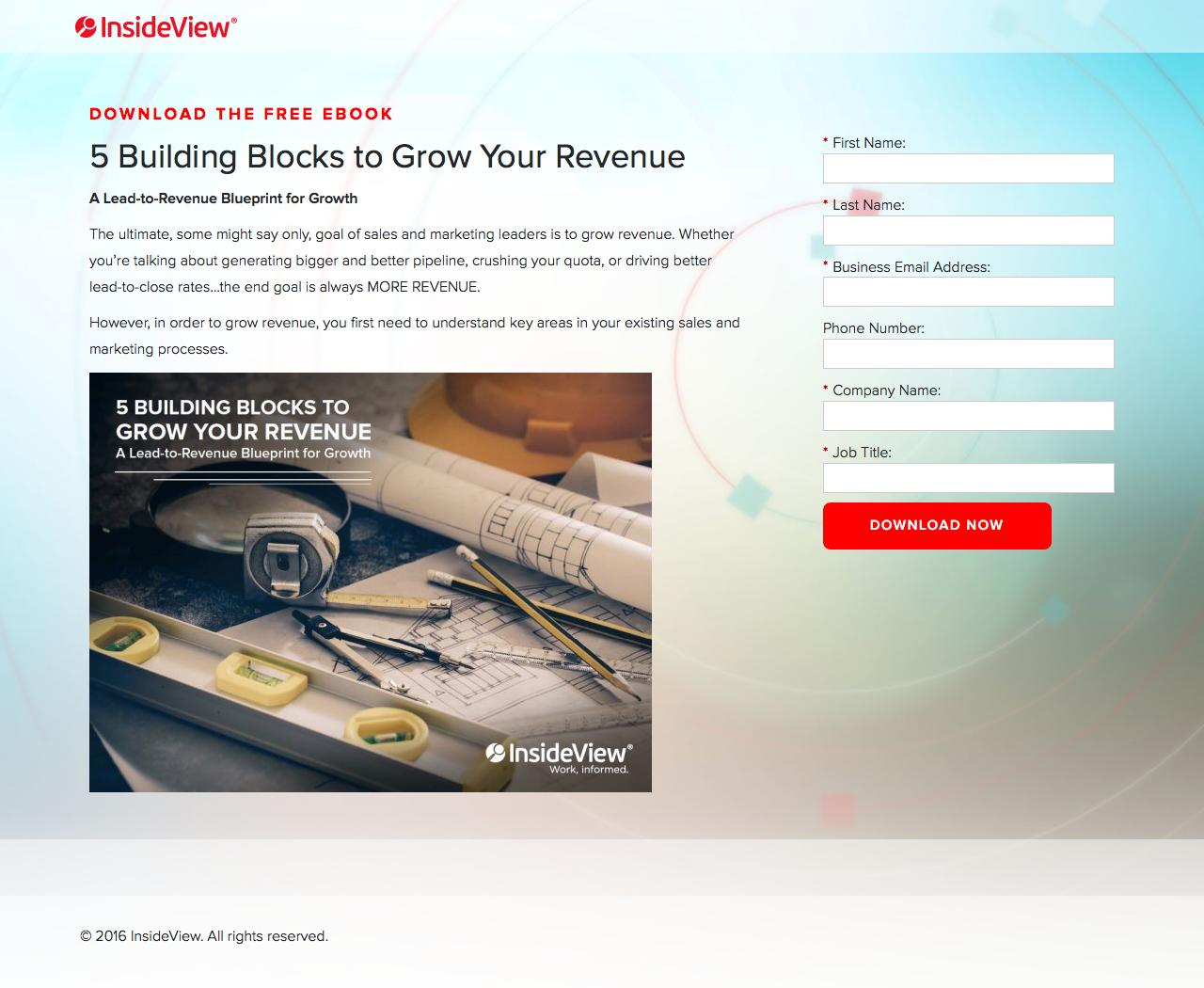
Why This is One of the Best Landing Pages Out There:
- Sales-oriented copy appeals to the target reader and market: “bigger and better pipeline,” “crushing your quota,” “MORE REVENUE” etc.
- Very visible CTA button contrasts exceedingly well.
- The background color works well with the image’s color-scheme – creating a professional look.
- The title is appealing and uses the same best practices as a blog article. People like list posts, building blocks and blueprints for growth. These are proven phrases and work for an ebook as well as they do a blog article.
16. Leankit Download Ebook Landing Page
Leankit is a work visualization software company.
Here’s one of their best landing pages:
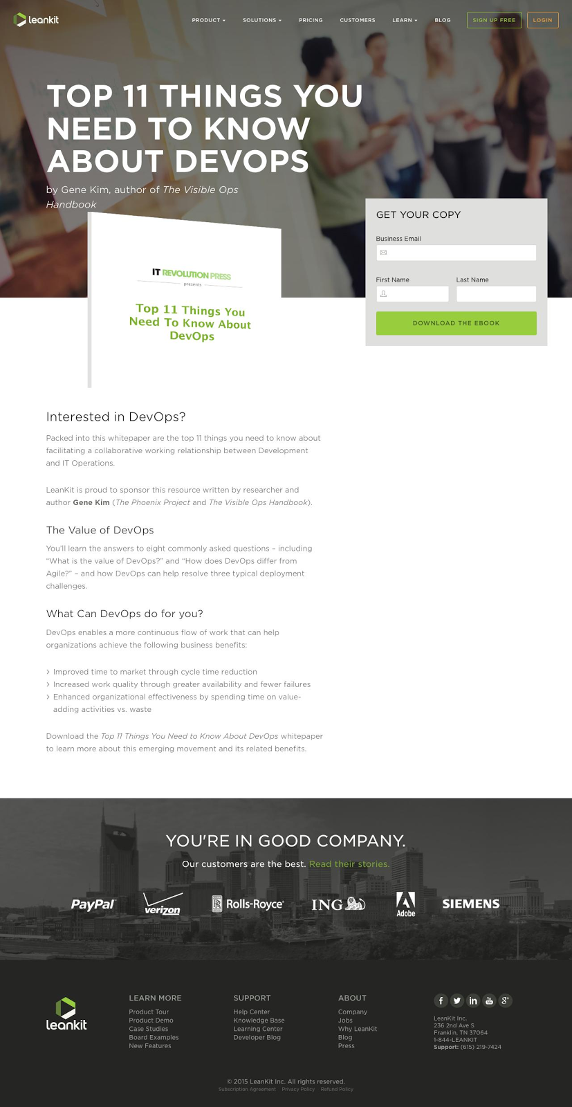
Why This is One of the Best Landing Pages Out There:
- The above-the-fold area is, design-wise, independent from below-the-fold. You don’t need to scroll to convert.
- All the below-the-fold information is secondary to the above-the-fold. It’s for visitors who aren’t sure what Devops is ro need to be sold further.
- Featuring the well-known author (within this niche) is a great way to promote an ebook: “Leankit is proud to sponsor.” Co-created or sponsored ebooks enable your business to increase the reach of your gated content. The author themselves will have a network and they’ll promote on your behalf, driving new visitors to your site.
17. Industrial Strength Marketing Ebook Download Landing Page
Industrial Strength Marketing is a marketing agency exclusively for manufacturers, distributors and logistics industries.
Here’s one of their best landing pages:
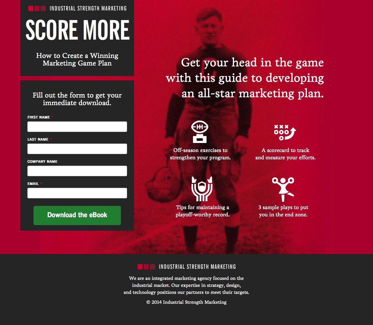
Why This is One of the Best Landing Pages Out There:
- Appealing to the industrial target market with red, black and sports metaphors. From the standpoint of the psychology of conversion rate optimization, those colors appeal to men and sports (stereotypically) do as well
- High-contrast CTA button and simple form fields.
- Visual and thematically consistent icons attract the eye to the four-point benefit list.
- “Get your immediate download,” alongside the color red, creates excitement and tells people what to do.
18. Liquid Interactive Ebook Download Landing Page
Liquid Interactive is a full-spectrum digital marketing agency offering strategy, design and technology management.
Here’s one of their best landing pages:
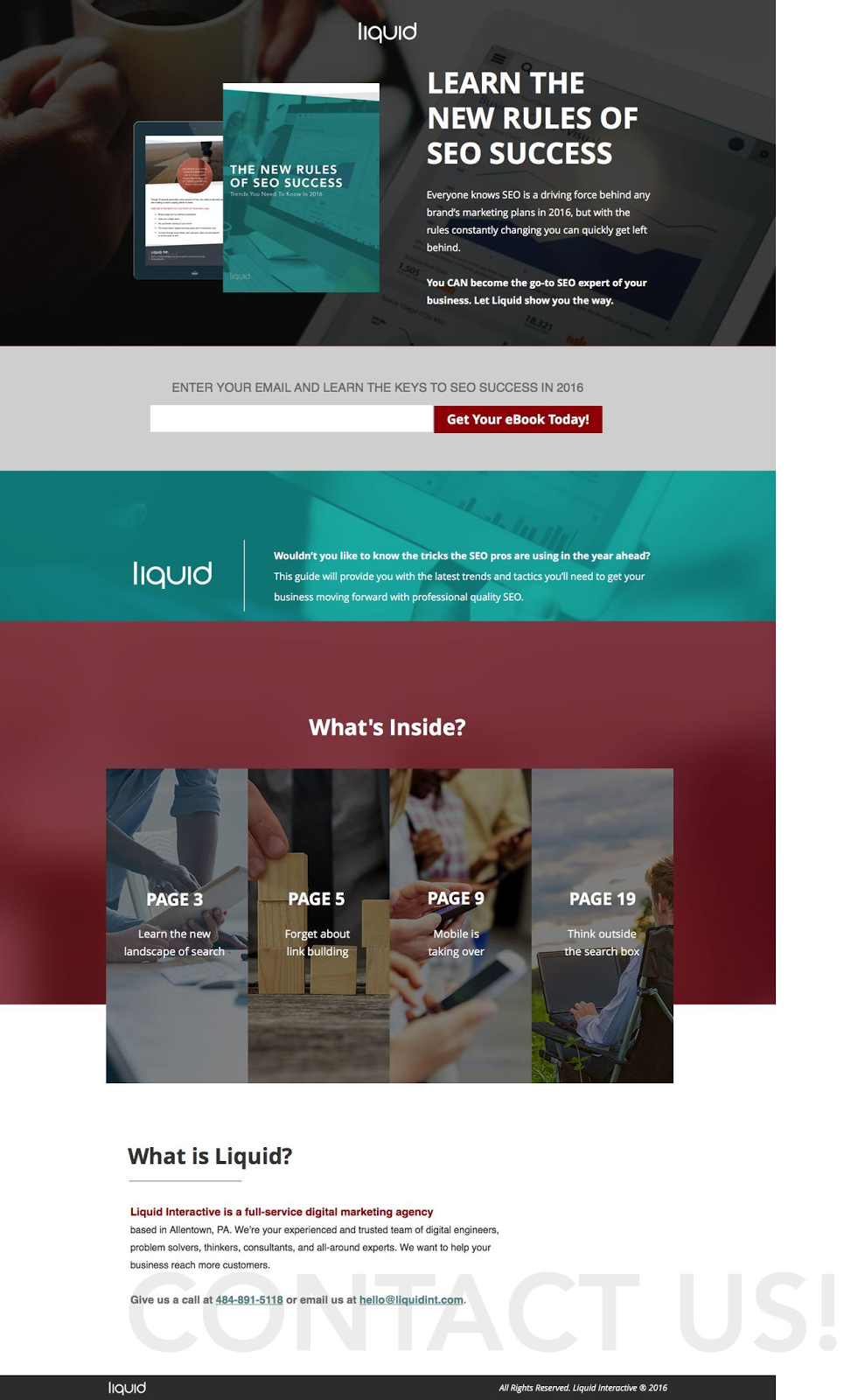
Why This is One of the Best Landing Pages Out There:
- Design-wise, there’s a lot going on here, but it’s professional, brand-consistent and the page is mobile responsive.
- The headline is top notch: the “new rules” of SEO success communicates the idea that old rules are outdated and won’t work, and that these are “rules” which need to be followed to find success. Only this ebook has updated strategies you have to follow.
- “Get your Ebook Today” is proven CTA copy – action-oriented and containing “today” to drive engagement now.
- The 4-page (or chapter, probably) sneak preview acts as both a look into the ebook as well as a benefit list. I like this idea and plan on stealing it.
19. Foxtail Ebook Download Landing Page
Foxtail is a digital marketing agency offering SEO, social media, paid advertising and content marketing services.
Here’s one of their best landing pages:
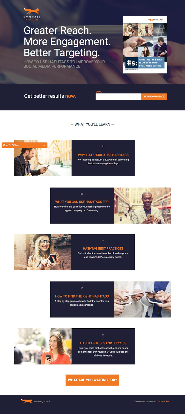
Why This is One of the Best Landing Pages Out There:
- In many ways this is a similar landing page to Liquid Interactive’s above: long-form, central CTA and an image-focused benefit list.
- My favorite part of this landing page is the images below-the-fold which show smiling and happy, non-stock, marketers finding success with hashtags. This adds personality to the page.
- The bottom CTA (“What are you waiting for?”) is a good one – driving visitors back up to the top of page form and asking a question they can’t help but answer.
- I also like “Get better results now” with “now” in contrasting orange.
20. FriesenPress Ebook Download Landing Page
FriesenPress provides self-publishing assistance for authors from editing to design, printing and publishing.
Here’s one of their best landing pages:
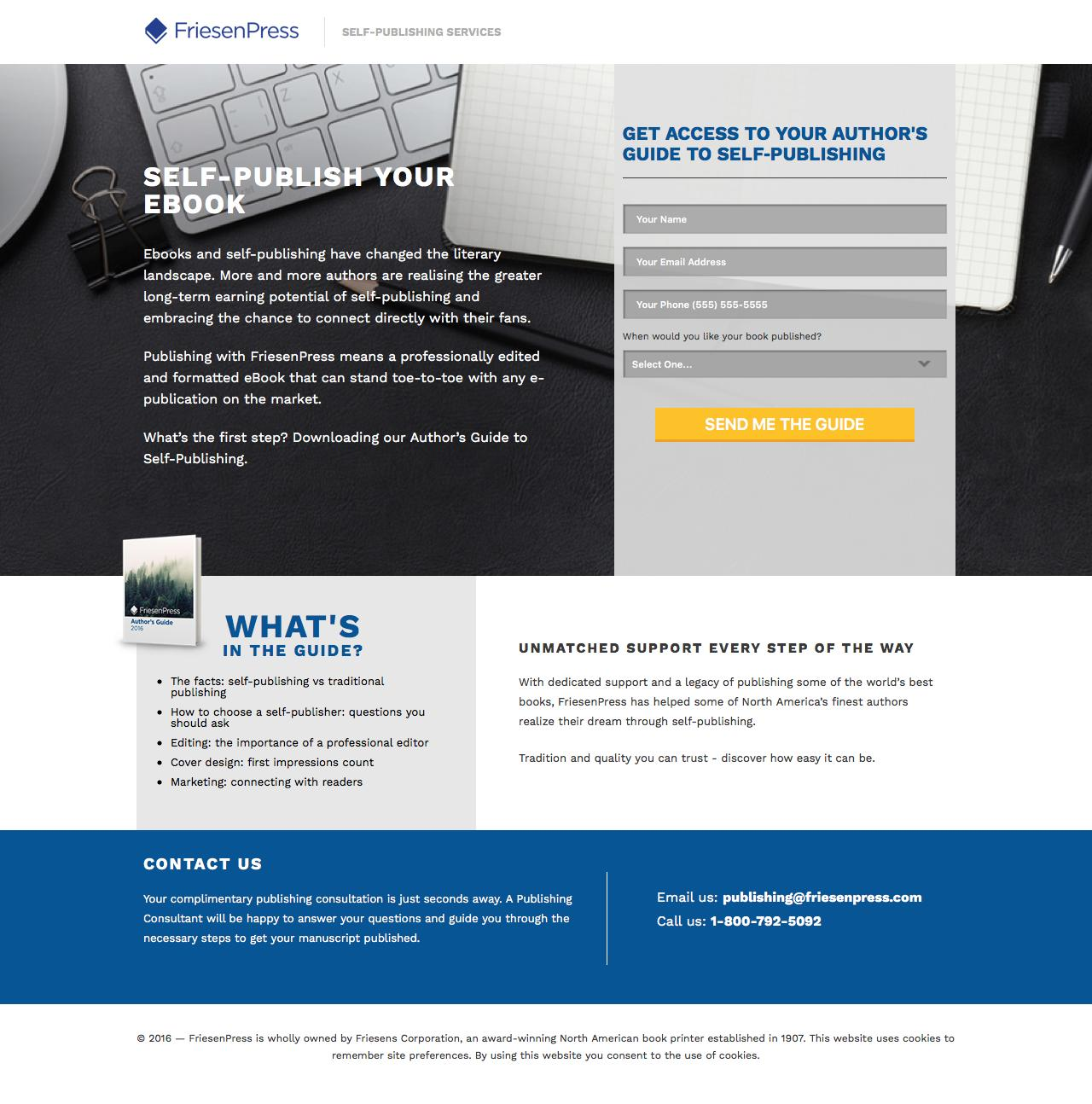
Why This is One of the Best Landing Pages Out There:
- Personal pronouns abound in this landing page, making the value even more relevant to the reader. The guide they’ve gated is “your guide” even before you download it. Claiming it is, therefore, more appealing.
- There’s actually quite a lot of text on this landing page, but the sections and balance make it more palatable than it would normally be if displayed in a single section. If you’re going to have a lot of text (which isn’t necessarily a bad thing if you have a complicated message or a lot to convey), be sure it’s broken up and the page feels balanced structurally, as this one does.
21. Relayware Ebook Download Landing Page
Relayware is a partnership and affiliate marketing management software provider.
Here’s one of their best landing pages:
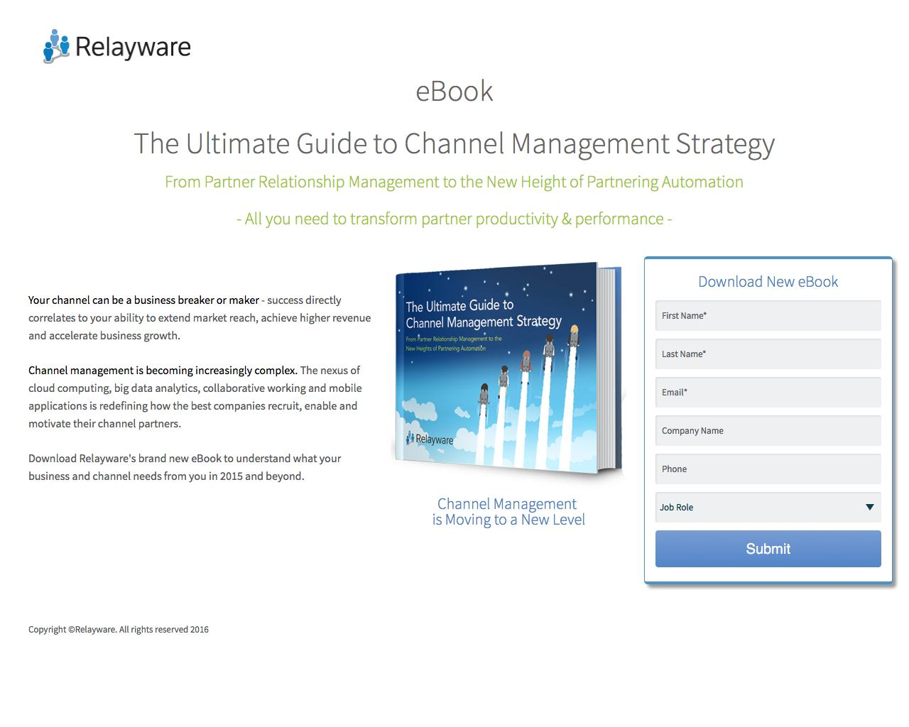
Why This is One of the Best Landing Pages Out There:
This landing page follows through on a few essential best practices:
- Encapsulation in the form on the right side draws attention and keeps it there
- Bolded text on the left side helps emphasize and keep skim readers reading
- The ebook-made-hardcopy image communicates something beyond the intangible, increasing the subjective value of the guide.
- The headline uses proven language (“ultimate,” “complete,” “comprehensive,”) etc to communicate the breadth of the ebook and what you get when you download it.
- Contrasting CTA button.
- No navigation or external links to distract from the conversion goal.
22. ReachLocal Ebook Download Landing Page
ReachLocal is a local-focused marketing company, providing businesses with the tools to increase their web presence, advertising and lead conversion rates.
Here’s one of their best landing pages:
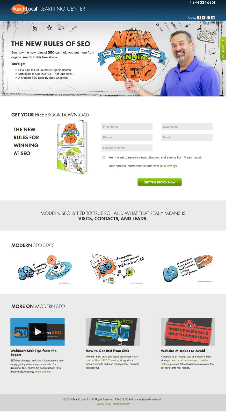
Why This is One of the Best Landing Pages Out There:
- The smiling face of one of ReachLocal’s marketers adds immediate personality to the landing page.
- Visitors immediately get the benefit list, front and center with the form right below (but still above-the-fold).
- This landing page, interestingly, uses the same headline as Liquid Interactive above. This just goes to show the value of “New” and “Rules” in communicating value. Again, we’re talking about “new” as something you haven’t heard but need to, and “rules” as the things you’ll fail without.
- Action-oriented and color-contrasted CTA button.
23. Results.com Ebook Download Landing Page
Results.com is an integrated business productivity platform, enabling users to see their CRM, sales, marketing and finance repots under one roof.
Here’s one of their best landing pages:
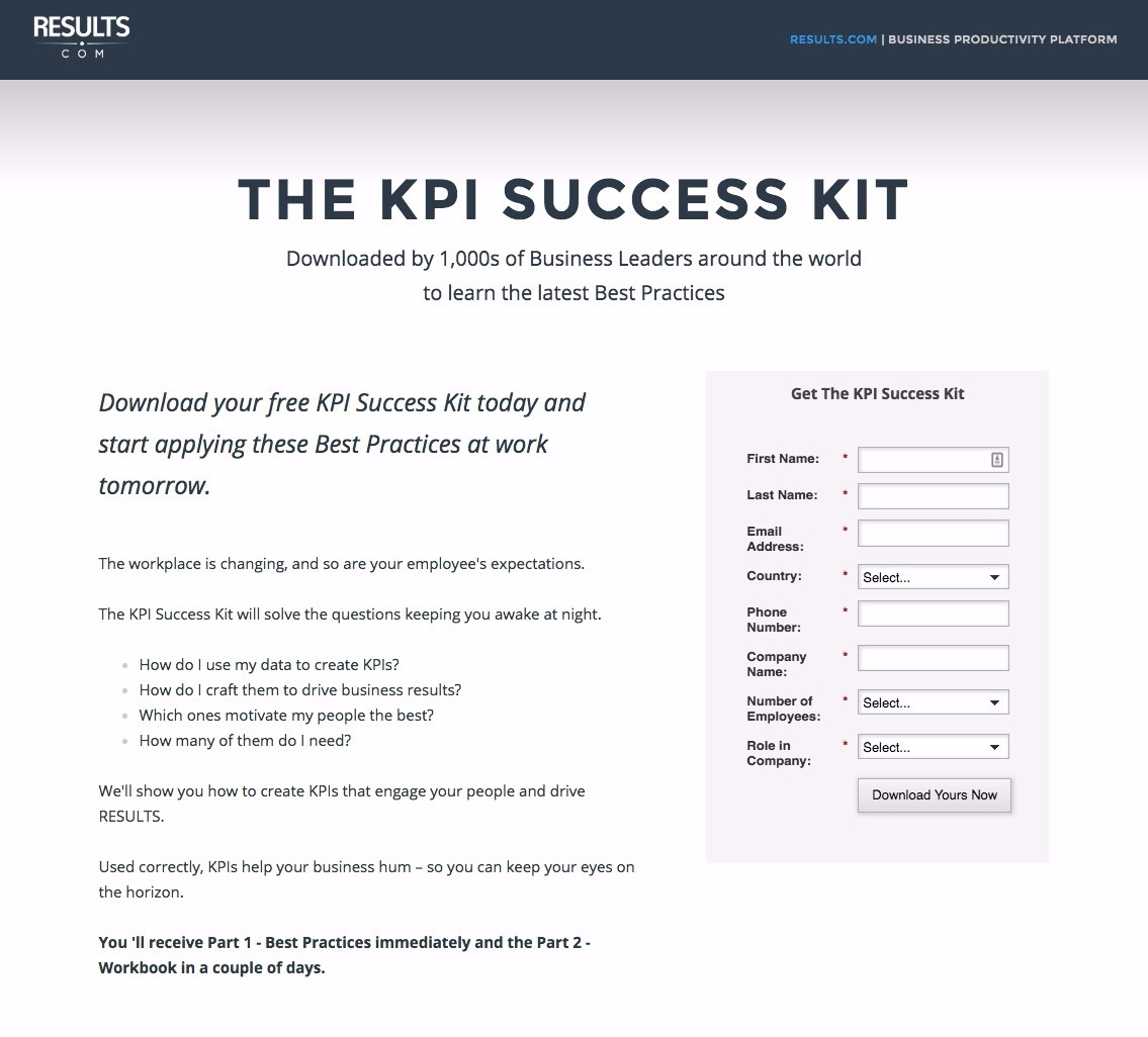
Why This is One of the Best Landing Pages Out There:
- Peer legitimacy in the subheadline.
- Well-separated paragraphs, bolded text and bullet-points make the landing page copy easy to read and more palatable than it might be otherwise.
- The lead magnet is a multi-step one: a best practices guide first and then a workbook a couple of days later. This is a great way to generate leads (with a bunch of lead information – see form on the right side) and get them used to receiving emails from you every couple days – optimizing the chance of a final conversion through nurturing.
The Best Demo and Contact Landing Pages
24. Hootsuite Request a Demo Landing Page
Hootsuite is a leading social media management platform, allowing marketing teams to schedule and create social media content from a single dashboard.
Here’s one of their best landing pages:
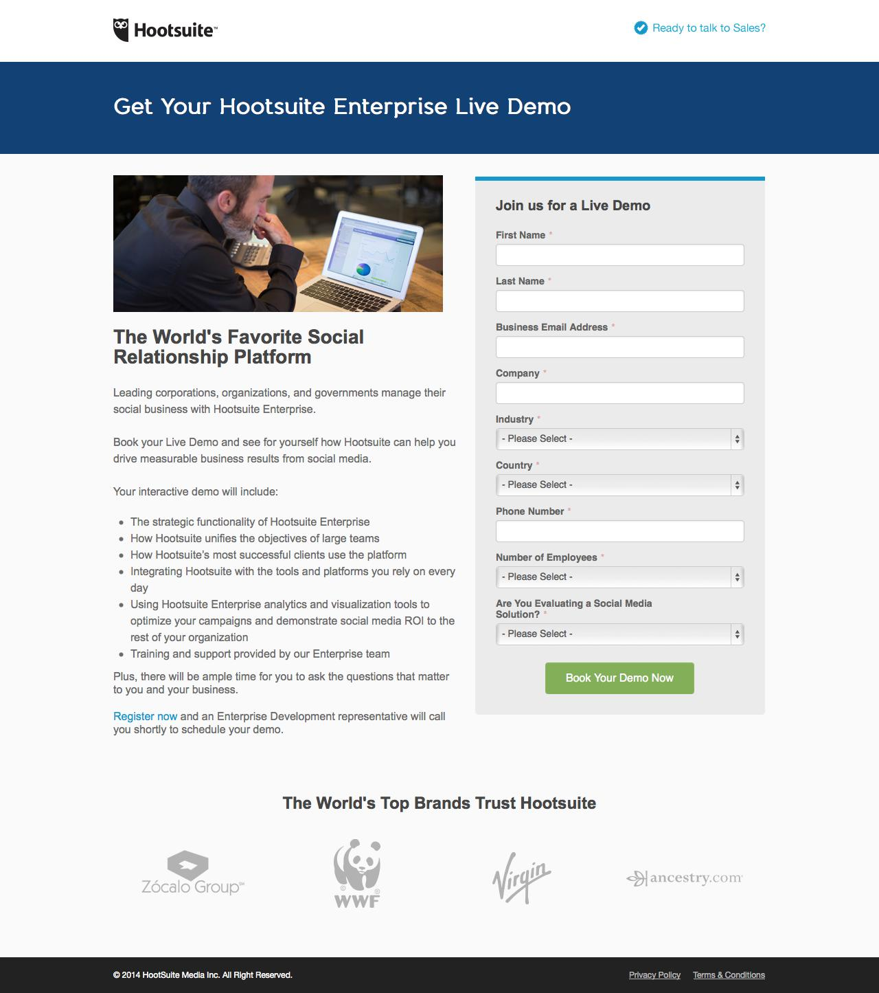
Why This is One of the Best Landing Pages Out There:
- This is an enterprise-targeted VIP demo page, and, as such, it’s different from a general VIP demo page. There are more form fields, more information about what the demo will include, and the businesses featured are larger than they otherwise would be.
- “The World’s Top Brands Trust Hootsuite” is a relevant section for this landing page, but it won’t always be. If Hootsuite used these same four organizations on all of their demo and free trial landing pages, they’d alienate any small business who might also find value with their non-enterprise plans. Small business marketers would think that Hootsuite was only for enterprise-level businesses.
- The field “are you evaluating a social media solution?” is an important one for VIP demo pages. Getting a solid answer to this will allow your sales team to better prepare, knowing they’re talking to a prospective customer who is shopping around. They can plan to talk more about comparing Hootsuite to competitors.
25. Salesforce Request a Demo Landing Page
Salesforce is the leading CRM platform in the world.
Here’s one of their best landing pages:
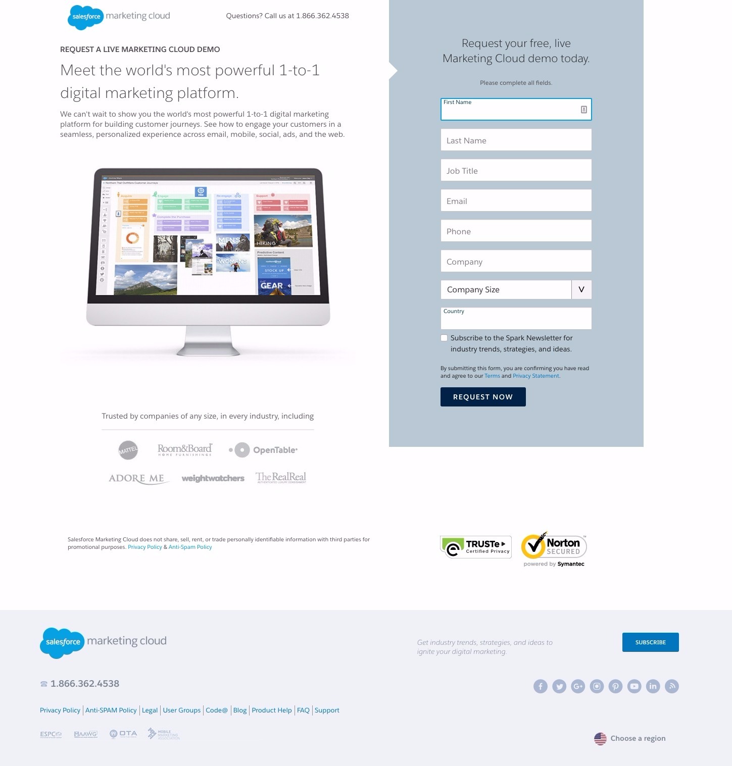
Why This is One of the Best Landing Pages Out There:
- “The world’s most powerful” is a USP which works for Salesforce, because visitors believe it. They know they’re the most well-known CRM, so “the world’s most powerful” naturally follows. If your business can claim anything similar (even if it’s “Omaha’s Top Hairdresser Award”) put it front and center.
- Featuring the trust icons on the bottom right (from TRUSTe and Norton) are best practice as well. They’re something which might differentiate some CRM platforms from others, and, coming from a third-party, are an objective symbol of legitimacy.
26. Uberflip Request a Demo Landing Page
Uberflip is a content management and optimization software company.
Here’s one of their best landing pages:
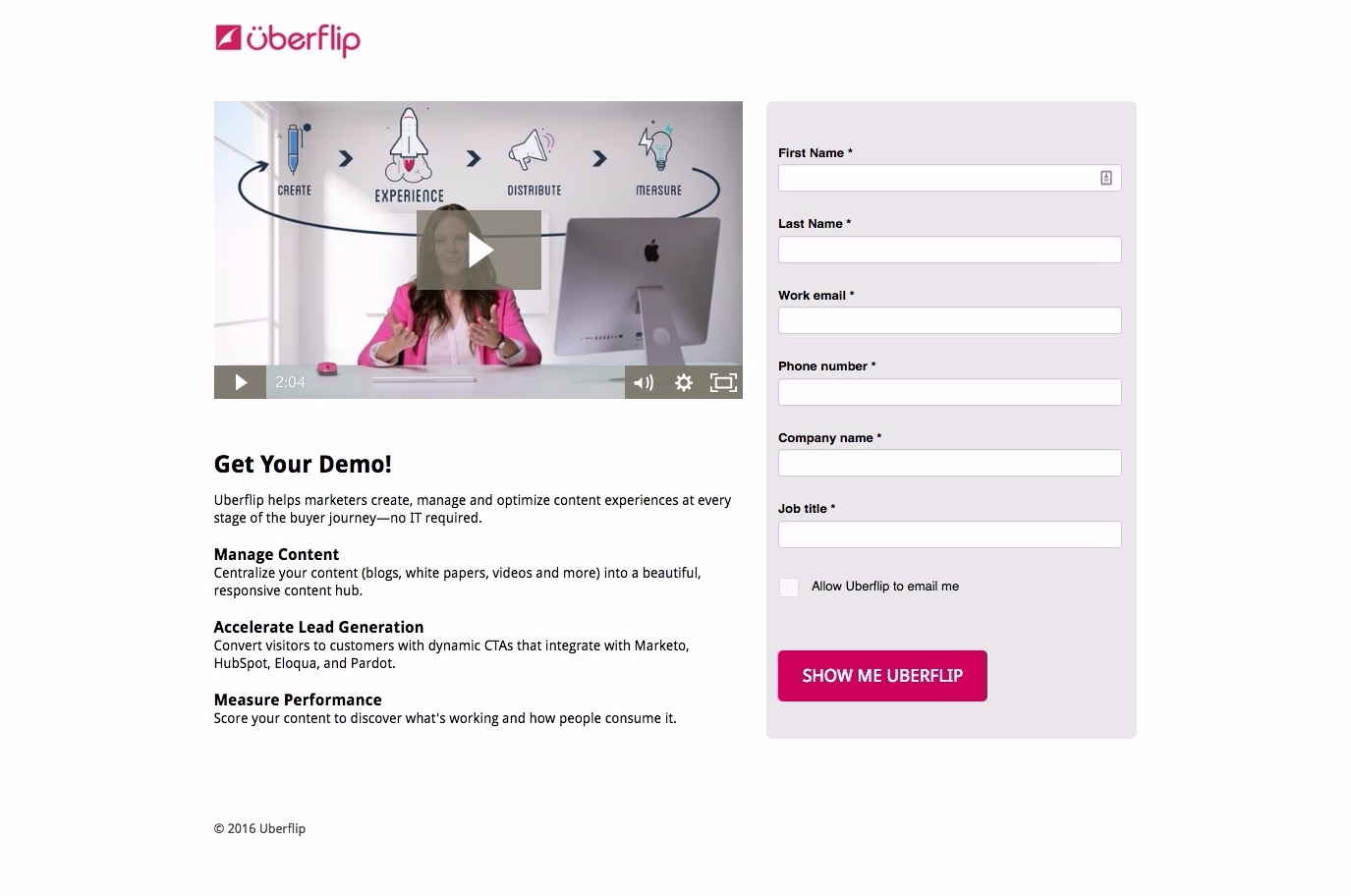
Why This is One of the Best Landing Pages Out There:
- The two minute video showcases the personality, friendliness and value of Uberflip extremely capably. A good video, as well, shows legitimacy – as very few businesses can create one.
- Video platform Wistia also found that two minutes is the optimal length for your video – long enough to introduce yourself and the company and explain everything you need to, but short enough that you won’t lose people’s attention.
- The CTA copy is good here. No “Submit,” which is colorless and lame, but “show me Uberflip” which includes a personal pronoun and takes the heat off a sales prompt.
27. SnapApp Request a Demo Landing Page
SnapApp is an interactive content marketing platform enabling users to create, publish, manage and measure the effect of their content on their audience.
Here’s one of their best landing pages:
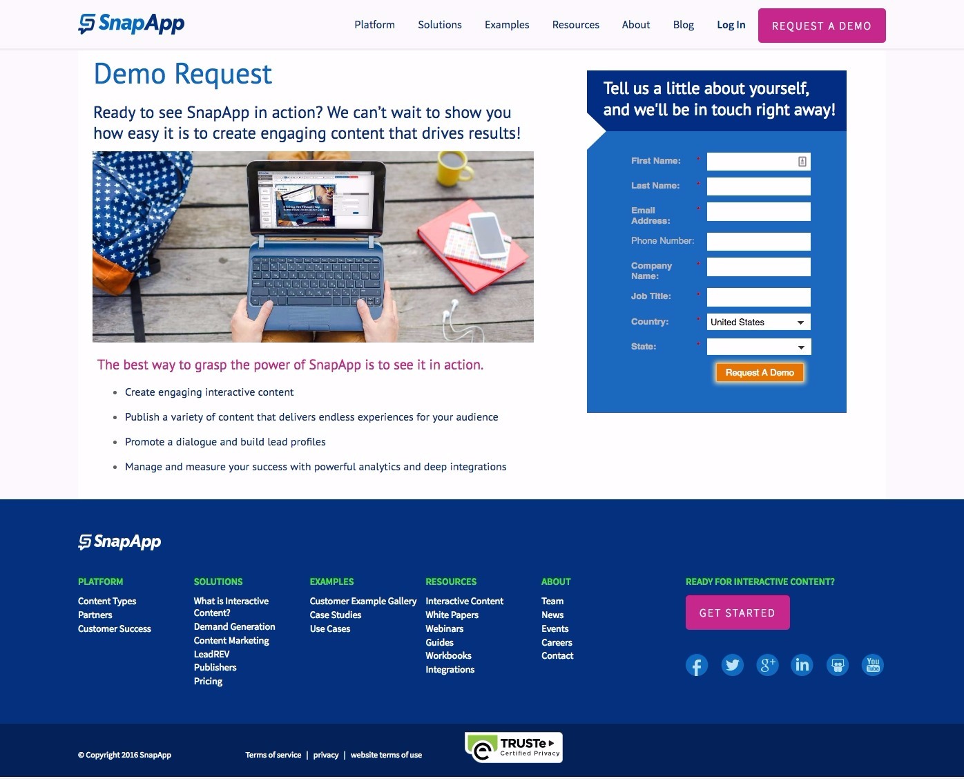
Why This is One of the Best Landing Pages Out There:
- The language here is really exciting and casual, which is super on-brand for SnapApp. Everything is bright and colorful (especially the CTAs).
- The image color scheme (the backpack and book cover) matches with the landing page color scheme.
- Discussing the value of the demo itself is a good call. Convincing visitors that a product demo is a good idea is as much about the value of the webinar as it is about the value of the product.
28. Campaign Monitor Request a Demo Landing Page
Campaign Monitor is an email marketing platform, enabling marketers to send personalized and scheduled emails.
Here’s one of their best landing pages:
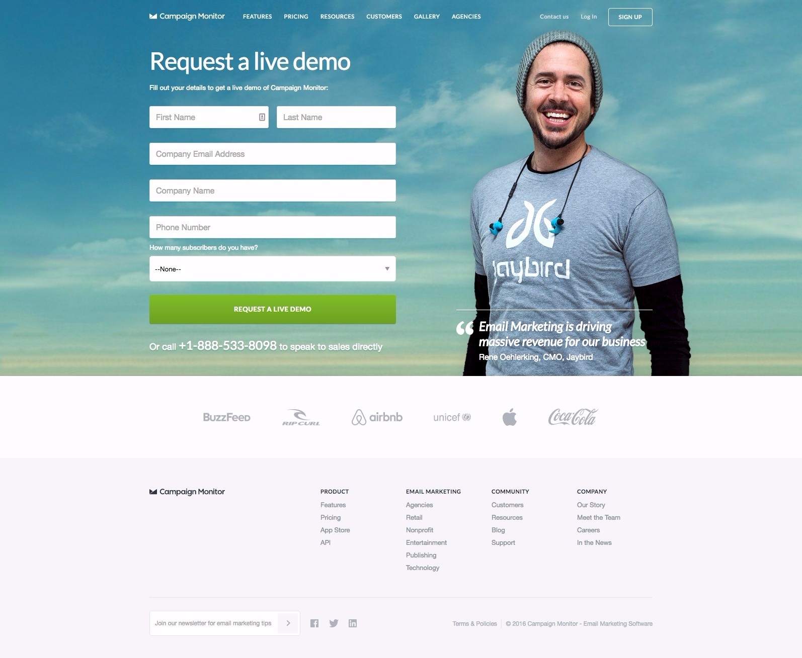
Why This is One of the Best Landing Pages Out There:
- If you have a smiling, youthful CMO whose customer testimonial is “[Business] is driving massive income for our business,” you should definitely test making that the centerpiece for your demo landing page.
- Rene is similar (or probably looks cooler, if anything) to Campaign Monitor’s target market. He’s a CMO (rather than a CEO) and we get his full name, title and company. This exact strategy has been used by Google Analytics’ homepage for years now, so you know it’s worth testing.
- This page is also super simple, featuring little more than the image of Rene, the form, and a few very recognizable brand logos (important particularly as Jaybird is not known all that well).
29. Base CRM Request a Demo Landing Page
Base CRM is a CRM platform designed for sales teams.
Here’s one of their best landing pages:
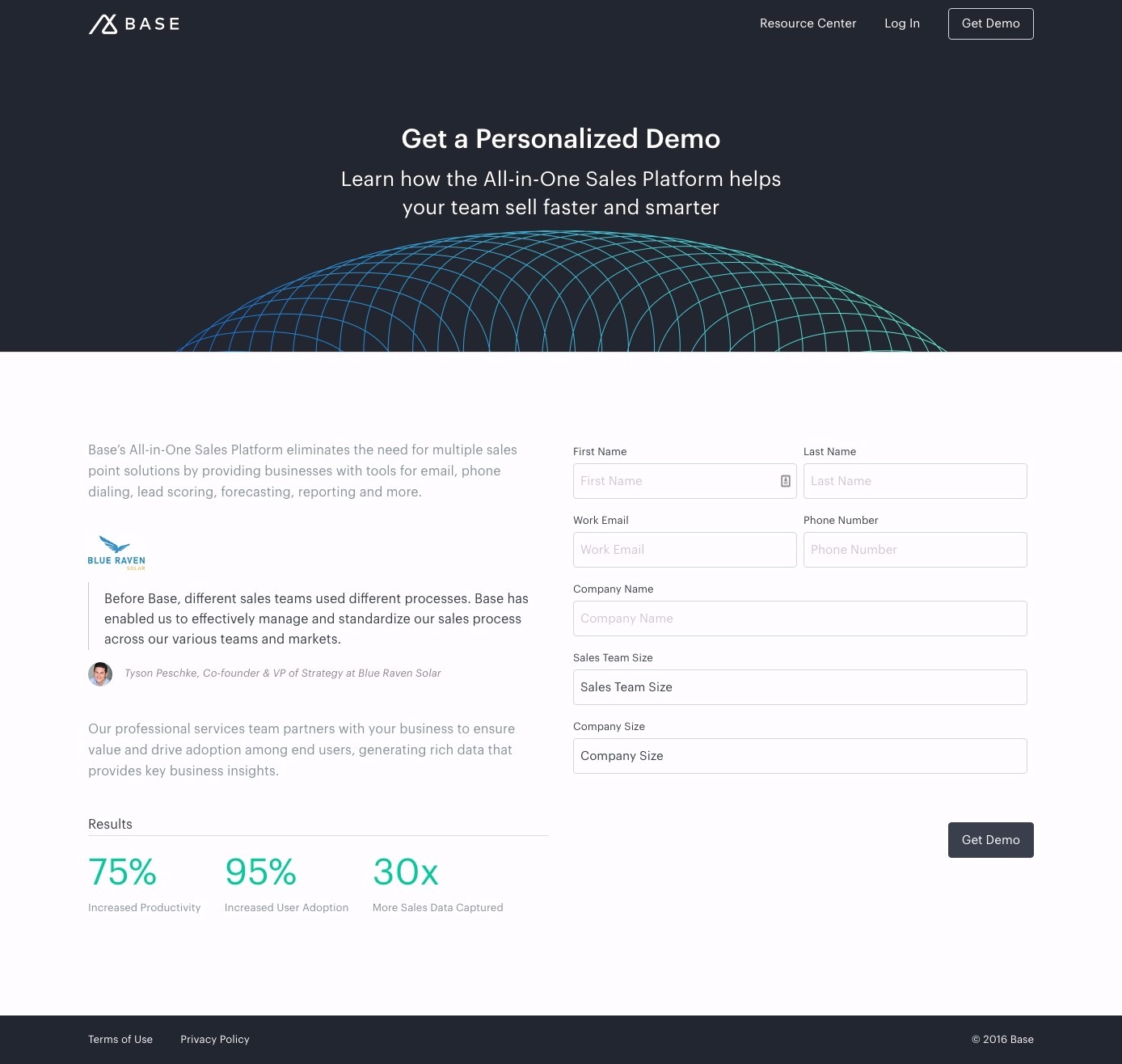
Why This is One of the Best Landing Pages Out There:
- This page does feature a customer testimonial and headshot, which is best practice
- We also get a few promised value propositions in the form of percentage increases in key business KPIs – communicating right on the demo page the value of Base CRM.
- Company and sales team size give Base’s sales team a really clear idea of the quality and value of leads coming through this page. Company name allows them to research their leads before any call – personalizing the demo for their industry and their business size.
30. Zendesk Request a Demo Landing Page
Zendesk is a leading customer service platform built for businesses to deliver excellent customer service and measure their performance.
Here’s one of their best landing pages:
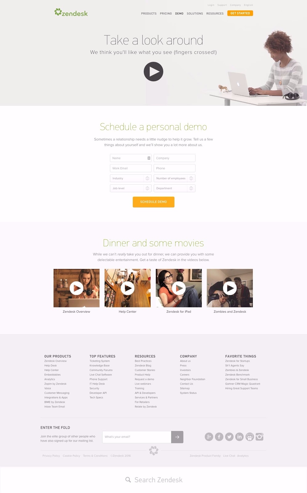
Why This is One of the Best Landing Pages Out There:
- The top video is a super professional (see: expensive) minute and a half video which says everything that’s not said in copy on this page.
- The four videos open up right within the tab (as sending users anywhere else would be a big conversion rate mistake) and are a minute long and funny. They add personality and introduce page visitors to the brand.
- Centering the form is both good for mobile optimization and also means that anyone who watches the to video can engage as well as anybody watching any of the bottom four videos. Placement of your form in relation to the page’s content is as important as any other form optimization strategy.
31. Pardot Request a Demo Landing Page
Pardot is a B2B marketing automation platform and a subsidiary of Salesforce.
Here’s one of their best landing pages:
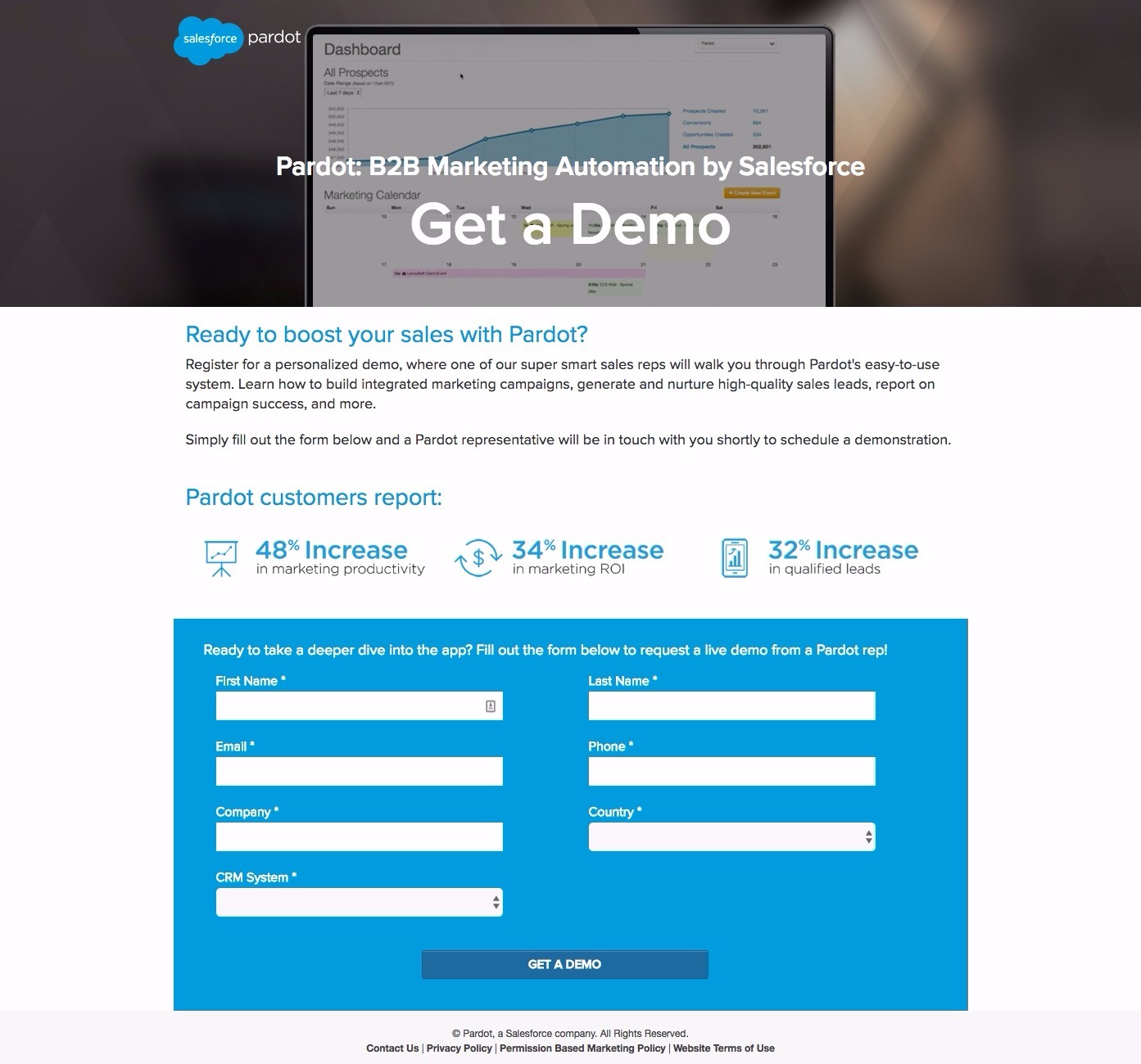
Why This is One of the Best Landing Pages Out There:
- The action-oriented subheadline is a good one. It clarifies immediately that the visitor is in the right place, and tells them exactly what this landing page is for.
- The question subhead “Ready to boost your sales with Pardot” is also action oriented and triggers an unconscious “yes” answer from visitors.
- The three statistics are an effective final piece of value proposition. It’s likely that visitors to this page have explored the rest of the site – product pages, content, etc – but this last bit of concrete, fact-based value is likely the last bit of push they need to book their demo.
32. Contently Request a Demo Landing Page
Contently is a content marketing platform enabling users to create, distribute and optimize their content from one dashboard.
Here’s one of their best landing pages:
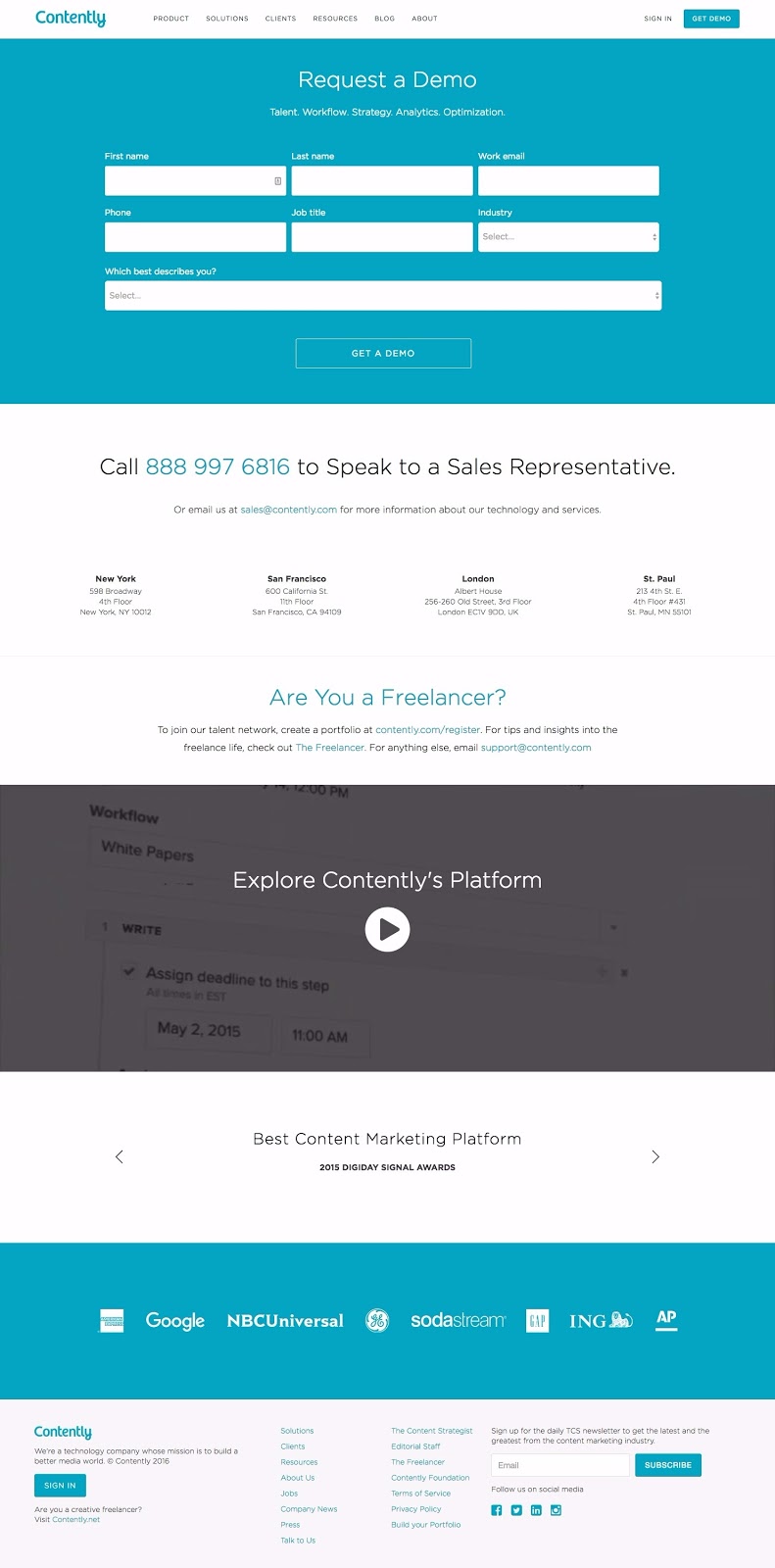
Why This is One of the Best Landing Pages Out There:
- I like the emphasized phone number in the middle of the page, making it easy for people to call Contently if they don’t want to wait to be called. This is a good strategy, so long as your customer support and sales team has the processes in place to address it.
- The video is a professionally-done couple minutes showcasing the look and power of the Contently platform.
- The slider features third-party acclamation, which drives trust.
- The only issues I see with this landing page are CTA related. I can’t help but feel that a CTA beneath the slider, which drives visitors back up to the form at the top, would improve conversions. Also, the lack of contrast concerns me.
33. TrustPilot Request a Demo Landing Page
TrustPilot is a customer review platform, enabling prospective buyers to research companies before engaging.
Here’s one of their best landing pages:
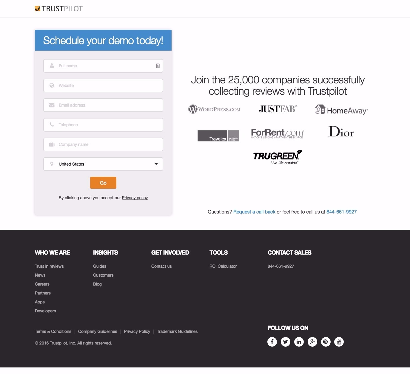
Why This is One of the Best Landing Pages Out There:
- Super simple and to the point, this landing page relies on brand logos to lend legitimacy and credibility to their platform.
- TrustPilot has done a great job of finding seven brand logos that represent the majority of industries who might be interested in collecting reviews. From software companies to real estate, fashion, home maintenance, travel and more.
- The CTA copy “Go” is an interesting one. It’s action-oriented and is significantly more inspiring of action than “Submit.”
34. Lever Request a Demo Landing Page
Lever is a collaborative recruiting platform, enabling businesses to collect, share and provide feedback on prospective employees.
Here’s one of their best landing pages:
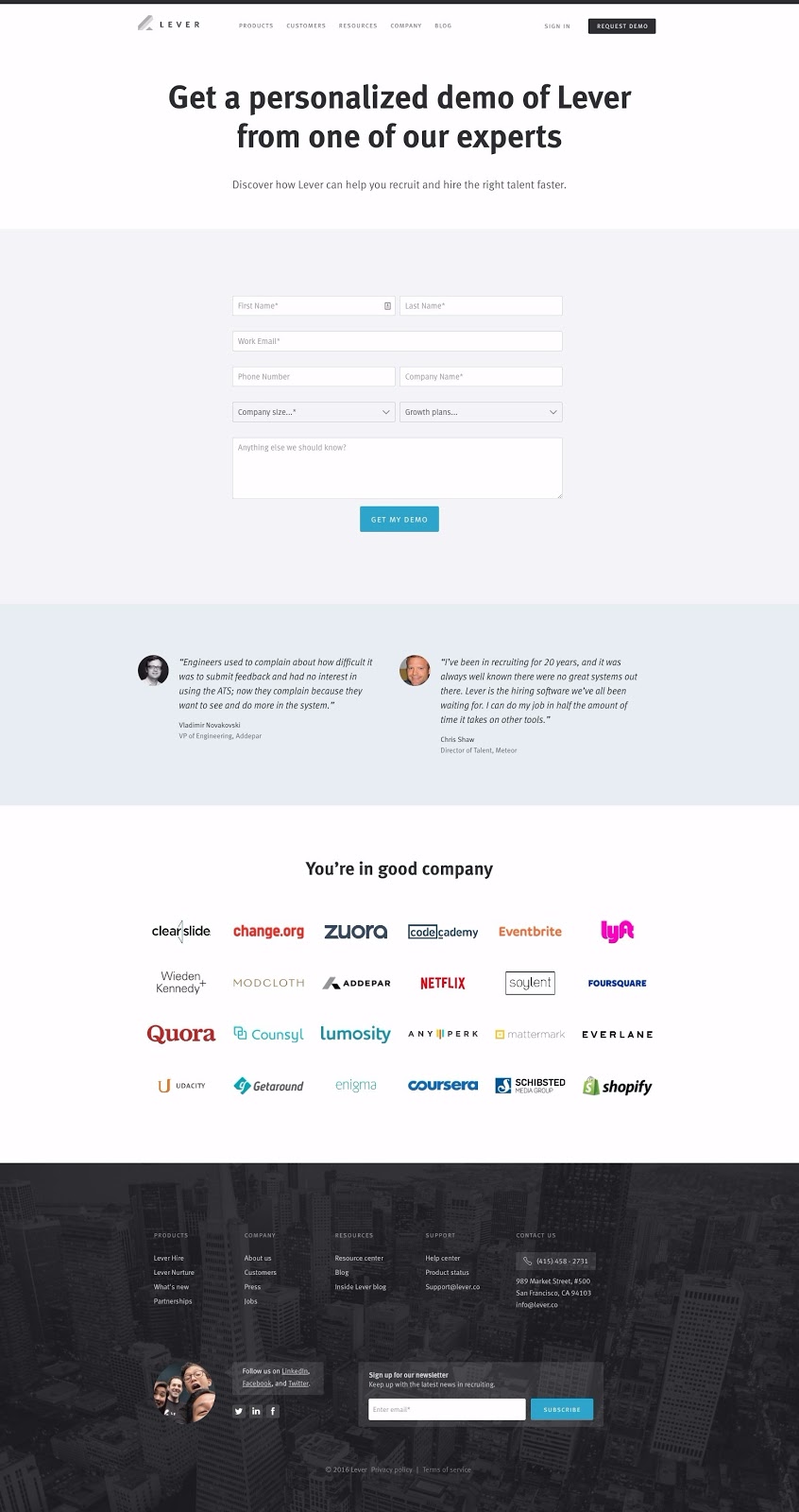
Why This is One of the Best Landing Pages Out There:
- The headline is action oriented, clarifying that people are in the right place and giving them something to do – “Get” is always a good way to start your landing page (no matter the objective). “Discover” (in the subheader) is also good.
- Two positive customer testimonials with headshots and full job titles add third-party, objective value to the page. People trust previous users far more than they do brand representatives. They have no reason to lie and are just reporting on their experience.
- There are enough brand logos here, from many different industries, to assuage any prospective user’s concerns about this company’s legitimacy. There are enough here which are so recognizable that they’ll impress, but a few which are small enough that page visitors aren’t going to be intimidated.
35. Looker Request a Demo Landing Page
Looker is a leading data analysis platform, enabling businesses to collect every piece of data they (and their users) create and derive meaning and strategy from it all.
Here’s one of their best landing pages:
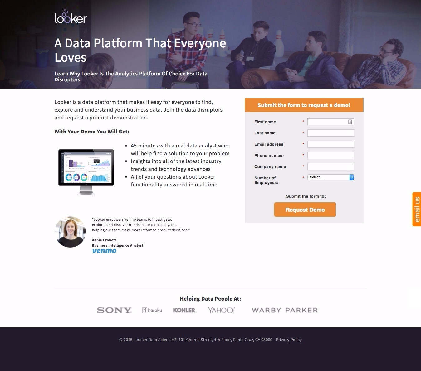
Why This is One of the Best Landing Pages Out There:
- Showcasing your business’ team in your demo page is a good call. People like to know who they’ll be talking to. This can be done through a video (as we’ve seen in several of these demo landing pages) or very simply in a header image, as Looker has done here.
- Breaking down exactly what people can expect from their demo, from the time it’s going to take to what the content will be, is a great way to inform them before converting. People like to know what they’re getting into.
- The customer testimonial, from a business likely to be recognized by the landing page visitor, is a good one. In fact, the choice Looker’s made with Venmo (a business not too large to be intimidating, but large enough to be recognized) is as good as it gets.
36. Pulsepoint Request a Demo Landing Page
Pulsepoint is an online advertising platform built to automate the ad process as well as increase accuracy and reporting.
Here’s one of their best landing pages:
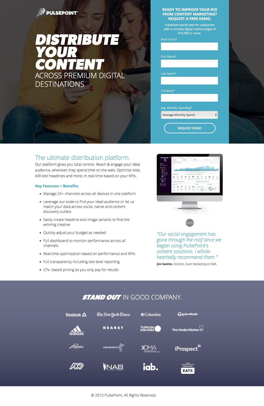
Why This is One of the Best Landing Pages Out There:
- Good background image, good benefit list, platform screenshot and increased legitimacy with the brand logos at the bottom and a customer testimonial.
- What I like most about this landing page is actually the phrase “Pulsepoint works best for businesses with a monthly digital media budget of $10,000 or more.” This is an excellent strategy to ensure you’re generating leads who are worth talking to and investing in. Pulsepoint gets to this right off the bat, only generating leads who match, truly, their ideal customer persona.
37. Knowlarity Request a Demo Landing Page
Knowlarity is a “new-age call center” offering automated SMS messaging as well as outreach and inbound call center services. Their product Super Receptionist is outreach calling.
Here’s one of their best landing pages:
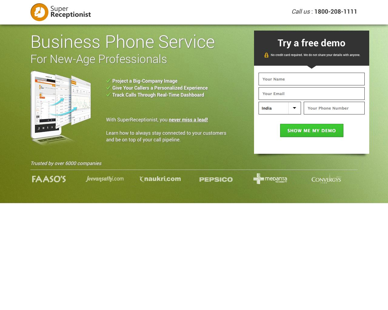
Why This is One of the Best Landing Pages Out There:
- The phone number at the top right makes speaking to an employee easy and is essential for a business whose market is phone sales and communication.
- Very succinct copy drives visitors to the demo, rather than product pages.
- A “Trusted by” section is a great way to communicate trust with visitors. These are large, recognizable brands and visitors know that if they trust and use Knowlarity, their businesses can too.
- If most of your visitors are coming from one particular country but you’re generating leads from all over, you might see an increase in conversion rate if you make the phone number area code/country code from the most likely location.
38. CMNTY Request a Demo Landing Page
CMNTY is a platform for creating customer-focused online communities which allow you to drive quantifiable results through communication.
Here’s one of their best landing pages:
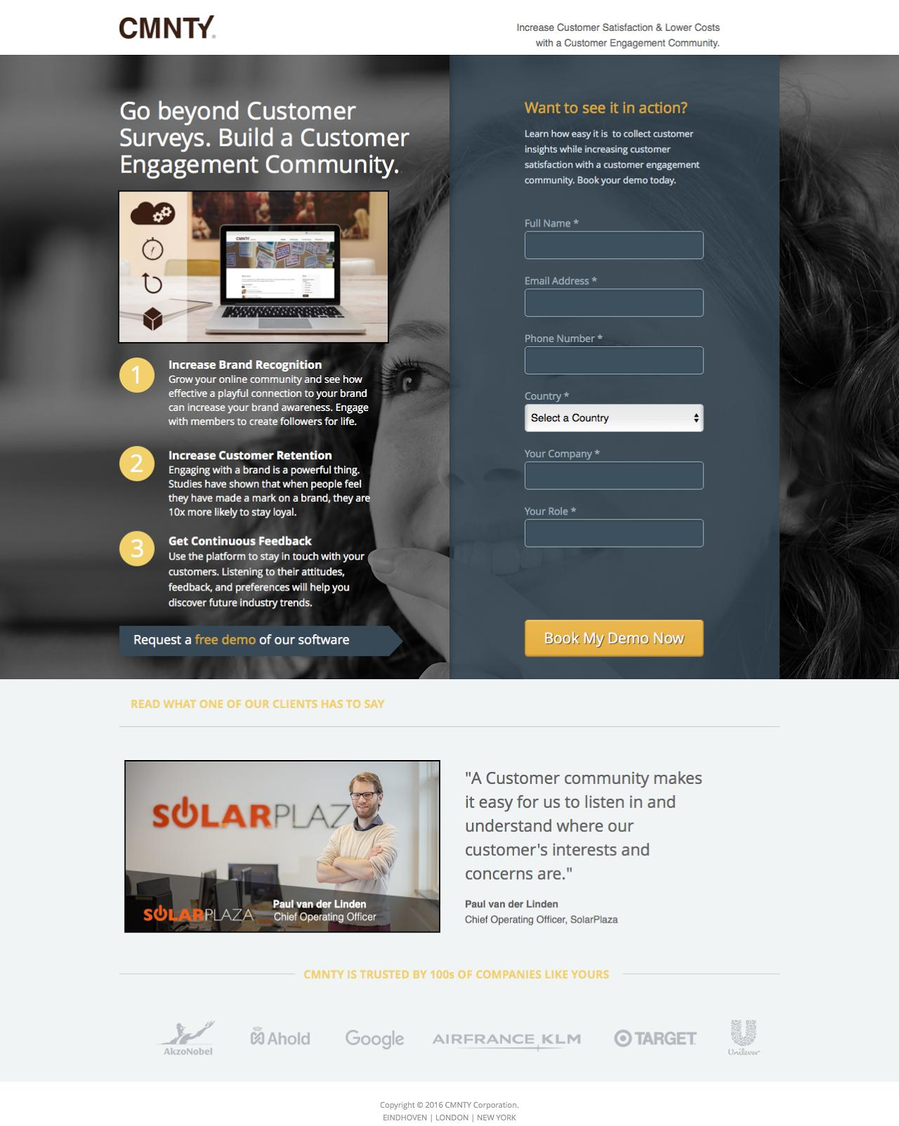
Why This is One of the Best Landing Pages Out There:
- A clear headline communicates the purpose of the company in an appealing way
- The three-point benefit list communicates value and unique selling points clearly.
- A directional cue (the arrow beneath the three bullet points) drives the viewer’s eye back to the CTA button. This is design best practice.
- Customer testimonial from someone like the visitor (CMNTY’s ideal customer) creates trust and gives specifics of the value of conversion.
39. Co-Construct Request a Demo Landing Page
Co-Construct creates home building and remodelling software, enabling contractors to manage selection sheets, change orders, scheduling and more.
Here’s one of their best landing pages:
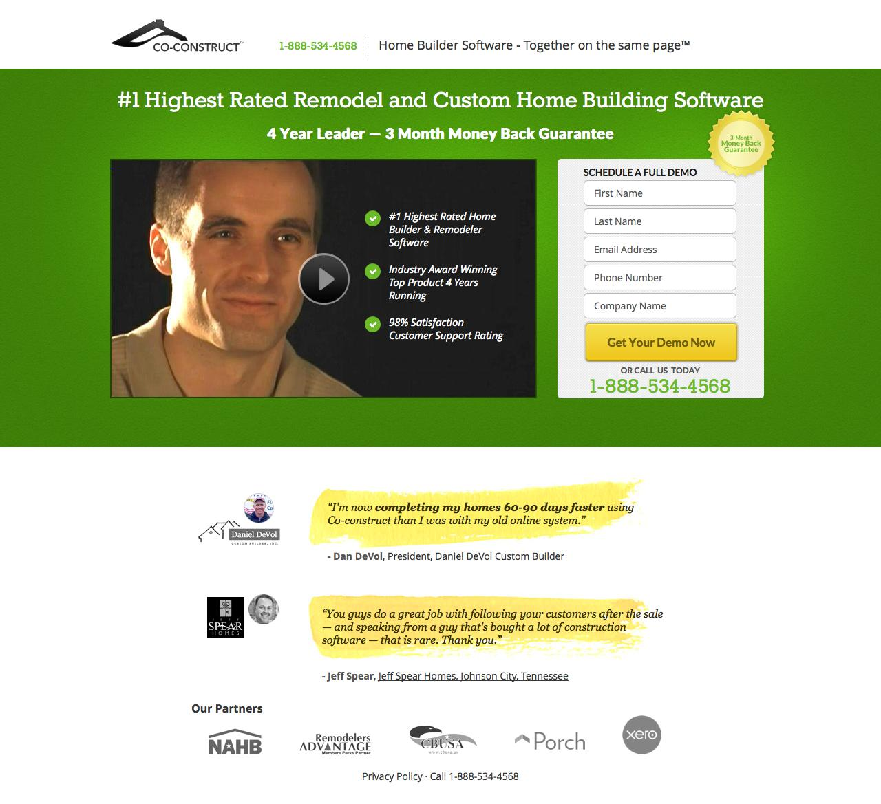
Why This is One of the Best Landing Pages Out There:
- Focuses on Unique Selling Points right off the bat: #1 highest rated remodeler, 4-year leader and a 3-month money back guarantee. All of these things set Co-Construct apart from competitors so it’s right that they’re front and center.
- Video featuring someone similar to the target market explaining the value of conversion.
- Customer testimonials bring home Co-Construct’s emphasis on customer satisfaction.
- Obvious phone number addresses landing page visitors not ready to convert here and now.
- Asking for company name allows sales associates to prepare before the demo, enabling personalization and increasing lead conversion rates.
40. Bizzabo Request a Demo Landing Page
Bizzabo is an event management software company which helps organizers build websites, sell tickets and grow communities.
Here’s one of their best landing pages:
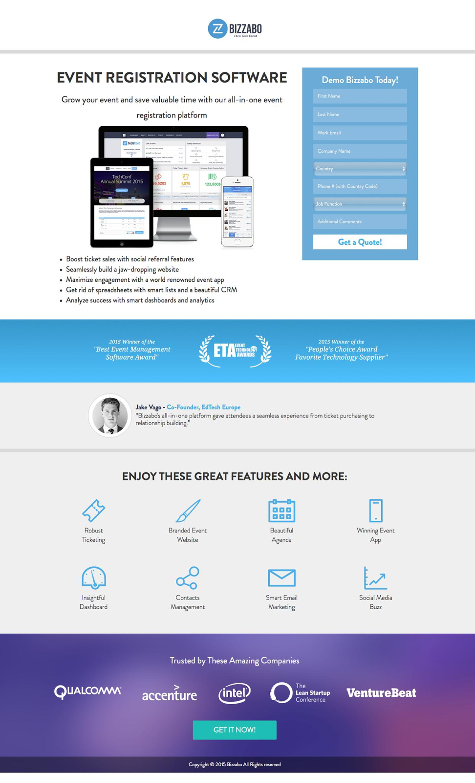
Why This is One of the Best Landing Pages Out There:
- If you have a modern and professional-looking dashboard, your demo page should showcase that platform. You’re selling the look of your product as much as the value of it. Bizzabo hasn’t shrunken away from featuring their beautiful dashboard front and center.
- If your business has won a recent award, it’s an unbiased way of saying you’re trustworthy and bring results. Similar to a testimonial (which this page also has), awards won are a great way to build trust with prospective customers.
- My only critique of this page is that they’ve consolidated their benefit list into a small section below the image, almost as an afterthought. The page could be better balanced if that was a full-width section.
- Second CTA below-the-fold is best practice and will send prospective leads back up to the form with anchor linking.
41. Athena Health Request a Demo Landing Page
Athena Health creates software for the medical field, making it easier for doctors, nurses and medical students to track and notate their patient’s diagnosis, treatment, behavior and everything else.
Here’s one of their best landing pages:
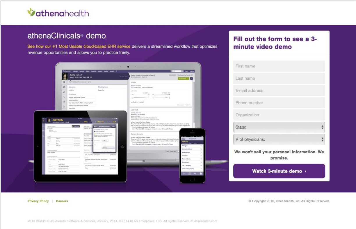
Why This is One of the Best Landing Pages Out There:
- This landing page puts the platform dashboard front and center, showcasing its mobile optimization and organization. This, in and of itself, makes the demo more desirable.
- If you have a video demo, be sure you inform people how long it is before they convert. The most important element of any video demo (or webinar, for that matter) is knowing how much time you have to commit to it. If your video is only 3 minutes, put that information front and center, as Athena Health does both in their form headline and CTA copy..
- Having a good “we won’t sell your information” note is best practice. Just be careful not to use the word “spam” as it’s been shown to do nothing more than remind prospective leads about the possibility.
42. Traackr Request a Demo Landing Page
Traackr is an influencer marketing coordination platform, enabling users to manage their relationships with influencers completely and from one place.
Here’s one of their best landing pages:
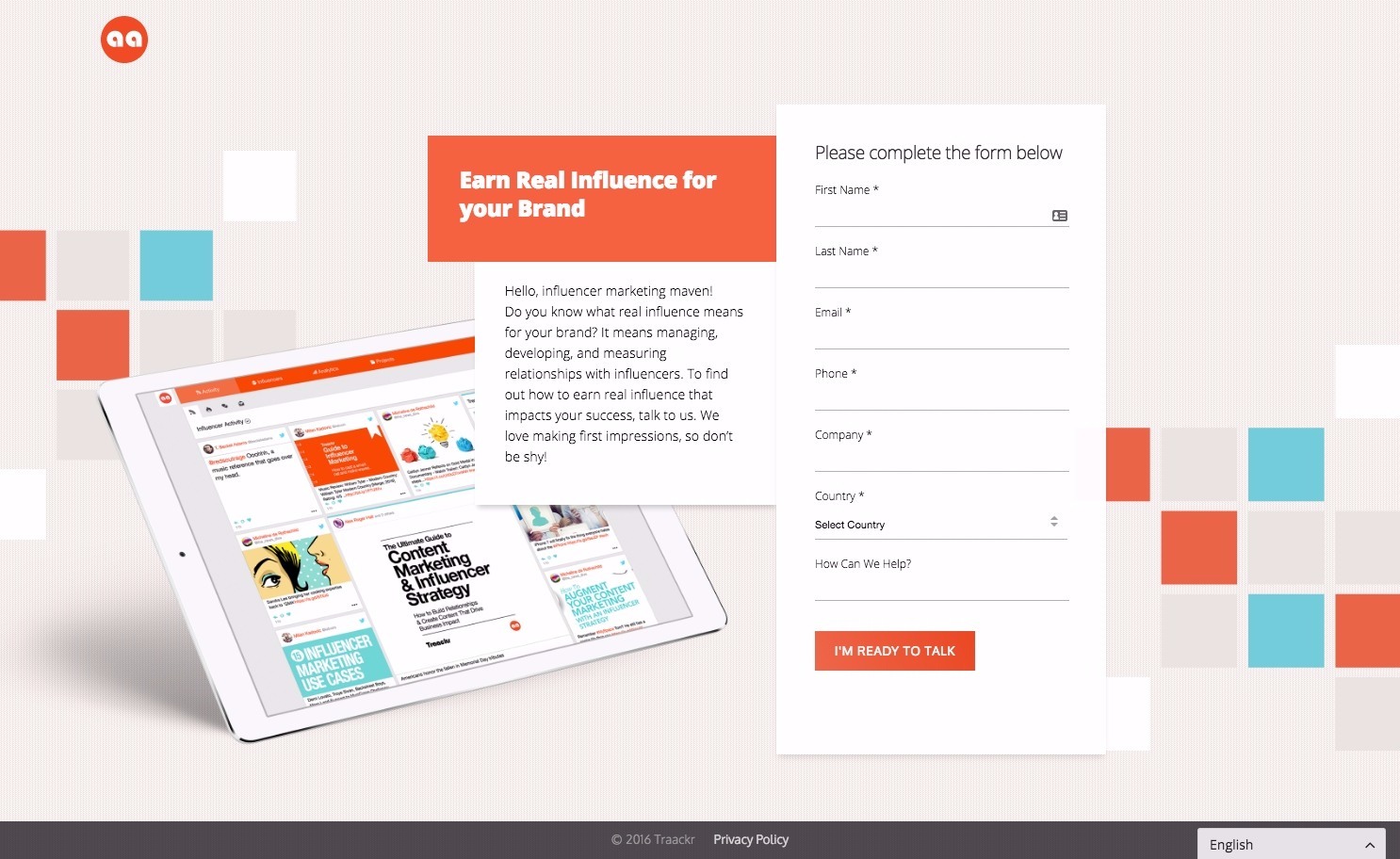
Why This is One of the Best Landing Pages Out There:
- This landing page is centered around the platform image – showing its mobile responsiveness as well as modern and visually appealing design which is perfectly consistent with the page itself.
- Because there’s so little text on this page, the paragraph is actually fine. Only when you need to communicate a lot of information or value do you need to separate it with bullet points or emphasize it with bolding or encapsulation.
- “I’m ready to talk” is a very straightforward CTA. This copy will actually ensure that everybody who clicks it is actually a late-stage lead. In many ways this CTA copy segments leads as much as any of the fields do.
43. Appboy Contact Us Landing Page
Appboy is a marketing platform which enables users to send personalized messaging automatically and at scale across devices.
Here’s one of their best landing pages:
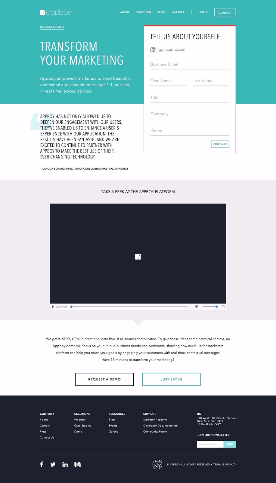
Why This is One of the Best Landing Pages Out There:
- Multiple CTAs drive visitors back to the form at the top. If you’re going to have a landing page which has a scroll, be sure to have multiple CTAs to enable easy conversion.
- The customer testimonial is large and in caps. As best practices dictate, the full name and job title of the customer is also featured.
- Enabling LinkedIn signup works well for Appboy’s target market (business professionals) and makes it easier for them to book a demo.
- The video gives visitors a full breakdown of what Appboy does and what the platform looks like, but also communicates the importance and necessity of a demo to understand. The paragraph below the video does the same.
44. Sila Contact Us Landing Page
Sila heating and air conditioning is a Virginia-based HVAC company.
Here’s one of their best landing pages:
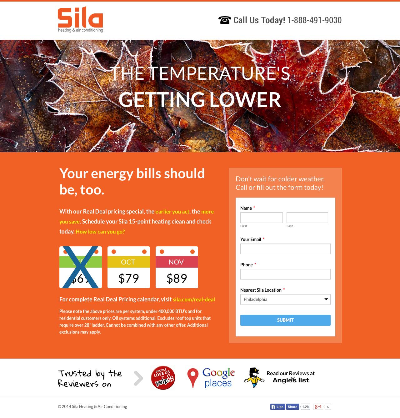
Why This is One of the Best Landing Pages Out There:
- Seasonal and time-based campaigns do significantly better than more general ones. If your business has any ties to the holidays, sporting events or the seasons, definitely take advantage of it.
- I love how they eliminate cheaper prices as the promotion gets farther into Fall – incentivizing visitors to engage before they lose out. This creates urgency – a valuable element of many successful lead generation campaigns.
- The headline is very general and unrelated (directly) with the offer. It works only when joined up with the subheader. This drives the visitor’s eye downward to the next value-focused message.
45. Cvent Contact Us Landing Page
Cvent is software company which creates online event registration, venue selection, event management, email marketing and web surveys centered around event management.
Here’s one of their best landing pages:
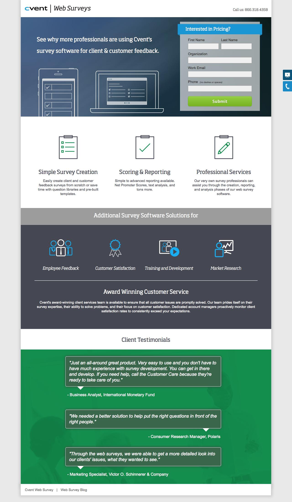
Why This is One of the Best Landing Pages Out There:
- This is, essentially, a product page for Cvent’s survey tool, but they’ve structured it as a landing page to generate leads interested in pricing for the software. Utilizing landing page conversion rate best practices within other pages of your site is a great way to improve your online conversions.
- The color scheme is good, and the sectioning very effective in keeping a visitor’s attention in one place at a time.
- Little things are well-done here as well. Asking for “work email” instead of email address is a subtle way to comfort prospective leads. They’re not asking for your personal email, just the one you use for business.