Wishpond Landing Page Templates
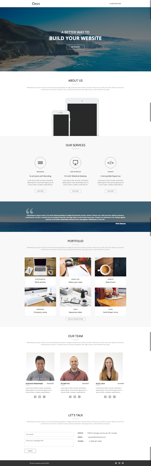
1. Wishpond Landing Page Template: “Speak Up Conference”
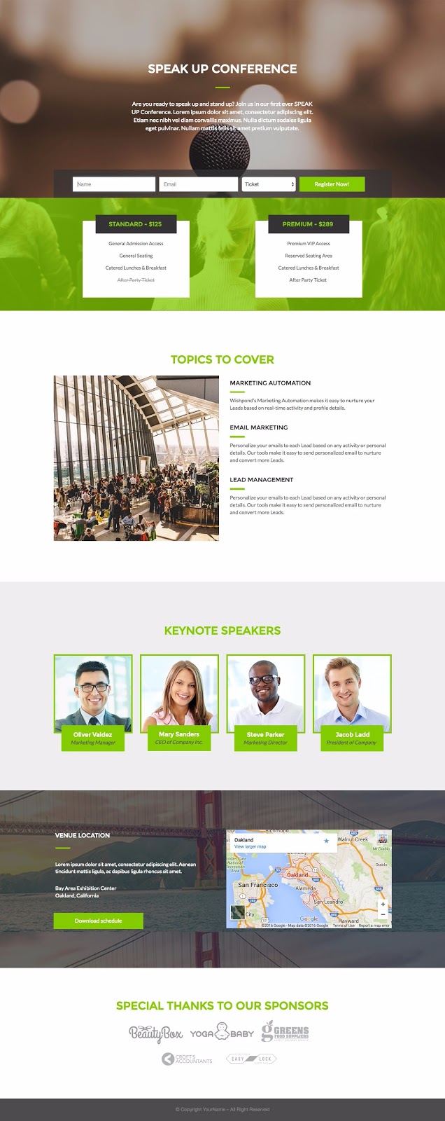
The Best Part of this Landing Page Template:
- This landing page has seven sections (the full-width elements which give us the background color and house rows). A template with a lot of sections is really useful because it allows users to easily remove a couple and retain the overall design layout. So long as the color scheme and pattern remains constant it still looks great.
Landing Page Template Use Cases:
- An upcoming conference: If you use this landing page for a conference, consider buying a relevant domain name and creating a small microsite with this as the homepage.
- Cafe or Restaurant: The hero image (top header image) can be replaced with an image of your restaurant or cafe and the “speaker” section can be removed. Retain the map and replace the “sponsor” section with a link to awards won. Make this your reservation or booking landing page.
- Webinar: Retain some of the images, remove the map section and change the two pricing options to the two times you’re running the webinar. Remove the horizontal form and add buttons to the two boxes below with corresponding click popups for registration. Retain the speakers section but have it feature your hosts.
2. Wishpond Landing Page Template: “Book Your Spot”
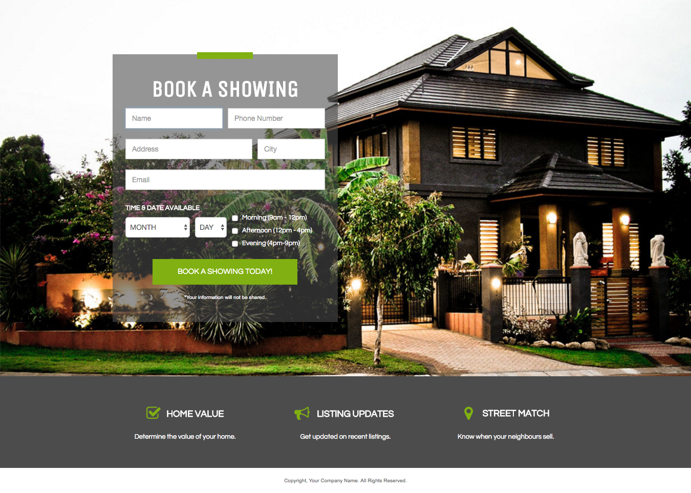
The Best Part of this Landing Page Template:
It’s simplicity. It relies heavily on a high quality image, but once that’s in you’re almost done. Unless you’re using it as a coming soon page, be sure to include the bottom section or add a headline. The page needs to feature value somewhere, but relies heavily on the image and minimalism.
Landing Page Template Use Cases:
Any business looking to book reservations or requests for quotes can use this landing page effectively…
- Realtors
- Restaurants: a large, high-res image featuring the outside or inside of your restaurant could replace the home image and you could take reservation appointments
- Daycares: Change the CTA to “Contact me” and change the three icons below to feature your primary sales points.
- Tradespeople: People can request a quote, and the image behind can feature a project you’ve worked on or your employees smiling, next to a job site.
- Coming-Soon: This page could effectively be changed into a squeeze page which generates lead data from people interested in a product not yet released.
3. Wishpond Landing Page Template: “Ebook One”
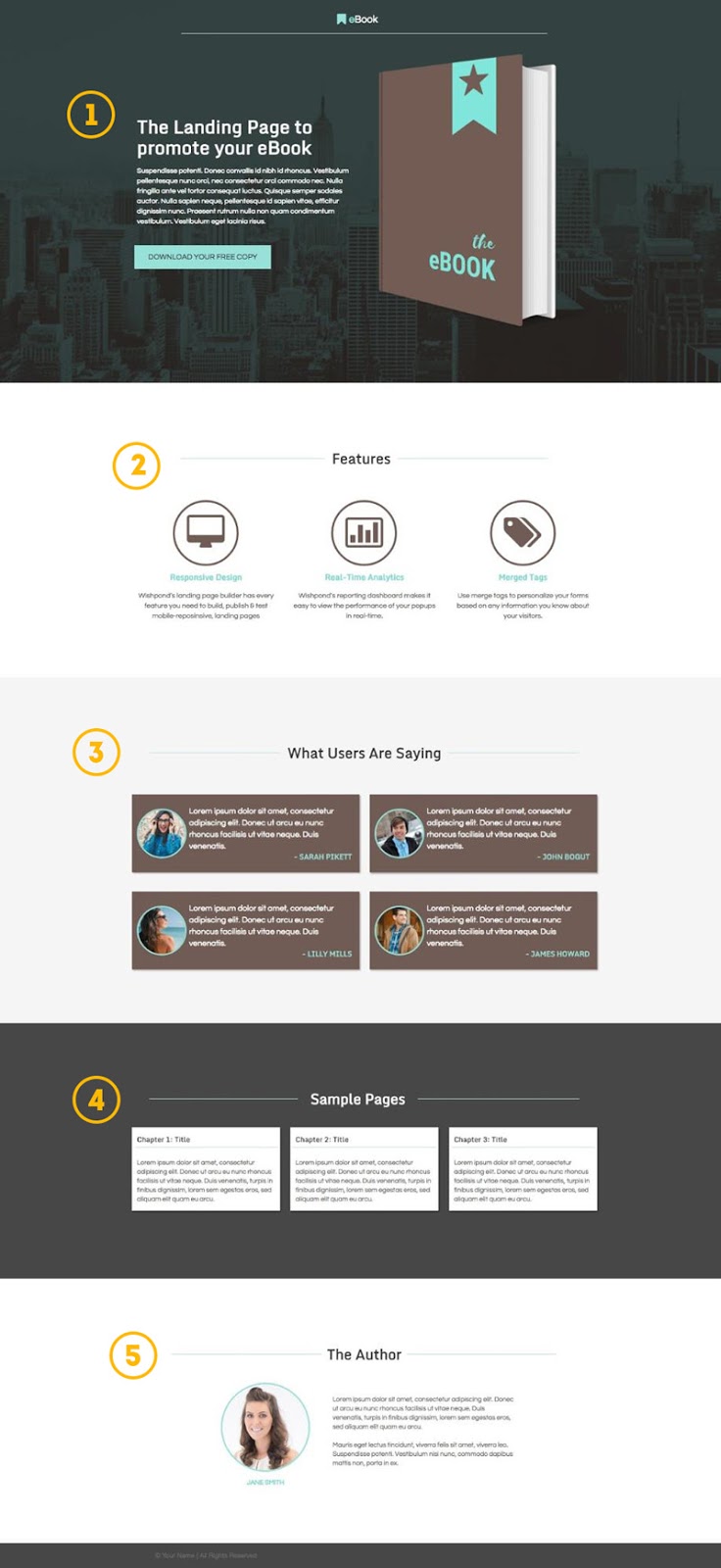
The Best Part of this Landing Page Template:
Features a section for every best practice:
- Above the fold CTA to trigger multi-step opt-in (a click popup)
- A key features section to easily display three primary selling points
- Testimonials section. Testimonials have shown to increase landing page conversion by 25%
- Sample pages tease the visitor with the value and professionalism of the ebook
- About the author personalizes the page and the content.
Landing Page Template Use Cases:
- Product page: This would work well as a product page because of the pre-existing testimonials and feature section. Remove the “author” section and replace the sample pages with platform screenshots and you’re good to go.
- Webinar: The “Author” section and testimonials would work well for a webinar landing page. Remove the sample pages section and change the features section to be “What you’ll learn.”
4. Wishpond Landing Page Template: “Canary”
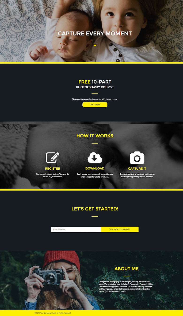
The Best Part of this Landing Page Template:
The color scheme is really engaging and professional without being cold and corporate. Replace the photography-centric images with professional ones and this can quickly jump industries.
Landing Page Template Use Cases:
- Squeeze Page: Replace the baby screenshot with a professional one and drop the “Free 10 part” section and the “About Me” section and you have a squeeze page with an above-the-fold CTA, horizontal form and a “how it works” section which can be remodelled to become benefits.
- Resources or Case Study Page: Reduce the hero image (top header) in height and bring the CTA upward for access to a resources or case study download. For case study, replace the “how it works” section with brand logos and add buttons. “About Me” would become “About Us.”
5. Wishpond Landing Page Template: “Rosy”
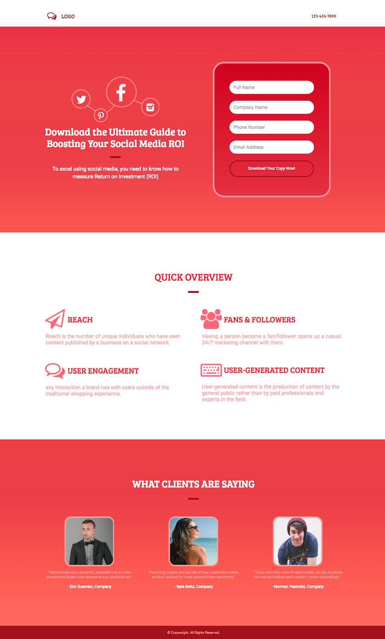
The Best Part of this Landing Page Template:
It’s a good length. Your ebook landing page needs a headline, form and CTA above-the-fold. The below-the-fold benefit list or “what you’ll learn” section is, technically, optional – as is the “What clients are saying” section. Both can be removed to create a squeeze page very easily.
Landing Page Template Use Cases:
- Webinar, course, whitepaper: This page would work well for any gated content. Use the bottom section either to feature the authors, showcase testimonials or tease visitors with pages from the content.
- Product Page: The “What clients are saying” and “Quick Overview” works well for a product page, though you’d need to remove the fields and use a simple button to send visitors to pricing
6. Wishpond Landing Page Template: “Sky Blue”
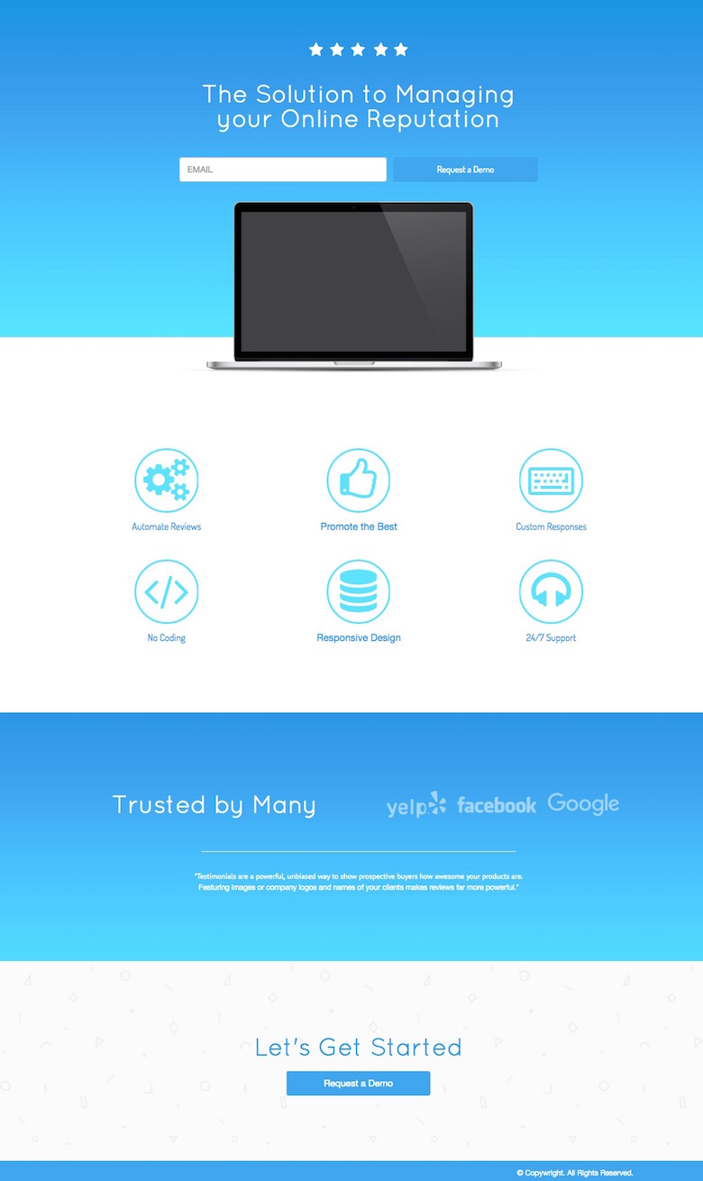
The Best Part of this Landing Page Template:
This is a great foundation page, allowing users to adapt a lot of it while retaining the reliable structure and flow:
- Headline
- Subheadline
- Form and CTA (above the fold)
- Image
- 6-point Benefit List
- Trust Building/Testimonial section
- Below-the-fold CTA so visitors don’t’ have to scroll back up
Landing Page Template Use Cases:
- As it is, this would work well as a PPC campaign page for a product. Add a nav bar and it no longer has to be only for PPC campaigns. Add a couple more images and turn the “trusted by Many” section into testimonials or brands you’ve worked with
- Could be used as a homepage as well as a product page. Many businesses are finding that landing page-style homepages are driving better conversions than just using their homepage as a hub for the rest of the site.
7. Wishpond Landing Page Template: “Smartwatch”
The Best Part of this Landing Page Template:
It’s pretty much done. Everything, including inspiration for your copy, is there. If the images don’t apply you can find others that have the same layout. Sometimes landing page templates (like above) are just the framework, and that enables people to explore their own creativity. This template, however is beautifully created by a UX-trained graphic designer and, if you simply add to it with your own copy and similar images you’ll be good to go.
Landing Page Template Use Cases:
- App or Browser Plugin: It’s what this page is made for. Whatever your app does, it’ll work here. Just switch out the images and retain most of the copy and you’ll be getting downloads in no time.
- Pre-launch/Kickstarter: Change the middle mobile image for a video and add a single form field above the CTA button and you’ve got a page optimized for software or a service not yet published.
8. Wishpond Landing Page Template: “Aquamarine”
The Best Part of this Landing Page Template:
The middle section is versatile, and, as it can be difficult to get the balance of multiple columns/multiple rows right, it’s nice to have it done for you.
With Wishpond’s editor it’s very easy to resize/overlay/color/edit any image you have so they work as well as these ones do here – even if they don’t start out the same.
Landing Page Template Use Cases:
- Anyone looking to display a selection of products: Ecommerce businesses could link each thumbnail and button to a product landing page (which are really easy to create and duplicate in Wishpond’s builder).
- Resource, Case Studies, Webinars or Courses: This page would work well for a collection of ebooks or case studies as well as recorded webinars. Each thumbnail could either open a click popup with a video/content embed or send visitors to relevant pages.
- Squeeze Page: The thumbnails don’t have to link anywhere except to their corresponding full-size image. If so, this page could be used simply to generate signups (particularly if you added a testimonial section at the bottom).
9. Wishpond Landing Page Template: “Adventure”
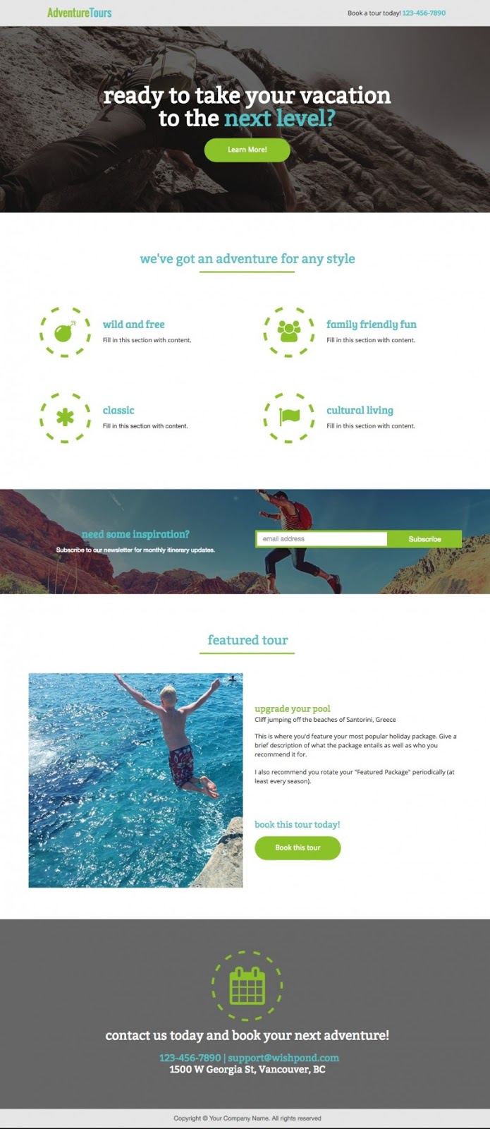
The Best Part of this Landing Page Template:
The color scheme is really good here – bright, contrasting greens and blues really set offf against the grey and white. It allows for your images to really stand out, so if you use this landing page, be sure the images you use are high quality and match well with the color scheme as it is. Wishpond’s editor makes it easy to create colorful, semi-transparent overlays if your images don’t currently match up.
Landing Page Template Use Cases:
- Tourism/Adventure: With a fun and family-oriented color scheme, this page would work well for any business’ homepage in the tourism industry. This page would work best with the CTA “Contact me.”
- Photography: The four icon-ed section could work for a photographer who did family, wedding, special event and newborn photo shoots. The “featured” section would work well for a “Featured, Limited-Time Deal.”
10. Wishpond Landing Page Template: “Teddy Bear”
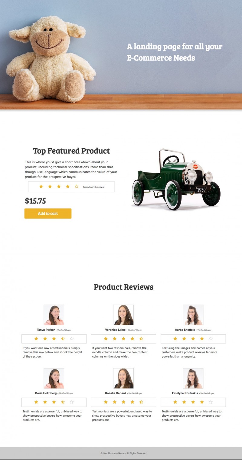
The Best Part of this Landing Page Template:
It’s always helpful when a template does something for you which might be difficult to create yourself. The Featured Product section of this page is just such a section.
Landing Page Template Use Cases:
- Individual Product Page: Ecommerce platforms could create and duplicate this page as many times as they need, with the header image being related to the part of their business (men’s, women’s, children’s, holiday, etc) and the image below specific to the product.
- Resource/Webinar: If you removed the “product” section and replaced the thumbnails of the girls below with resource thumbnails this page would work well for a resource or webinar page.
- About Us: If you replace the reviews at the bottom with headshots of your employees and a single sentence bio or job title this could work as an about us page.
11. Wishpond Landing Page Template: “Warehouse”
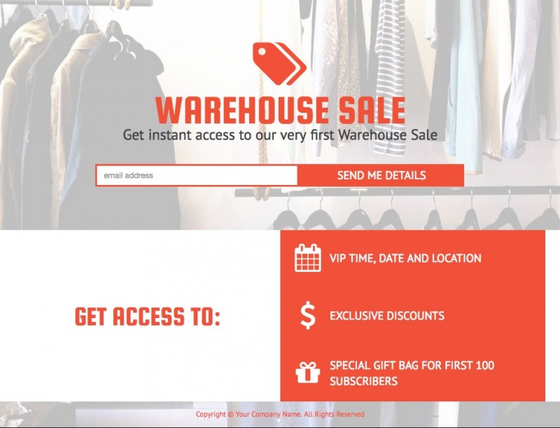
The Best Part of this Landing Page Template:
This is a very simple page, but includes everything you need nonetheless. The best part is probably the background image. If you can get a relevant image of your product or people smiling and using your platform, the background can parallax-on-scroll to give you a very cool and contemporary design effect.
Landing Page Template Use Cases:
Why we love this landing page:
- Offer or Discount: if you’re running any promotion for your business, this page can quickly and easily be utilized to generate leads for it. Tie your social posts or a scroll bar to this page to maximize conversions.
- Pre-Launch Promotion: If you replaced the “Get Access To” column with a video the page could be an effective Kickstarter-type page or pre-launch squeeze page.
12. Wishpond Landing Page Template: “Big City”
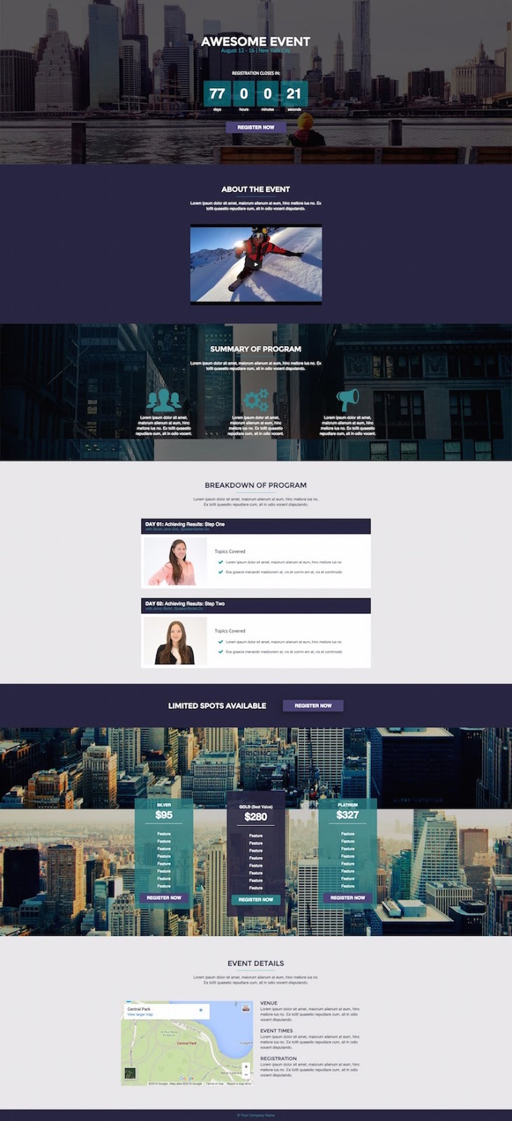
The Best Part of this Landing Page Template:
Countdown timers have been shown to increase promotion conversion rates by more than 300]%. This one is front and center and the first (and then probably third) thing you see, alongside the headline confirming visitors are in the right place.
Landing Page Template Use Cases:
- Conference/Event: This is what the page is made for, and it’s an optimized one. If you are running a conference, replace the city images with images of the city you’re holding it in.
- Webinar: The countdown timer and testimonials can be utilized without any change, while the three-part pricing structure can be altered to become three times for your webinar (PST, CT and EST).
If you are going to remove the testimonial section in the middle, add the grey background into the benefit section to maintain the balance of the page color scheme.
13. Wishpond Landing Page Template: “Seattle Startup”
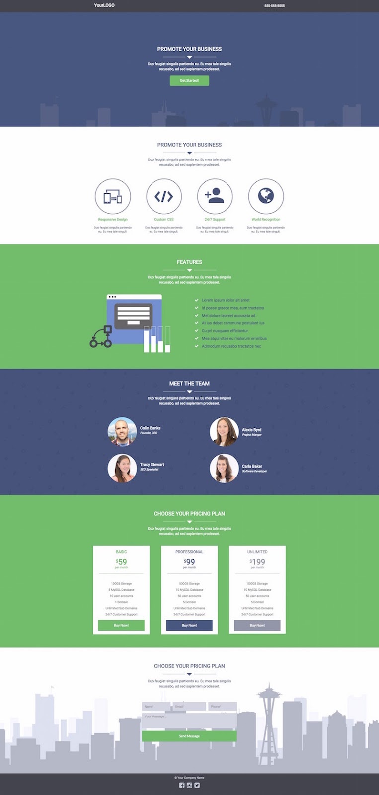
The Best Part of this Landing Page Template:
The city-focused images, reflecting each other on top and bottom of this page, are a visually-appealing idea, and could be recreated in no time by a designer with even a modicum of experience – for any city. And if you’re from Seattle, just steal ours…
Landing Page Template Use Cases:
- Homepage or Product Page: The “Meet the Team” and “Choose your Plan” section can easily be repurposed to hold another Feature or Tool section.
- Pricing: The middle blue and bottom green section can be removed and the pricing section can be brought up, expanded, and placed above the green Features section.
14. Wishpond Landing Page Template: “Sunflower Startup”
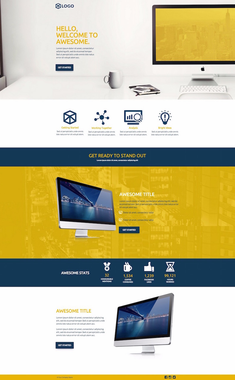
The Best Part of this Landing Page Template:
The color scheme here. Even though dark blue is a very commonly-used color (particularly in the tech industry) the brightness of the yellow brings an element of light and youthfulness which effectively makes what would otherwise be a sincere page both professional and fun.
Landing Page Template Use Case:
- Product/Homepage: This page is made to be a product or homepage, and it’s an excellent one. Replace the images with something relevant to your business or a graphic of your platform and change the yellow for whatever accent color you use. Try to retain the dark blue, though. Keep the two blue accent sections in the middle, whatever you do.
15. Wishpond Landing Page Template: “Bay Street”
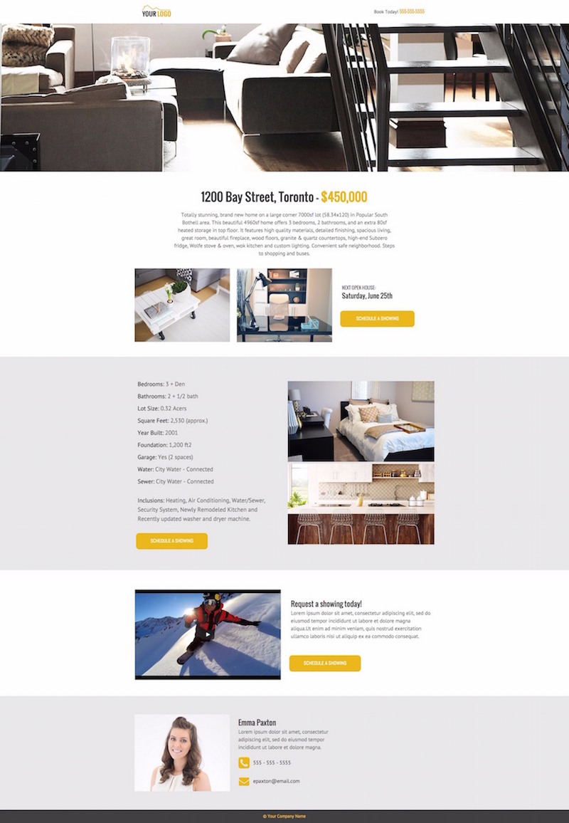
The Best Part of this Landing Page Template:
The multiple CTAs, all of which have the same conversion goal, but correspond to different selling points. As soon as a visitor is sold on booking an appointment, no matter what sold them (right off the bat, the home information, or the video), they can do so.
Landing Page Template Use Cases:
- Real Estate: This page would be difficult to adapt to anything except real estate purposes. As it is, each section should be retained. However, if you don’t have a video you can make the “About Realtor” section background at the bottom white and remove the video section altogether. Whatever you do to change these templates, try to retain the vertical color pattern.
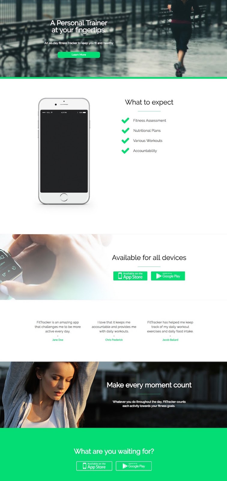
16. Wishpond Landing Page Template: “Quinoa”
The Best Part of this Landing Page Template:
The lack of visible form. Many businesses have found that embedding a form in a click popup (triggered when someone clicks on the CTA button) results in improved conversion rates. This page taps into that knowledge
Landing Page Template Use Cases:
- Gym/Fitness: One-on-one personal training sessions or a dietician could effectively use this page.
- Self Help/Consulting: This page would work well for a single consultant. The three images can correspond to what you offer while the testimonial and picture at the bottom are the primary selling content.
- Photography: Change the headline for the name of the photographer and the images for portfolio pictures and the testimonial for something relevant and you’ve got an optimized “Contact Me” page for a photographer.
17. Wishpond Landing Page Template: “Brick and Mortar”

The Best Part of this Landing Page Template:
The image. It has to be. The one there is extremely basic, but with the right one (check Unsplash or Pexels for free, high-quality, high-res images) this page would be very visually appealing. No landing page needs much more than a good background image. This one is just a brand logo, a headline, a short paragraph and a CTA. All of which are fine and essential, but what sets it apart will be whatever image you choose to go behind it all.
Landing Page Template Use Cases:
- Free Trial: People who click through on your free trial CTA (from your homepage or wherever else) don’t need a lot of convincing. Get to the point immediately and give them an easy, visible option/CTA to sign up.
- Squeeze Page: If all you’re looking for is an email address you don’t need to do much selling. Come up with a good headline and a good benefit-oriented paragraph or bullet-pointed list and you’re good to go.
- Software: Perhaps you’ll find this surprising, but this kind of minimalist landing page has worked for CrazyEgg for years. Again, it relies on your ability to create a good headline and subheader, but it’s possible. It’s super focused and offers no distraction whatsoever from the goal of the page. That said, CrazyEgg’s “ask” is for people to submit their website URL for analysis, not submit lead information. Keep that in mind.
18. Wishpond Landing Page Template: “The Consultation”
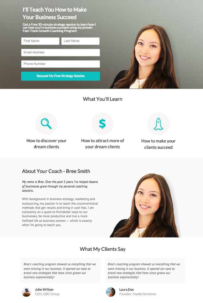
The Best Part of this Landing Page Template:
The large and obvious picture of the consultant or coach is the primary part of this landing page. Get a professional headshot if you’re going to be consulting. A, if makes sense to familiarize the prospective lead with you and B, it makes page feel more personalized and increases your reputation as a professional businessperson.
The bio is also an important element to back up the large photo. Without it the visitor has no idea who this person is.
Landing Page Template Use Cases:
- Self-Help/Coaching/Personal Training Consultation
- Investment/Accounting/Lawyer:
19. Wishpond Landing Page Template: “Get a Quote”
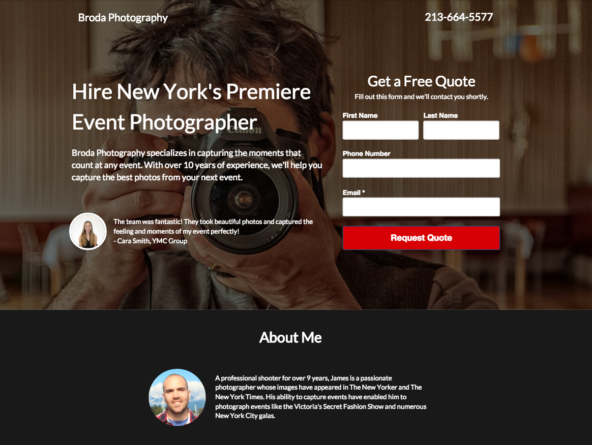
The Best Part of this Landing Page Template:
Honestly the best part of this page is the eye-catching CTA button. If you’re going to go with a dark color scheme, feel free to arrest your visitor’s eyes with a bright CTA button. It will make it extremely clear where the focus should be, and makes it impossible for your visitor to not know.
Landing Page Template Use Cases:
- Photography
- Promotion: This page would work very well collecting traffic from a PPC or Facebook Ad promoting a limited-time discount. If you’ve convinced someone to click on your ad, often the information on the page just gets in the way (particularly when we’re talking about a discount or sale). That’s why I’d recommend you remove the testimonial and “About Me.” Get to the point.
- Restaurant Reservation Page: Similarly to a discount landing page, a restaurant reservation page should make conversion easy and obvious. Change the “About Me” section at the bottom to a map/address and the background image to feature your restaurant.
20. Wishpond Landing Page Template: “Ebook Two”
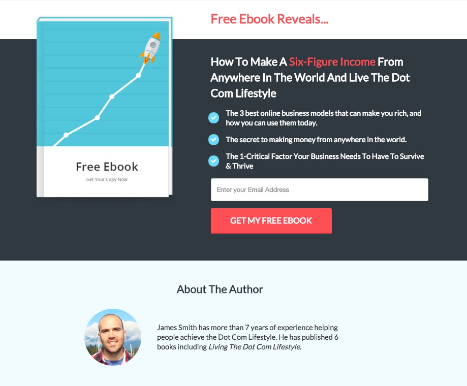
The Best Part of this Landing Page Template:
The obvious, single field. If you’re only asking for one piece of lead information in your squeeze page, don’t hide the fact. This landing page does an awesome job of grabbing the visitor’s eye with a well-contrasted CTA button but, more importantly, shows off the fact that they’re not asking a lot from the visitor. Seeing that field before reading the text means you’re aware that, whatever the landing page offers, it only has to be worth a single piece of information.
Landing Page Template Use Case:
- Ebook or Webinar: The only thing you’ll need to bring here, apart from the copy specific to your ebook, is the ebook image. We’ve found that creating an image which looks like the hard copy of an ebook increases the ebook’s subjective value. People value more “real” things. This image makes the ebook more of a concrete commodity. Flaticon has a huge selection of ebook images available in SVG and PSD.
21. Wishpond Landing Page Template: “Petals”
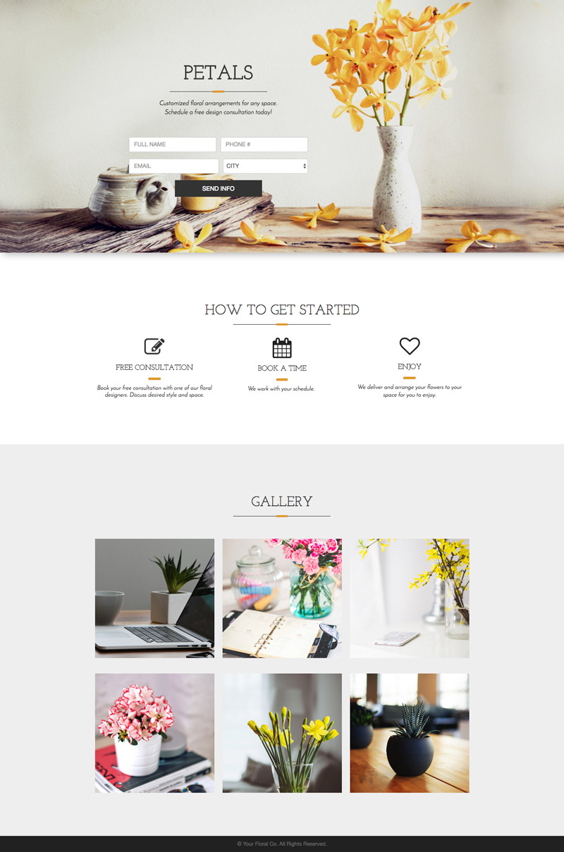
The Best Part of this Landing Page Template:
Beautifully simplistic and elegant, this page’s accent colors against the white background looks fantastic. The designer for this template used a color picker tool (here’s the Chrome plugin) to grab the hex code of the flowers in the header image and used that yellow as an accent for the rest of the page. If you’d like to change the top image (which you probably will) try the same technique!
Landing Page Template Use Cases:
- Florist
- Photography: Simply change the “How to Get Started” section for “What I do.” Change the gallery to image links or full-size photo examples of your work.
- Event Planning: This would make a great “Get a Quote” page for an event planner. The bottom image gallery could feature examples of your events or even links to individual landing pages made from the case studies. Change the “How to Get Started” to “What We Do.”
22. Wishpond Landing Page Template: “Master Class”
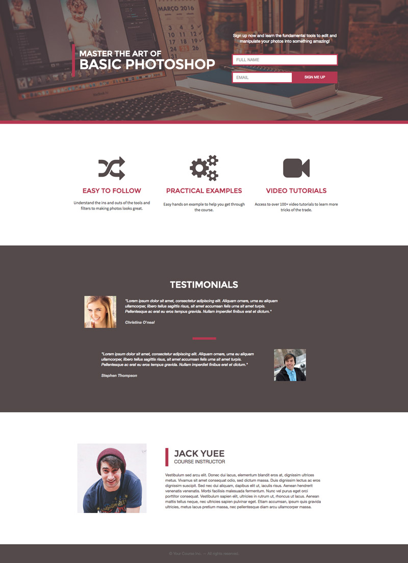
The Best Part of this Landing Page Template:
I love the muted vibe of this landing page. The color scheme is really solid (and I rarely say that about brown). What stands out though is the whitespace – and this can be one of the most difficult things to retain when you start dismantling a landing page template for your own use. Every time I do this and ask for a designer’s thoughts before launching, they tell me to add more whitespace between sections and between columns. Keep that in mind when you’re building your own landing pages from a template.
Landing Page Template Use Cases:
- Online Course
- Webinar: To make this a more optimized webinar landing page, I’d move the author bio content within the bottom section into a column on the left or right side of the white section above. I’d reduce the size of the three benefits and add them into one column with a “what you’ll learn” subheader. I’d decrease the height on the white section at the bottom but keep it to retain the pattern.
23. Wishpond Landing Page Template: “Social Prints”
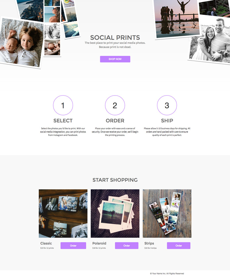
The Best Part of this Landing Page Template:
The professional but fun collage-type images at the top of the landing page are really effective. Spend the time to create something similar for your own images using Photoshop or an online photo-editing tool (even Canva and Google Drawing could create something similar if you don’t have Photoshop).
Landing Page Template Use Cases:
- Photo Printing
- E-Commerce: One of my friends runs an online business selling posters. This page would work perfectly for him. This page would also work well for anyone driving traffic from Instagram or Pinterest.
- Photographer: This could be a great landing page for a photographer looking to encourage their previous customers to buy a photo book or differently-sized photos for their wall. It wouldn’t take more than 10 minutes to duplicate this landing page, populate the images with customer-specific snapshots and create a page specifically for each customer.
24. Wishpond Landing Page Template: “Blogging For Business”
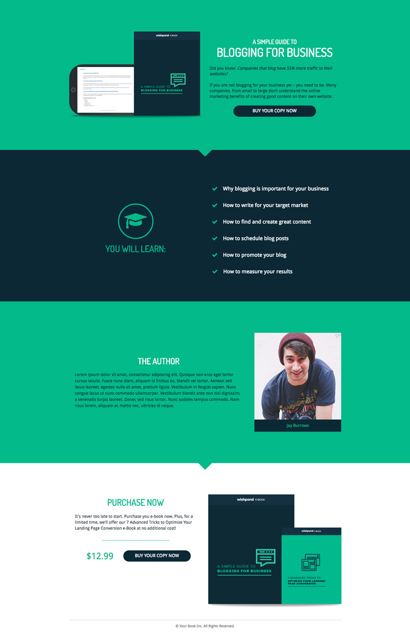
The Best Part of this Landing Page Template:
Multiple CTAs increase the chance of conversion, so long as they accomplish the same conversion goal. If you have a long-form page (or a page with a below-the-fold section) be sure you have a CTA at both the top and bottom. The buttons on this page would trigger a click popup with a “complete your purchase” embed from any WordPress ePurchase plugin.
Landing Page Template Use Cases:
- Ebook
- Online Courses: The “You will Learn” section can easily be expanded to feature another column. The “You Will Learn” could also be moved to another row above the bullet lists and those lists made into multiple columns for whatever your classes cover.
- Consulting: Change the author section to “About Me” and replace the top image with another image of you and bring the bio up there as well. Add a testimonial where the “author bio” is now and you’re good to go.
Remember to create a click popup to generate lead information from this landing page template!
25. Wishpond Landing Page Template: “Skyblue Conference”
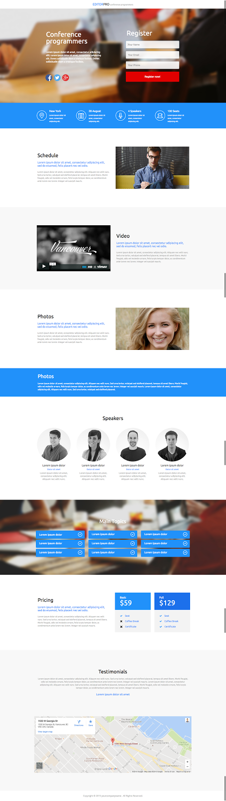
The Best Part of this Landing Page Template:
Everything you need for a conference landing page is ready to go, from a breakdown of the three days to your speakers with bios, a navigation section, pricing, a map and registration form. You may not need it all, but sections are easily removed or moved around, and placeholder images can be replaced in seconds with those you’ve uploaded. The best part of this landing page template is its ability to address your needs and give you a serious leg up.
Landing Page Template Use Cases:
- Conference
- Webinar: If you’ve invested heavily in a webinar, this page can be downsized to accommodate it. Change the “Schedule,” “Video,” and “Photos” section to feature your hosts and their bios and change the pricing section to feature the two times you’re running your promotion. Lose the form at the top and change the buttons both there and below for click popup triggers with a couple options for registration. Lose the map and middle navigation section.
26. Wishpond Landing Page Template: “San Fran Startup”
The Best Part of this Landing Page Template:
I love how well the images flow. There’s a lot of whitespace here, but the images really set it off and add a bit of color. The top image is a good one (particularly if your target market recognizes where it is or if it resonates with them) and having the middle one match it is best practice.
Landing Page Template Use Cases:
- Software/App Homepage
- E-Commerce: Duplicate a row or two from the portfolio section to make it larger and feature a few of your most popular products. Lose the “Our Team” section and decrease the section height of the top and “About Us” section (and relabel that “Featured Promotion.” Change the testimonial to a product review.
- Small Agency: The Portfolio section could link to case studies and the “About Us” could (again) be relabelled “Featured Case Study.” Retain the “Our Team” section.
27. Wishpond Landing Page Template: “Travel Bug”
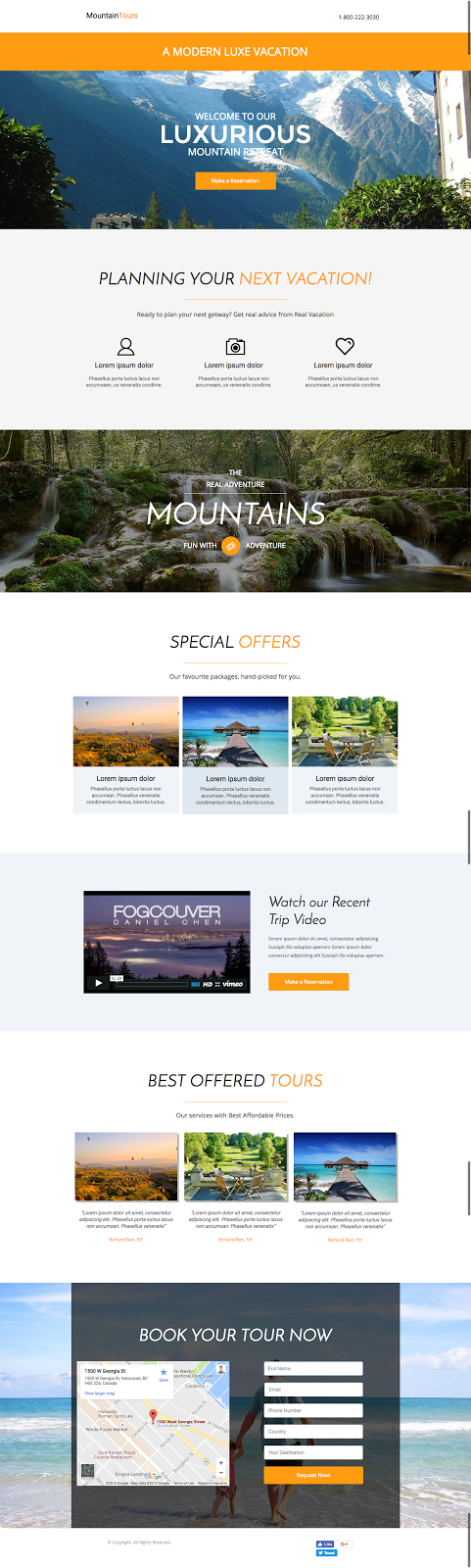
The Best Part of this Landing Page Template:
Again, it’s going to be the comprehensiveness. Long-form landing page templates like this are great, because they allow your business to remove what’s unnecessary and be left with a well-balanced, well-designed page. Adding and recreating, in a landing page editor, is always more difficult to do than removal. Again, just try to retain the color pattern – white, image/color, white, image/color.
Landing Page Template Use Cases:
- Travel/Tourism
- Photography: Duplicate a row within the Special Offers section to feature more of your photography, keep or remove the video (depending on if you’ve done one) and remove the “best offered tours” section. Move the form to the top of page and remove the map and bottom section. Remove as many other sections as make sense. If you’re running a promotion, retain one of the sections to link to a promotion-specific landing page.
- Fitness: Replace the “Planning Your Next Vacation” section with the “Special Offers” section, lose the Mountain and “Best Offered Tours” sections and add your own promotional video. Retain the map and bottom form and use Wishpond’s anchor linking to send everybody who clicks on the landing page’s CTAs to the bottom form.
28. Wishpond Landing Page Template: “Twilight”
The Best Part of this Landing Page Template:
Even if dark gray isn’t one of your brand colors, give it a try here. Change the pink for your brand accent color (a blue, orange or green would work and look just as good here).
A landing page or homepage without an obvious nav bar and a CTA only halfway down the page needs to have an awesome above-the-fold. If you’re going to go with this template and not add an above-the-fold CTA, spend serious time and energy on your headline, subheadline and the image on the right side.
Landing Page Template Use Cases:
- App/Browser Plugin
- Pricing: Lose the screenshot and video section but retain the features and usage statistics (if they’re good. If not, add a testimonial). Bring the pricing section above the usage statistics/testimonial and keep the map at the bottom – this makes your business seem more real and approachable, though a phone number would do the same. Lose the contact us form. Make the pricing columns larger and longer (they’re focus of the page). Lose “subscribe,” but keep the section for color balance.
29. Wishpond Landing Page Template: “Rose Petals”
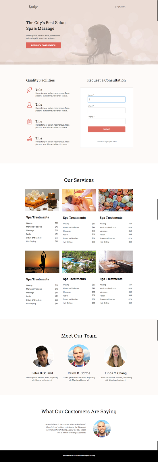
The Best Part of this Landing Page Template:
The middle section makes this page a versatile one, applicable for hotels, spas, restaurants, photographers, gyms and more.
Landing Page Template Use Cases:
- Spa
- Hotel: Lose one one of the rows of treatments and change it to featured rooms. Change the “Meet our Team” section to a featured promotion if you’re running one. Drop the form and add a click popup with a room selection and date selection embed.
- Restaurant: Lose the “Meet our Team” section and change the “Our Services” section to “Featured Dishes” with images and a brief description. Change “Request a Consultation” to “Make a Reservation.” Retain the testimonial at the bottom.
- Gym: Retain the “Meet our Team” section to feature your personal trainers and their experience. Drop one row of the “Services” section and instead feature shots of your facilities (weight room, cardio machines and personal training sessions) with links to service-specific landing pages. Lose the form but add a “Start Getting Fit” CTA which triggers a click popup with “Book a time to come in.”
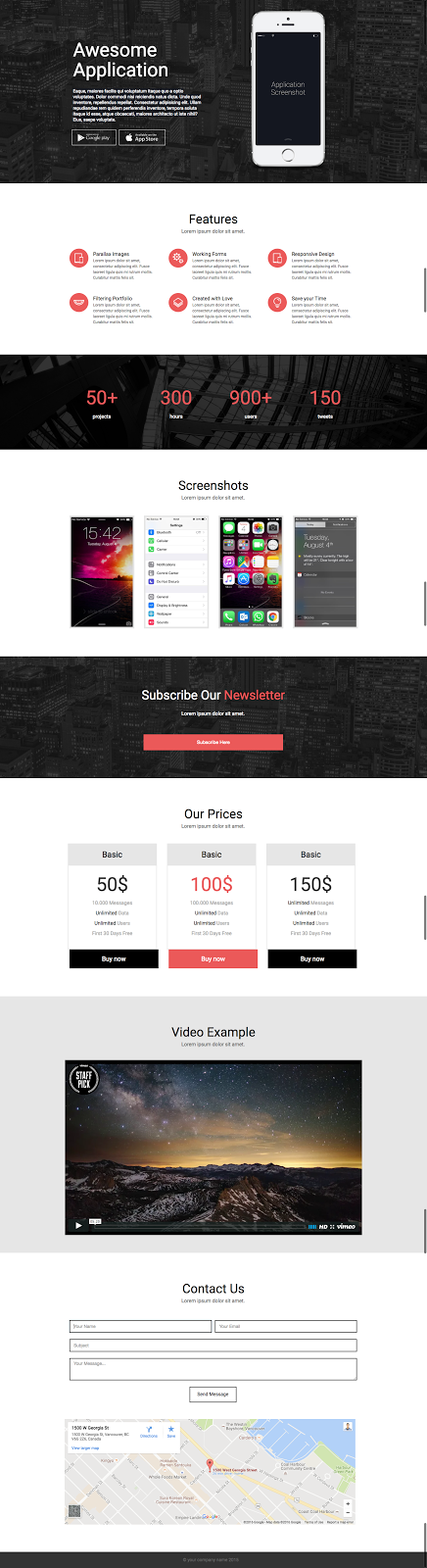
30. Wishpond Landing Page Template: “Appme”
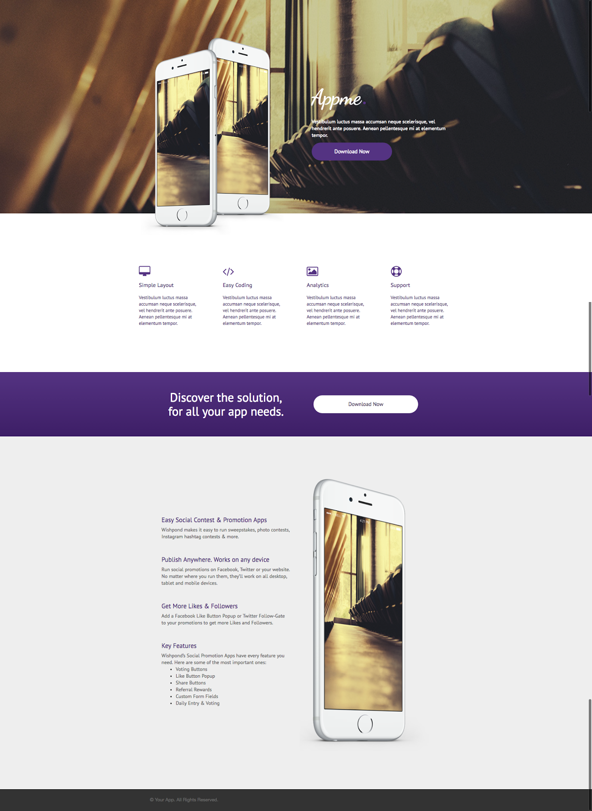
The Best Part of this Landing Page Template:
This is a very modern landing page focused on images and whitespace. Reminiscent of Apple’s product pages, this is the kind of landing page you’ll want if your target market is millenials or tech junkies.
Focus on using high res images for this landing page, because there’ll be no hiding lower-quality.
Find free vector files of smartphones here, and here (for an angled one).
Landing Page Template Use Cases:
- App
- Photographer: If your photography business does weddings, family and other miscellaneous photoshoots, create a landing page like this one for each of the individual types of work you do. Retain the top header/hero shot image (remove the mobile phones, of course) and replace the bottom section with a gallery of relevant images.
- Software: A software company could use this landing page as a product page. Replace the image of phones with platform screenshots or, alternatively, retain the smartphones and showcase your tool’s mobile optimization.
31. Wishpond Landing Page Template: “Island Tours”
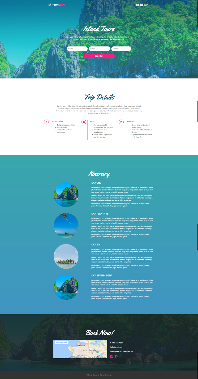
The Best Part of this Landing Page Template:
The itinerary section here makes the page a versatile one. See below for examples, but suffice it to say that well-balanced rows can apply to many different landing page needs. The thumbnails can quickly become icons and another CTA quickly added below it all to send visitors back up to the page’s form.
Landing Page Template Use Cases:
- Tourism
- Online Course: The middle “Itinerary” section can be repurposed for your course syllabus or “What you’ll Learn.” Replace “Trip Details” with the bio and headshot of the course teacher and change out the images. Remove the map at the bottom but retain contact details. Make the CTA “Register Today.”
- Trades: Anyone looking to promote a landscaping, handyman or repair business, or any of the trades (plumbing, painting, drywall, electrician, etc) can use this landing page effectively. Replace the “Itinerary” section with all of the tasks you can do and add relevant thumbnails. Make the CTA “Request a Quote” or “Contact Me.”
32. Wishpond Landing Page Template: “Clean Water”
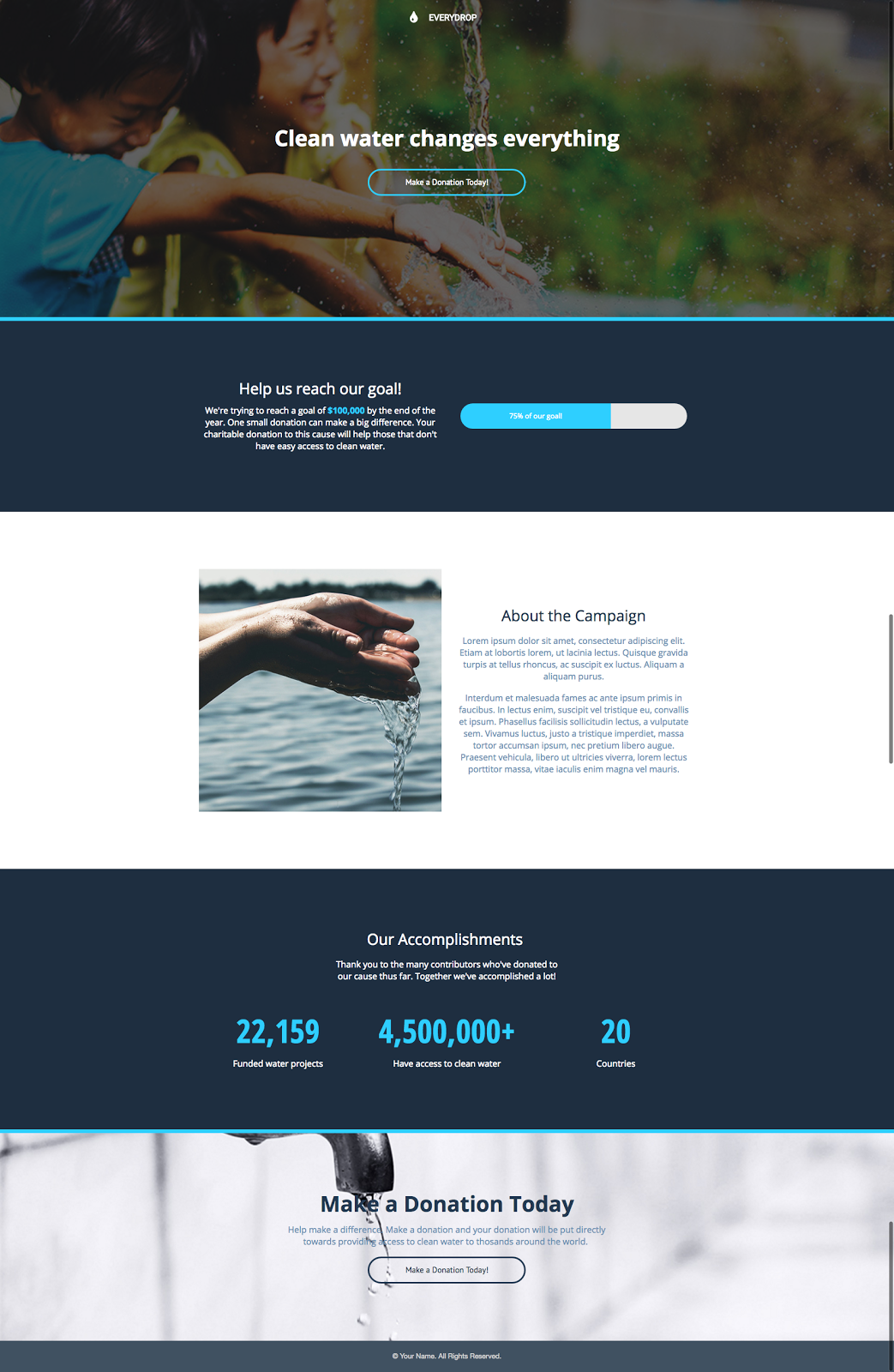
The Best Part of this Landing Page Template:
I love the color scheme of this landing page. The dark blue, grey and the light blue accent work really well together, and are surprisingly under-utilized (especially the light blue accent). It’s a modern look which really pops, and it would work really well for anyone in the tech industry despite the default copy and original objective of the landing page template.
Landing Page Template Use Cases:
- Nonprofit/Charity
- Pre-Launch: If you have an aspirational, professional business idea or kickstarter-esque concept and you’re looking to drum up interest before the launch. Try this landing page. Retain the “Help us Reach our Goal” (even if that goal is email addresses) and consistently update the “Accomplishments” section with people who have donated or expressed interest. Replace the “Accomplishments” image with a video.
33. Wishpond Landing Page Template: “Business Heights”
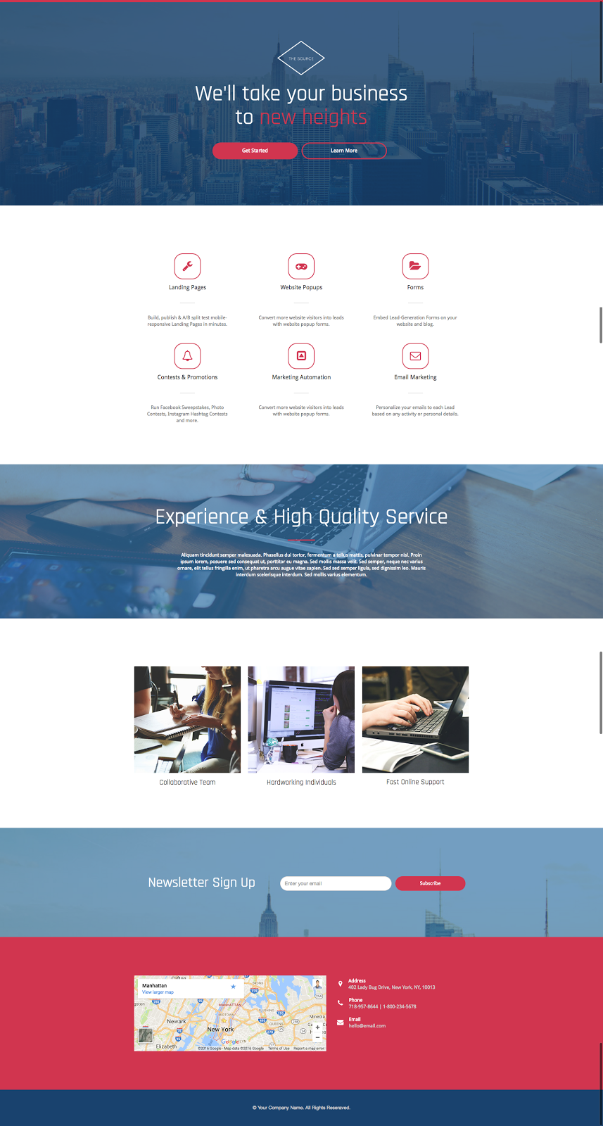
The Best Part of this Landing Page Template:
The three images within this landing page set it apart from what you usually see, and I can’t help but think businesses are missing out by not using images more extensively on their website and in their landing pages. Images of a city (particularly if you’re in the trades) add color to a website and get local prospective customers engaged. And even if you don’t have a local target market, people like to see more than just boring color.
Landing Page Template Use Cases:
- Software
- Trades: If you’re a tradesperson or business using this landing page, replace the images with cityscapes from your area. Have the middle section (currently six icons) break down the three or six things that your company does. Remove the three images in the white row beneath “Experience High & Quality Service” but retain some of the white section. Remove the form at the bottom but change it to the same click popup-triggering CTA you’ll have at the top with “Contact Me” or “Request a Quote” copy.
- Agency: An agency of any kind could use this landing page to break down everything what they do. In fact, the only thing you’d need to change would be to remove the map at the bottom. All the other sections can pretty much remain the same.
34. Wishpond Landing Page Template: “Yogi”
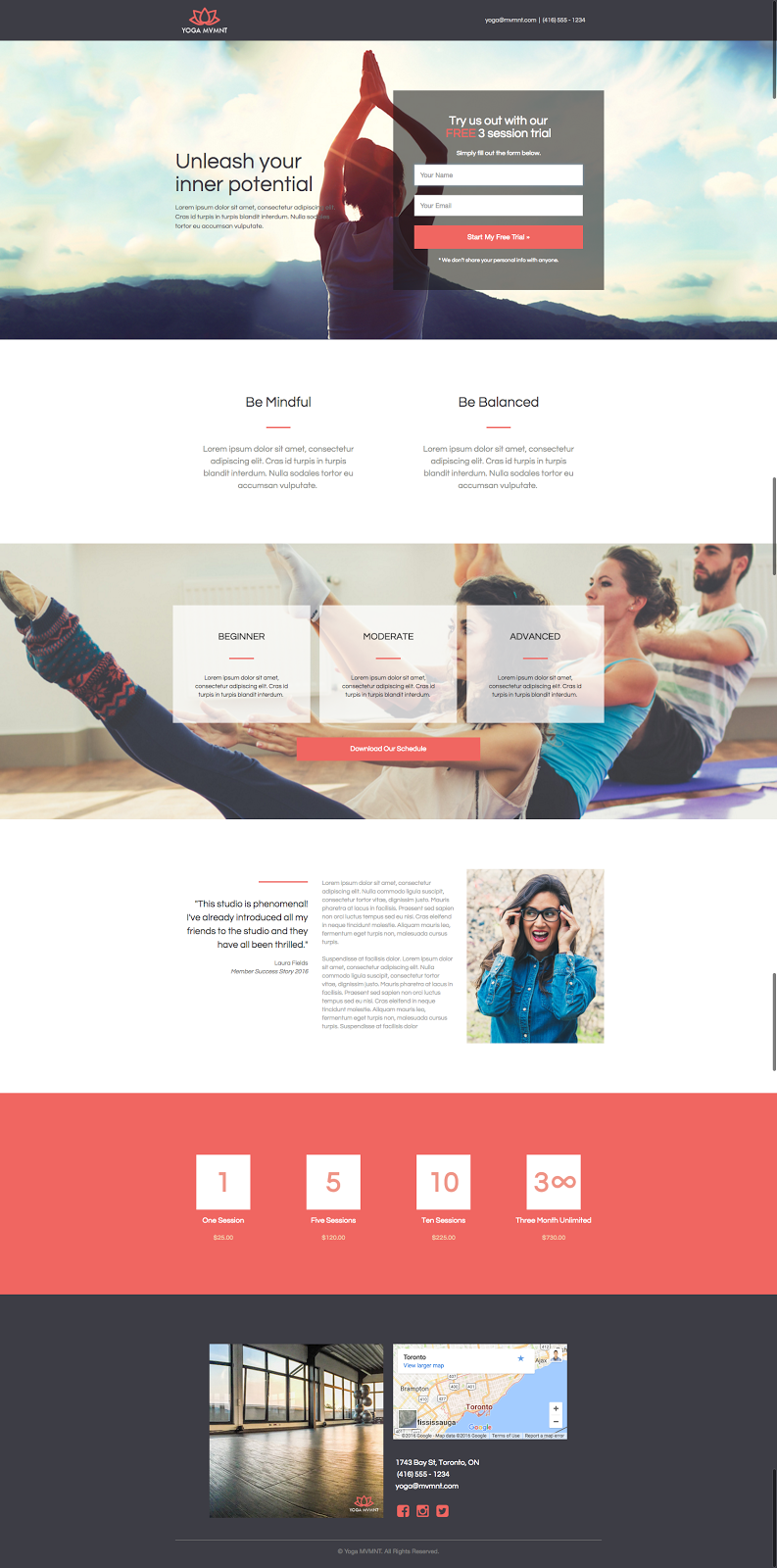
The Best Part of this Landing Page Template:
The semi-transparent container boxes work really well with the image-heavy landing page. Again, these can be a bit of a challenge to do yourself. So whenever you see them on a template, be sure to check how they were created so you can do it yourself. I particularly like the top form container box. It works really well with the background hero image.
Landing Page Template Use Cases:
- Yoga
- Gym/Fitness/Personal Training: Keep everything but change the images to be relevant to your service. Feel free to remove the “1, 5, 10, 3 month unlimited” session text, but keep the section reduced in height.
- Restaurant: Change the images, of course, but retain the map at the bottom. Lose the session text (but retain the pink section, reduced in height). Retain the testimonial and make the three-part plan section into a 7-part Daily Specials noticeboard. Remove the “Be Mindful” and “Be Balanced” copy but retain the section, reduced in height.

Landing Pages
500 Strategies, Ideas & Examples
Click below to download the most comprehensive collection of landing page strategies and examples ever compiled. Completely free.