101 of the Best Landing Pages Analyzed – Part 5
The Best Miscellaneous Landing Pages
83. Nielsen Join Community Landing Page
Nielsen is a world-leading marketing and consumer research company that has been delivering their members with valuable insight into consumer behavior since 1923.
Here’s one of their best landing pages:
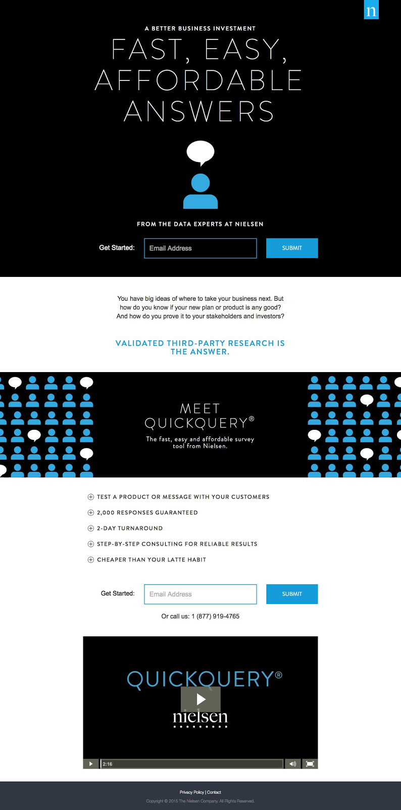
Why This is One of the Best Landing Pages Out There:
- One CTA button above-the-fold and one below makes for easy conversion.
- Questions which address visitor pain points create that pain in visitors: “But how do you know if your new plan or product is any good?” So long as your landing page addresses how you can assuage that pain, it’s a good strategy.
- Benefit list communicates value quickly and easily.
- A video expands on the message of the landing page for visitors who need it.
- The option to call and get more information is best practice for free trial/signup pages.
84. CopyHackers Course Pre-Launch Landing Page
Led by Joanna Weibe, CopyHackers is a thought-leading and innovative consultancy providing some of the best information out there about how to write web copy for conversion.
Here’s one of their best landing pages:
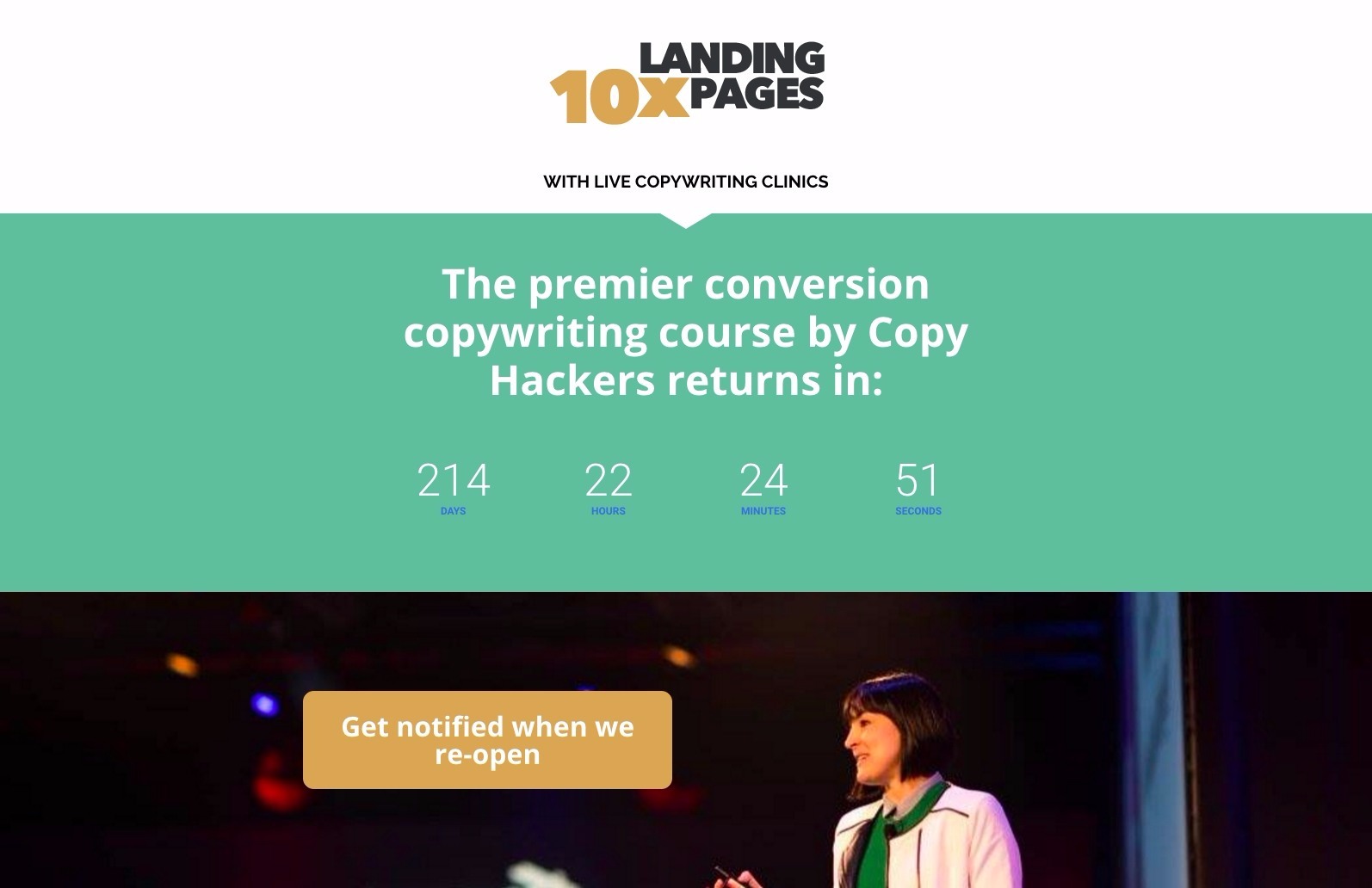
Why This is One of the Best Landing Pages Out There:
- Pre-launch pages don’t need a lot of information. In fact, simpler is better as intriguing your visitors is (in this case) a better idea than explaining at length about something which isn’t available yet.
- This landing page features Joanna on stage – showcasing both her face (increasing the personal touch) and her renown (affirming her reputation and legitimacy)
- The countdown timer is, when it’s at 214 days, nothing more than an informational strategy. There’s no urgency created here, it’s just more effective than saying “This course will return on June 1, 2017.”
- The goal of any pre-launch page is to get people to subscribe to be notified. The more you can intrigue people (this landing page uses “premier” to that effect) the better.
85. Growth Everywhere Marketing Vault Landing Page
Growth Everywhere is an industry-leading blog devoted to business growth featuring interviews hosted by marketing thought-leader Eric Siu.
Here’s one of their best landing pages:
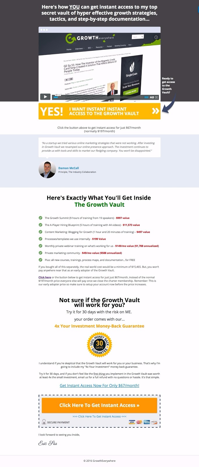
Why This is One of the Best Landing Pages Out There:
- If you’re familiar with any digital marketing course or training landing pages, you’ll be familiar with the layout here: long-form, large text and the word “YOU” underlined. The thing is, for the target market, this structure works, and few people do it better than Eric Siu.
- This landing page features visitor-centric language: “Work for you,” “You’ll get” “I want” “heer’s how YOU” – this is best practice for all landing pages, but particularly for this target market. These pages are about how much the visitor will gain, not who’s providing the value.
- I like the focus on the 30-day money-back guarantee towards the bottom of the page. Visitors will watch the video first and then convert if they’re sold. If they’re not, the 30-day money-back guarantee addresses any remaining concerns as we get towards the bottom of the page.
86. When I Work Excel Template Landing Page
When I Work is an employee scheduling tool.
Here’s one of their best landing pages:
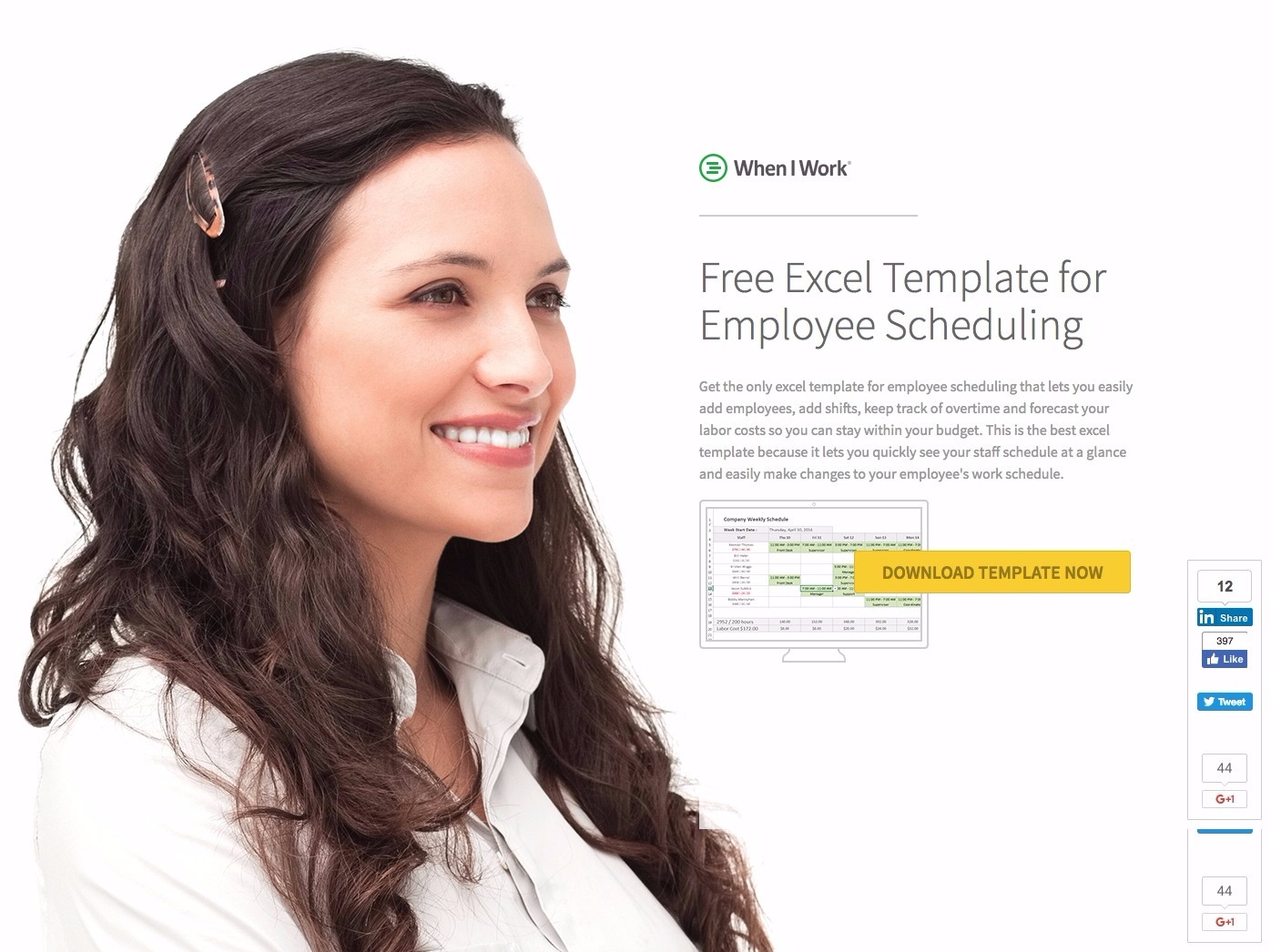
Why This is One of the Best Landing Pages Out There:
Simple but optimized, this landing page features a few proven best practices for landing page optimization:
- A smiling woman with her eyes looking at the value proposition and headline. People are naturally inclined to follow the “eye-line” of the people we see. We want to know what they’re looking at (think about antelope on the African savannah – it’s important for us to be able to identify what our lookouts are seeing.)
- The two-step conversion with a click popup triggered by the CTA button.
- The social share toolbar on the right side making it easy for visitors to share with friends and colleagues.
- A small image featuring the dashboard (or in this case, excel template)
87. ConversionSciences Report Landing Page
Conversion Sciences is a conversion-rate optimization consultancy led by Brian Massey and Joel Harvey.
Here’s one of their best landing pages:
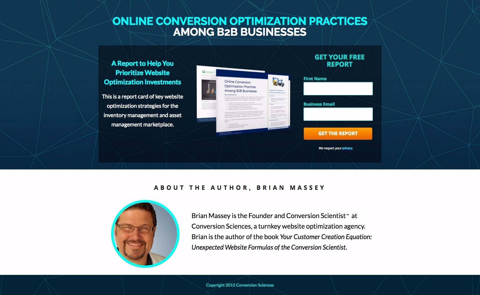
Why This is One of the Best Landing Pages Out There:
- This landing page is short and to-the-point, with no unnecessary links or copy. Sometimes simple is optimized.
- Ebook, whitepaper or report landing pages should feature, somehow, a tease of the content, as this page does. People like to know that when they download your guide they’re getting something concrete (this is also why so many businesses have found success by creating a book-looking image to represent the ebook).
- Brian Massey is a well-known thought-leader in his industry, so featuring him as much as the messaging above is a good call. He is part of the value proposition here.
88. Mobify Report Landing Page
Mobify is a software company creating mobile commerce and customer engagement tools to enable users to organize mobile web, native apps, push notifications and store drivers in one platform.
Here’s one of their best landing pages:
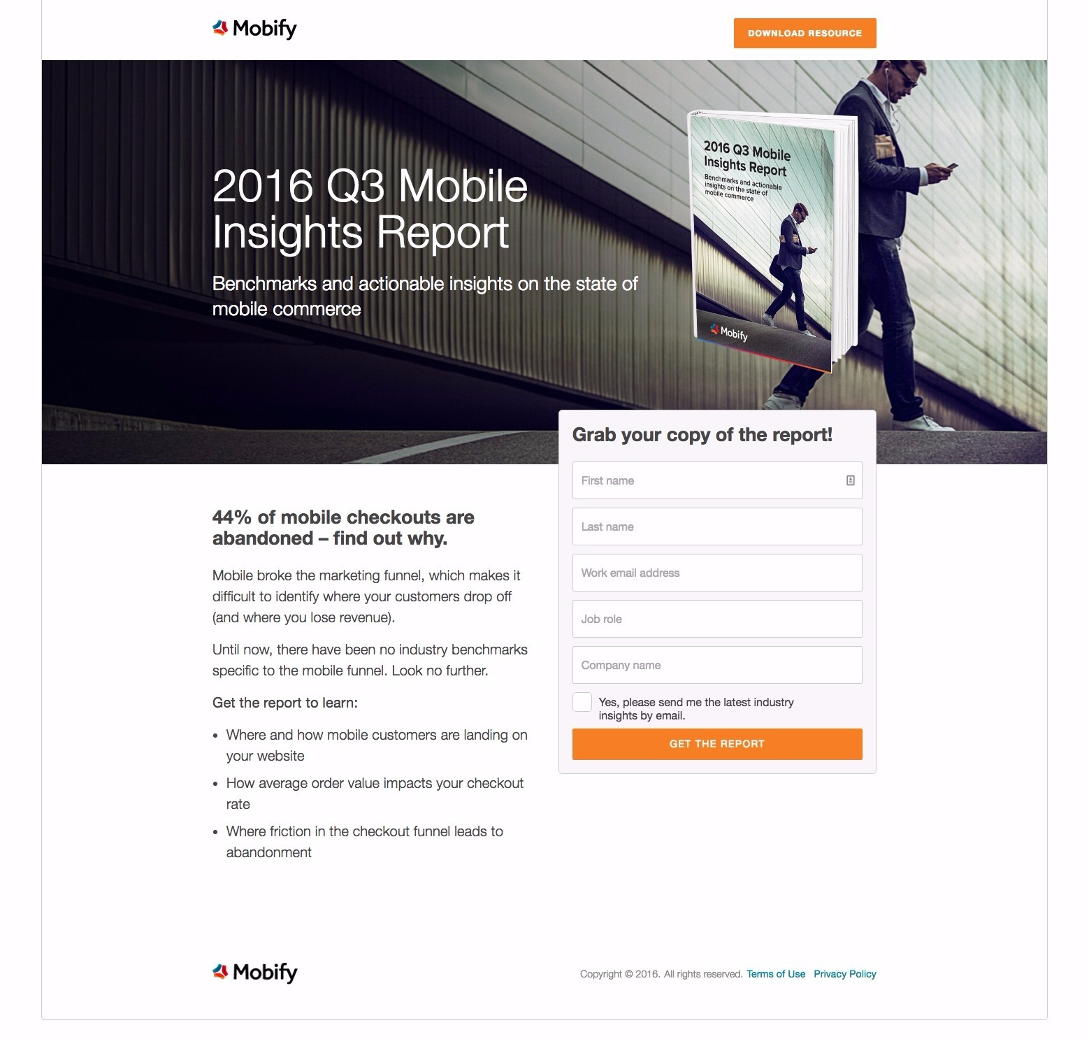
Why This is One of the Best Landing Pages Out There:
- The representation of the ebook as a hard-copy book creates concrete value in the mind of visitors. It increases the subjective value and therefore the chance of conversion.
- The statistic and “find out why” is a great way to inform and intrigue landing page visitors. Mobify has found a statistic (and point) which is vital to the success of mobile-focused businesses, and offers answers to that pain point in the downloadable resource.
- “Get the X” is a proven CTA copy formula, which we’ve A/B tested ourselves and seen to be one of the best formulas out there.
- “What You’ll Learn” is an important element of any landing page, but particularly industry reports, as visitors need to be assured there’s valuable information contained – and not just meaningless numbers
89. CopyBlogger Membership Landing Page
Here’s one of their best landing pages:
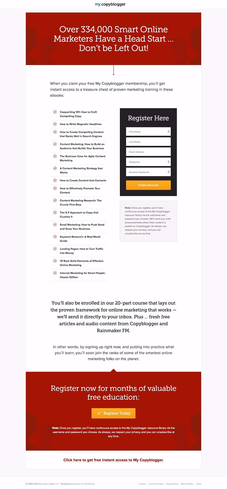
Why This is One of the Best Landing Pages Out There:
- Normally I’d say that this page is too long and the benefit list excessive. But the point of this page is to communicate the sheer quantity of value you get by becoming a member. So in this case, it’s actually a great strategy: “If you convert, you get this, and this, and this, and this, and this, and this…”
- The headline, “Over 334,000” creates peer validation and increases the subjective value of conversion. If 334,000 people have done something, it’s pretty guaranteed to be worthwhile.
- Multiple CTAs are essential on a long-form landing page.
90. Linkfluencer Video Course Landing Page
Linkfluencer is a consultancy based on providing businesses with a winning LinkedIn marketing strategy.
Here’s one of their best landing pages:
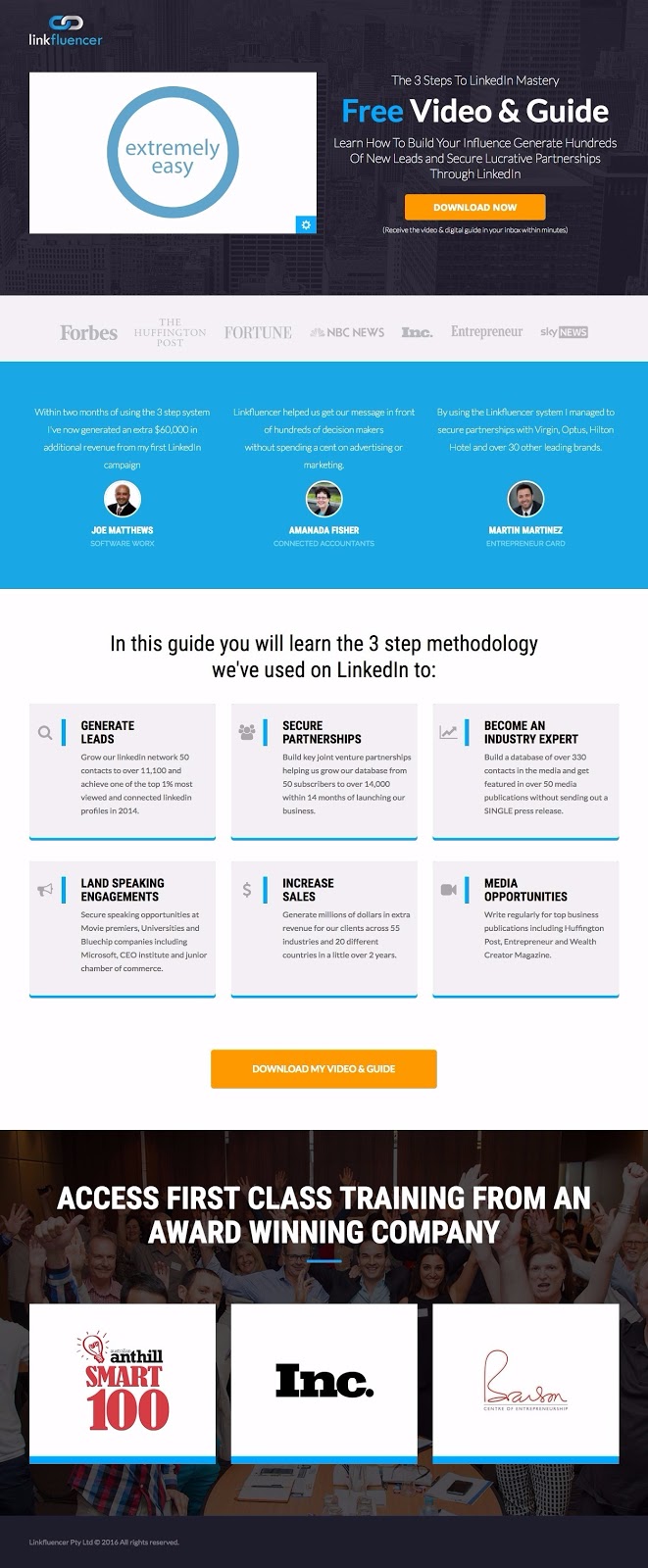
Why This is One of the Best Landing Pages Out There:
- This landing page has an auto-play video, which is an aggressive move which needs to be tested. However, it’s very capable of winning, as, if you can grab the attention of visitors you can reduce the immediate bounce (anywhere from 70-90% of your visitors)
- CTA button triggers a click popup, which means there’s no lengthy form on an already lengthy landing page.
- Three testimonials provide third-party, objective legitimacy to the course.
- All six of the boxes in the middle of the page feature case-study-like stories. If you can quote fact to your visitors, they’re far more likely to believe you than if everything you say is hypothetical.
91. Trulia Personalized Report Landing Page
Trulia is an online real estate resource which helps buyers, sellers and renters by giving them the insight they need to make an informed decisions.
Here’s one of their best landing pages:
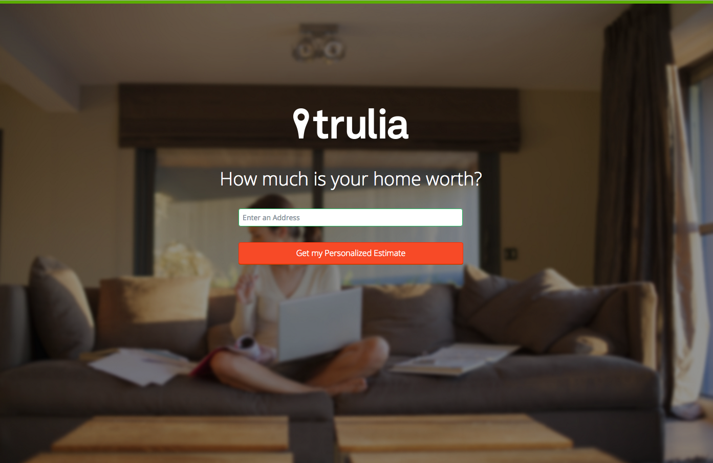
Why This is One of the Best Landing Pages Out There:
- Extremely simple but to the point. When you navigate here from the homepage, the navigation bar disappears.
- The background image both personalizes the page and communicates the frustration of trying to find the value of your home – making conversion even more desirable.
- They’ve recently A/B tested both the form and the CTA:
- They used to ask for the visitor’s address in 5 fields (Address, Unit #, City, State and Zipcode) but recently reverted to the single field. This has won.
- The CTA used to read “Get a Personalized Report.” “Get my Personalized Estimate” uses the personal pronoun and “estimate” sounds less formal than “report.” This has won.
92. DuctTape Marketing Join Community Landing Page
DuctTape Marketing, led by John Jantsch, is a marketing consulting company focused on small businesses.
Here’s one of their best landing pages:
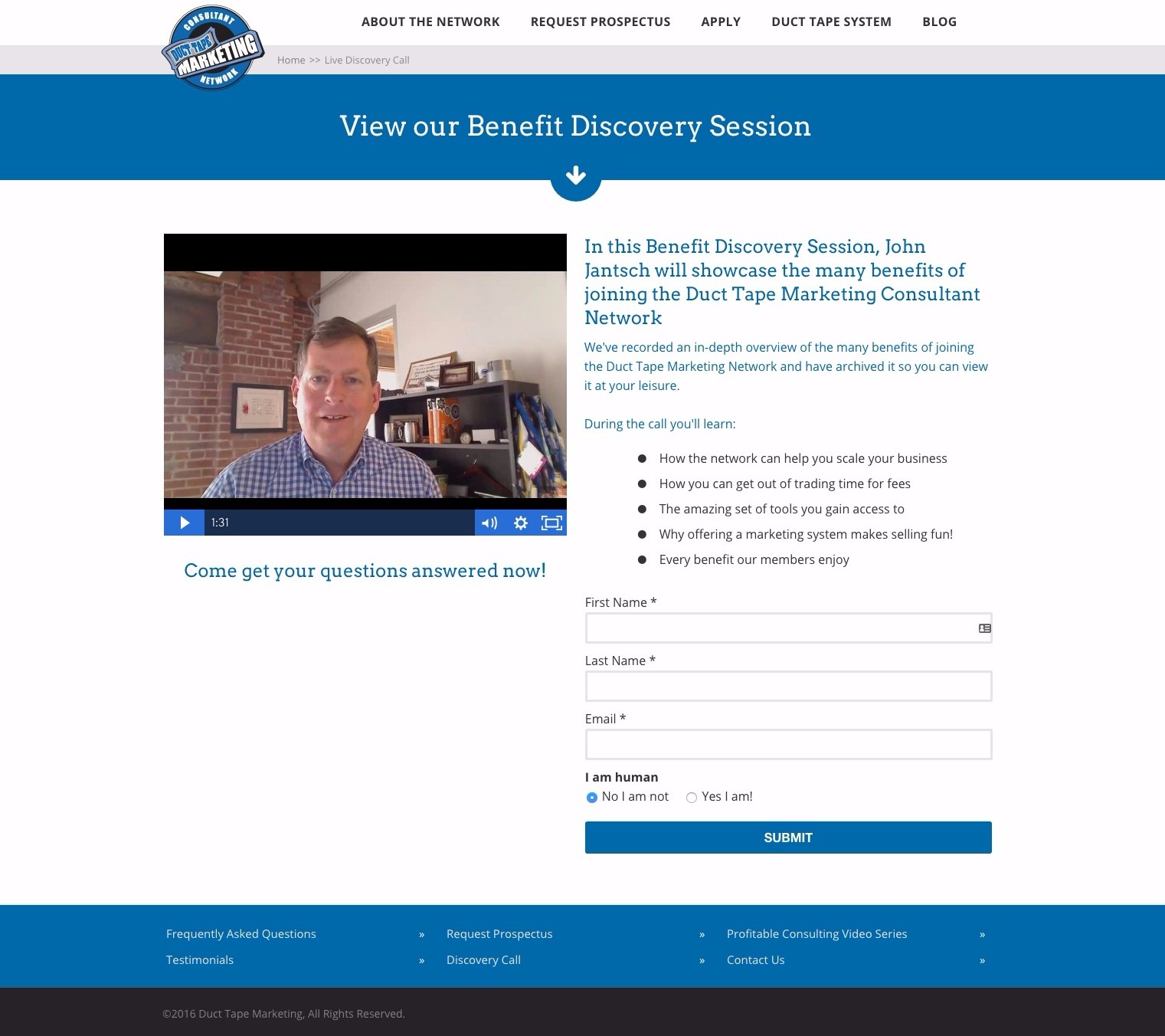
Why This is One of the Best Landing Pages Out There:
- If you’re an individual consultant, you’re asking visitors to subscribe to your community based only on the value they stand to receive from content and your reputation. As a result, a video prominently featuring you is definitely worth testing. YOU are the product here.
- It’s a good benefit list, as well, breaking down five distinct points of value for visitors with none of them sounding forced.
- My only critique here would be in the balance of the page design and the CTA copy “Submit,” which should be avoided if you want an optimized landing page strategy.
93. PostPlanner Infographic Landing Page
PostPlanner is a social media management software company, enabling users to schedule posts to 29 social networks and with a focus on maximizing engagement and reach.
Here’s one of their best landing pages:
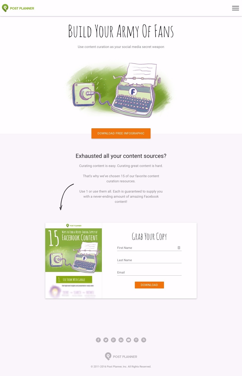
Why This is One of the Best Landing Pages Out There:
- Identifying a headline which will resonate with your target market is of paramount importance when designing your landing page. This one, “Build your army of fans,” is a really good one, communicating the idea that this piece of email-gated content can help you grow your social media fan base but, more than that, brand ambassadors,
- Directional cues (the arrow) are a best practice if your landing page has a “below-the-fold” section. They keep people scrolling.
- Multiple CTAs are best practice for a longer-format landing page. A good landing page builder will make it easy for you to link your CTA buttons to sections of the page, a click popup or anywhere else.
- The graphics are also well-done – professional but fun.
94. Moz Community Landing Page
Moz is a premier SEO and digital marketing software provider, enabling users to see how they can best improve their business’ online profile.
Here’s one of their best landing pages:
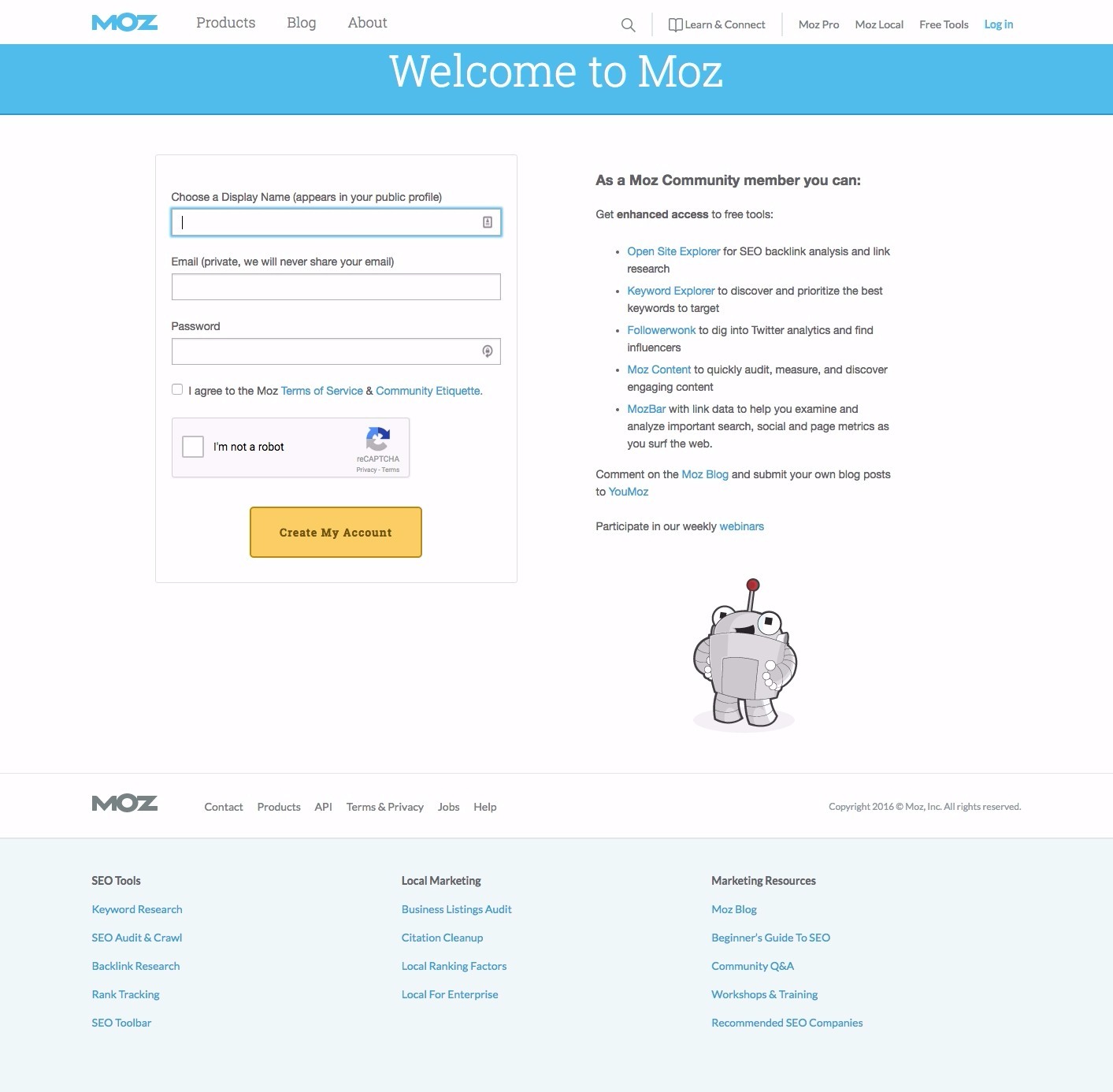
Why This is One of the Best Landing Pages Out There:
- I like that the form fields contain context and give a reason why the information is necessary. They also assure prospective leads of the privacy policy.
- Hits home with value. No paragraphs, just single sentences and links to relevant tools which open in a new tab.
- The lack of headline or typical salesy (see: optimized) elements here matches Moz’ branding – they focus on providing value, and are recognized as such. There’s no gimmicks to their brand, and it works for them. Test what works for you, then commit (as Moz has).
95. Optimizely Community Landing Page
Optimizely is a leading provider of testing software, enabling businesses to quickly and easily create A/B and multivariate tests and optimize their websites.
Here’s one of their best landing pages:
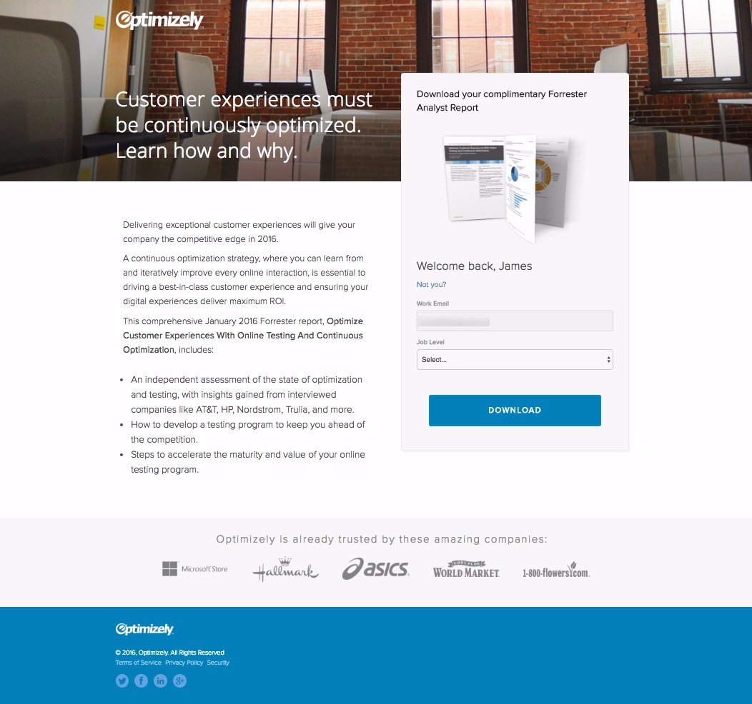
Why This is One of the Best Landing Pages Out There:
- When I first arrived on this page (the first screenshot), Optimizely’s form copy read “Welcome back, James.” I’m an Optimizely user and have given lead information for gated content before. Optimizely’s marketing automation platform remembers me, so doesn’t ask for information they already have. Instead, they ask for information they don’t have: my job level. This is called progressive profiling, and is quickly becoming more accessible for non-enterprise businesses, and is the way forward. It quickly and easily combats low quality lead generation and form friction, as well as ingratiating you with your existing leads by not asking them for information they’ve already provided.
- The rest of the landing page is excellent as well.
96. UBER Become a Driver Landing Page
Uber is a transportation company making it easy for regular people to rent out their vehicles to people looking to get across town.
Here’s one of their best landing pages:
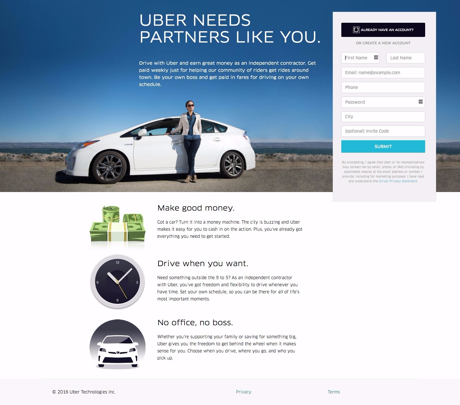
Why This is One of the Best Landing Pages Out There:
This page is all about making driving for Uber appealing:
- Phrasing the headline in terms of “Why X Needs You” puts the visitor in the power seat and switches the messaging from the traditional “Why You Want X.”
- The paragraph text hits at least five benefit points: Earn great money; get paid weekly; help our community; be your own boss; get paid in fares; drive on your own schedule
- The image, of an “everywoman” next to an “everycar” in an “everycity” generalizes the appeal and alienates no one.
- The paragraph text is reiterated with the three points below, though they’re really just value-adds. Everything is in the above-the-fold.
97. Compeer Tool Comparison Landing Page
Compeer provides job search and job posting services.
Here’s one of their best landing pages:
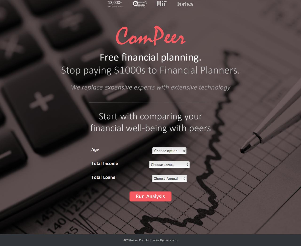
Why This is One of the Best Landing Pages Out There:
- Center-alignment makes mobile optimization easy, meaning there’s little difference between desktop formatting and mobile/tablet.
- Single sentence messaging keeps your landing page tight and optimized without running the risk of overwhelming visitors.
- Dropdowns allow you to get complicated information out of your leads without making your form over-long.
- The lead magnet of “get my personalized report” is a great one if you can set it up correctly.
98. Ecobee Affiliate Marketing Landing Page
Ecobee offers room-specific, “smart” thermostats to eliminate wasted heating and cooling in rooms not in use.
Here’s one of their best landing pages:
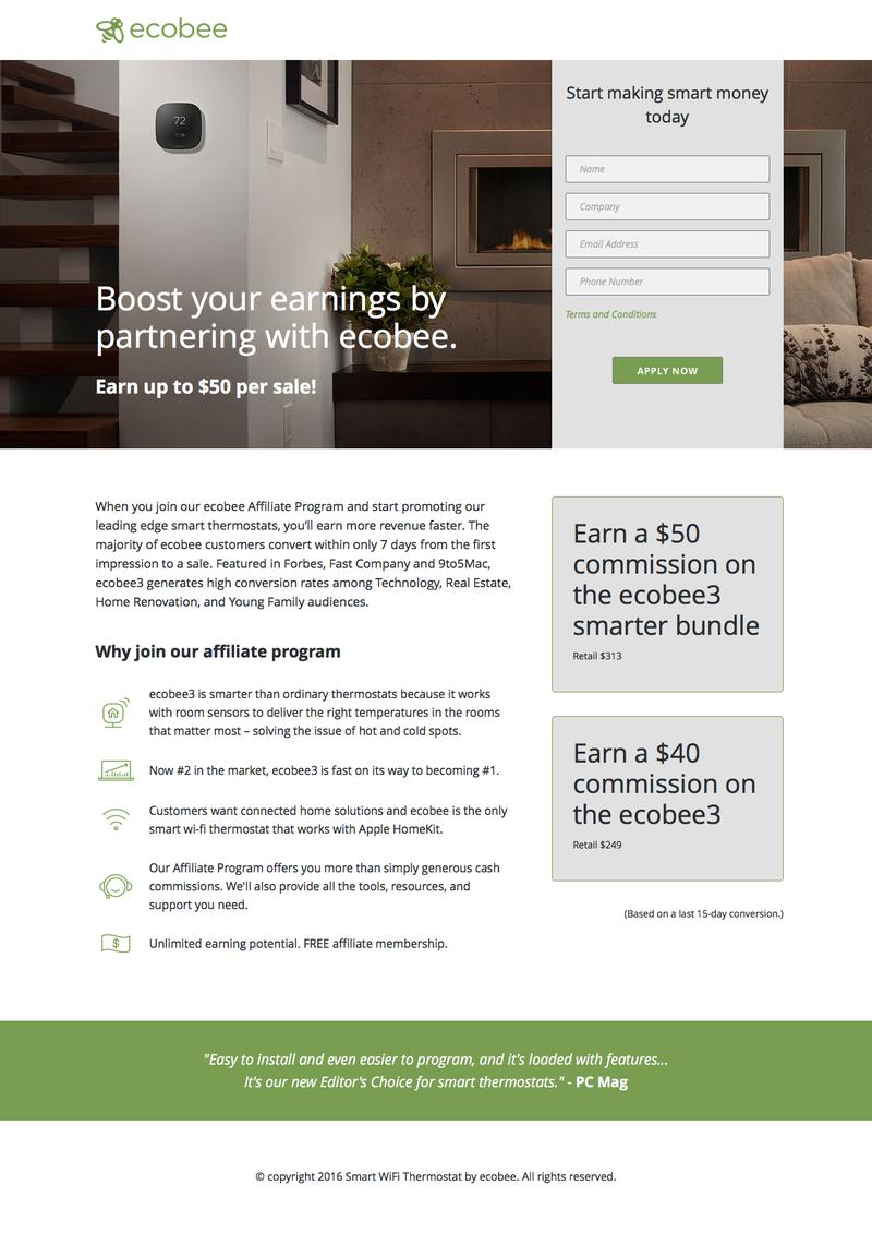
Why This is One of the Best Landing Pages Out There:
- Affiliate marketers aren’t like the rest of Ecobee’s target market. The messaging on this page, therefore, is different. The USPs aren’t “save money on your monthly utility bill” but instead “customers want connected home solutions,” and “earn a $50 commission.” They know how to phrase their offer in terms affiliate marketers understand. This is important no matter what target market you’re writing for.
- “Apply Now” CTA copy communicates an exclusivity to the affiliate marketing membership. Rather than “sign up now” or “start selling,” “Apply Now” adds subjective value to being a member.
99. Dealstruck Loan Request Landing Page
Dealstruck provides business loans up to $350,000.
Here’s one of their best landing pages:
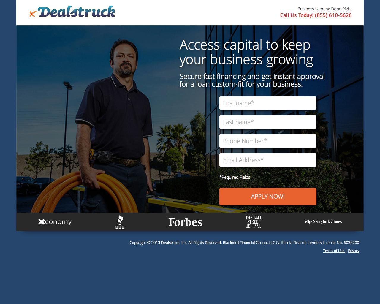
Why This is One of the Best Landing Pages Out There:
- The image of someone who looks like DealStruck’s target audience is a good one, especially as it’s both professional but not aggressively stock footage. I like, as well, that Dealstruck has chosen to make the image the initial focus of the landing page rather than cover it with text.
- The phone number is an important element as well, making it possible for people to call to get details before converting.
- If your business has had some PR writeups in well-known publications (like DealStruck has above) be sure to feature links to them somewhere. This creates legitimacy and, if someone wants to read about your business, they can.
100. Content Marketing Association Industry Report Landing Page
The Content Marketing Association (CMA) is the industry body for content marketing.
Here’s one of their best landing pages:
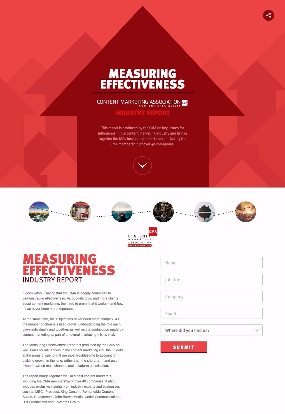
Why This is One of the Best Landing Pages Out There:
- As the content marketing association you’d imagine this landing page to be copy-heavy, and it is. Normally that’d be against best practice, but with this target market and this audience, who knows? Landing page optimization is all about knowing your audience and then testing what works. If this works for CMA’s audience, who are we to say it’s not optimized?
- The above-the-fold section is large and bright, the headline of a pretty significant size.
- The directional cue induces visitors to proceed down the page.
101. Wishpond Industry Report Landing Page
Wishpond makes it easy for businesses of all sizes to generate, manage and nurture leads into sales with landing pages, popups, promotions, email marketing software and by integrating with all the tools you already use.
Here’s one of our best landing pages:
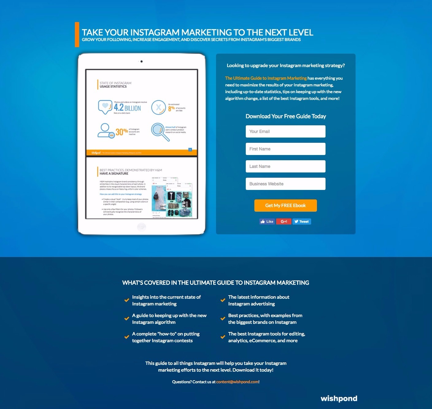
Why This is One of the Best Landing Pages Out There:
- Action-oriented headline is aspirational for visitors, and gives immediate value to the gated content.
- The large image on the left side gives visitors a preview of the look and value of the ebook – professional images and the most recent reporting on the Instagram platform as well as real-world examples.
- The form section is encapsulated subtly and intrigues visitors with a question right away.
- The form and CTA are above-the-fold.
- The page uses the hierarchy of elements – image and form/CTA on top and benefit list below-the-fold for those who need it to make their conversion decision.

Landing Pages
500 Strategies, Ideas & Examples
Click below to download the most comprehensive collection of landing page strategies and examples ever compiled. Completely free.