200 Landing Page Examples Analyzed
Ecommerce Landing Pages
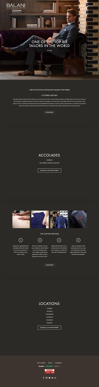
What makes this ecommerce landing page work?
- Process: The process of getting a custom made suit is clearly laid out on the page for customers.
- Proof: “One of the top six tailors in the world” is meant to give the service credibility and confidence for a buyer.
- History: The storied history of the brand is meant to invest visitors in the product and craft.
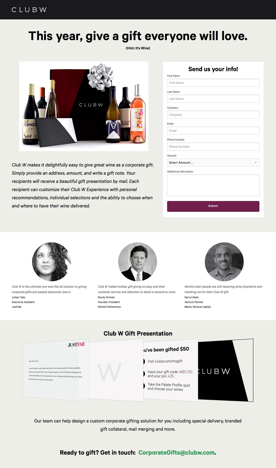
What makes this ecommerce landing page work?
- Social proof: Company logos and testimonials add trust and credibility to the page. Knowing that other companies have had success using the product is a huge conversion driver.
- Contrast: Visuals, graphics and CTAs are designed with bright colours to stand out from the ample white space.
- Encapsulated: The form and ‘Club W Gift Presentation’ are encapsulated so that they stand out on the page as important elements.
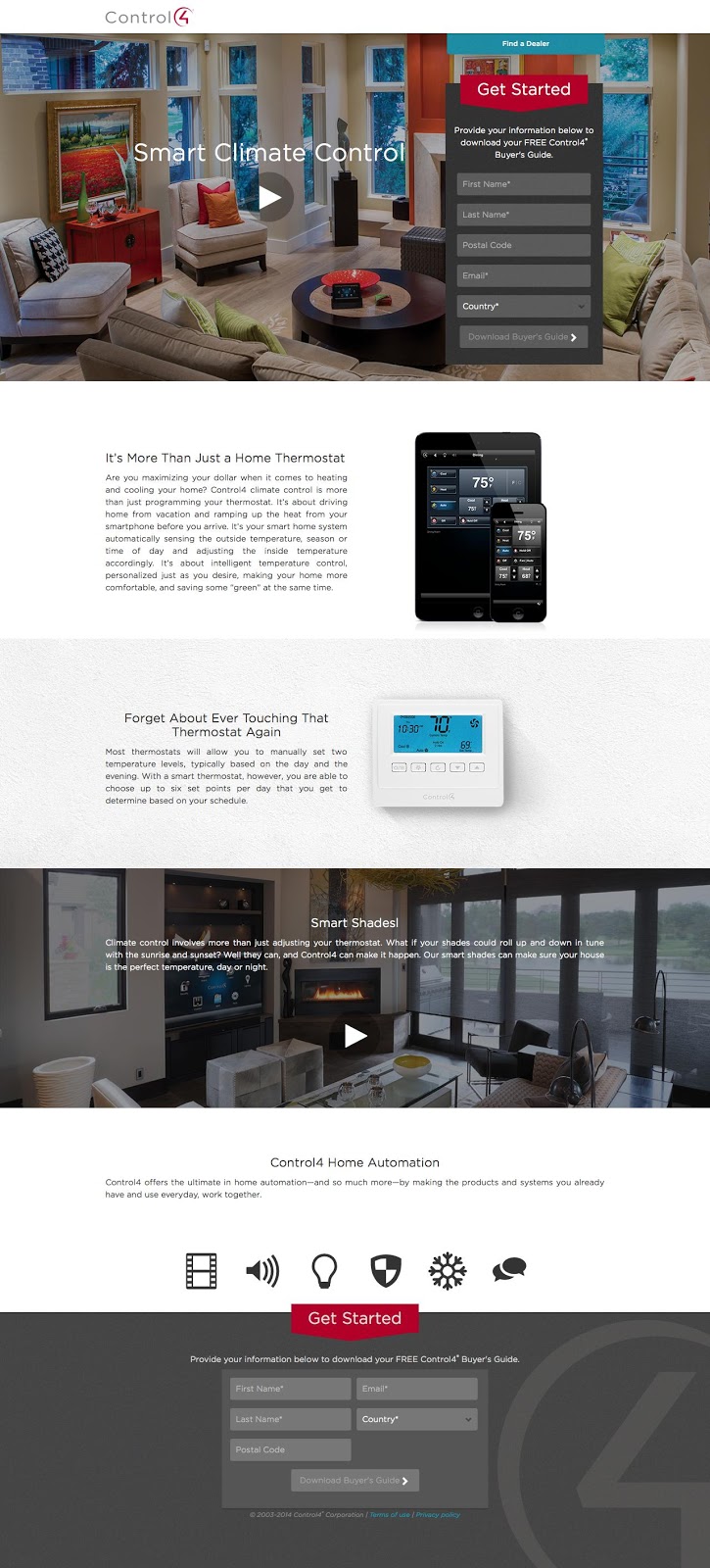
What makes this ecommerce landing page work?
- Video: A landing page video quickly and succinctly explains Sage and the offer. Visuals do a much better job at explaining and presenting information.
- Contrast: Visuals, graphics and CTAs are designed with bright colours to stand out from the ample white space. The page is built to direct the eyes downwards or upwards to either of the forms.
- Encapsulated: The forms are encapsulated so that they stand out on the page as important elements.
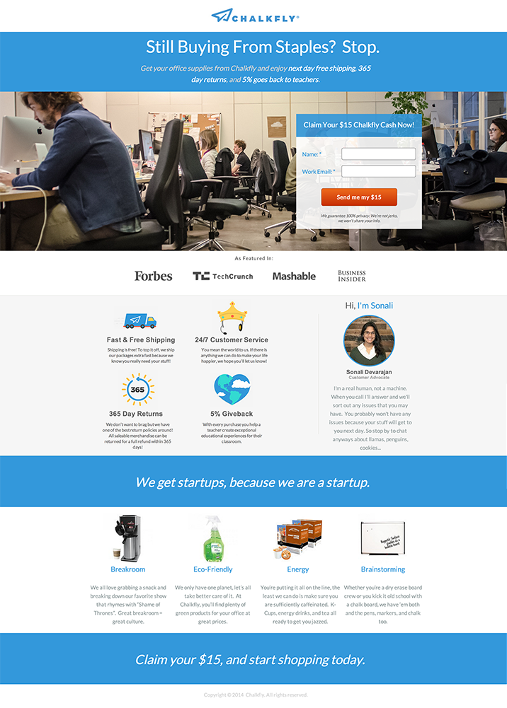
What makes this ecommerce landing page work?
- Social proof: Company logos and testimonials add trust and credibility to the page. Knowing that other companies have had success using the product is a huge conversion driver.
- Contrast: Visuals, graphics and CTAs are designed with bright colours to stand out from the ample white space. Each feature and benefit is represented by a fun graphic that draws the eyes in.
- Offer: The offer for $15 credit is a tempting one. The language to claim your $15 is persuasive and makes visitors consider the dollar value.
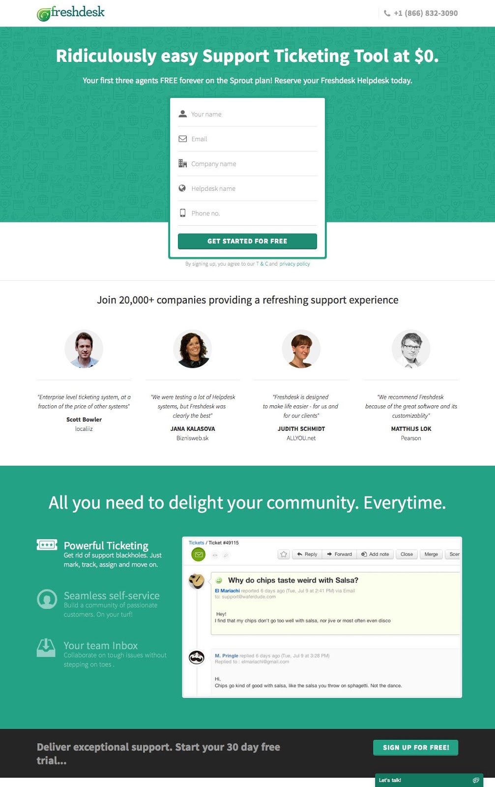
What makes this ecommerce landing page work?
- Social proof: Company logos and testimonials add trust and credibility to the page. Knowing that other companies have had success using the product is a huge conversion driver.
- Contrast: Visuals, graphics and CTAs are designed with bright colours to stand out from the ample white space. Colour is used wisely in important areas like the CTA, feature list and form to attract attention.
- Headline: The headline stands out with a truly persuasive offer “Ridiculously easy support ticketing for $0”. It adds a dollar value and explains the ‘why’ of the product.
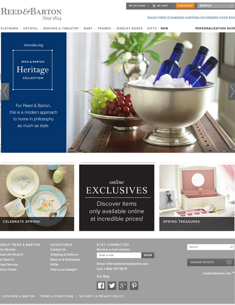
What makes this ecommerce landing page work?
- USP: The modern approach to home in philosophy as much as style is what Reed&Baron communicate right off the bat.
- Photo slider: A photo slider maximizes the screen space and shows off multiple images to its visitors.
- Exclusives: Reed&Baron offer their online shopper exclusive products not available in store.
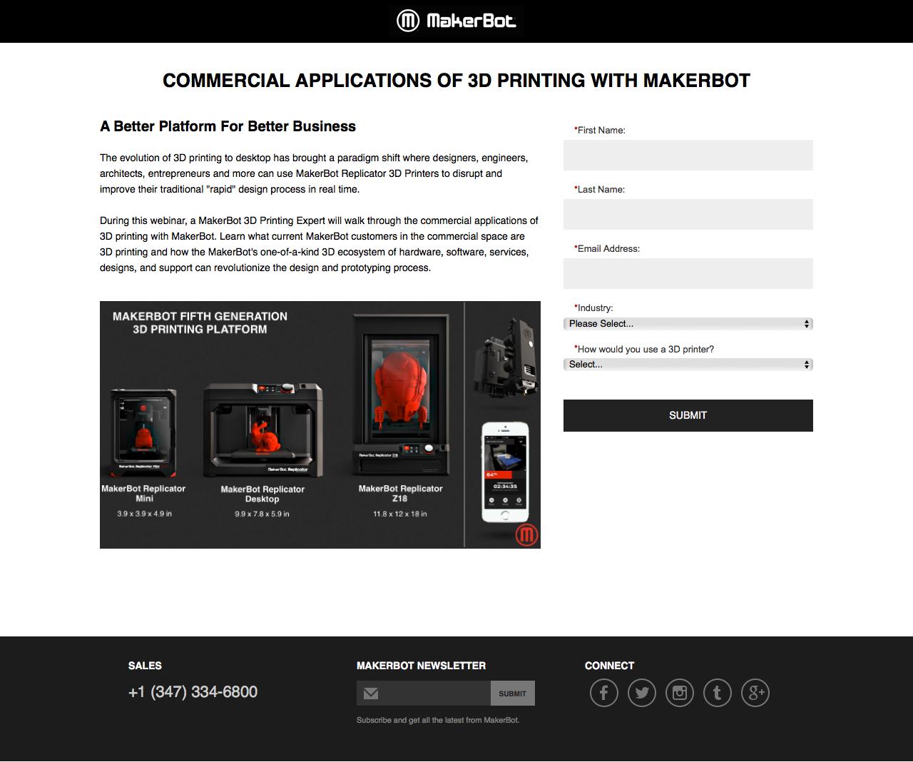
What makes this ecommerce landing page work?
- Contrast: Visuals, graphics and CTAs are designed with bright colours to stand out from the ample white space. Since black and white are the only colour used, anything black immediately stands out.
- Visual: Makerbot adds an example image to give visitors a quick look at its products.
- White space: Plenty of white space keeps attention on the content and leads the eye towards the form.
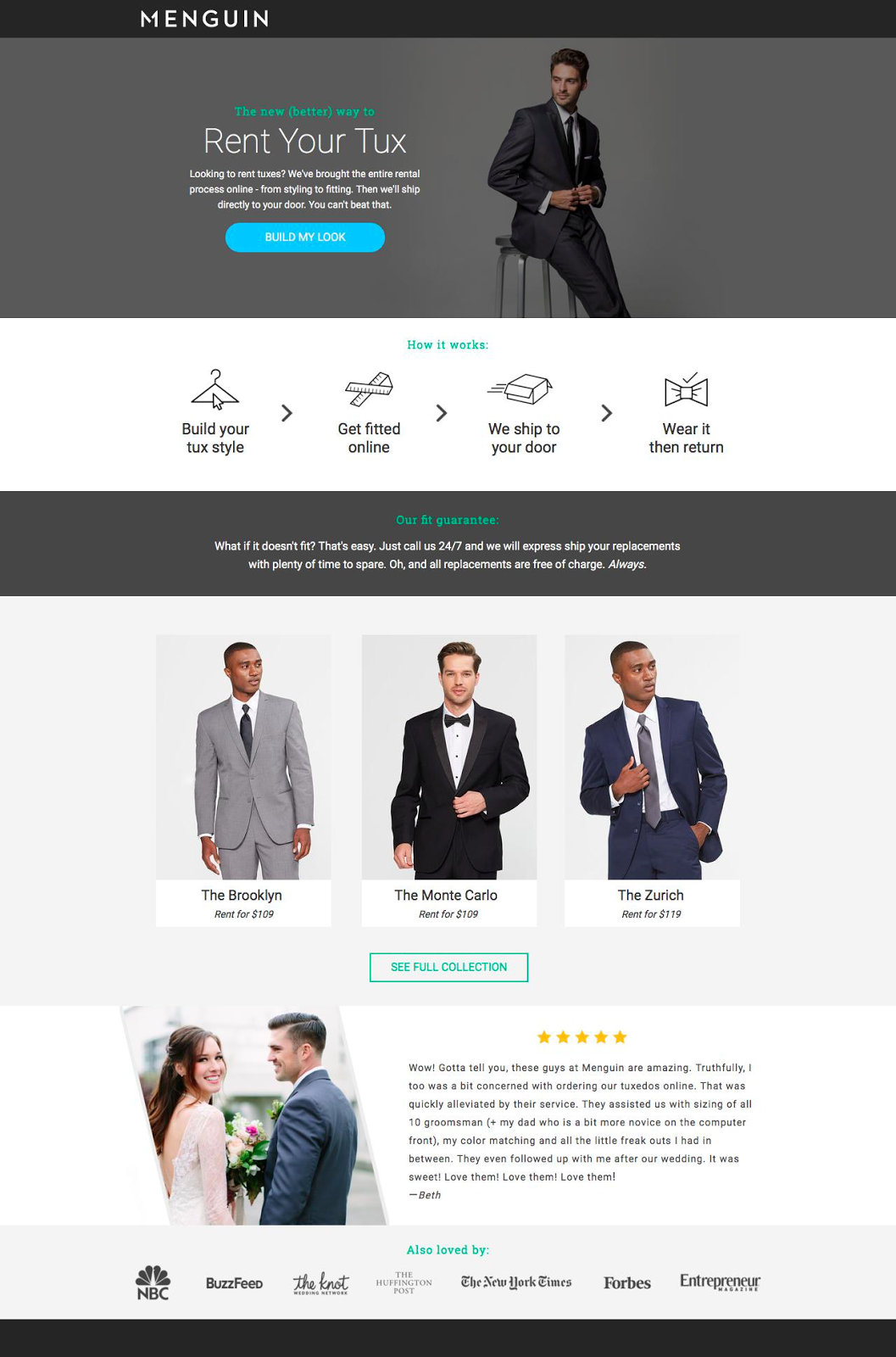
What makes this ecommerce landing page work?
- Social proof: Company logos and testimonials add trust and credibility to the page. Knowing that other companies and consumers have enjoyed using the product is a huge conversion driver.
- Visual: This landing page is very visual. It employs examples well throughout the page and makes sure to focus on the tuxedos.
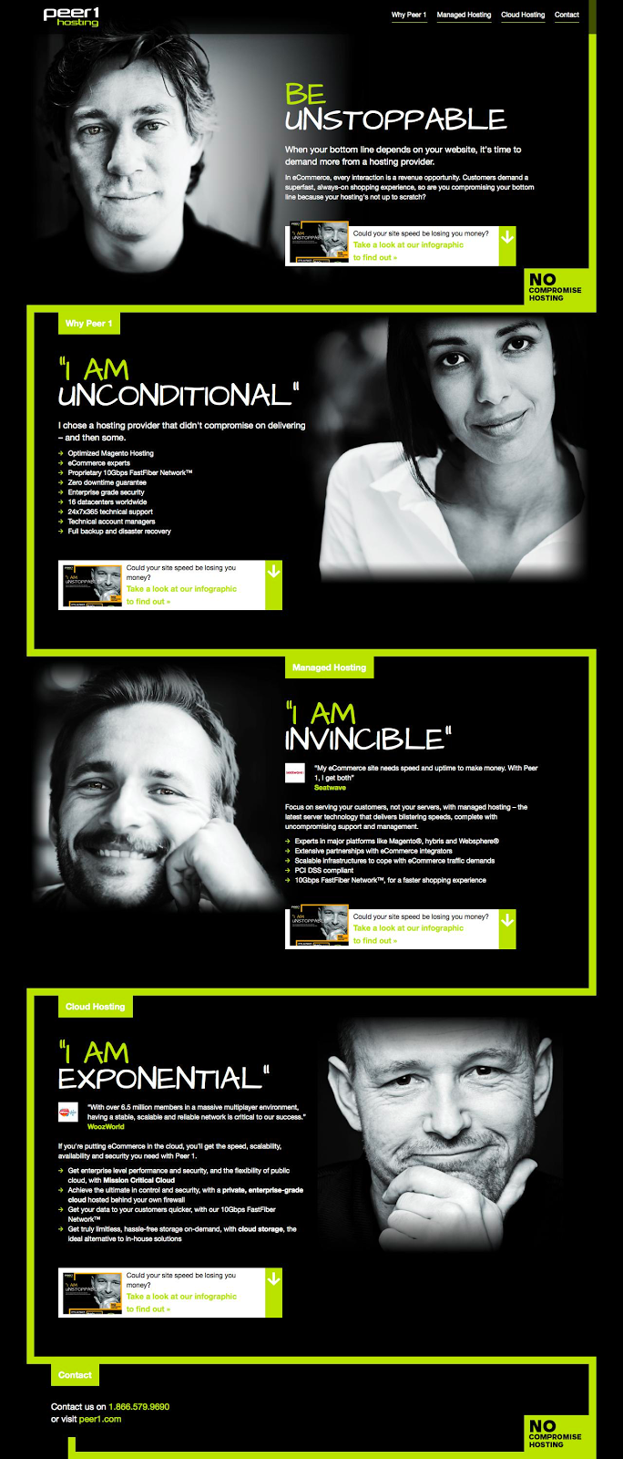
What makes this ecommerce landing page work?
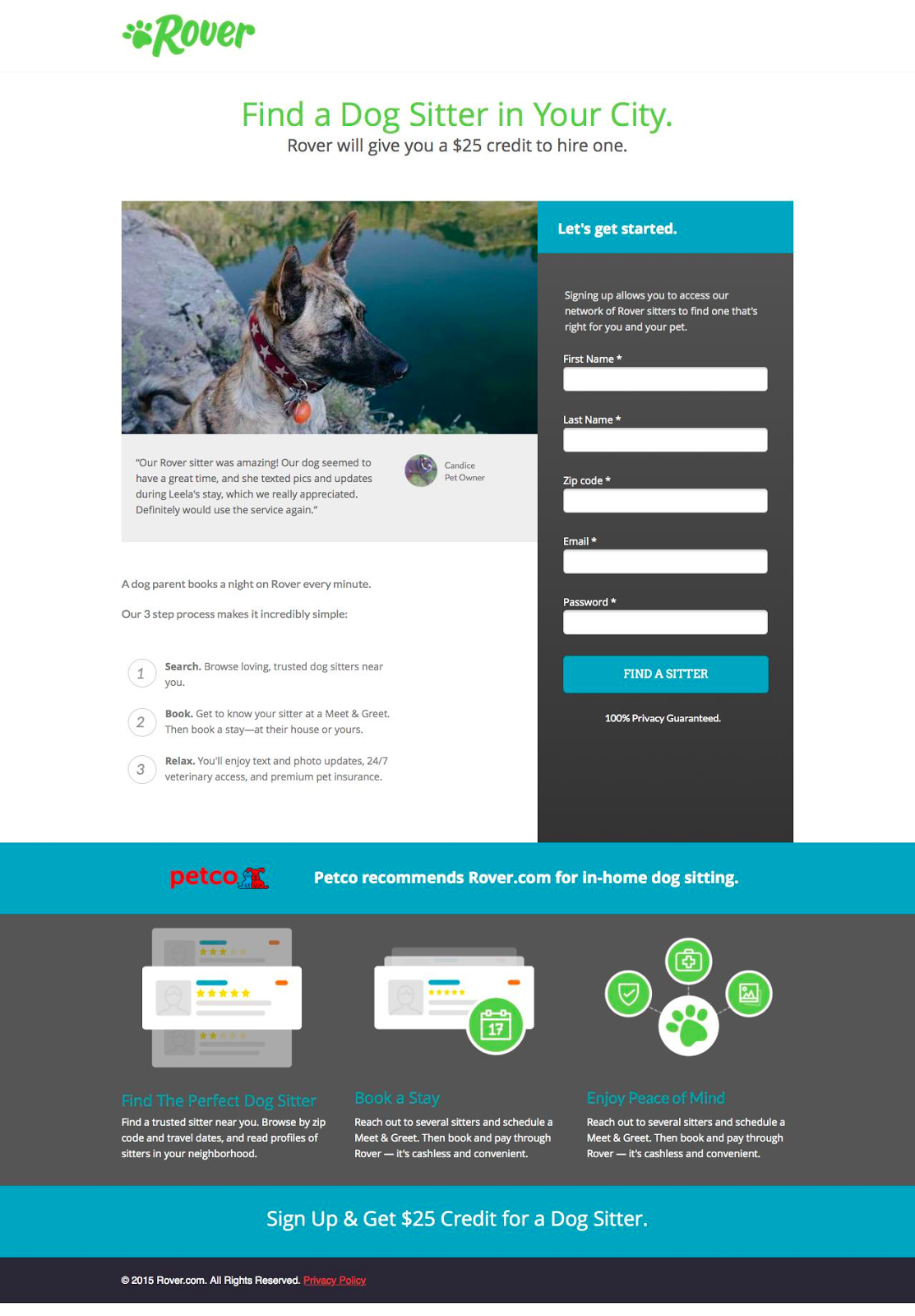
- Contrast: Visuals, graphics and CTAs are designed with bright colours to stand out from the ample white space. Graphics help communicate the benefits and lead the eyes toward the encapsulated form.
- Action: The CTA button language “Find a sitter” uses action-oriented language to command action from the visitor.
- Process: Rover outlines the simple steps of using the service in the body copy so that visitors can know what to expect.
What makes this ecommerce landing page work?
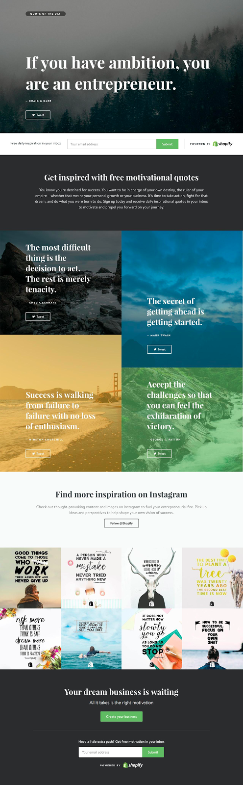
- Social proof: Company logos and testimonials add trust and credibility to the page. Knowing that other companies have had success using the product is a huge conversion driver.
- Visual: Images and pleasing colours attract attention and lead visitors down the page. Well used white space directs the eyes towards areas of interest for the visitor.
- Offer: Shopify offers up excellent free resources to get the visitor to act. Everything on the page is meant to get them invested in the brand and onto the next step.
What makes this ecommerce landing page work?
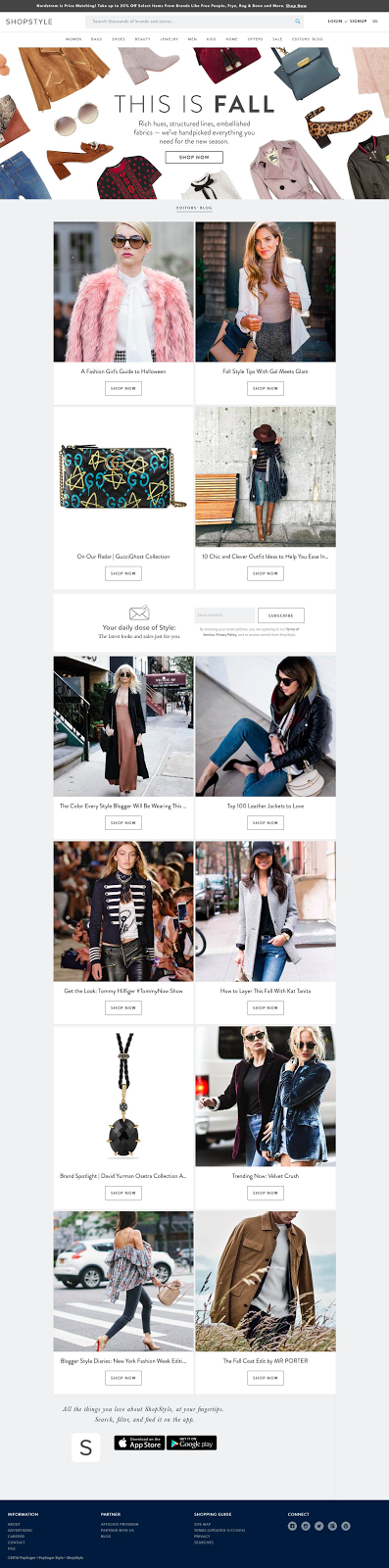
- Visual: Photos of outfits and clothing really represent the style of the brand.
- Contrast: Visuals, graphics and CTAs are designed with bright colours to stand out from the ample white space.
- Heading: The heading speaks to visitors ready for the fall fashion season. The subheading goes further to embellish the collecting and build hype around it.
What makes this ecommerce landing page work?
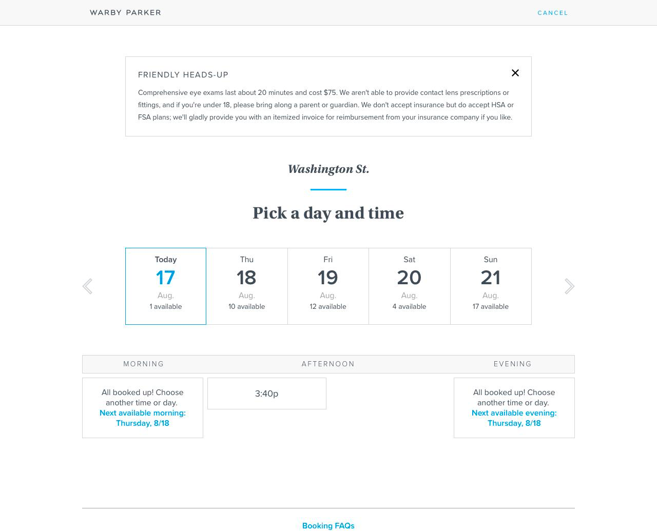
- Scheduling: To come in for a fitting at Warby Parker they’ve use a convenient online booking systems for shoppers.
- Friendly: A friendly message about their eye examples show that they care about their customers.
- White space: As part of their design aesthetic, Warby Parker uses ample white space so as to not distract from their content.
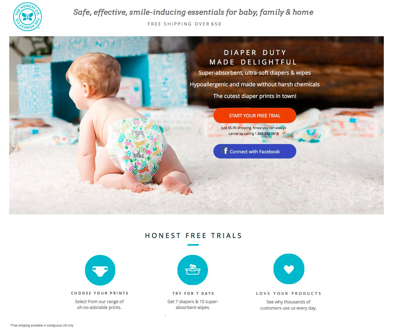
What makes this ecommerce landing page work?
- Honest: Everything that the Honest Co communicates relates to honesty. They make sure their customers love their product or their money back.
- Contrast: Visuals, graphics and CTAs are designed with bright colours to stand out from the ample white space. White space highlights the features and focuses on the free trial setup.
- Imagery: Strong visuals frame the CTAs and draw attention to the header.
What makes this ecommerce landing page work?
- Visual: Images and pleasing colours attract attention and lead visitors down the page. Well used white space directs the eyes towards areas of interest for the visitor.
- Features: A long list of features allows visitors to learn more about the business and the benefits they’ll receive.
- Huge CTA: The bottom has a massive CTA that redirects up to the form at the top.
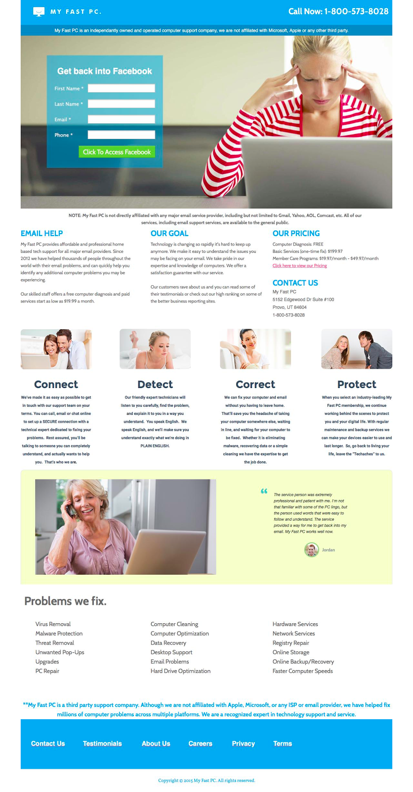
What makes this ecommerce landing page work?
- Informed: MyFastPC provides heaps of info for its visitors. They provide enough info to make sure visitors are comfortable converting.
- Social proof: Company logos and testimonials add trust and credibility to the page. Knowing that other companies have had success using the product is a huge conversion driver.
- Contrast: Visuals, graphics and CTAs are designed with bright colours to stand out from the ample white space. The testimonial and form are encapsulated to draw attention.
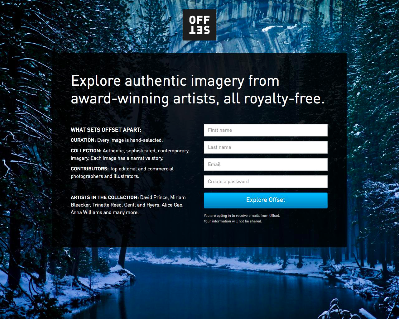
What makes this ecommerce landing page work?
- Imagery: A huge background image frames the form and focuses the attention towards the centre of the page.
- Set apart: OffSet lists out the reasons it stands out in the marketplace.
- Bright: The CTA and the form fields are bright and stand out from the rest of the dark landing page.
What makes this ecommerce landing page work?
- Contrast: Visuals, graphics and CTAs are designed with bright colours to stand out from the ample white space. The lines act as directional cues and lead the eyes down the page.
- Social proof: Company logos and testimonials add trust and credibility to the page. Knowing that other companies have had success using the product is a huge conversion driver.
What makes this ecommerce landing page work?
- Slideshow: An image slideshow maximizes the space available for images.
- Guaranteed: Signs and signals underneath the form are meant to give the visitor confidence in converting on this landing page.
- Visual: Images and pleasing colours attract attention and lead visitors down the page. Well used white space directs the eyes towards areas of interest for the visitor.
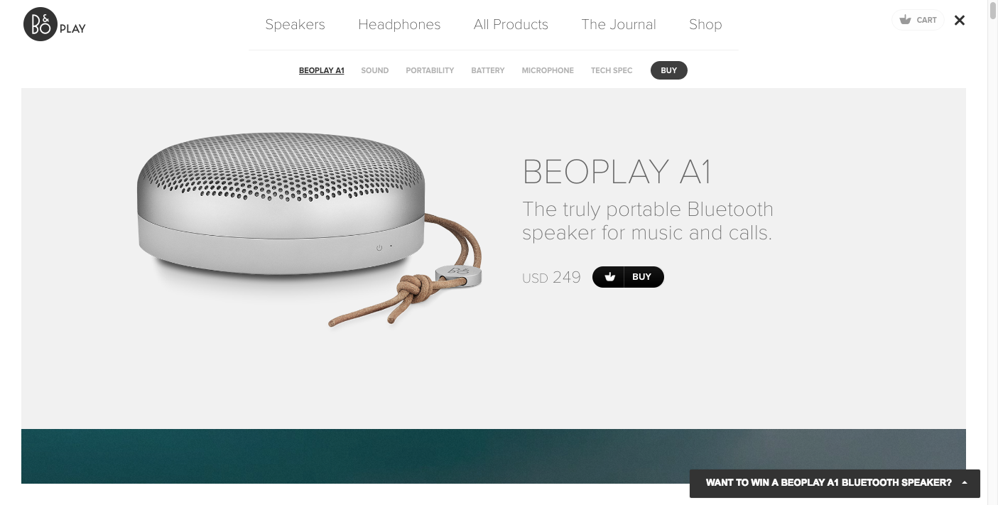
What makes this ecommerce landing page work?
- Visual: A huge product shot graces the top of the screen. It gives the visitor an up close and personal look at the product.
- CTAs: The CTAs are dark and bold so that they stand out amongst the white space.
- Simple: The USP is communicated simply and the benefits are stated clearly.

Landing Pages
500 Strategies, Ideas & Examples
Click below to download the most comprehensive collection of landing page strategies and examples ever compiled. Completely free.