s
200 Landing Page Examples Analyzed
Ebook Landing Pages
Landing pages are an ideal environment for your first interaction with a potential customer. They work well because they provide a single conversion goal — nothing else.
But what is the incentive for the visitor to convert?
That’s where your lead magnet comes in. A lead magnet is the ‘reward’ for the visitor. It’s the small value-packed gift they receive for converting and becoming a lead.
One of the best and most effective lead magnets are ebooks. They’re low cost to produce, only requiring your time and information. If you have valuable information to teach an ebook is a legitimate lead magnet to offer your audience.
Here are some excellent ebook landing pages to draw inspiration from.
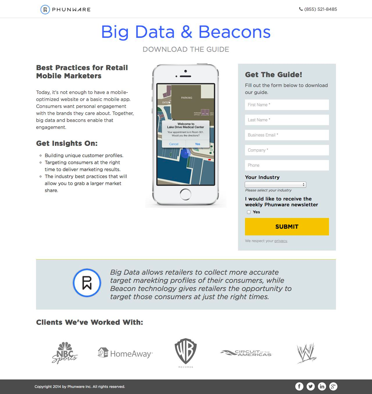
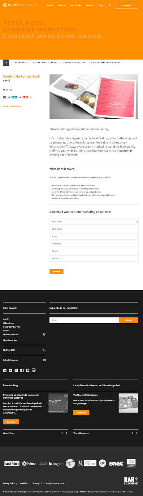
What makes this ebook landing page work?
- Tangible: The ebook is shown off as a real physical book for added appearance of value. The ebook being digital, can be given an extra boost with a graphical image thus making it a more attractive offer.
- Contents: The contents and value are laid out for the visitor. This way they’ll get a sense of what they will learn and what to expect.
- Contrast: Visuals, graphics and CTAs are designed with bright colours to stand out from the ample white space.
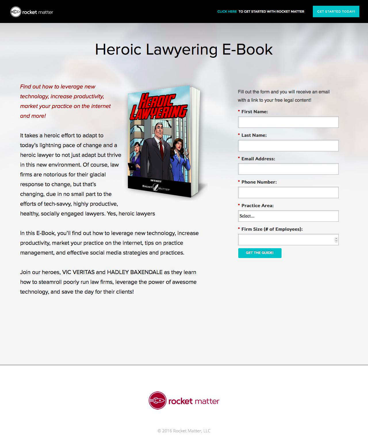
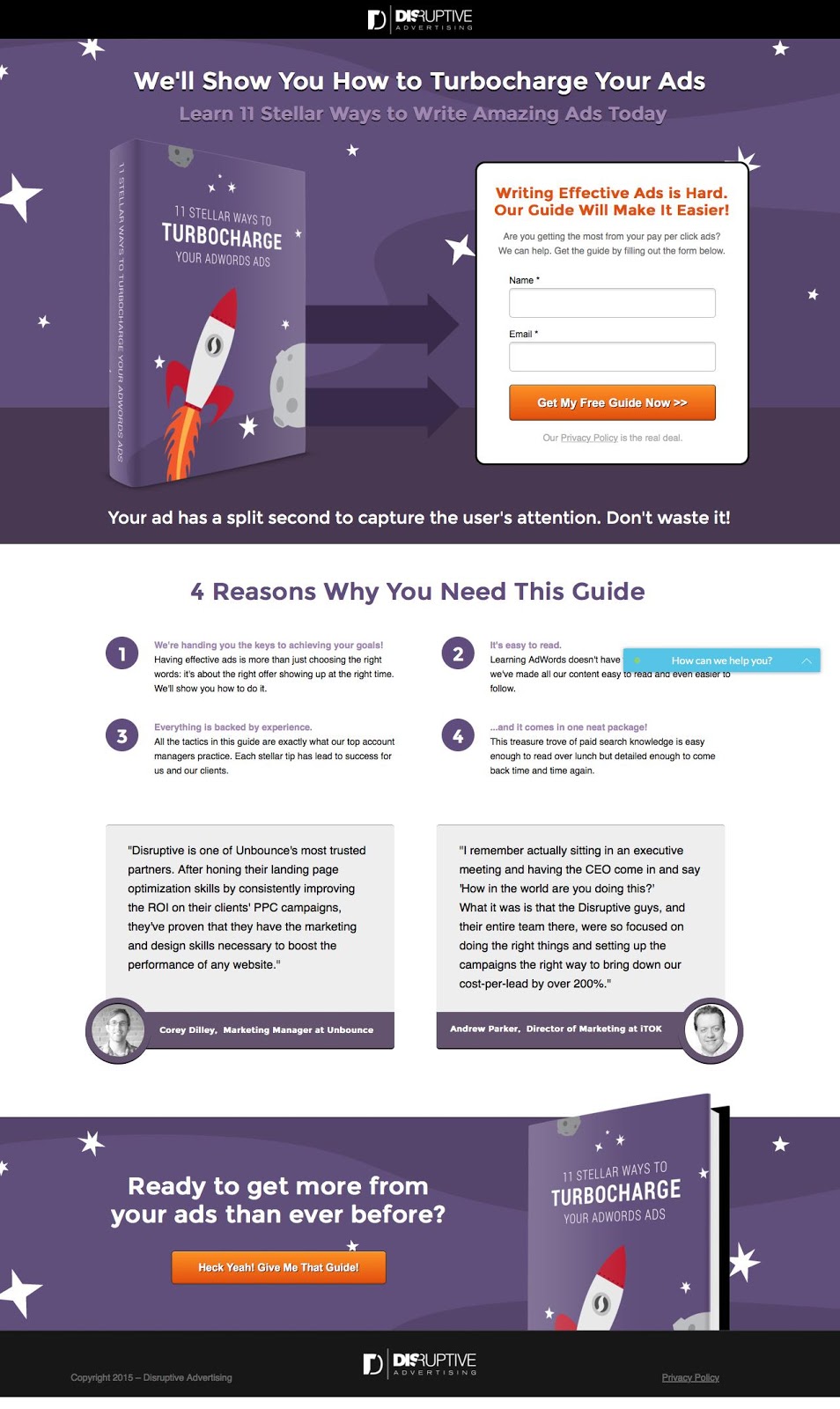
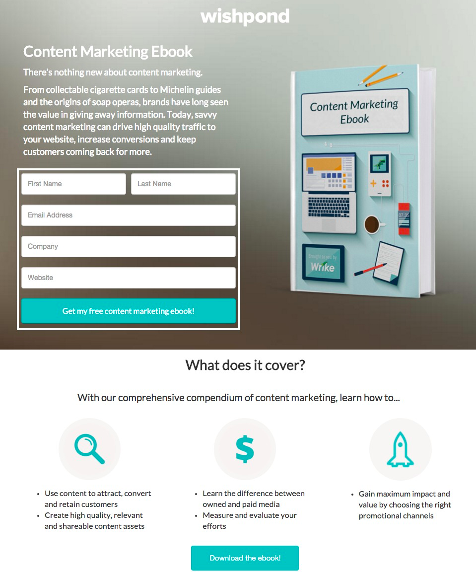
What makes this ebook landing page work?
- Tangible: The ebook is shown off as a real physical book for added appearance of value. The ebook being digital, can be given an extra boost with a graphical image thus making it a more attractive offer.
- Why: “4 reasons why you need this guide”. The contents and value are laid out for the visitor. This way they’ll get a sense of what they will learn and what to expect.
- Proof: Real testimonials from market leaders add extra credibility to the resource.
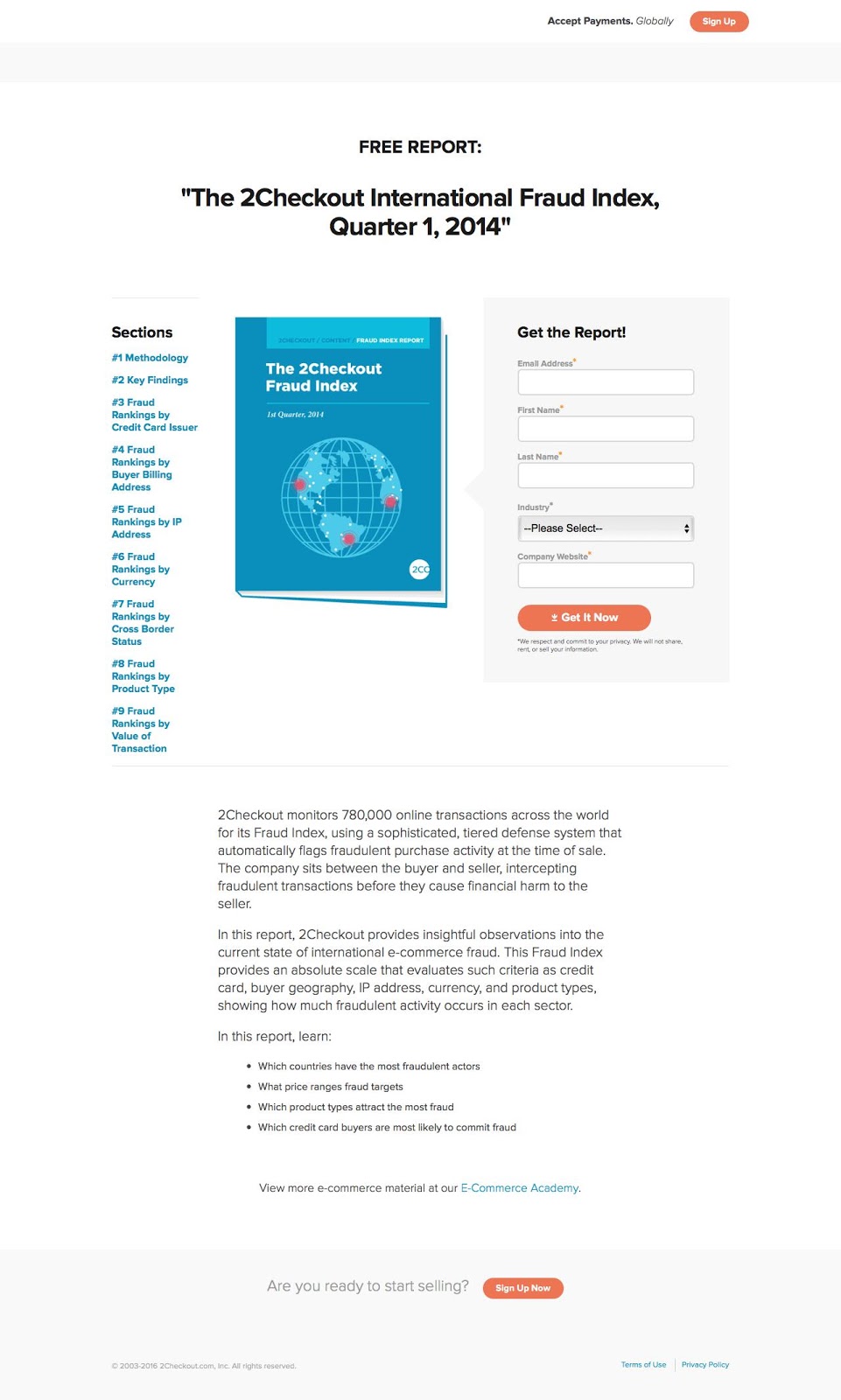
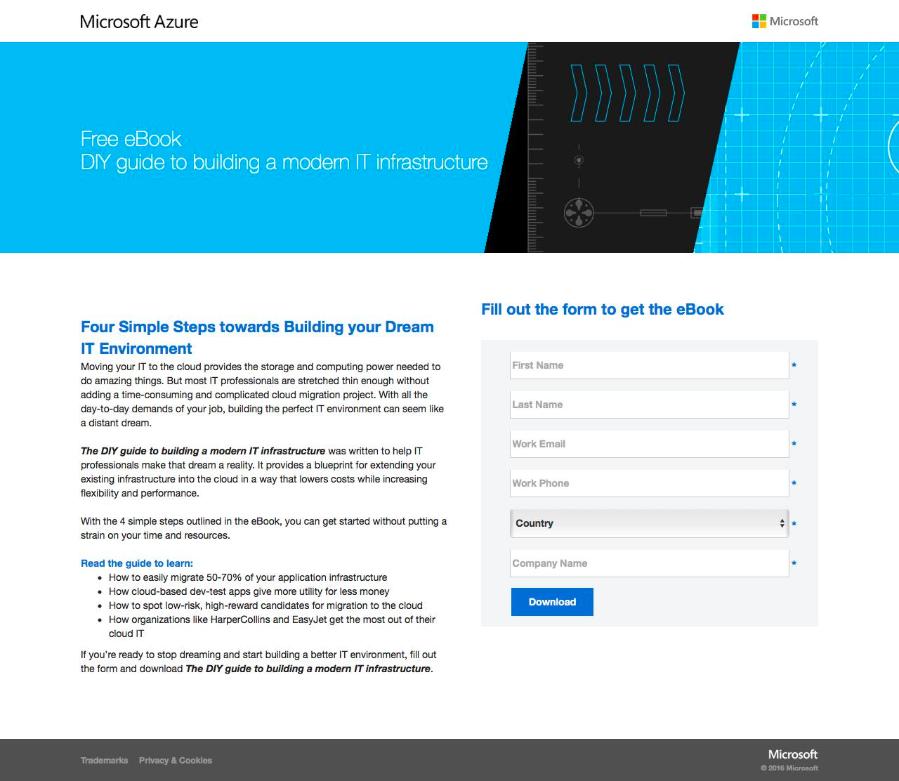
What makes this ebook landing page work?
- Tangible: The ebook is shown off as a real physical book for added appearance of value. The ebook being digital, can be given an extra boost with a graphical image thus making it a more attractive offer.
- Why: “What’s in the ebook?” The contents and value are laid out for the visitor. This way they’ll get a sense of what they will learn and what to expect.
- Contrast: Visuals, graphics and CTAs are designed with bright colours to stand out from the ample white space.
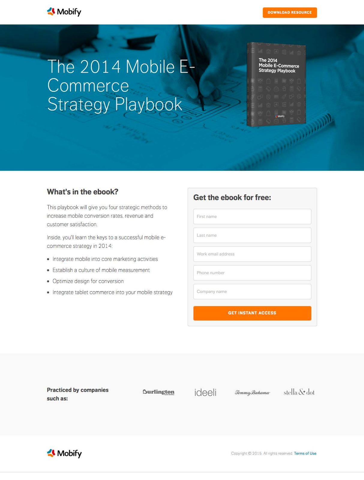
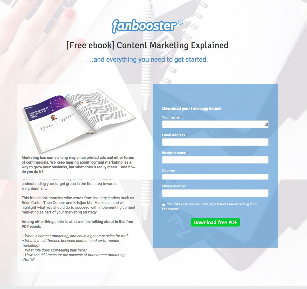
What makes this ebook landing page work?
- Action: The CTA button and form headline uses action-oriented language to command action from the visitor.
- Encapsulated: The form is encapsulated in a grey box to stand out from the page and separate itself from the information.
- Contrast: Visuals, graphics and CTAs are designed with bright colours to stand out from the ample white space.
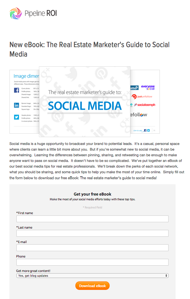
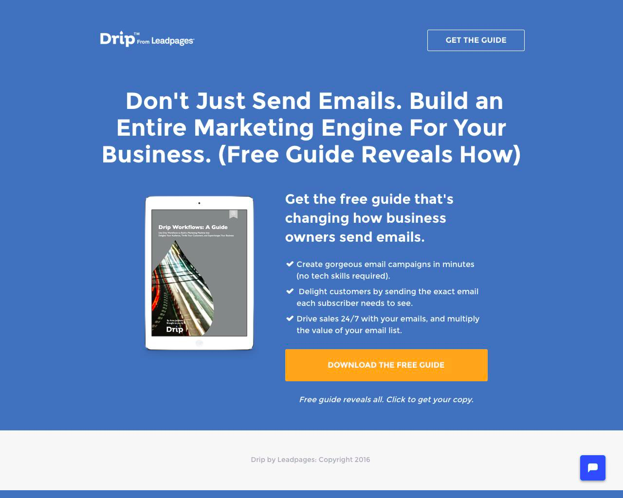
What makes this ebook landing page work?
- White space: Colour is used only in the area with the form. It’s a smart way to highlight the form and separate it from the rest of the information.
- Contents: The contents and value are laid out for the visitor. This way they’ll get a sense of what they will learn and what to expect.
- Contrast: Visuals, graphics and CTAs are designed with bright colours to stand out from the ample white space. The form is placed on the bright orange portion to highlight itself from the information.
What makes this ebook landing page work?
- Tangible: The ebook is shown off as a real physical book for added appearance of value. Since the ebook is digital, a physical book graphic lends a tangible value.
- Contents: The contents and value are laid out for the visitor. This way they’ll get a sense of what they will learn and what to expect.
- Social proof: Company logos and testimonials add trust and credibility to the page. Knowing that other companies have had success using the product is a huge conversion driver.
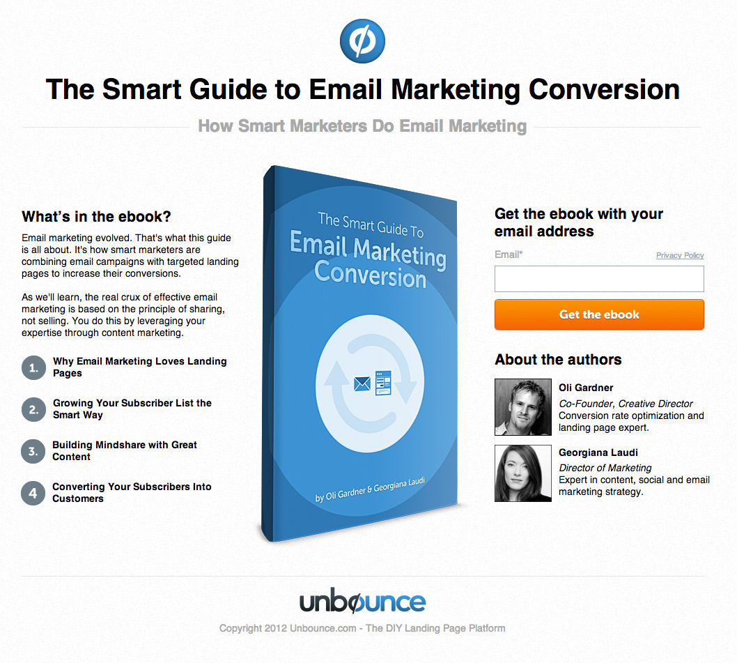
What makes this ebook landing page work?
- Tangible: The ebook is shown off as a real physical book for added appearance of value. A real book has the appearance of more value than one that is digital.
- Contents: The contents and value are laid out for the visitor. This way they’ll get a sense of what they will learn and what to expect.
- Social proof: Pictures and bios of the authors add credibility to the resource.
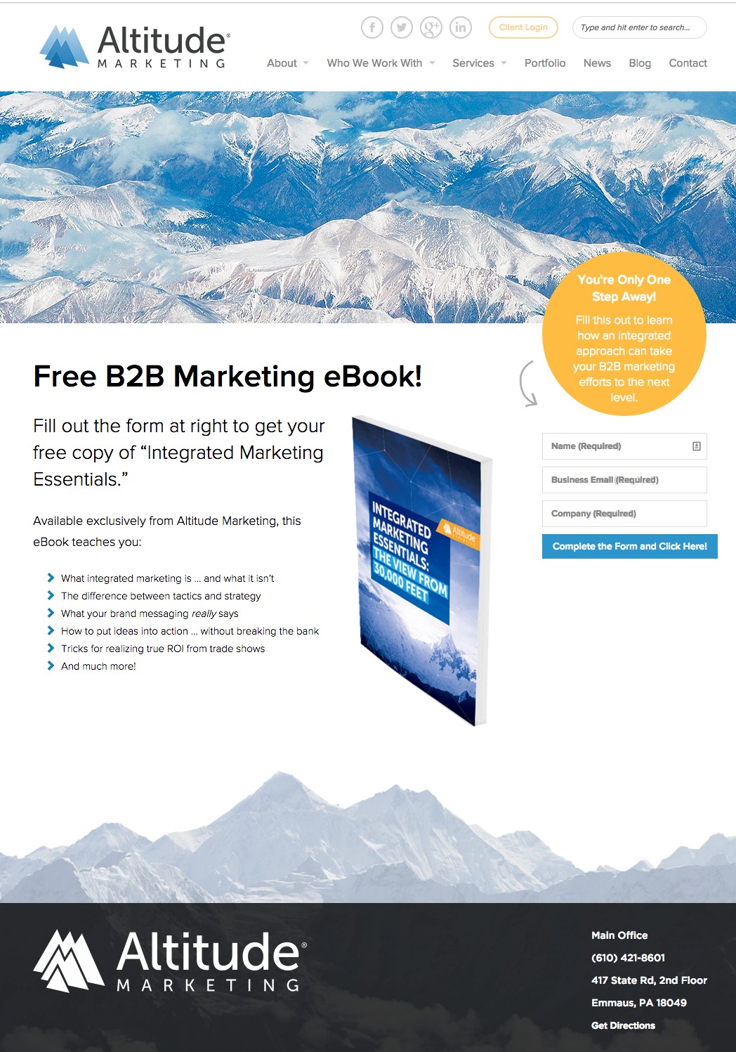
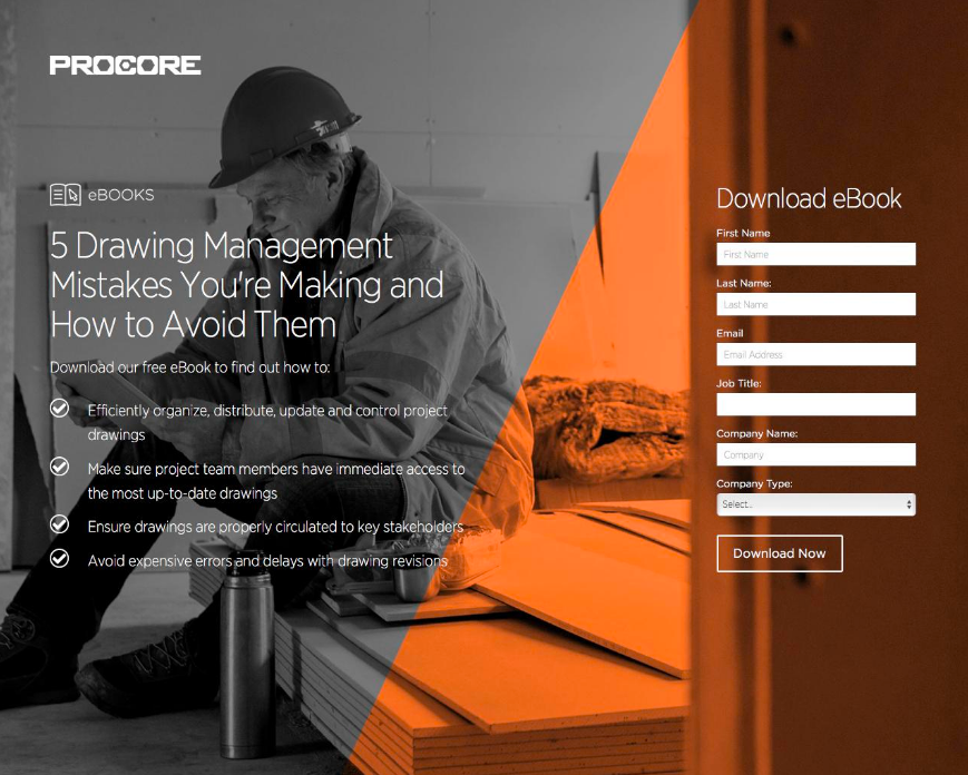
What makes this ebook landing page work?
- Tangible: The ebook is shown off as a real physical book for added appearance of value. A real book has the appearance of more value than one that is digital. Note the step stamp near the form “you’re only one step away!”
- Contents: The contents and value are laid out for the visitor. This way they’ll get a sense of what they will learn and what to expect.
- Contrast: Visuals, graphics and CTAs are designed with bright colours to stand out from the ample white space. It leads the eyes to only the important information and to the form. Note the directional cue arrow as well.
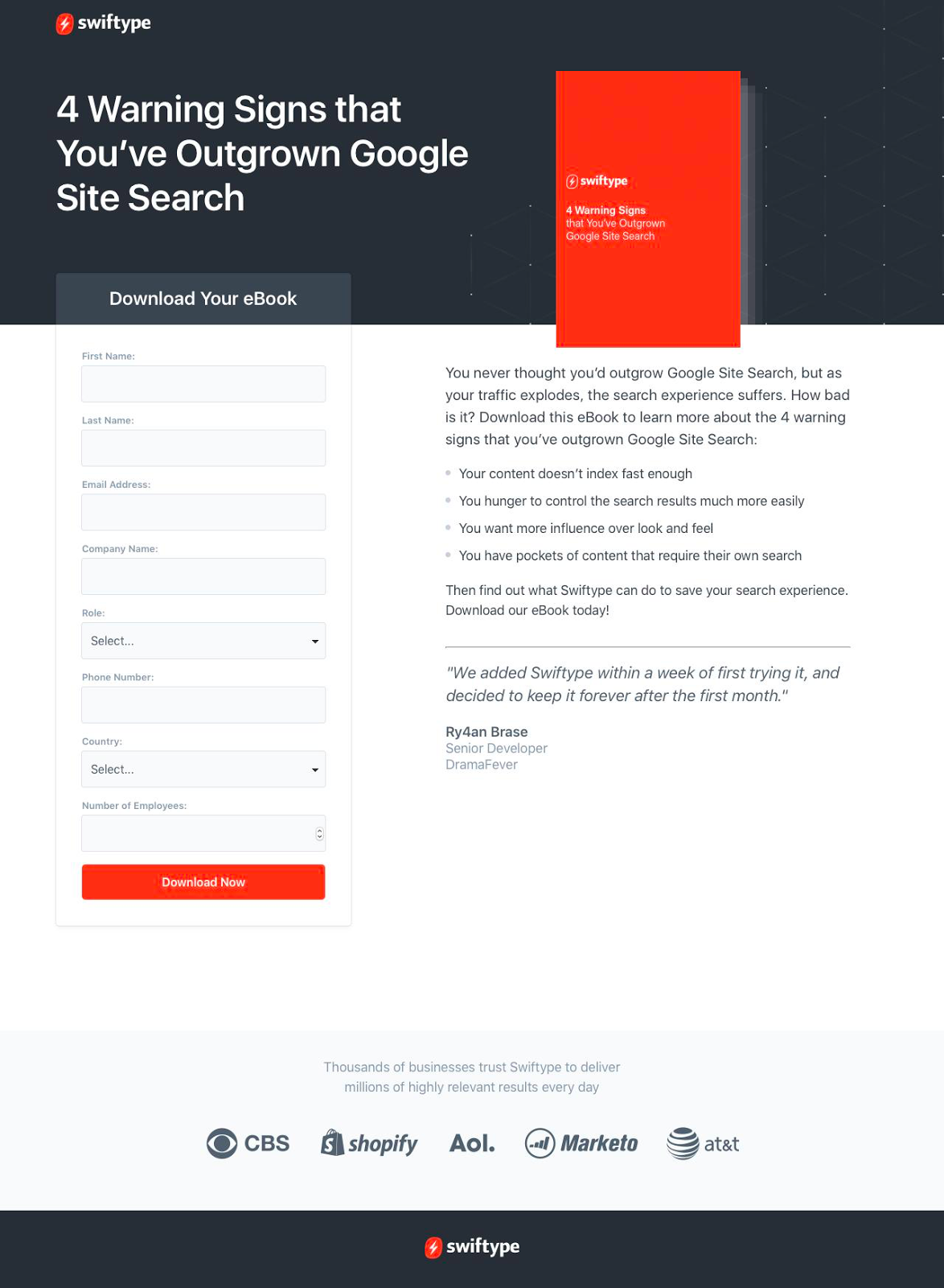
What makes this ebook landing page work?
- Tangible: The ebook is shown off as a real physical book for added appearance of value. A nice book cover adds much more value than one with a poor appearance.
- White space: Colour is used only in the image. It’s a smart way to draw attention to the form and separate it from the rest of the information.
What makes this ebook landing page work?
- Tangible: The ebook is shown off as a real physical book for added appearance of value. Like a real book, a well-designed cover is meant to attract a reader.
- Contents: The contents and value are laid out for the visitor. This way they’ll get a sense of what they will learn and what to expect.
- Contrast: Visuals, graphics and CTAs are designed with bright colours to stand out from the ample white space. The bright yellow CTA instinctively draws the eye towards it.
What makes this ebook landing page work?
- Tangible: The ebook is shown off as a real physical book for added appearance of value. Laid out in the picture, it lends a physical feeling to the offer.
- Contents: The contents and value are laid out for the visitor. This way they’ll get a sense of what they will learn and what to expect.
- Contrast: Visuals, graphics and CTAs are designed with bright colours to stand out from the ample white space. The encapsulated box and bright CTA instinctively draw eyes towards it.
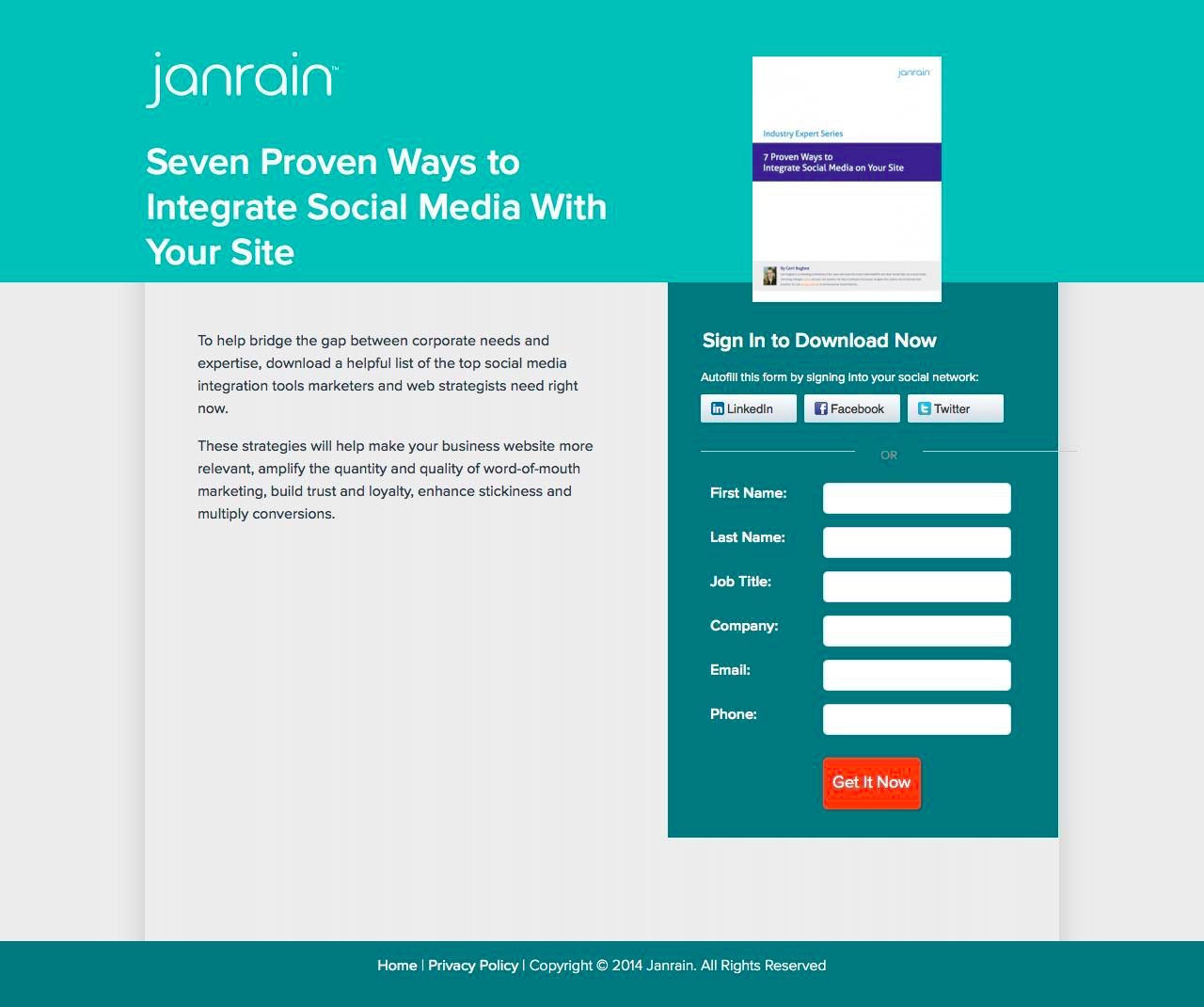
What makes this ebook landing page work?
- Tangible: The ebook is shown off as a real physical book for added appearance of value. Laid out in the picture, it lends a physical feeling to the offer.
- Value: The offer is tempting “7 proven ways to integrate social media with your site”. Value and what you’ll get out of this event is immediately recognizable.
- Contrast: Visuals, graphics and CTAs are designed with bright colours to stand out from the ample white space. The encapsulated box and bright CTA instinctively draw eyes towards it.
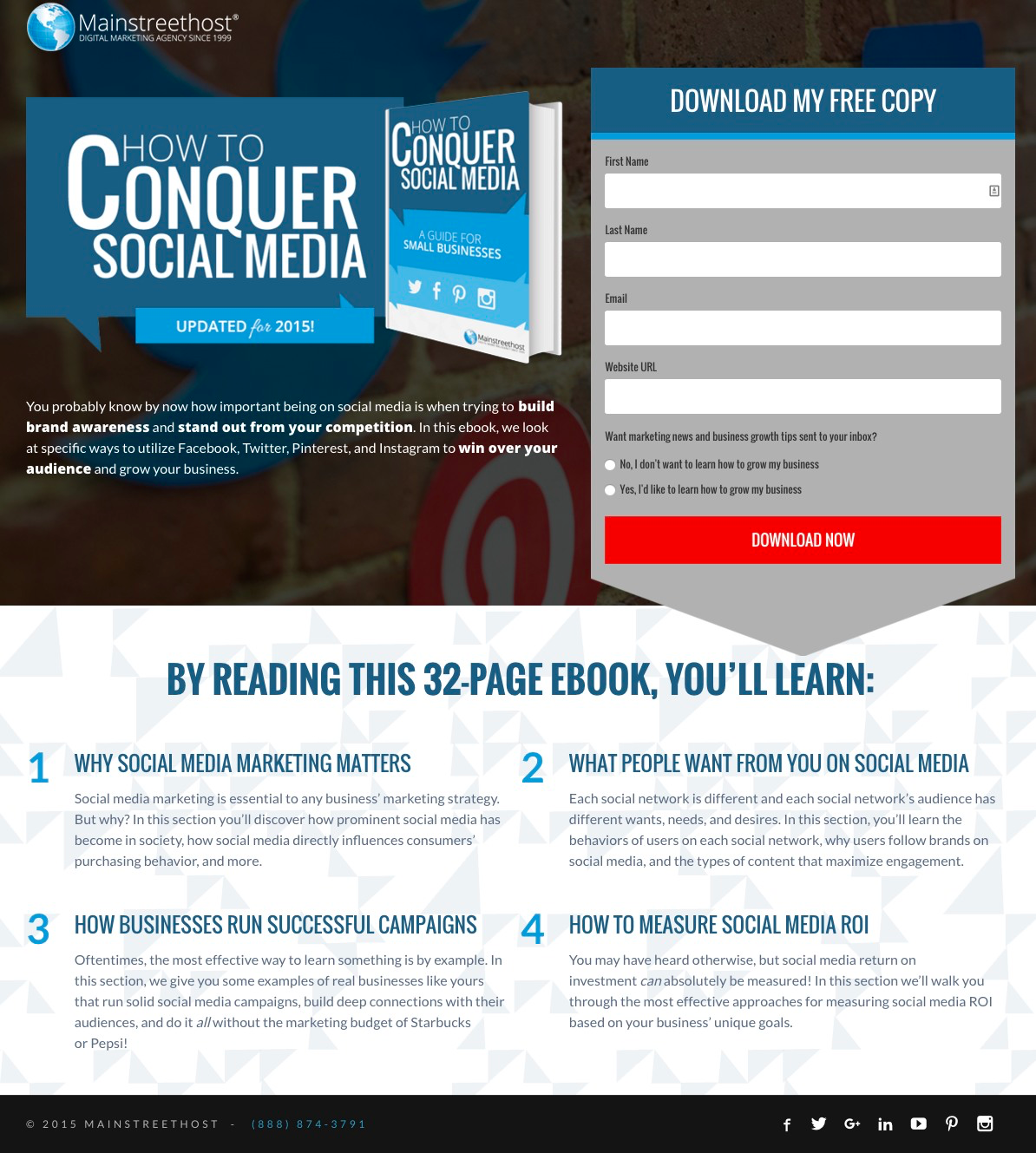
What makes this ebook landing page work?
- Tangible: The ebook is shown off as a real physical book for added appearance of value. Laid out in bright green, it lends a physical feeling to the offer.
- Social proof: Company logos and testimonials add trust and credibility to the page. Knowing that other companies have had success using the product is a huge conversion driver.
- Contrast: Visuals, graphics and CTAs are designed with bright colours to stand out from the ample white space. The encapsulated box and bright green CTA instinctively draw eyes towards it.
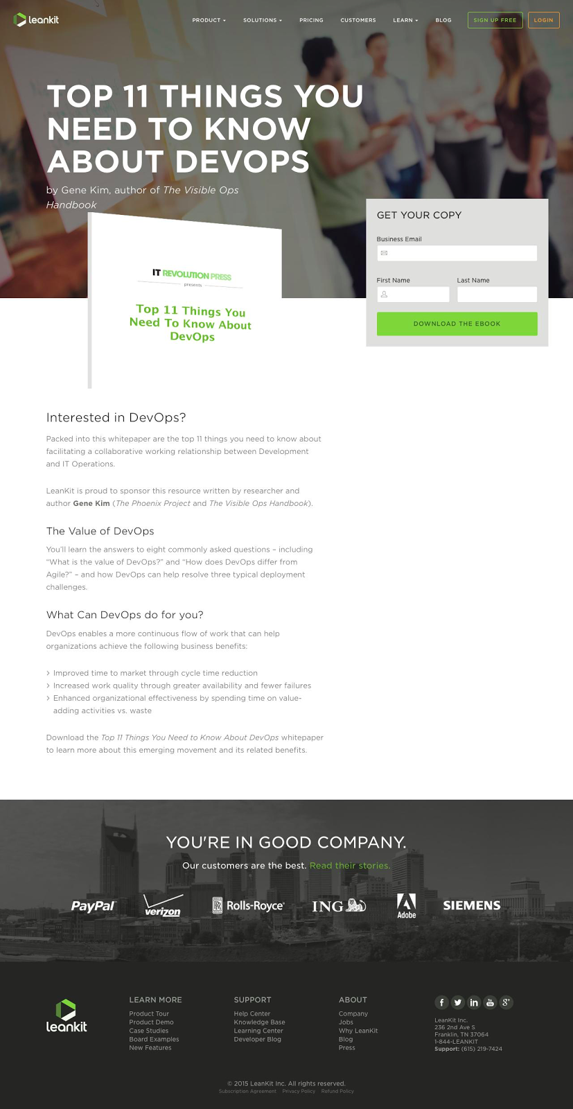
What makes this ebook landing page work?
- Tangible: The ebook is shown off as a real physical book for added appearance of value. The bold cover lends a physical feeling to the offer.
- Contents: “By reading this 32-page book, you’ll learn”. The contents and value are laid out for the visitor. This way they’ll get a sense of what they will learn and what to expect.
- Contrast: Visuals, graphics and CTAs are designed with bright colours to stand out from the ample white space. The encapsulated box and bright red CTA instinctively draw eyes towards it.
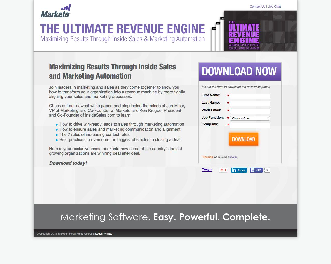
What makes this ebook landing page work?
- Tangible: The ebook is shown off as a real physical book for added appearance of value. Laid out in bright green, it lends a physical feeling to the offer.
- Value: The value of this resource is made immediately clear with language like “ultimate revenue engine” and “maximizing results”.
- Contrast: Visuals, graphics and CTAs are designed with bright colours to stand out from the ample white space. The encapsulated purple box and bright orange CTA instinctively draw eyes towards it.
What makes this ebook landing page work?
- Tangible: A concrete example of the mobile app leads the page. Examples do a lot to add credibility to the offer.
- Social proof: Company logos and testimonials add trust and credibility to the page. Knowing that other companies have had success using the product is a huge conversion driver.
- Contrast: Visuals, graphics and CTAs are designed with bright colours to stand out from the ample white space. The encapsulated box and bright yellow CTA instinctively draw eyes towards it.
What makes this ebook landing page work?
- Tangible: A physical graphic of the book does a lot to add value and credibility to the offer.
- White space: Colour is used only in the area with the form. It’s a smart way to highlight the form and separate it from the rest of the information.
- Contrast: Visuals, graphics and CTAs are designed with bright colours to stand out from the ample white space. The encapsulated box and bright cyan CTA instinctively draw eyes towards it.
What makes this ebook landing page work?
- Tangible: A physical graphic of the book does a lot to add value and credibility to the offer. A well designed cover only makes the offer more appealing.
- Encapsulated: The form is encapsulated in a white border to draw attention.
- Contrast: Visuals, graphics and CTAs are designed with bright colours to stand out from the ample white space. The encapsulated box and bright cyan CTA instinctively draw eyes towards it.
What makes this ebook landing page work?
- Contents: The contents and value are laid out for the visitor. This way they’ll get a sense of what they will learn and what to expect.
- Encapsulated: The form is encapsulated in a grey box to draw attention.
- Contrast: Visuals, graphics and CTAs are designed with bright colours to stand out from the ample white space. The encapsulated box and bright blue CTA instinctively draw eyes towards it.
What makes this ebook landing page work?
- Contents: The contents and value are laid out for the visitor. This way they’ll get a sense of what they will learn and what to expect.
- Tangible: A visual representation of the ebook is shown in the image. Having an example of an offer that is digital can do much more
- Contrast: Visuals, graphics and CTAs are designed with bright colours to stand out from the ample white space. The graphics and body copy do a lot to direct the eyes down the page.
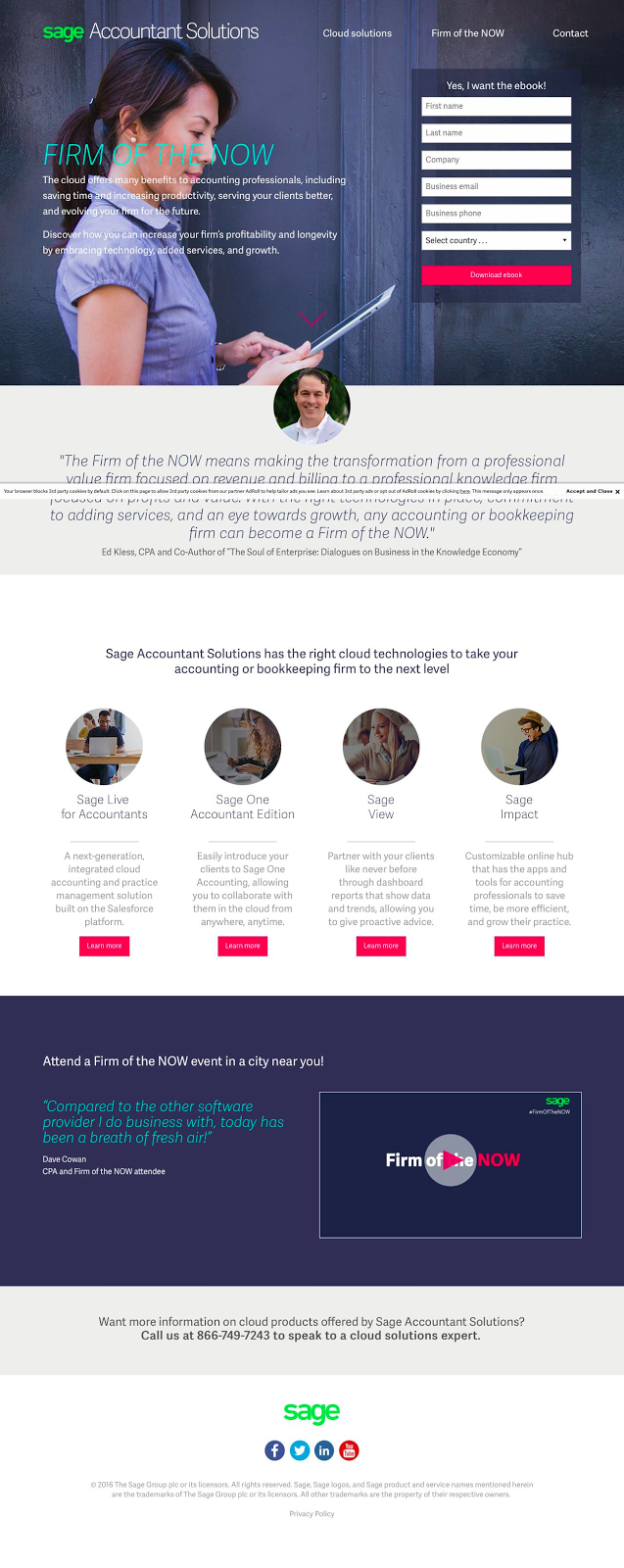
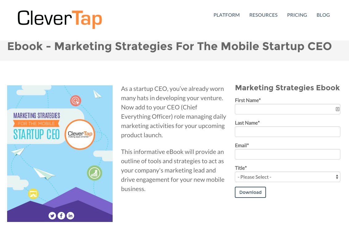
What makes this ebook landing page work?
- Contents: The contents and value are laid out for the visitor. This way they’ll get a sense of what they will learn and what to expect.
- Video: A landing page video quickly and succinctly explains Sage and the offer. Visuals do a much better job at explaining and presenting information.
- Social proof: Company logos and testimonials add trust and credibility to the page. Knowing that other companies have had success using the product is a huge conversion driver.
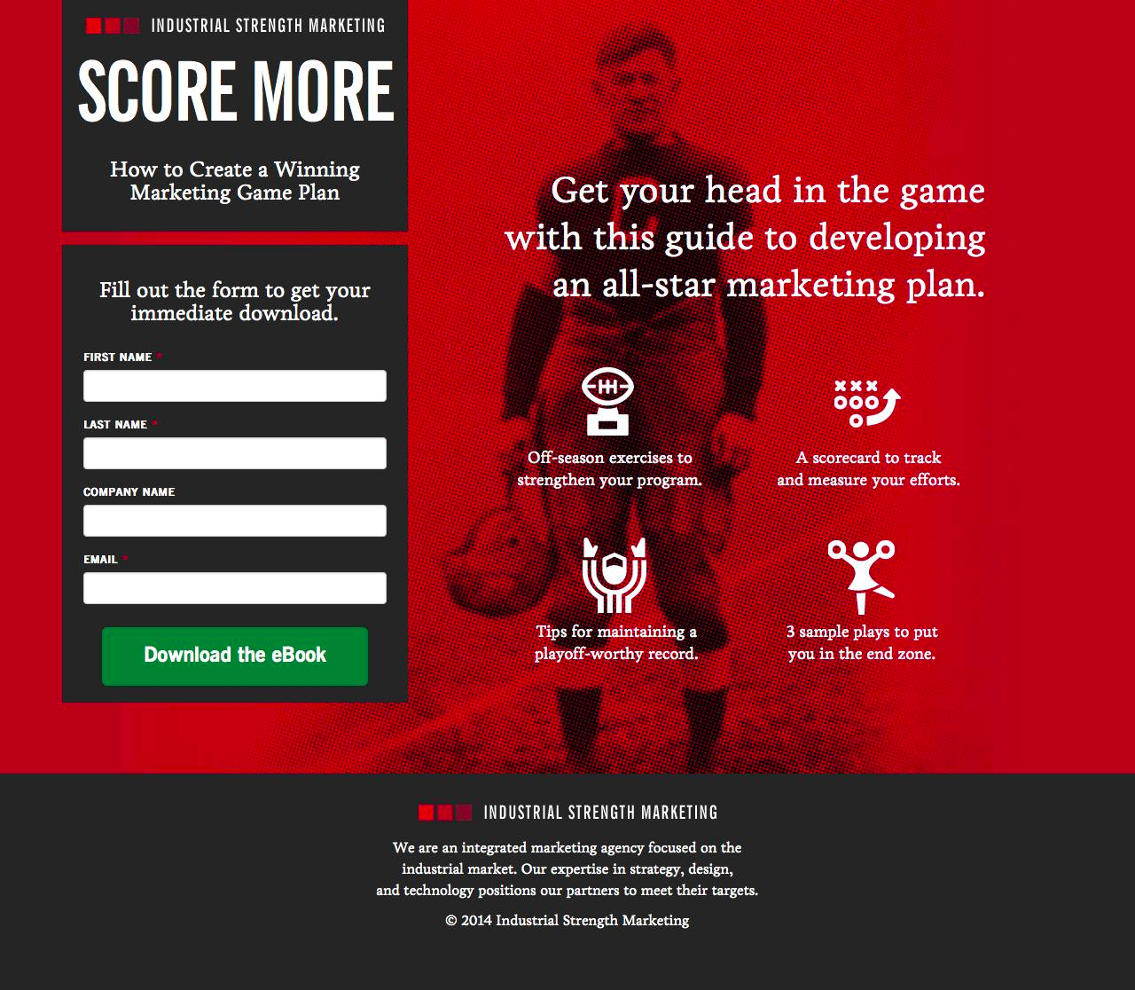
What makes this ebook landing page work?
- Contents: The contents and value are laid out for the visitor. This way they’ll get a sense of what they will learn in this all-star marketing plan guide.
- Encapsulated: The form on the left hand side really stands out from the rest of the page. The dark grey box and bright green CTA help focus the attention on the form.
- White space: This time white is used to separate important elements from the red ‘white space’.
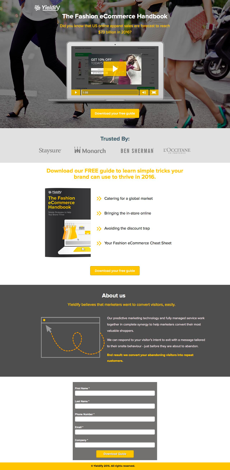
What makes this ecommerce landing page work?
- Contents: The contents and value are laid out for the visitor. This way they’ll get a sense of what they will learn and what to expect.
- Video: A landing page video quickly and succinctly explains the offer. Visuals do a much better job at explaining and presenting information.
- Social proof: Company logos are shown clearly on the page to add credibility to the resource.

Landing Pages
500 Strategies, Ideas & Examples
Click below to download the most comprehensive collection of landing page strategies and examples ever compiled. Completely free.