200 Landing Page Examples Analyzed
Event Landing Pages
Landing pages not only excel at collecting leads, they can make great event registration pages as well.
Whether your event is in-person or virtual, a landing page makes registration straightforward by having only a registration conversion goal.
Take some inspiration from these awesome event pages for your next event.
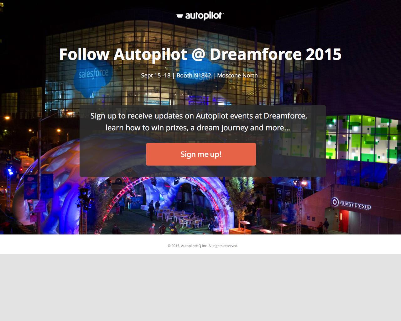
What makes this event landing page work?
- Visual: A large background image frames the CTA and draws attention to the centre.
- Action: The CTA button language uses action-oriented language to command action from the visitor.
- Benefits: The benefits are clearly stated above the CTA to persuade visitors to follow this event.
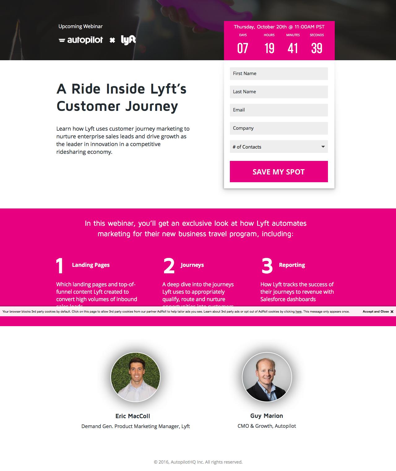
What makes this event landing page work?
- Social proof: The instructors and their qualifications are shown clearly on the page to add credibility to the event.
- Schedule: The schedule is laid out so that registrants can know what to expect after registering.
- Scarcity: “Save my spot” as CTA language signifies scarcity. In other words, spot are limited so sign up quickly.

What makes this event landing page work?
- Social proof: The instructors and their qualifications are shown clearly on the page to add credibility to the event.
- Schedule: The schedule is laid out so that registrants can know what to expect after registering.
- Anchor links: Anchor link CTAs redirect visitors to the form just incase they get lost.
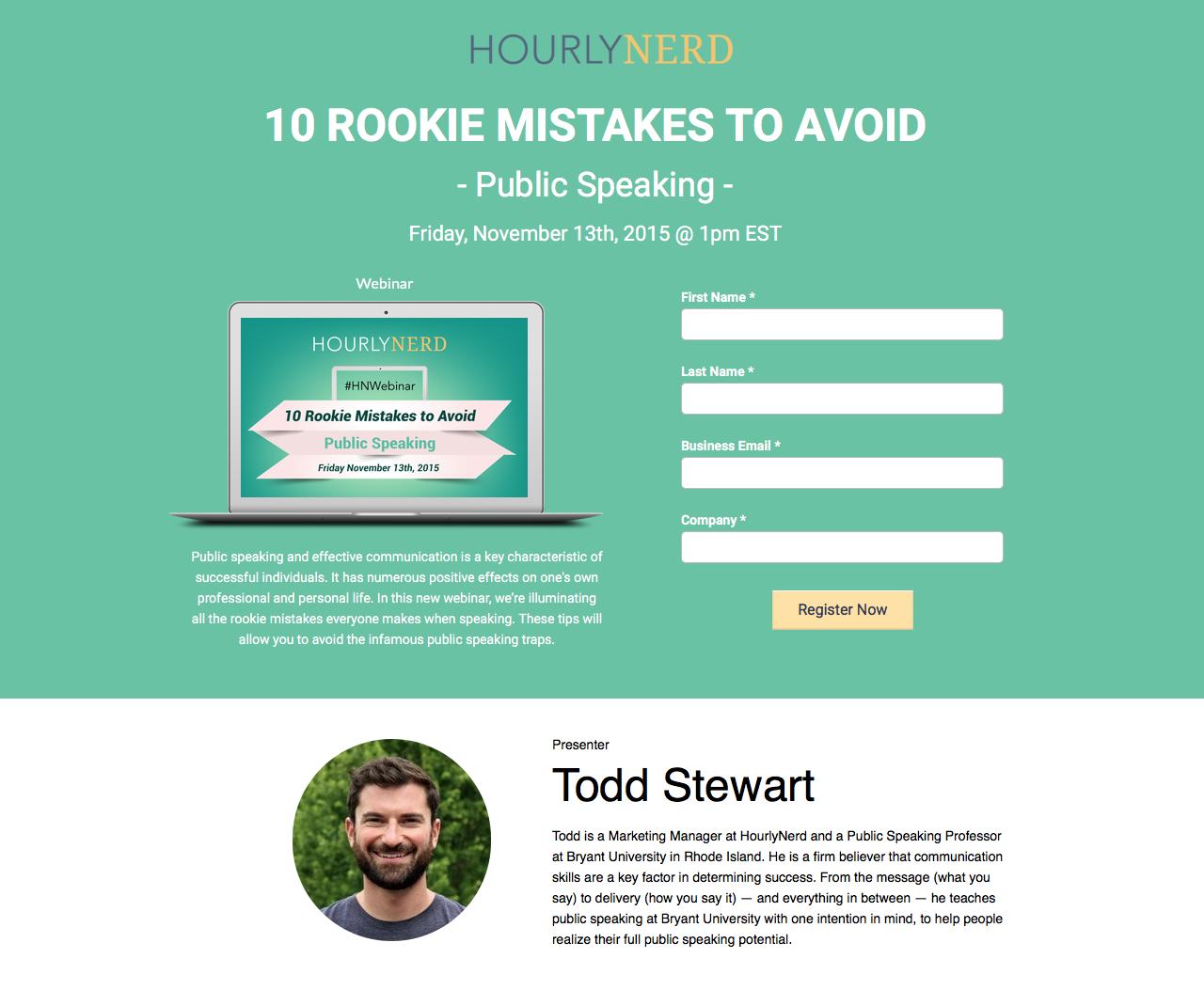
What makes this event landing page work?
- Social proof: The instructor and his qualifications are shown clearly on the page to add credibility to the event. Visitors can have confidence knowing they’re learning from a pro.
- Value: The offer is tempting “10 rookie mistakes to avoid”. Value and what you’ll get out of this event is immediately recognizable.
- Contrast: Visuals, graphics and CTAs are designed with bright colours to stand out from the ample white space.
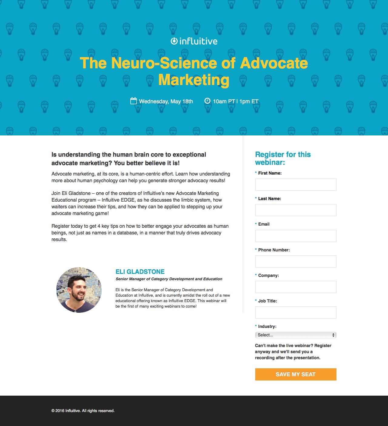
What makes this event landing page work?
- The instructors and their qualifications are shown clearly on the page to add credibility to the event. They’ll have confidence knowing they’re learning from a pro.
- Visuals, graphics and CTAs are designed with bright colours to stand out from the ample white space.
- Scarcity: “Save my seat” as CTA language signifies scarcity. In other words, spot are limited so sign up quickly.
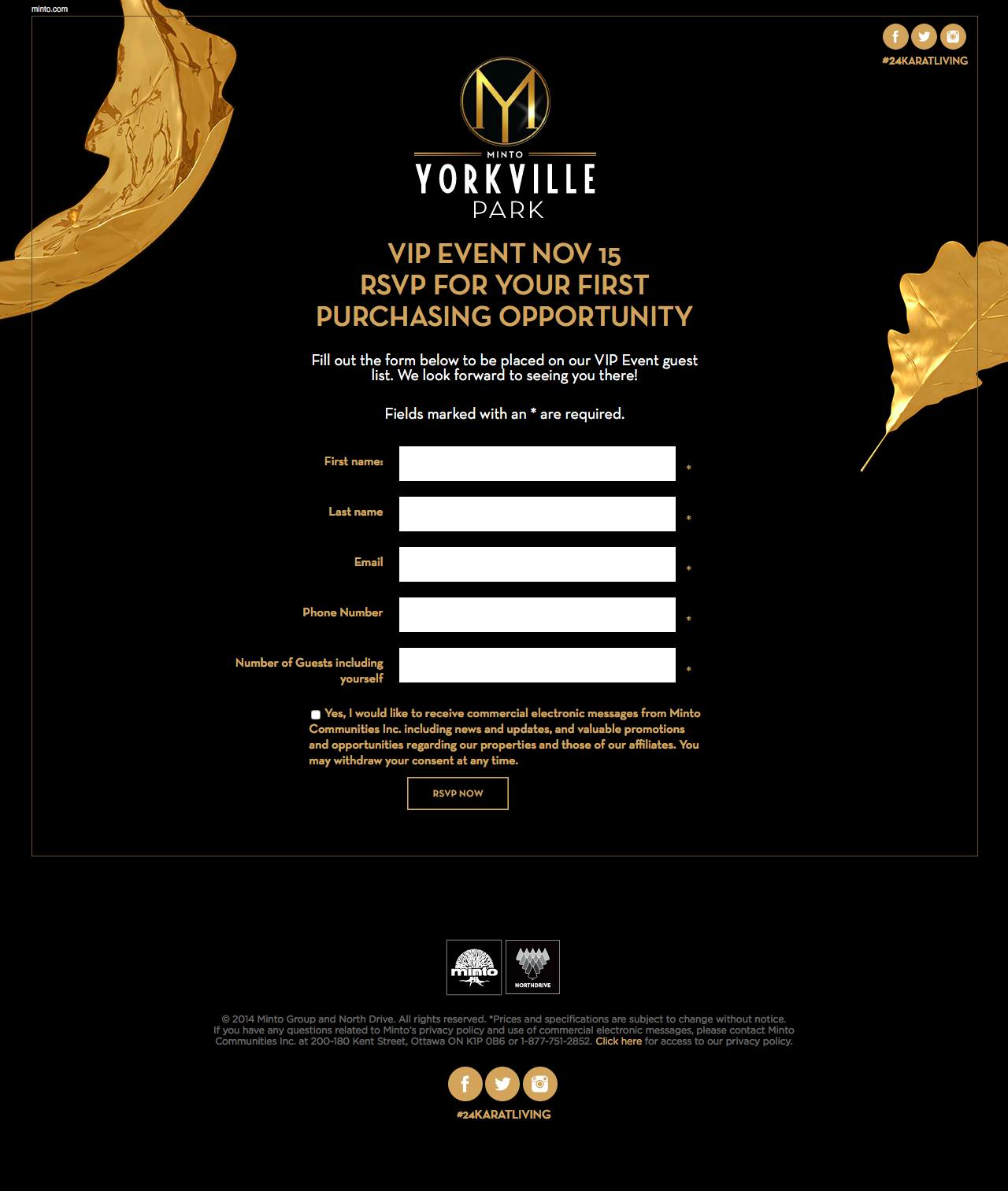
What makes this event landing page work?
- Imagery: Visuals, graphics and CTAs are designed with bright colours to stand out from the ample white space.
- Scarcity: “RSVP Now” as CTA language signifies scarcity. In other words, spot are limited so sign up quickly.
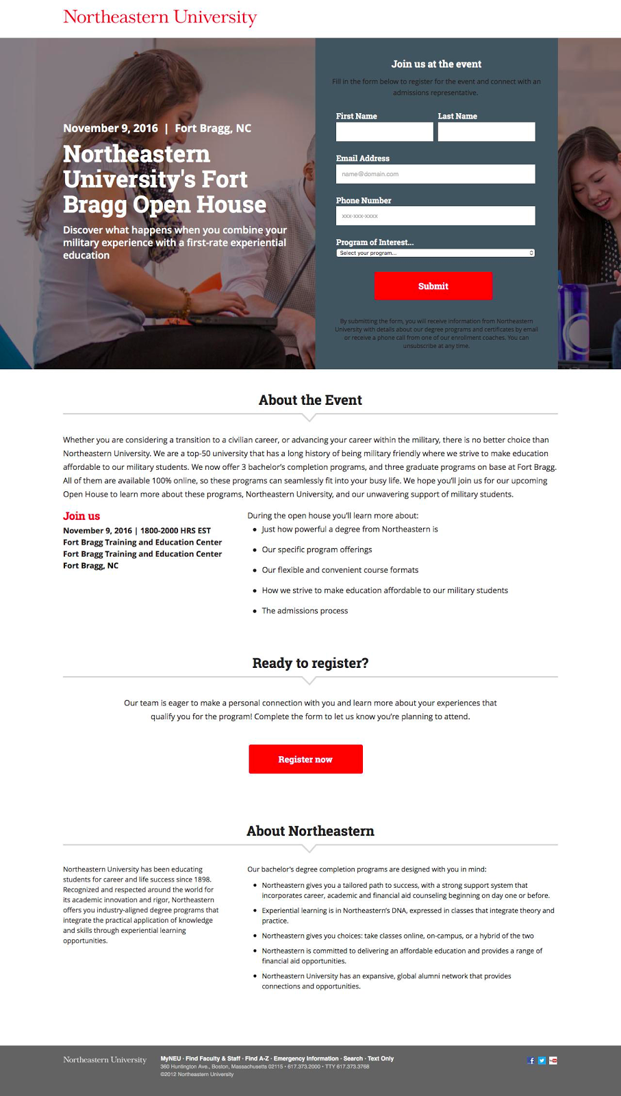
What makes this event landing page work?
- Schedule: The schedule is laid out so that registrants can know what to expect after registering.
- Contrast: Visuals, graphics and CTAs are designed with bright colours to stand out from the ample white space.
- Action: The CTA button language “Register now” uses action-oriented language to command action from the visitor
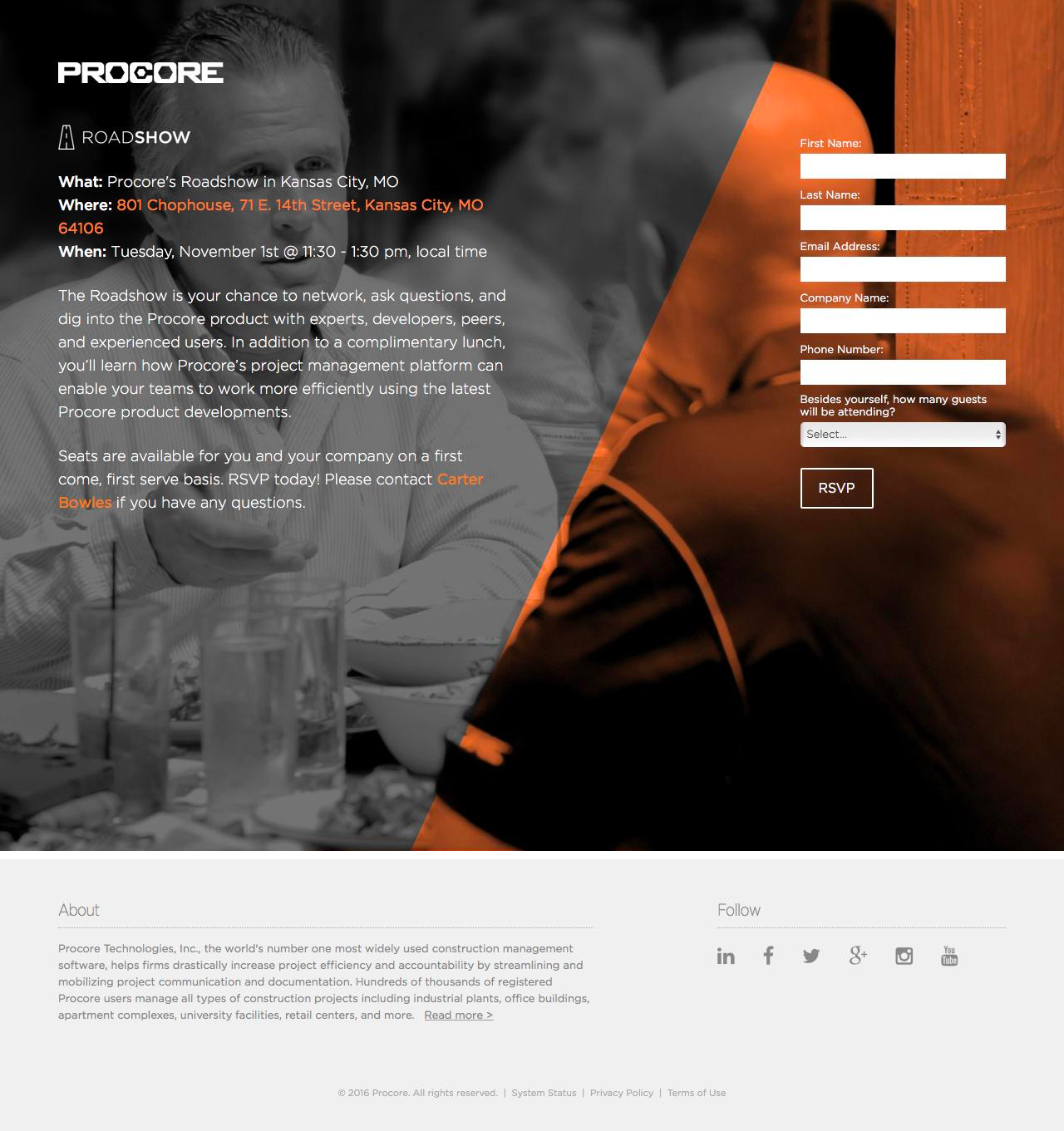
What makes this event landing page work?
- Visual: Images and pleasing colours attract attention and lead visitors down the page. Well used white space directs the eyes towards areas of interest for the visitor.
- Encapsulated: The form is placed in the bright orange section of the page to draw the most attention possible.
- Scarcity: First come first serve basis. In other words, spot are limited so sign up quickly.
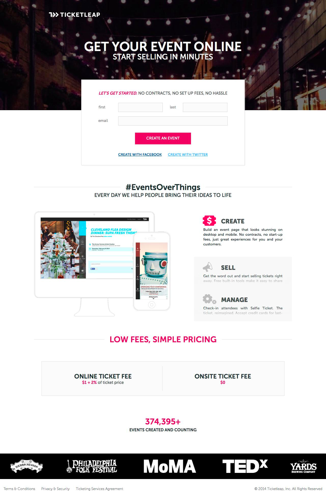
What makes this event landing page work?
- Contrast: Visuals, graphics and CTAs are designed with bright colours to stand out from the ample white space.
- Social proof: Company logos and testimonials add trust and credibility to the page. Knowing that other companies have had success using the product is a huge conversion driver.
- White space: Nothing crowds the information on the page. White space allows areas of importance stand out and grab attention.
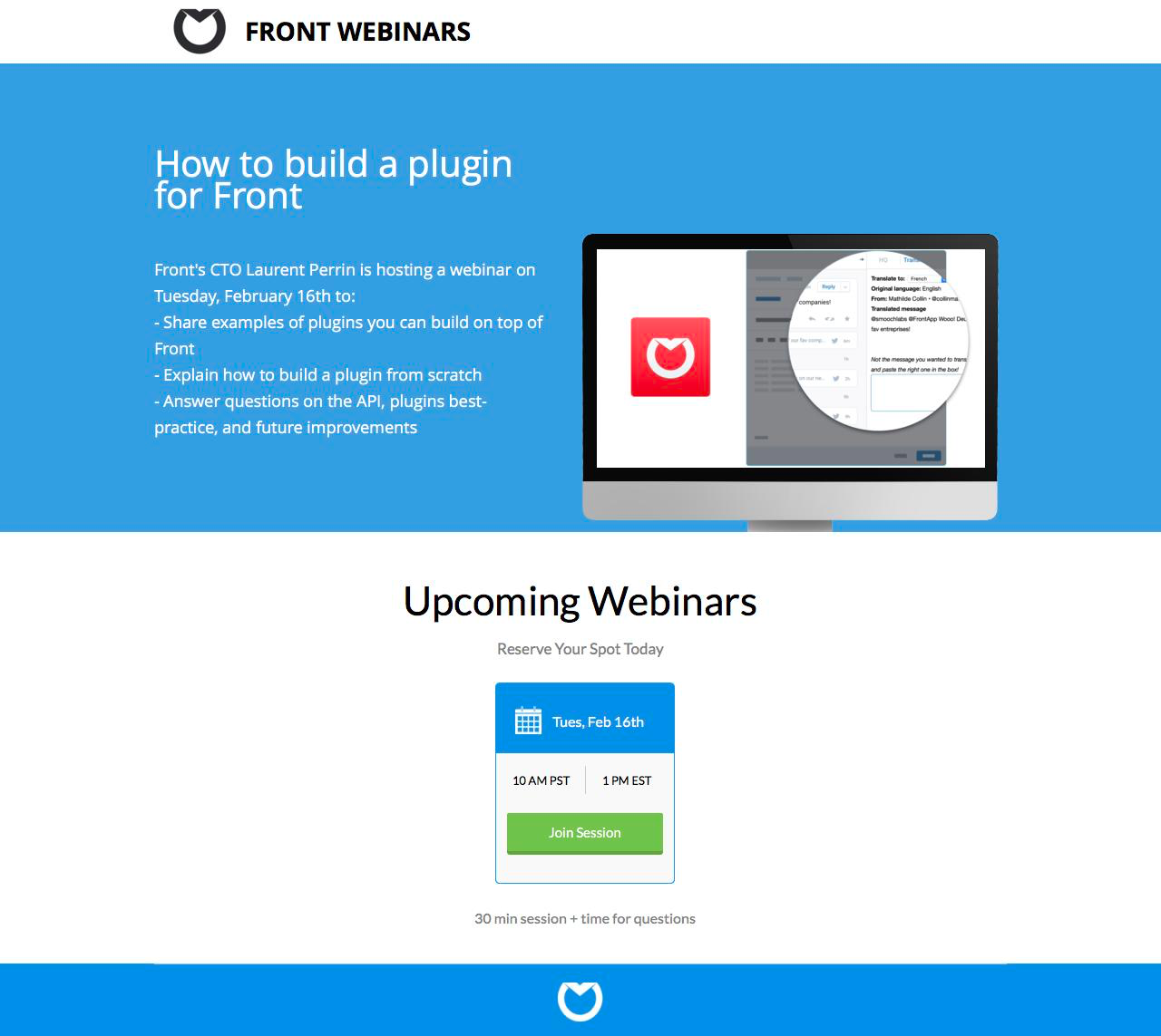
What makes this event landing page work?
- Scarcity: “Reserve your spot today” above the booking form signifies scarcity. In other words, spot are limited so sign up quickly.
- Contrast: Visuals, graphics and CTAs are designed with bright colours to stand out from the ample white space.
- Action: The CTA button language “Join session” uses action-oriented language to command action from the visitor.
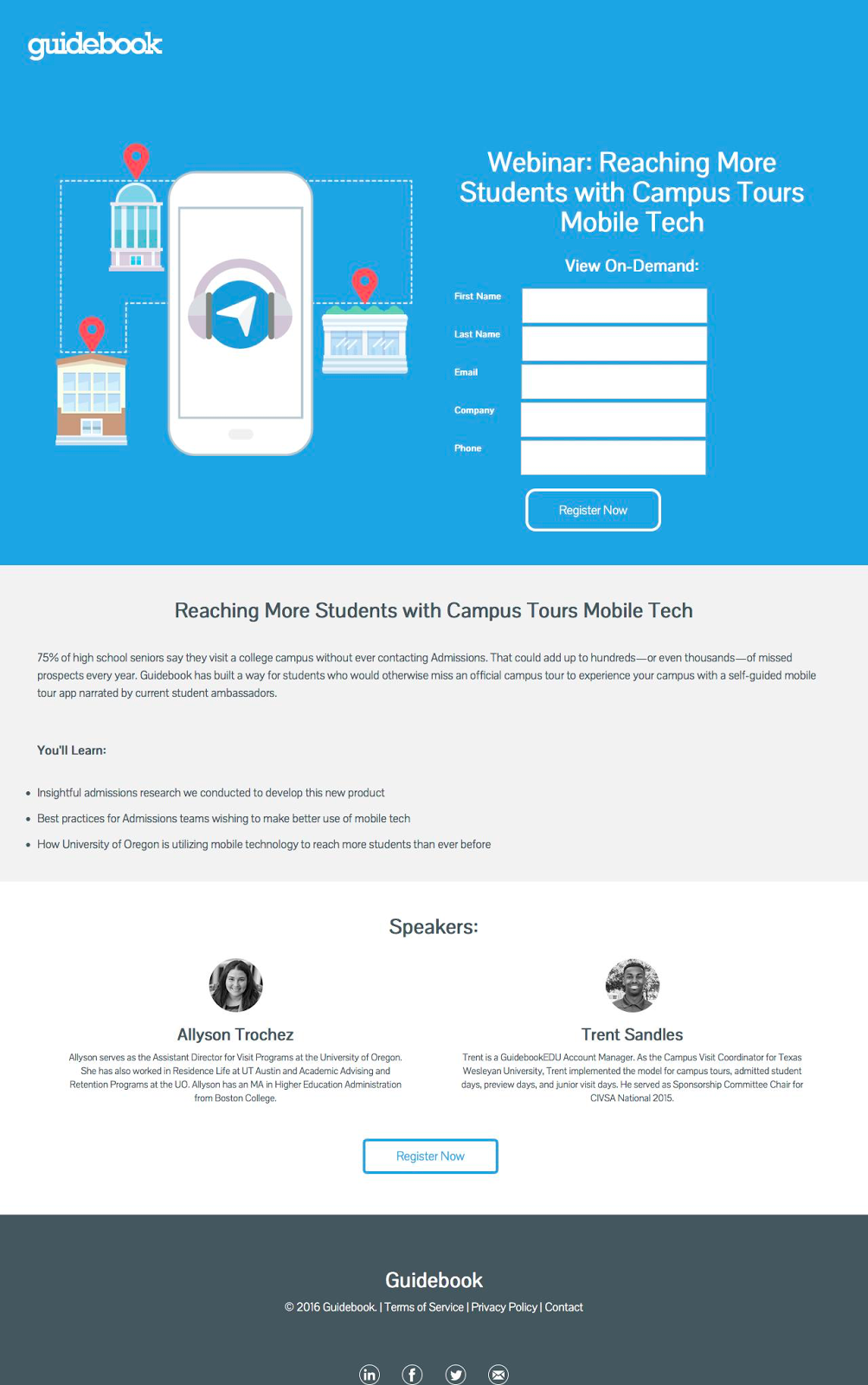
What makes this event landing page work?
- Social proof: The instructors and their qualifications are shown clearly on the page to add credibility to the event.
- Schedule: The schedule is laid out so that registrants can know what to expect after registering. Visitors can expect to learn the following items.
- Contrast: Visuals, graphics and CTAs are designed with bright colours to stand out from the ample white space. The large hero image grabs attention and directs the eye towards the form.
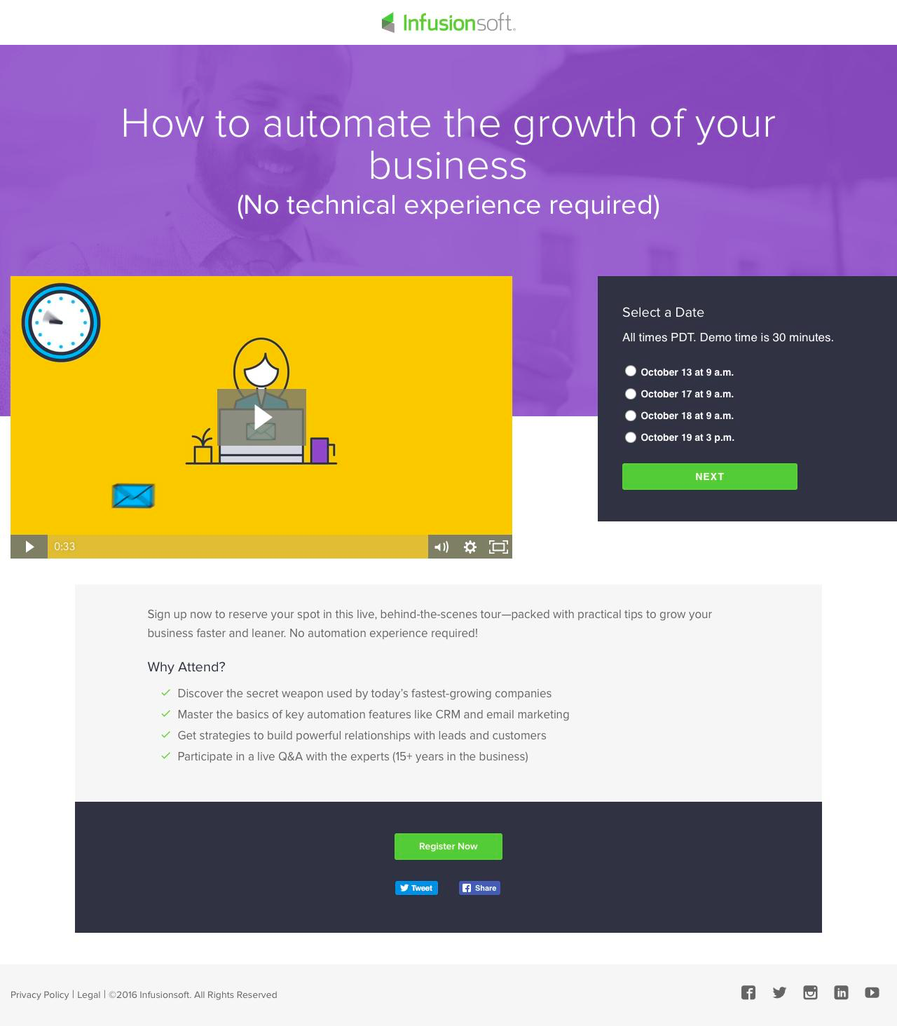
What makes this event landing page work?
- Schedule: The schedule is laid out so that registrants can know what to expect after registering. Purpose driven points tempt visitors into registering.
- Video: An event video quickly and succinctly explains the purpose of the course for visitors. It’s a value packed way to come off as professional and informed.
- Contrast: Visuals, graphics and CTAs are designed with bright colours to stand out from the ample white space.
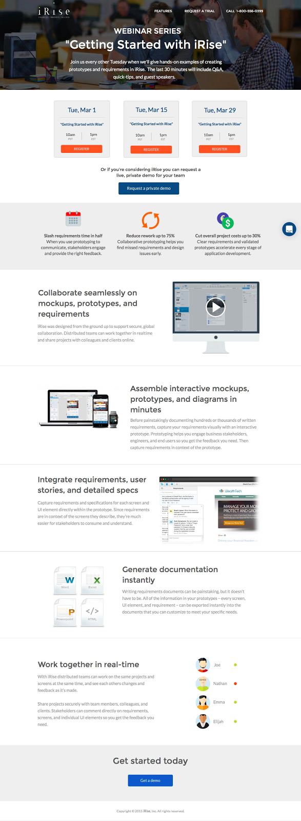
What makes this event landing page work?
- Contrast: Visuals, graphics and CTAs are designed with bright colours to stand out from the ample white space. Nothing else crowds the information or takes away from the value on the page.
- Action: The CTA button language “get a demo” and “register” uses action-oriented language to command action from the visitor.
- Visual: Images and pleasing colours attract attention and lead visitors down the page. Well used white space directs the eyes towards areas of interest for the visitor.
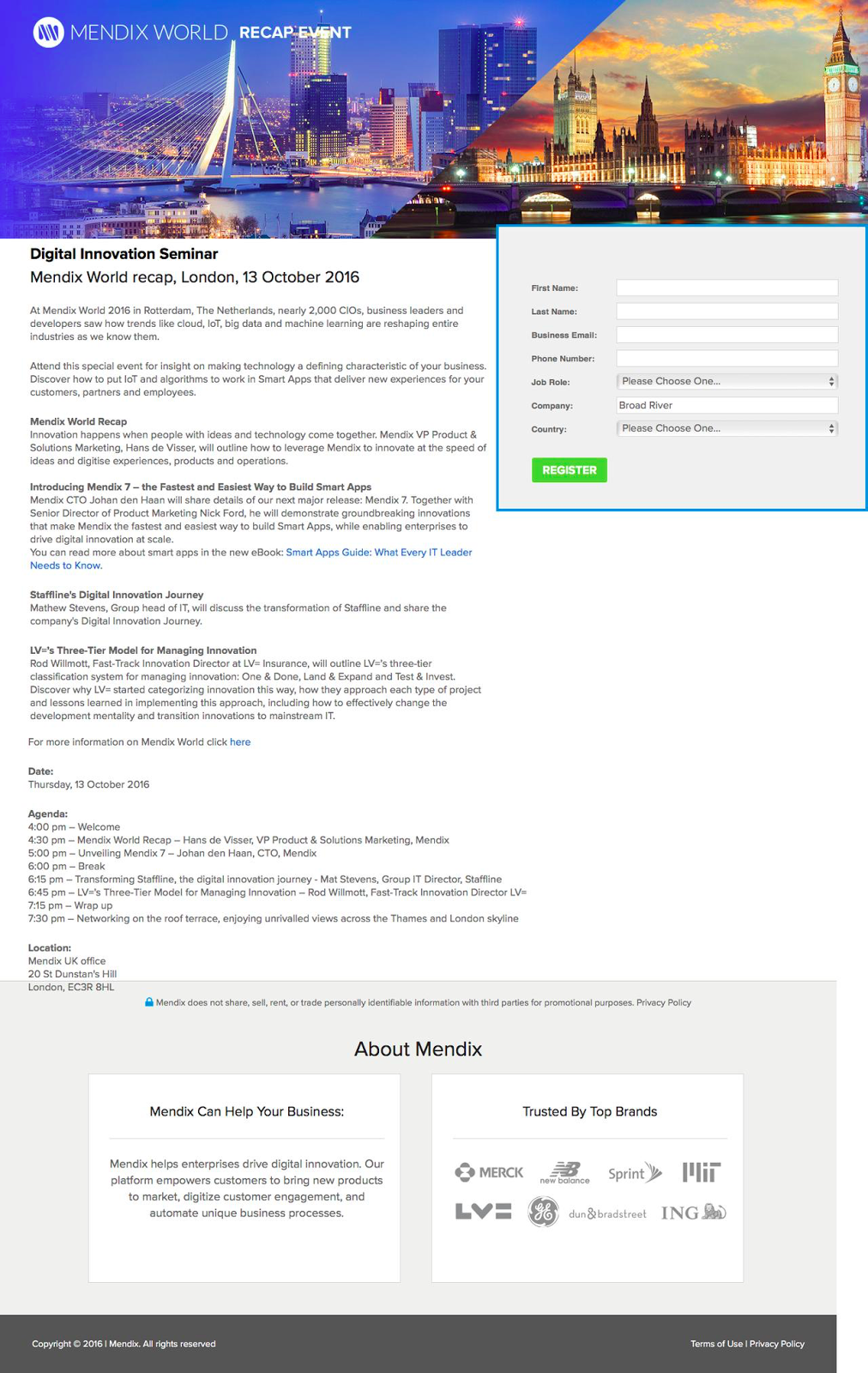
What makes this event landing page work?
- Contrast: Visuals, graphics and CTAs are designed with bright colours to stand out from the ample white space. Nothing else crowds the information or takes away from the value on the page.
- Schedule: The schedule is laid out so that registrants can know what to expect after registering.
- Social proof: Company logos and testimonials add trust and credibility to the page. Knowing that other companies have had success using the product is a huge conversion driver.

What makes this event landing page work?
- Contrast: Visuals, graphics and CTAs are designed with bright colours to stand out from the ample white space. Bright pink does an excellent job at drawing the eye.
- Agenda: The schedule is laid out so that registrants can know what to expect after registering. It lays out the agenda by hour and highlights areas of interest.
- Social proof: The instructors and their qualifications are shown clearly on the page to add credibility to the event.
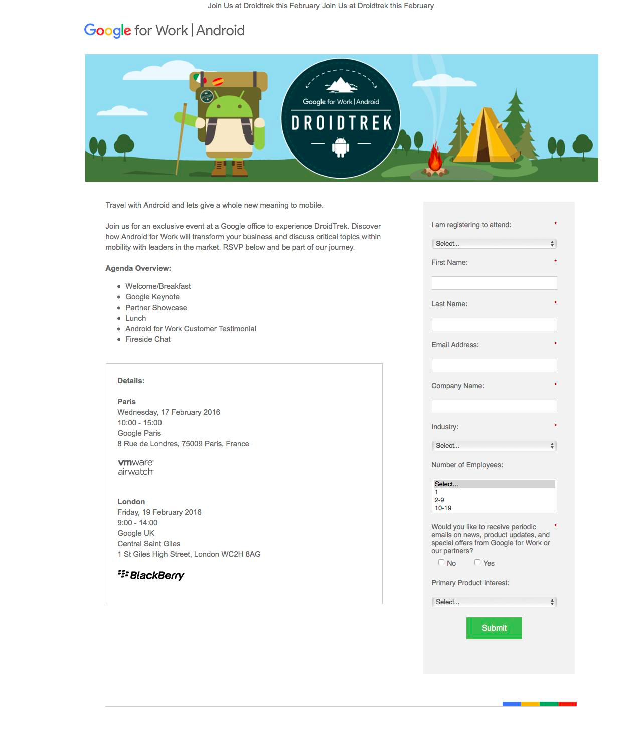
What makes this event landing page work?
- Contrast: Visuals, graphics and CTAs are designed with bright colours to stand out from the ample white space. The large hero graphic directs eyes downwards.
- Agenda: The schedule is laid out so that registrants can know what to expect after registering. It lays out the agenda by hour and highlights areas of interest.
- Form: The form, while lengthy, does its best to help the registrant by using dropdown menus and multiple choice.
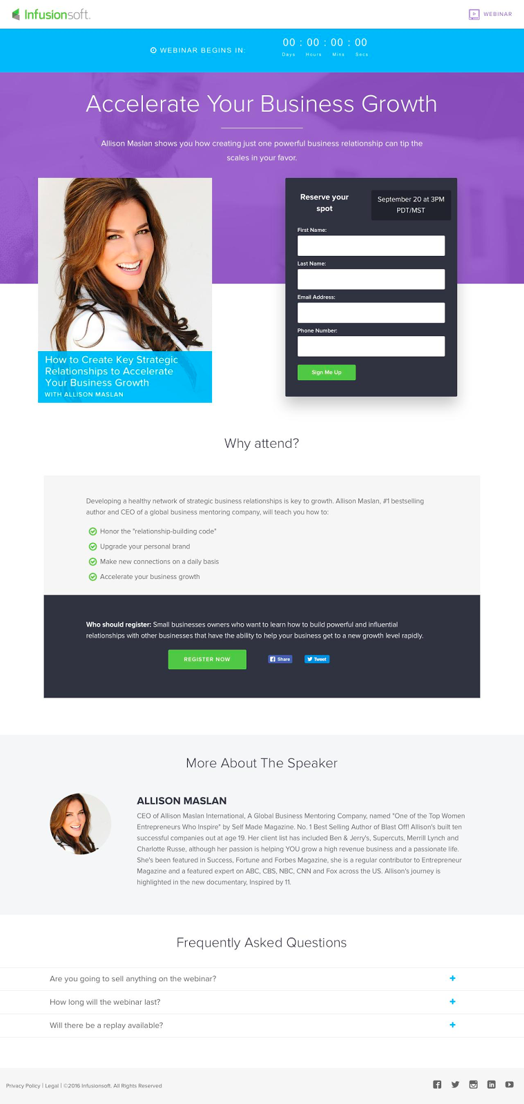
What makes this landing page work?
- Trust: Infusionsoft makes sure to fully present the webinar speaker at 2 points on the landing page. They explain the ‘why’ people should attend and include a bio of the speaker for added trust.
- Who should register: Infusionsoft explicitly says who should attend this webinar to attract the right audience.
- Schedule: The schedule is laid out so that registrants can know what to expect after registering. The purpose of the event clearly laid out for visitors who are hesitant.
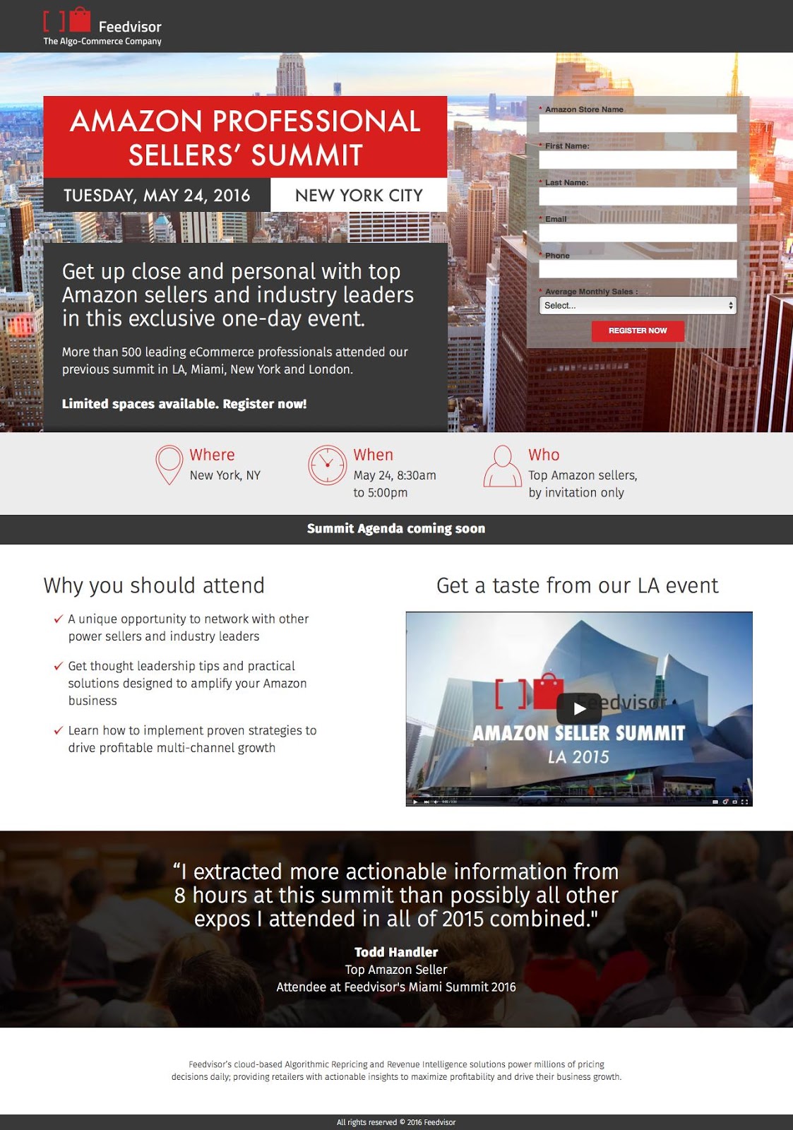
What makes this real estate landing page work?
- Video: A landing page video quickly and succinctly explains the sellers’ summit and the offer. Visuals do a much better job at explaining and presenting information.
- Proof: Testimonials provide social proof and credibility for potential attendees.

Landing Pages
500 Strategies, Ideas & Examples
Click below to download the most comprehensive collection of landing page strategies and examples ever compiled. Completely free.